pure CSS3 实现三角形 icon的方法 All In One
pure CSS3 实现三角形 icon的方法 All In One
border: color+transparent

transform : rotate() /rotateZ()
使用 实体字符 "◆" 实现三角形效果 ?
demos
<!DOCTYPE html>
<html lang="en">
<head>
<meta charset="UTF-8">
<title>Document</title>
<style>
*{
-webkit-overflow-scrolling: touch;
}
.container{
margin-left: 300px;
margin-top: 200px;
}
.box{
width:60px;
height:60px;
/*border: 1px solid #0f0;*/
float: left;
position: relative;
}
.b1{
background: #e66161;
}
.b1 .circle{
width: 10px;
height: 10px;
background: #fff;
position: absolute;
border-radius: 5px;
top: 25px;
left: 60px;
z-index: 9999;
}
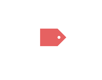
.triangle{
width:0px;
height:0px;
border-width:30px;
border-style:solid;
/*border-color:#e66161 #f3bb5b #94e24f #85bfda;*/
border-color:transparent transparent transparent #e66161;
/*can not using border-radius, head is not the real triangle*/
}
</style>
</head>
<body>
<div>
<h1>-webkit-overflow-scrolling: touch;</h1>
</div>
<div class="container">
<div class="box b1">
<div class="circle">
<!-- -->
</div>
</div>
<div class="box">
<div class="triangle">
<!-- -->
</div>
</div>
</div>
</body>
</html>
<!DOCTYPE html>
<html lang="en">
<head>
<meta charset="UTF-8">
<title>Document</title>
<style>
*{
-webkit-overflow-scrolling: touch;
}
.container{
margin-left: 300px;
margin-top: 200px;
background-color: #000;
width: auto;
height: auto;
overflow: hidden;
}
.box{
width:60px;
height:60px;
/*border: 1px solid #0f0;*/
float: left;
position: relative;
border-radius: 7px 0 0 7px;
}
.b1{
background: #2CCD76;
}
.b1 .circle{
width: 10px;
height: 10px;
background: #fff;
position: absolute;
border-radius: 5px;
top: 25px;
left: 60px;
z-index: 9999;
}
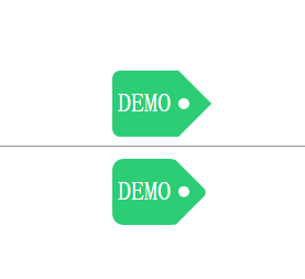
.b1 span{
color: #fff;
font-size: 1.5em;
display: inline-block;
/*text-align: center;*/
/*justify-content: center;*/
/*border: 1px solid red;*/
margin: 25% 8.3%;
}
.triangle{
width:0px;
height:0px;
border-width:30px;
border-style:solid;
/*border-color:#e66161 #f3bb5b #94e24f #85bfda;*/
border-color:transparent transparent transparent #2CCD76;
/*can not using border-radius, head is not the real triangle*/
}
</style>
<style>
.r-container{
margin-left: 300px;
margin-top: 10px;
background-color: #000;
width: auto;
height: auto;
overflow: hidden;
}
.r-box{
width:60px;
height:60px;
/*border: 1px solid #0f0;*/
float: left;
position: relative;
border-radius: 10px 7px 7px 10px;
background: #2CCD76;
z-index: 9999;
}
.r-box span{
color: #fff;
font-size: 1.5em;
display: inline-block;
/*text-align: center;*/
/*justify-content: center;*/
/*border: 1px solid red;*/
margin: 25% 8.3%;
}
.rr{
width:42.5px;
height:42.5px;
/*border: 1px solid #0f0;*/
float: left;
left: 35px;
top: 9px;
position: absolute;
background: #2CCD76;
transform: rotateZ(45deg);
/* rotate center ???*/
z-index: -1;
border-radius: 3px 5px;
}
.rr .rc{
width: 10px;
height: 10px;
background: #fff;
position: absolute;
border-radius: 5px;
top: 10px;
left: 22px;
}
</style>
</head>
<body>
<div>
<h1>-webkit-overflow-scrolling: touch;</h1>
</div>
<div class="container">
<div class="box b1">
<span>DEMO</span>
<div class="circle">
<!-- -->
</div>
</div>
<div class="box">
<div class="triangle">
<!-- -->
</div>
</div>
</div>
<hr>
<div class="r-container">
<div class="r-box">
<span>DEMO</span>
<div class="rr">
<div class="rc">
<!-- -->
</div>
</div>
</div>
</div>
</body>
</html>
refs
©xgqfrms 2012-2020
www.cnblogs.com/xgqfrms 发布文章使用:只允许注册用户才可以访问!
原创文章,版权所有©️xgqfrms, 禁止转载 🈲️,侵权必究⚠️!
本文首发于博客园,作者:xgqfrms,原文链接:https://www.cnblogs.com/xgqfrms/p/5947745.html
未经授权禁止转载,违者必究!

 浙公网安备 33010602011771号