CSS ? Layout Module : CSS 布局模型
1
1
1
https://www.w3.org/TR/css-grid-1/
CSS Grid Layout Module Level 1
W3C Working Draft, 19 May 2016
1
https://www.w3.org/TR/css3-multicol/
CSS Multi-column Layout Module
W3C Candidate Recommendation 12 April 2011
1
https://www.w3.org/TR/css-ruby-1/
CSS Ruby Layout Module Level 1
W3C Working Draft, 5 August 2014
1
https://www.w3.org/TR/css-inline-3/
CSS Inline Layout Module Level 3
W3C Working Draft, 24 May 2016
1
https://www.w3.org/TR/css-flexbox-1/
CSS Flexible Box Layout Module Level 1
W3C Candidate Recommendation, 26 May 2016
“Old” Flexbox and “New” Flexbox
https://css-tricks.com/old-flexbox-and-new-flexbox/
1
https://drafts.csswg.org/css-position/#sticky-pos
CSS Positioned Layout Module Level 3
Editor’s Draft, 19 August 2016
https://www.w3.org/TR/CSS21/visuren.html#fixed-positioning
1
https://www.w3.org/TR/css-flexbox-1/
CSS Template Layout Module
W3C Working Group Note 26 March 2015
9.3.1 Choosing a positioning scheme: 'position' property
The 'position' and 'float' properties determine which of the CSS 2.1 positioning algorithms is used to calculate the position of a box.
9.2.4 The 'display' property
- 'display'
Value: inline | block | list-item | inline-block | table | inline-table | table-row-group | table-header-group | table-footer-group | table-row | table-column-group | table-column | table-cell | table-caption | none | inherit Initial: inline Applies to: all elements Inherited: no Percentages: N/A Media: all Computed value: see text
1. Introduction
This section is not normative.
CSS 2.1 defined four layout modes — algorithms which determine the size and position of boxes based on their relationships with their sibling and ancestor boxes:
block layout, designed for laying out documents
inline layout, designed for laying out text
table layout, designed for laying out 2D data in a tabular format
positioned layout, designed for very explicit positioning without much regard for other elements in the document
This module introduces a new layout mode, flex layout, which is designed for laying out more complex applications and webpages.
1
https://developer.mozilla.org/zh-CN/docs/Web/CSS/Layout_mode
Layout mode
CSS 布局模式, 有时简称为布局, 是一种基于盒子与其兄弟姐妹盒子和祖辈盒子的交互方式,来确定盒子的位置和框的大小的算法. 有以下几种不同形式:
- 块布局(block layout), designed for laying out documents. The block layout contains document-centric features, like the ability to float elements or to lay them out over multiple columns.
- 行内布局(inline layout), designed for laying out text.
- 表格布局(table layout), designed for laying out tables.
- 定位布局(positioned layout), designed for positioning elements without much interaction with other elements.
- 弹性盒子布局( flexible box layout), designed for laying out complex pages that can be resized smoothly.
- 网格布局(grid layout), designed for laying out elements relative to a fixed grid.
1
1
1
1
https://www.w3.org/TR/css-overflow-3/
CSS Overflow Module Level 3
W3C Working Draft, 31 May 2016
1
1
学习CSS布局
http://zh.learnlayout.com/
"display"属性
displayCSS property specifieshttps://developer.mozilla.org/zh-CN/docs/Web/CSS/display
display是CSS中最重要的用于控制布局的属性。每个元素都有一个默认的 display 值,这与元素的类型有关。对于大多数元素它们的默认值通常是
block或inline。一个 block 元素通常被叫做块级元素,一个 inline 元素通常被叫做行内元素。
一个块级元素会新开始一行并且尽可能撑满容器。
一个行内元素可以在段落中 <span> 像这样 </span>包裹一些文字而不会打乱段落的布局。
另一个常用的display值是
none。一些特殊元素的默认 display 值是它,例如
script。display:none;通常被用于JavaScript 中,来实现在不删除元素的情况下,隐藏/显示 元素。
display: none; (真隐藏元素,不占空间)与visibility: hidden; (假隐藏元素,占空间)。
display:none; 看不到元素,且不会保留元素原来占用的显示空间,
visibility: hidden;看不到元素,但是仍会保留元素原来占用的显示空间.
tips:
每个元素都有一个默认的 display 类型,不过你可以随时随地的重写它!
虽然“人工制造”一个行内元素可能看起来很难以理解,不过你可以把有特定语义的元素改成行内元素。
常见的例子是:使用
li{display: inline},制作成水平菜单。
margin: auto;
设置块级元素的
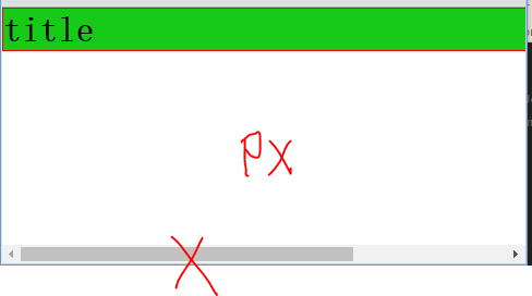
width可以阻止它从左到右撑满容器,然后你就可以设置左右外边距为auto来使其水平居中。元素会占据你所指定的宽度width(像素/百分百),剩余的宽度(window.width-div.width)会被左右外边距平均分配。
唯一的问题是,当浏览器窗口比元素的宽度还要窄时(指定的宽度?px;),浏览器会显示一个水平滚动条来容纳页面。
让我们再来改进下这个方案...(指定的宽度 ?%;)
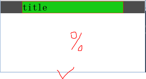
使用
max-width替代width可以使浏览器更好地处理小窗口的情况。(min-width)?这点在移动设备上显得尤为重要,调整下浏览器窗口大小检查下吧!
demo:
<!DOCTYPEhtml><htmllang="en"><head><metacharset="UTF-8"><title>margin center</title><style>*{margin: 0;padding: 0;}.box{background: rgba(0,0,0,0.7);}.d{border: 1px solid red;margin: 0 0 10px;}.d1{background: rgba(0,255,0,0.7);/*width: 700px;*//*唯一的问题是,当浏览器窗口比元素的宽度还要窄时(指定的宽度?px;),浏览器会显示一个水平滚动条来容纳页面。改进方案...(指定的宽度 ?%;)*/width: 70%;margin: 0 auto 10px;/*div 自动居中(设置width=?,margin=auto)width: 50%;margin: auto;*/}</style></head><body><divclass="box"><divclass="d d1"><h1>title</h1></div></div></body></html>image:
1
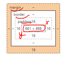
盒子模型
在我们讨论宽度的时候,我们应该讲下与它相关的一个重点知识:盒子模型。
margin = margin-top + margin-bottom ;
border = border-top +border-bottom ;
padding = padding-top + padding-bottom ;
盒子长度: (margin+border+padding)+height ;
盒子宽度:(margin+border+padding)+width ;
当你设置了元素的长度,宽度,实际展现的元素可能会超出你设置的width:因为元素的边框和内边距可能会撑爆元素width,height。
两个盒子设置相同(width)宽度的元素,实际显示的盒子宽度却不一样。
? padding: auto 15px//Error: Invalid property value
demo:
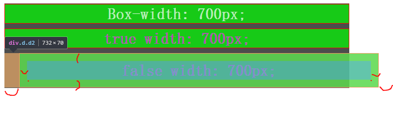
<!DOCTYPEhtml><htmllang="en"><head><metacharset="UTF-8"><title>BOX</title><style>*{margin: 0;padding: 0;}.box{background: rgba(0,0,0,0.7);width: 702px;/*height: 300px;*/margin: 10px auto;padding: 1px 0;}.d{border: 1px solid red;text-align: center;margin: 0 auto 10px;background: rgba(0,255,0,0.7);color: rgba(255,0,255,0.7);}.d0{color: rgba(255,255,255,0.7);}.d1{width: 700px;/*margin: auto;padding: auto;*/}.d2{width: 700px;margin: auto 30px;padding: 15px;/*存在bug,优先级 ?padding: 0 15px;//OKpadding: auto 15px;//Error: Invalid property value(Chrome 测试)*/}</style></head><body><divclass="box"><divclass="d d0"><h1>Box-width: 700px;</h1></div><divclass="d d1"><h1>true width: 700px;</h1></div><divclass="d d2"><h1>false width: 700px;</h1></div></div></body></html>image:
以前有一个代代相传的解决方案是数学计算。CSS开发者需要用比他们实际想要的宽度小一点的宽度,需要减去内边距和边框的宽度。
值得庆幸地是你不需要再这么做了...
所以他们新增了一个叫做
box-sizing的CSS属性。当你设置一个元素为
box-sizing: border-box;时,此元素的内边距和边框不再会增加它的宽度。? margin ?
1
1
1
1
1
1
1
1
1
1
1
1
1
1
1
1
1
1
1
1
Create fluid layouts with HTML5 and CSS3
http://www.creativebloq.com/css3/create-fluid-layouts-html5-and-css3-3142768
A Complete Guide to Grid
https://css-tricks.com/snippets/css/complete-guide-grid/
CSS Layout - inline-block
http://www.w3schools.com/css/css_inline-block.asp
学习CSS布局
http://zh.learnlayout.com/toc.html
学习CSS布局
http://zh.learnlayout.com/
使用CSS3 Flexbox布局
http://www.w3cplus.com/css3/css3-flexbox-layout.html
https://developer.mozilla.org/zh-CN/docs/Web/CSS/CSS_Flexible_Box_Layout
https://developer.mozilla.org/zh-CN/docs/Web/CSS/CSS_Flexible_Box_Layout/使用弹性盒子进行高级布局
https://developer.mozilla.org/zh-CN/docs/Web/CSS/CSS_Flexible_Box_Layout/Using_flexbox_to_lay_out_web_applications
1
1
1
1
1
本文首发于博客园,作者:xgqfrms,原文链接:https://www.cnblogs.com/xgqfrms/p/5789605.html
未经授权禁止转载,违者必究!


【推荐】国内首个AI IDE,深度理解中文开发场景,立即下载体验Trae
【推荐】编程新体验,更懂你的AI,立即体验豆包MarsCode编程助手
【推荐】抖音旗下AI助手豆包,你的智能百科全书,全免费不限次数
【推荐】轻量又高性能的 SSH 工具 IShell:AI 加持,快人一步
· AI与.NET技术实操系列(二):开始使用ML.NET
· 记一次.NET内存居高不下排查解决与启示
· 探究高空视频全景AR技术的实现原理
· 理解Rust引用及其生命周期标识(上)
· 浏览器原生「磁吸」效果!Anchor Positioning 锚点定位神器解析
· DeepSeek 开源周回顾「GitHub 热点速览」
· 记一次.NET内存居高不下排查解决与启示
· 物流快递公司核心技术能力-地址解析分单基础技术分享
· .NET 10首个预览版发布:重大改进与新特性概览!
· .NET10 - 预览版1新功能体验(一)