HTML5 动效
HTML5 动效
https://github.com/xgqfrms/mojs
A collection of loading indicators animated with CSS
http://tobiasahlin.com/spinkit/
Just-add-water CSS animations
http://daneden.github.io/animate.css/
制作3D旋转导航menuhttp://www.imooc.com/code/1883
http://codepen.io/xgqfrms/pen/BLBQZZ
<iframe height="300" style="width: 100%;" scrolling="no" title="HTML5 & CSS3 & 3D menu" src="https://codepen.io/xgqfrms/embed/BLBQZZ?height=300&theme-id=25577&default-tab=result" frameborder="no" allowtransparency="true" allowfullscreen="true">
See the Pen <a href='https://codepen.io/xgqfrms/pen/BLBQZZ'>HTML5 & CSS3 & 3D menu</a> by xgqfrms
(<a href='https://codepen.io/xgqfrms'>@xgqfrms</a>) on <a href='https://codepen.io'>CodePen</a>.
</iframe>

1
demo:
HTML:
<divid="nav"><ulclass="nav-menu clearfix unstyled"><li><ahref="#" class="three-d active">Home<spanclass="three-d-box"><spanclass="front">Home</span><spanclass="back">Home</span></span></a></li><li><ahref="#" class="three-d">Services<spanclass="three-d-box"><spanclass="front">Services</span><spanclass="back">Services</span></span></a></li><li><ahref="#" class="three-d">Products<spanclass="three-d-box"><spanclass="front">Products</span><spanclass="back">Products</span></span></a></li><li><ahref="#" class="three-d">About<spanclass="three-d-box"><spanclass="front">About</span><spanclass="back">About</span></span></a></li><li><ahref="#" class="three-d">Contact<spanclass="three-d-box"><spanclass="front">Contact</span><spanclass="back">Contact</span></span></a></li><li><ahref="#" class="three-d">Blog<spanclass="three-d-box"><spanclass="front">Blog</span><spanclass="back">Blog</span></span></a><ulclass="clearfix unstyled drop-menu"><li><ahref="#" class="three-d">Html5<spanclass="three-d-box"><spanclass="front">Html5</span><spanclass="back">Html5</span></span></a></li><li><ahref="#" class="three-d">Css3<spanclass="three-d-box"><spanclass="front">Css3</span><spanclass="back">Css3</span></span></a></li><li><ahref="#" class="three-d">JavaScript<spanclass="three-d-box"><spanclass="front">JavaScript</span><spanclass="back">JavaScript</span></span></a></li><li><ahref="#" class="three-d">Videogames<spanclass="three-d-box"><spanclass="front">Videogames</span><spanclass="back">Videogames</span></span></a></li></ul></li><li><ahref="#" class="three-d">Shop On-line<spanclass="three-d-box"><spanclass="front">Shop On-line</span><spanclass="back">Shop On-line</span></span></a></li></ul></div>
CSS:
@importurl("http://www.w3cplus.com/demo/css3/base.css");@font-face {font-family:'sansationregular';src:url('http://www.w3cplus.com/demo/css3/3DAnimationDropdownMenu/sansation_regular-webfont.eot');src:url('http://www.w3cplus.com/demo/css3/3DAnimationDropdownMenu/sansation_regular-webfont.eot?#iefix')format('http://www.w3cplus.com/demo/css3/3DAnimationDropdownMenu/embedded-opentype'),url('http://www.w3cplus.com/demo/css3/3DAnimationDropdownMenu/sansation_regular-webfont.woff')format('woff'),url('http://www.w3cplus.com/demo/css3/3DAnimationDropdownMenu/sansation_regular-webfont.ttf')format('truetype'),url('http://www.w3cplus.com/demo/css3/3DAnimationDropdownMenu/sansation_regular-webfont.svg#sansationregular')format('svg');font-weight:normal;font-style:normal;}body {background-color:#edecec;}/* basic menu styles */.nav-menu {display:block;background:#74adaa;width:950px;margin:50pxauto150px;}.nav-menu > li {display:inline;float:left;border-right:1pxsolid#94c0be;}.nav-menu > li:last-child {border-right:none;}.nav-menu li a {color:#fff;display:block;text-decoration:none;font-family:'sansationregular';-webkit-font-smoothing: antialiased;-moz-font-smoothing: antialiased;font-smoothing: antialiased;text-transform:capitalize;overflow:visible;line-height:20px;font-size:20px;padding:15px30px15px31px;}/* animation domination */.three-d {-webkit-perspective:200px;-moz-perspective:200px;-ms-perspective:200px;-o-perspective:200px;perspective:200px;-webkit-transition:all.07s linear;-moz-transition:all.07s linear;-ms-transition:all.07s linear;-o-transition:all.07s linear;transition:all.07s linear;position:relative;}.three-d:not(.active):hover {cursor:pointer;}.three-d:not(.active):hover .three-d-box,.three-d:not(.active):focus .three-d-box {-wekbit-transform: translateZ(-25px) rotateX(90deg);-moz-transform: translateZ(-25px) rotateX(90deg);-o-transform: translateZ(-25px) rotateX(90deg);-ms-transform: translateZ(-25px) rotateX(90deg);transform: translateZ(-25px) rotateX(90deg);}.three-d-box {-webkit-transition:all.3s ease-out;-moz-transition:all.3s ease-out;-ms-transition:all.3s ease-out;-o-transition:all.3s ease-out;transition:all.3s ease-out;-webkit-transform: translatez(-25px);-moz-transform: translatez(-25px);-ms-transform: translatez(-25px);-o-transform: translatez(-25px);transform: translatez(-25px);-webkit-transform-style: preserve-3d;-moz-transform-style: preserve-3d;-ms-transform-style: preserve-3d;-o-transform-style: preserve-3d;transform-style: preserve-3d;-webkit-pointer-events:none;-moz-pointer-events:none;-ms-pointer-events:none;-o-pointer-events:none;pointer-events:none;position:absolute;top:0;left:0;display:block;width:100%;height:100%;}.front {-webkit-transform: rotatex(0deg) translatez(25px);-moz-transform: rotatex(0deg) translatez(25px);-ms-transform: rotatex(0deg) translatez(25px);-o-transform: rotatex(0deg) translatez(25px);transform: rotatex(0deg) translatez(25px);}.back {-webkit-transform: rotatex(-90deg) translatez(25px);-moz-transform: rotatex(-90deg) translatez(25px);-ms-transform: rotatex(-90deg) translatez(25px);-o-transform: rotatex(-90deg) translatez(25px);transform: rotatex(-90deg) translatez(25px);color:#FFE7C4;}.front, .back {display:block;width:100%;height:100%;position:absolute;top:0;left:0;background:#74adaa;padding:15px30px15px31px;color:white;-webkit-pointer-events:none;-moz-pointer-events:none;-ms-pointer-events:none;-o-pointer-events:none;pointer-events:none;-webkit-box-sizing: border-box;box-sizing: border-box;}.nav-menu li .active .front,.nav-menu li .active .back,.nav-menu li a:hover .front,.nav-menu li a:hover .back {background-color:#51938f;-webkit-background-size:5px5px;background-size:5px5px;background-position:00,30px30px;background-image: -webit-linear-gradient(45deg,#47848025%,transparent25%,transparent75%,#47848075%,#478480), linear-gradient(45deg,#47848025%,transparent25%,transparent75%,#47848075%,#478480);background-image: -moz-linear-gradient(45deg,#47848025%,transparent25%,transparent75%,#47848075%,#478480), linear-gradient(45deg,#47848025%,transparent25%,transparent75%,#47848075%,#478480);background-image: -ms-linear-gradient(45deg,#47848025%,transparent25%,transparent75%,#47848075%,#478480), linear-gradient(45deg,#47848025%,transparent25%,transparent75%,#47848075%,#478480);background-image: -o-linear-gradient(45deg,#47848025%,transparent25%,transparent75%,#47848075%,#478480), linear-gradient(45deg,#47848025%,transparent25%,transparent75%,#47848075%,#478480);background-image: linear-gradient(45deg,#47848025%,transparent25%,transparent75%,#47848075%,#478480), linear-gradient(45deg,#47848025%,transparent25%,transparent75%,#47848075%,#478480);}.nav-menu ul {position:absolute;text-align:left;line-height:40px;font-size:14px;width:200px;-webkit-transition:all0.3s ease-in;-moz-transition:all0.3s ease-in;-ms-transition:all0.3s ease-in;-o-transition:all0.3s ease-in;transition:all0.3s ease-in;-webkit-transform-origin:0px0px;-moz-transform-origin:0px0px;-ms-transform-origin:0px0px;-o-transform-origin:0px0px;transform-origin:0px0px;-webkit-transform: rotateX(-90deg);-moz-transform: rotateX(-90deg);-ms-transform: rotateX(-90deg);-o-transform: rotateX(-90deg);transform: rotateX(-90deg);-webkit-backface-visibility:hidden;-moz-backface-visibility:hidden;-ms-backface-visibility:hidden;-o-backface-visibility:hidden;backface-visibility:hidden;}.nav-menu > li:hover ul {display:block;-webkit-transform: rotateX(0deg);-moz-transform: rotateX(0deg);-ms-transform: rotateX(0deg);-o-transform: rotateX(0deg);transform: rotateX(0deg);}
JS:
/*no need javascript!*/
1
1
1
1
1
1
1
1
1
1
1
1
1
1
1
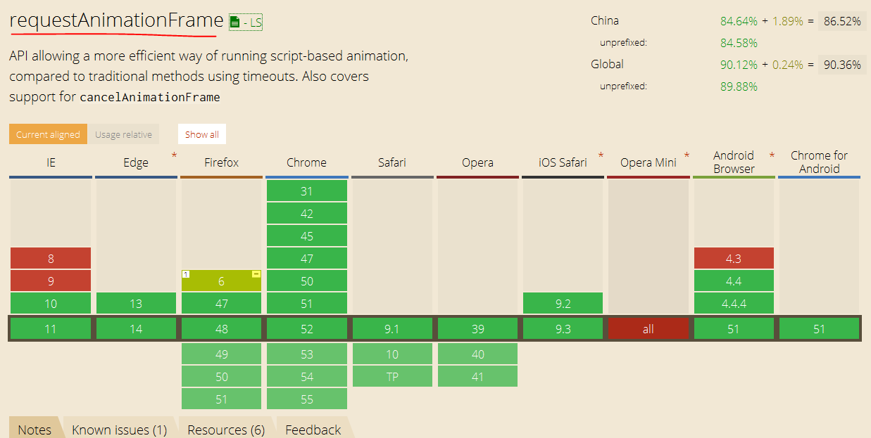
window.requestAnimationFrame
https://developer.mozilla.org/zh-CN/docs/Web/API/Window/requestAnimationFrame
window.requestAnimationFrame
https://html.spec.whatwg.org/multipage/webappapis.html#animation-frames
HTML
Living Standard — Last Updated 2 September 2016
Web Performance Working Group
https://www.w3.org/TR/2011/WD-animation-timing-20110602/
Timing control for script-based animations
W3C Working Draft 2 June 2011
https://www.w3.org/TR/animation-timing/
Timing control for script-based animations
W3C Working Group Note 22 September 2015
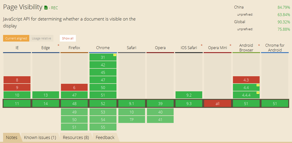
https://www.w3.org/TR/2011/WD-page-visibility-20110602/
Page Visibility
W3C Working Draft 2 June 2011
https://www.w3.org/TR/page-visibility/
Page Visibility (Second Edition)
W3C Recommendation 29 October 2013
https://css-tricks.com/using-requestanimationframe/
http://javascript.ruanyifeng.com/htmlapi/requestanimationframe.html
http://www.zhangxinxu.com/wordpress/2013/09/css3-animation-requestanimationframe-tween-动画算法
http://www.cnblogs.com/bigbearbb/p/4276808.html
http://www.webhek.com/requestanimationframe
1
1
1
1
1
1
1
1
1
本文首发于博客园,作者:xgqfrms,原文链接:https://www.cnblogs.com/xgqfrms/p/5782352.html
未经授权禁止转载,违者必究!


【推荐】国内首个AI IDE,深度理解中文开发场景,立即下载体验Trae
【推荐】编程新体验,更懂你的AI,立即体验豆包MarsCode编程助手
【推荐】抖音旗下AI助手豆包,你的智能百科全书,全免费不限次数
【推荐】轻量又高性能的 SSH 工具 IShell:AI 加持,快人一步
· AI与.NET技术实操系列(二):开始使用ML.NET
· 记一次.NET内存居高不下排查解决与启示
· 探究高空视频全景AR技术的实现原理
· 理解Rust引用及其生命周期标识(上)
· 浏览器原生「磁吸」效果!Anchor Positioning 锚点定位神器解析
· DeepSeek 开源周回顾「GitHub 热点速览」
· 记一次.NET内存居高不下排查解决与启示
· 物流快递公司核心技术能力-地址解析分单基础技术分享
· .NET 10首个预览版发布:重大改进与新特性概览!
· .NET10 - 预览版1新功能体验(一)