Chakra UI All In One
Chakra UI All In One
⚡️ Simple, Modular & Accessible UI Components for your React Applications
恰克如啊?
React ✅
https://github.com/chakra-ui/chakra-ui/
Vue ❌
https://github.com/chakra-ui/chakra-ui-vue
docs
$ pnpm add @chakra-ui/react @emotion/react @emotion/styled framer-motion
import * as React from 'react'

// 1. import `ChakraProvider` component
import { ChakraProvider } from '@chakra-ui/react'

function App() {
  // 2. Wrap ChakraProvider at the root of your app
  return (
    <ChakraProvider>
      <TheRestOfYourApplication />
    </ChakraProvider>
  )
}
⚠️
Version 2of Chakra UI is only compatible withReact 18.
If you are still needing to useReact 17or earlier, please useversion 1of Chakra UI.
https://chakra-ui.com/getting-started
tutorials
https://www.chakrauiforbeginners.com/
https://github.com/estheragbaje/chakra-ui-for-beginners/
Next.js
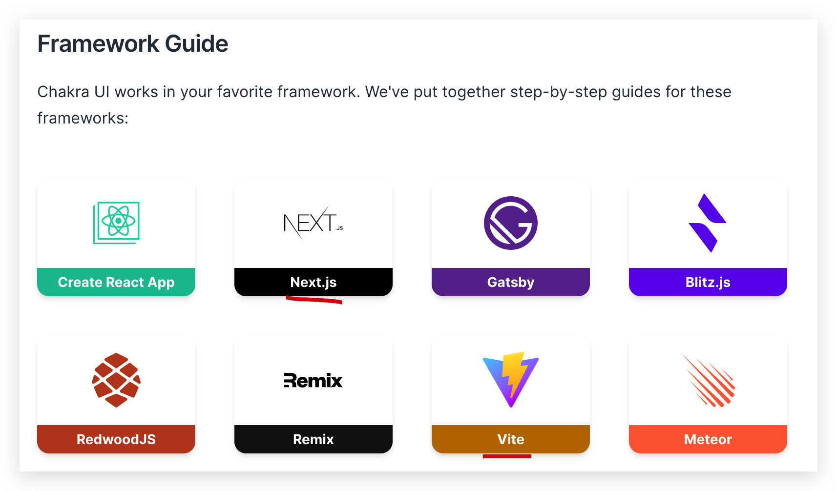
https://chakra-ui.com/getting-started/nextjs-guide
demos
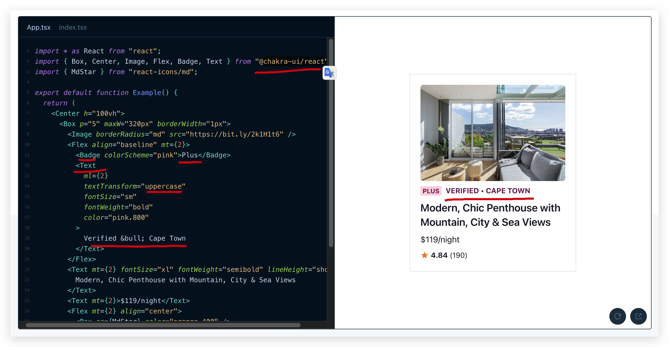
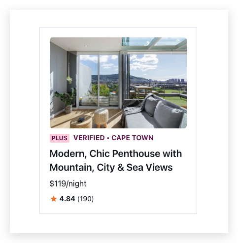
import * as React from "react";
import { Box, Center, Image, Flex, Badge, Text } from "@chakra-ui/react";
import { MdStar } from "react-icons/md";
export default function Example() {
return (
<Center h="100vh">
<Box p="5" maxW="320px" borderWidth="1px">
<Image borderRadius="md" src="https://bit.ly/2k1H1t6" />
<Flex align="baseline" mt={2}>
<Badge colorScheme="pink">Plus</Badge>
<Text
ml={2}
textTransform="uppercase"
fontSize="sm"
fontWeight="bold"
color="pink.800"
>
Verified • Cape Town
</Text>
</Flex>
<Text mt={2} fontSize="xl" fontWeight="semibold" lineHeight="short">
Modern, Chic Penthouse with Mountain, City & Sea Views
</Text>
<Text mt={2}>$119/night</Text>
<Flex mt={2} align="center">
<Box as={MdStar} color="orange.400" />
<Text ml={1} fontSize="sm">
<b>4.84</b> (190)
</Text>
</Flex>
</Box>
</Center>
);
}
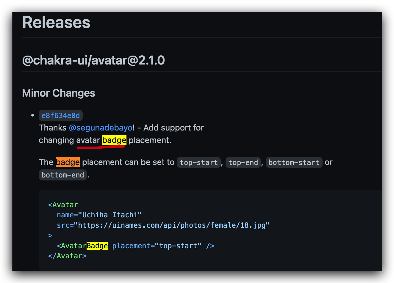
Badge
https://github.com/chakra-ui/chakra-ui/blob/main/packages/components 中搜索不到 💩
https://github.com/chakra-ui/chakra-ui/pull/6555 issues 里面搜出来的,在 Avatar 下面 ✅
TypeScript
https://github.com/chakra-ui/chakra-ui/blob/main/packages/components/avatar/src/avatar-badge.tsx
// Record<keys, values>

import {
  chakra,
  forwardRef,
  HTMLChakraProps,
  SystemStyleObject,
} from "@chakra-ui/system"
import { cx } from "@chakra-ui/shared-utils"
import { useAvatarStyles } from "./avatar-context"

type BadgePlacement = "top-start" | "top-end" | "bottom-start" | "bottom-end"

const placementMap: Record<BadgePlacement, SystemStyleObject> = {
  "top-start": {
    top: "0",
    insetStart: "0",
    transform: "translate(-25%, -25%)",
  },
  "top-end": {
    top: "0",
    insetEnd: "0",
    transform: "translate(25%, -25%)",
  },
  "bottom-start": {
    bottom: "0",
    insetStart: "0",
    transform: "translate(-25%, 25%)",
  },
  "bottom-end": {
    bottom: "0",
    insetEnd: "0",
    transform: "translate(25%, 25%)",
  },
}

export interface AvatarBadgeProps extends HTMLChakraProps<"div"> {
  placement?: BadgePlacement
}

/**
 * AvatarBadge used to show extra badge to the top-right
 * or bottom-right corner of an avatar.
 */
export const AvatarBadge = forwardRef<AvatarBadgeProps, "div">(
  function AvatarBadge(props, ref) {
    const { placement = "bottom-end", className, ...rest } = props
    const styles = useAvatarStyles()

    const placementStyles = placementMap[placement]

    const badgeStyles: SystemStyleObject = {
      position: "absolute",
      display: "flex",
      alignItems: "center",
      justifyContent: "center",
      ...placementStyles,
      ...styles.badge,
    }

    return (
      <chakra.div
        ref={ref}
        {...rest}
        className={cx("chakra-avatar__badge", className)}
        __css={badgeStyles}
      />
    )
  },
)

AvatarBadge.displayName = "AvatarBadge"
ui-components / ui-library
https://github.com/topics/ui-components?o=desc&s=stars
https://github.com/topics/ui-library?o=desc&s=stars
(🐞 反爬虫测试!打击盗版⚠️)如果你看到这个信息, 说明这是一篇剽窃的文章,请访问 https://www.cnblogs.com/xgqfrms/ 查看原创文章!
refs
©xgqfrms 2012-2021
www.cnblogs.com/xgqfrms 发布文章使用:只允许注册用户才可以访问!
原创文章,版权所有©️xgqfrms, 禁止转载 🈲️,侵权必究⚠️!
本文首发于博客园,作者:xgqfrms,原文链接:https://www.cnblogs.com/xgqfrms/p/17092690.html
未经授权禁止转载,违者必究!

