CSS Units: large, small, dynamic viewport units All In One
CSS Units: large, small, dynamic viewport units All In One
The large, small, and dynamic
viewport units
CSS Units vh/vw
vw = 1% of the width of the viewport size.
vh = 1% of the height of the viewport size.
Give an element a width of 100vw and a height of 100vh, and it will cover the viewport entirely.
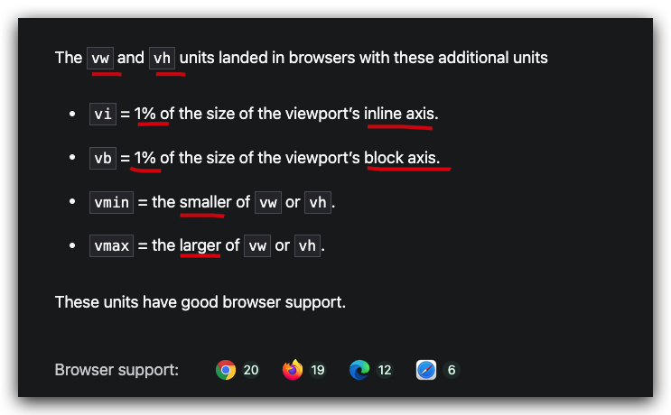
The vw and vh units landed in browsers with these additional units
vi = 1% of the size of the viewport’s inline axis.
vb = 1% of the size of the viewport’s block axis.
vmin = the smaller of vw or vh.
vmax = the larger of vw or vh.

CSS Units lvh/lvw & svh/svw
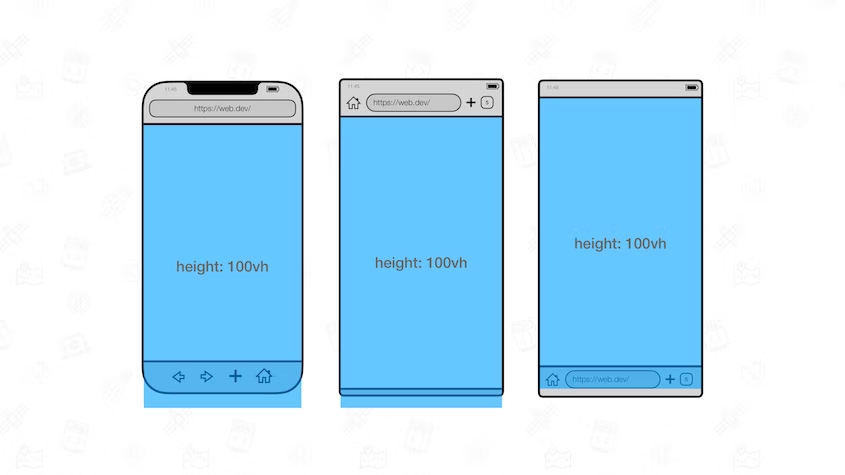
Large viewport: The viewport sized assuming any UA interfaces that are dynamically expanded and retracted to be retracted.
Small Viewport: The viewport sized assuming any UA interfaces that are dynamically expanded and retracted to be expanded.
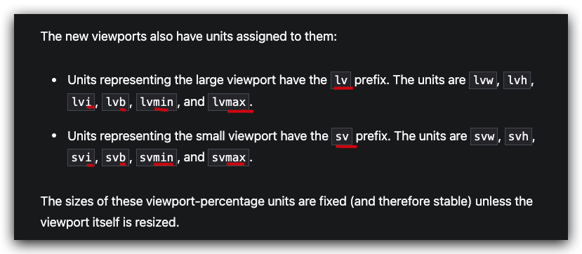
Units representing the large viewport have the lv prefix.
The units are lvw, lvh, lvi, lvb, lvmin, and lvmax.
Units representing the small viewport have the sv prefix.
The units are svw, svh, svi, svb, svmin, and svmax.

demos


(🐞 反爬虫测试!打击盗版⚠️)如果你看到这个信息, 说明这是一篇剽窃的文章,请访问 https://www.cnblogs.com/xgqfrms/ 查看原创文章!
refs
https://web.dev/viewport-units/
©xgqfrms 2012-2021
www.cnblogs.com/xgqfrms 发布文章使用:只允许注册用户才可以访问!
原创文章,版权所有©️xgqfrms, 禁止转载 🈲️,侵权必究⚠️!
本文首发于博客园,作者:xgqfrms,原文链接:https://www.cnblogs.com/xgqfrms/p/17062508.html
未经授权禁止转载,违者必究!


