CSS Flex Layout Tutorials All In One
CSS Flex Layout Tutorials All In One
CSS 弹性布局教程
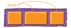
flex container
.container {
  display: flex; /* or inline-flex */
}

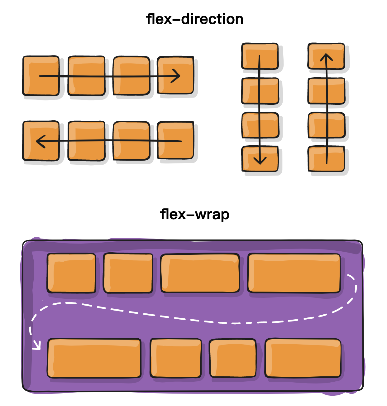
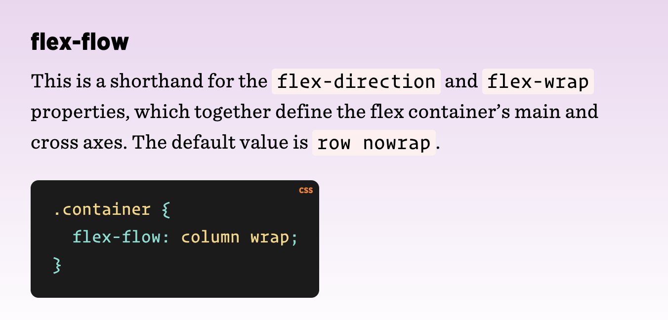
flex-flow:
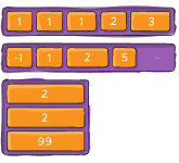
flex-direction(row, column, row-reverse, column-reverse)flex-wrap(nowrap, warp, wrap-reverse)
default value: row nowrap
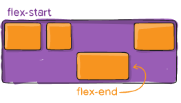
justify-content:
.container {
  justify-content: flex-start | flex-end | center | space-between | space-around | space-evenly | start | end | left | right ... + safe | unsafe;
}

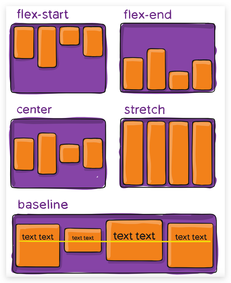
align-items:
.container {
  align-items: stretch | flex-start | flex-end | center | baseline | first baseline | last baseline | start | end | self-start | self-end + ... safe | unsafe;
}
align-content:
.container {
  align-content: flex-start | flex-end | center | space-between | space-around | space-evenly | stretch | start | end | baseline | first baseline | last baseline + ... safe | unsafe;
}
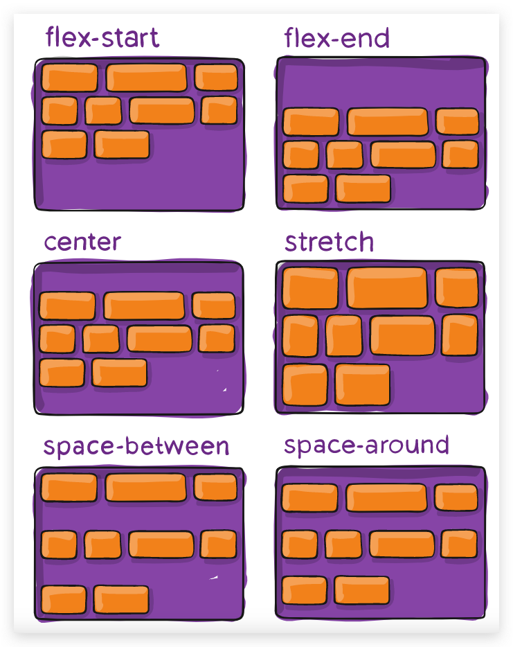
Note: This property only takes effect on multi-line flexible containers, where flex-wrap is set to either wrap or wrap-reverse).
A single-line flexible container (i.e. where flex-wrap is set to its default value, no-wrap) will not reflect align-content.
注意:此属性仅对多行柔性容器有效,其中 flex-wrap 设置为 wrap 或 wrap-reverse)。
单行柔性容器(即 flex-wrap 设置为其默认值 no-wrap)将不会反映 align-content。
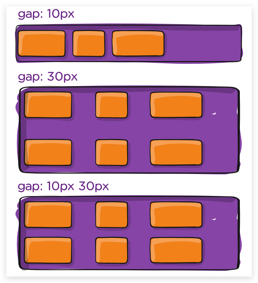
gap, row-gap, column-gap
.container {
  display: flex;
  ...
  gap: 10px;
  gap: 10px 20px; /* row-gap column gap */
  row-gap: 10px;
  column-gap: 20px;
}
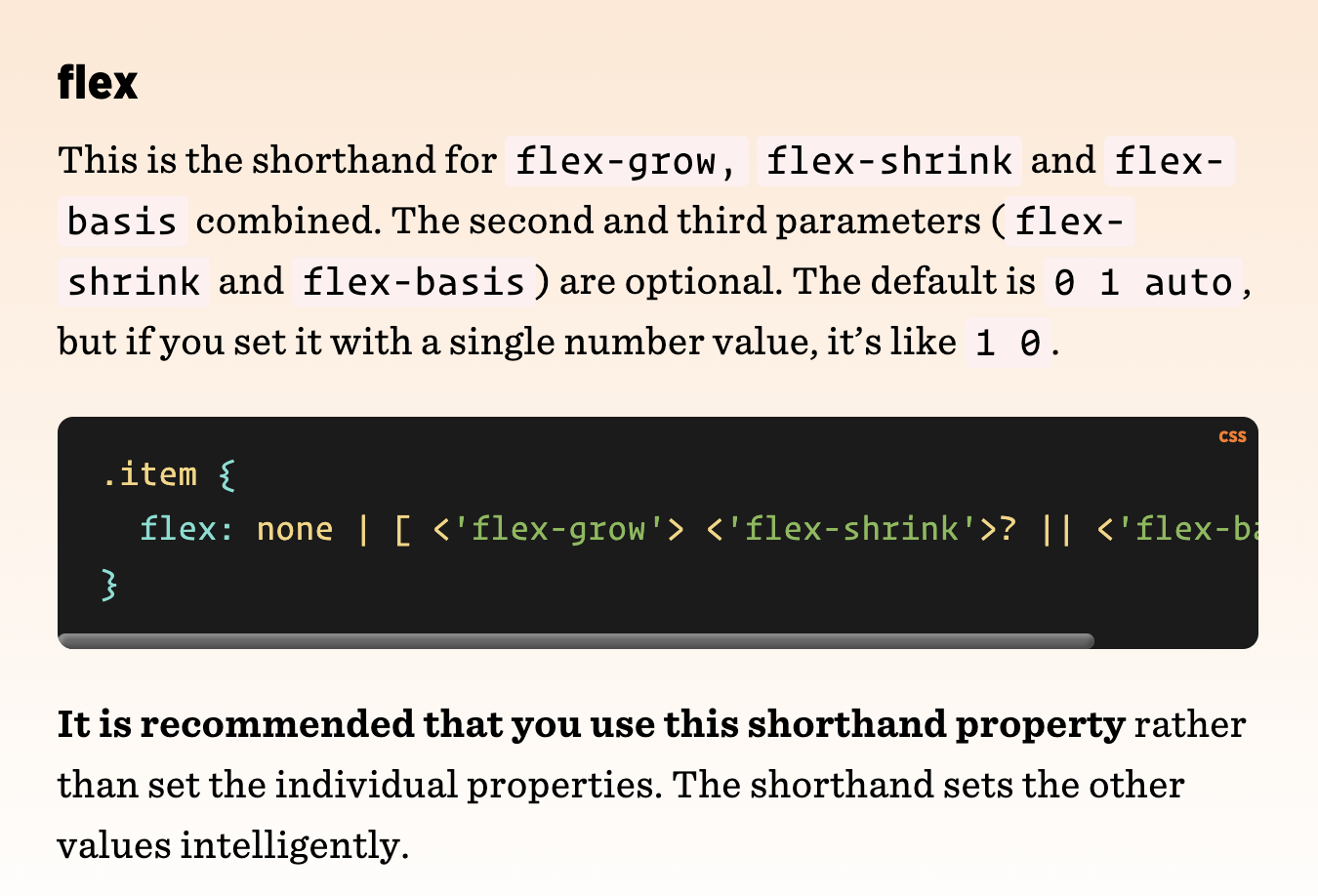
flex item
.item {
order: 5; /* default is 0 */
flex-grow: 4; /* default 0 */
flex-shrink: 3; /* default 1 */
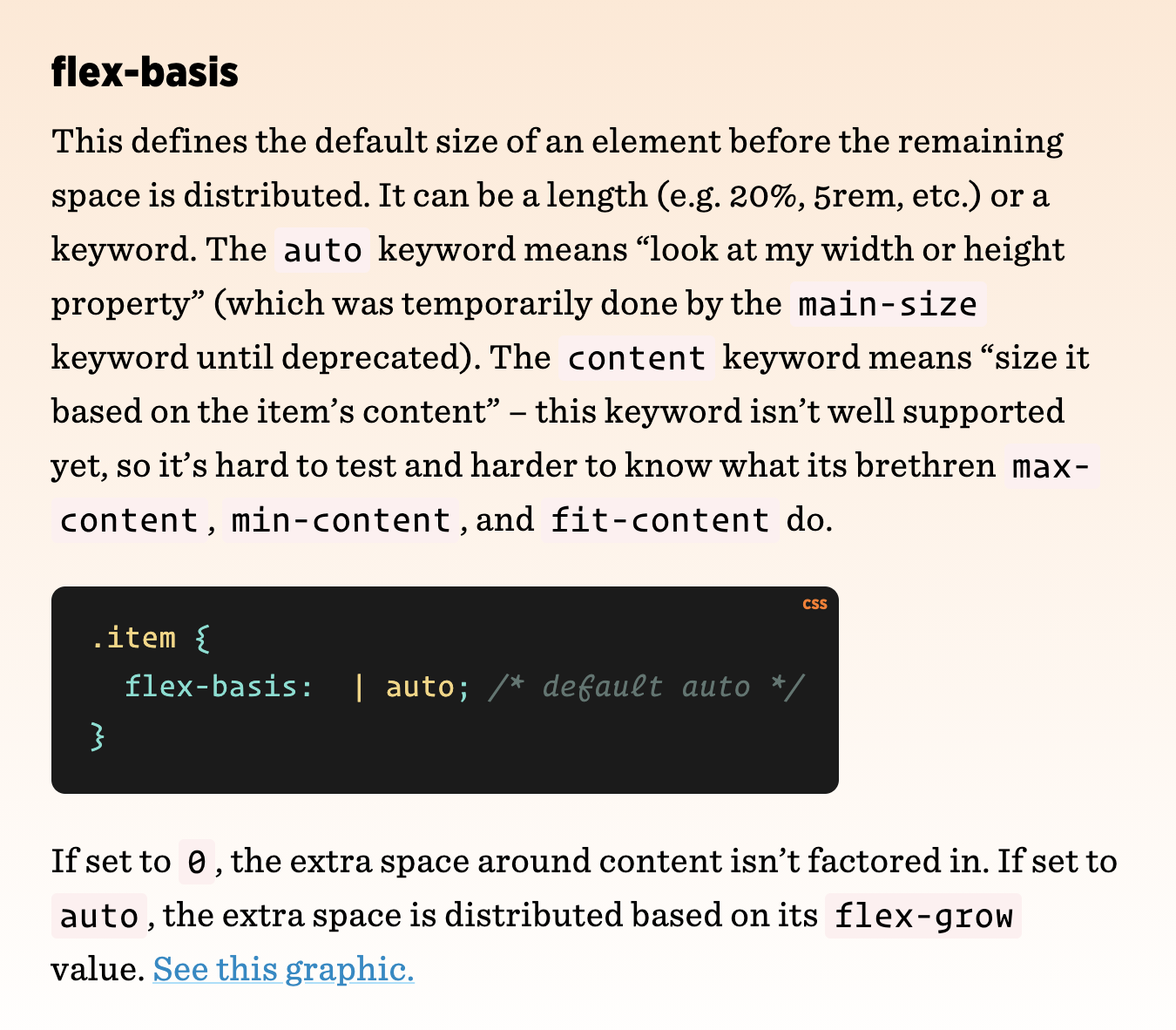
flex-basis: | auto; /* default auto */
}
flex:
flex-growflex-shrinkflex-basis
default value: 0 1 auto / 1 0;

order
align-self
.item {
  align-self: auto | flex-start | flex-end | center | baseline | stretch;
}
demos
flex dynamic height line
text-ellipsis
flex REPL games
https://codepip.com/games/flexbox-froggy/
CSS Flex Poster | CSS Flex 海报
https://css-tricks.com/snippets/css/a-guide-to-flexbox/
https://css-poster-all-in-one.xgqfrms.xyz/
https://github.com/xgqfrms/css-poster-all-in-one
(🐞 反爬虫测试!打击盗版⚠️)如果你看到这个信息, 说明这是一篇剽窃的文章,请访问 https://www.cnblogs.com/xgqfrms/ 查看原创文章!
refs
https://developer.mozilla.org/en-US/docs/Learn/CSS/CSS_layout/Flexbox
https://css-tricks.com/snippets/css/a-guide-to-flexbox/
https://www.digitalocean.com/community/cheatsheets/css-flexbox
https://www.smashingmagazine.com/2018/10/flexbox-use-cases/
©xgqfrms 2012-2021
www.cnblogs.com/xgqfrms 发布文章使用:只允许注册用户才可以访问!
原创文章,版权所有©️xgqfrms, 禁止转载 🈲️,侵权必究⚠️!
本文首发于博客园,作者:xgqfrms,原文链接:https://www.cnblogs.com/xgqfrms/p/14227462.html
未经授权禁止转载,违者必究!

