matplotlib数据可视化
 1 #绘制简单的折线图
 2 import matplotlib.pyplot as plt
 3 input_values = [1, 2, 3, 4, 5]
 4 squares = [1, 4, 9, 16, 25]
 5 #设置线条粗细
 6 plt.plot(input_values,squares,linewidth=5)
 7 #设置图表标题。并给坐标轴加上标签,文字大小
 8 plt.title("Square Numbers",fontsize=24)
 9 plt.xlabel("Value",fontsize=14)
10 plt.ylabel("Square of Value",fontsize=14)
11 #设置刻度标记大小
12 plt.tick_params(axis='both',labelsize=14)
13 plt.show()

 1 #使用scatter()绘制一系列点
 2 import matplotlib.pyplot as plt
 3 x_values = [1, 2, 3, 4, 5]
 4 y_values = [1, 4, 8, 16, 25]
 5 plt.scatter(x_values,y_values,s=100)
 6 #设置图表标题并给坐标轴加上标签
 7 plt.title("Square Number",fontsize=24)
 8 plt.xlabel("Value",fontsize=14)
 9 plt.ylabel("Square of value",fontsize=14)
10 #设置刻度标记大小
11 plt.tick_params(axis='both',which='major',labelsize=14)
12 plt.show()

 1 #使用scatter()绘制一系列点
 2 #自动计算数据
 3 import matplotlib.pyplot as plt
 4 x_values = list(range(1,1001))
 5 y_values = [x**2 for x in x_values]
 6 plt.scatter(x_values,y_values,s=40)
 7 plt.title("Squares number",fontsize=24)
 8 plt.xlabel("values",fontsize=14)
 9 plt.ylabel("square of number",fontsize=14)
10 plt.axis([0, 1100, 0, 1100000])
11 plt.show()

 1 #使用scatter()绘制一系列点
 2 #自定义颜色
 3 import matplotlib.pyplot as plt
 4 x_values = list(range(1,1001))
 5 y_values = [x**2 for x in x_values]
 6 plt.scatter(x_values,y_values,c='red',edgecolor='none',s=60)
 7 plt.title("Squares number",fontsize=24)
 8 plt.xlabel("values",fontsize=14)
 9 plt.ylabel("square of number",fontsize=14)
10 plt.axis([0, 1100, 0, 1100000])
11 plt.show()

 1 #使用scatter()绘制一系列点
 2 #使用颜色映射
 3 import matplotlib.pyplot as plt
 4 x_values = list(range(1,1001))
 5 y_values = [x**2 for x in x_values]
 6 plt.scatter(x_values,y_values,c=y_values,cmap=plt.cm.Blues,edgecolor='none',s=60)
 7 plt.title("Squares number",fontsize=24)
 8 plt.xlabel("values",fontsize=14)
 9 plt.ylabel("square of number",fontsize=14)
10 plt.axis([0, 1100, 0, 1100000])
11 plt.show()

 1 #随机漫步
 2 from random import choice
 3 class RandomWalk():
 4     def __init__(self,num_points=5000):
 5         self.num_points = num_points
 6         self.x_values = [0]
 7         self.y_values = [0]
 8     def fill_walk(self):
 9         while len(self.x_values) < self.num_points:
10             x_direction = choice([1, -1])
11             x_distance = choice([0, 1, 2, 3, 4])
12             x_step = x_direction * x_distance
13             y_direction = choice([1, -1])
14             y_distance = choice([0, 1, 2, 3, 4])
15             y_step = y_direction * y_distance
16             if x_step == 0 and y_step == 0:
17                 continue
18             next_x = self.x_values[-1] + x_step
19             next_y = self.y_values[-1] + y_step
20             self.x_values.append(next_x)
21             self.y_values.append(next_y)
22 while True:
23
24     rw = RandomWalk()
25     rw.fill_walk()
26     plt.scatter(rw.x_values,rw.y_values,s=15)
27     plt.show()
28     keep_running = input("make another walk:(y/n):")
29     if keep_running == 'n':
30         break

 1 while True:
 2     #给点着色
 3     rw = RandomWalk()
 4     rw.fill_walk()
 5     points_numbers = list(range(rw.num_points))
 6     plt.scatter(rw.x_values,rw.y_values,c=points_numbers,cmap=plt.cm.Blues,edgecolor='none',s=15)
 7     #重新绘制起点和终点
 8     plt.scatter(0, 0, c='green',edgecolors='none',s=100)
 9     plt.scatter(rw.x_values[-1],rw.y_values[-1],c='red',edgecolors='none',s=100)
10     #隐藏坐标轴
11     plt.axes().get_xaxis().set_visible(False)
12     plt.axes().get_yaxis().set_visible(False)
13     plt.show()
14     keep_running = input("make another walk:(y/n):")
15     if keep_running == 'n':
16         break

 1  #增加点数
 2     rw = RandomWalk(50000)
 3     rw.fill_walk()
 4     points_numbers = list(range(rw.num_points))
 5     plt.scatter(rw.x_values,rw.y_values,c=points_numbers,cmap=plt.cm.Blues,edgecolor='none',s=1)
 6     #重新绘制起点和终点
 7     plt.scatter(0, 0, c='green',edgecolors='none',s=100)
 8     plt.scatter(rw.x_values[-1],rw.y_values[-1],c='red',edgecolors='none',s=100)
 9     #隐藏坐标轴
10     plt.axes().get_xaxis().set_visible(False)
11     plt.axes().get_yaxis().set_visible(False)
12     plt.show()
13     keep_running = input("make another walk:(y/n):")
14     if keep_running == 'n':
15         break

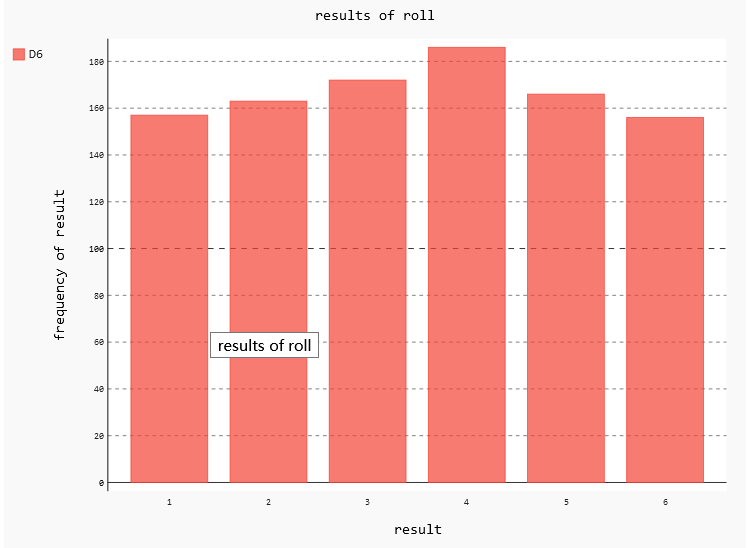
 1 #使用Pygal模拟掷骰子
 2 import pygal
 3 from random import randint
 4 class Die():
 5     def __init__(self,num_sides=6):
 6         self.num_sides = 6
 7
 8     def roll(self):
 9         return randint(1, self.num_sides)
10
11 die = Die()
12 results = []
13 for roll_num in range(1000):
14     result = die.roll()
15     results.append(result)
16
17 #分析结果
18 frequencies = []
19 for value in range(1, die.num_sides+1):
20     frequency = results.count(value)
21     frequencies.append(frequency)
22
23 hist = pygal.Bar()
24 hist.title="results of roll"
25 hist.x_labels = ['1','2','3','4','5','6']
26 hist.x_title = "result"
27 hist.y_title="frequency of result"
28 hist.add('D6',frequencies)
29 #hist.render_to_file('die.svg')
 1 #绘制气温图表
 2 import csv
 3 from matplotlib import pyplot as plt
 4 filename = r'C:\Users\xufangzhou\Desktop\sitka_weather_07-2014.csv'
 5 with open(filename) as f:
 6     reader = csv.reader(f)
 7     header_row = next(reader)
 8     highs = []
 9     for row in reader:
10         high = int(row[1])
11         highs.append(high)
12     fig = plt.figure(dpi=128,figsize=(10,6))
13     plt.plot(highs, c='red')
14     plt.title("123",fontsize=24)
15     plt.xlabel('',fontsize=16)
16     plt.ylabel("34",fontsize=16)
17     plt.tick_params(axis='both',which='major',labelsize=16)
18
19     plt.show()

 1 from datetime import datetime
 2 import csv
 3 from matplotlib import pyplot as plt
 4 filename = r'C:\Users\xufangzhou\Desktop\sitka_weather_2014.csv'
 5 #从文件中获取最高气温和日期
 6 with open(filename) as f:
 7     reader = csv.reader(f)
 8     header_row = next(reader)
 9     dates,highs = [], []
10     for row in reader:
11         current_date = datetime.strptime(row[0],"%Y-%m-%d")
12         dates.append(current_date)
13         high = int(row[1])
14         highs.append(high)
15     fig = plt.figure(dpi=128,figsize=(10,6))
16     plt.plot(dates,highs, c='red')
17     plt.title("123",fontsize=24)
18     plt.xlabel('',fontsize=16)
19     fig.autofmt_xdate()
20     plt.ylabel("34",fontsize=16)
21     plt.tick_params(axis='both',which='major',labelsize=16)
22
23     plt.show()

 1 from datetime import datetime
 2 import csv
 3 from matplotlib import pyplot as plt
 4 filename = r'C:\Users\xufangzhou\Desktop\sitka_weather_2014.csv'
 5 #从文件中获取最高气温、日期、最低气温
 6 with open(filename) as f:
 7     reader = csv.reader(f)
 8     header_row = next(reader)
 9     dates,highs,lows = [], [], []
10     for row in reader:
11         current_date = datetime.strptime(row[0],"%Y-%m-%d")
12         dates.append(current_date)
13         high = int(row[1])
14         highs.append(high)
15         low = int(row[3])
16         lows.append(low)
17     fig = plt.figure(dpi=128,figsize=(10,6))
18     plt.plot(dates,highs, c='red')
19     plt.plot(dates,lows, c='blue')
20     plt.title("123",fontsize=24)
21     plt.xlabel('',fontsize=16)
22     fig.autofmt_xdate()
23     plt.ylabel("34",fontsize=16)
24     plt.tick_params(axis='both',which='major',labelsize=16)
25
26     plt.show()

 1 from datetime import datetime
 2 import csv
 3 from matplotlib import pyplot as plt
 4 filename = r'C:\Users\xufangzhou\Desktop\sitka_weather_2014.csv'
 5 #从文件中获取最高气温、日期、最低气温
 6 #给图表区域着色
 7 with open(filename) as f:
 8     reader = csv.reader(f)
 9     header_row = next(reader)
10     dates,highs,lows = [], [], []
11     for row in reader:
12         current_date = datetime.strptime(row[0],"%Y-%m-%d")
13         dates.append(current_date)
14         high = int(row[1])
15         highs.append(high)
16         low = int(row[3])
17         lows.append(low)
18     fig = plt.figure(dpi=128,figsize=(10,6))
19     plt.plot(dates,highs, c='red',alpha=0.5)
20     plt.plot(dates,lows, c='blue',alpha=0.5)
21     plt.fill_between(dates,highs,lows,facecolor='blue',alpha=0.1)
22     plt.title("123",fontsize=24)
23     plt.xlabel('',fontsize=16)
24     fig.autofmt_xdate()
25     plt.ylabel("34",fontsize=16)
26     plt.tick_params(axis='both',which='major',labelsize=16)
27
28     plt.show()

 1 from datetime import datetime
 2 import csv
 3 from matplotlib import pyplot as plt
 4 filename = r'C:\Users\xufangzhou\Desktop\death_valley_2014.csv'
 5 #从文件中获取最高气温、日期、最低气温
 6 #异常数据检查
 7 with open(filename) as f:
 8     reader = csv.reader(f)
 9     header_row = next(reader)
10     dates,highs,lows = [], [], []
11     for row in reader:
12         try:
13
14             current_date = datetime.strptime(row[0],"%Y-%m-%d")
15             high = int(row[1])
16             low = int(row[3])
17         except ValueError:
18             print(current_date,'missing data')
19         else:
20             dates.append(current_date)
21             highs.append(high)
22             lows.append(low)
23     fig = plt.figure(dpi=128,figsize=(10,6))
24     plt.plot(dates,highs, c='red',alpha=0.5)
25     plt.plot(dates,lows, c='blue',alpha=0.5)
26     plt.fill_between(dates,highs,lows,facecolor='blue',alpha=0.1)
27     plt.title("123",fontsize=24)
28     plt.xlabel('',fontsize=16)
29     fig.autofmt_xdate()
30     plt.ylabel("34",fontsize=16)
31     plt.tick_params(axis='both',which='major',labelsize=16)
32
33     plt.show()

参考文章:
1.《Python编程从入门到实践》 Eric Matthes 著 袁国忠 译
作者:舟华520
出处:https://www.cnblogs.com/xfzh193/
本文以学习,分享,研究交流为主,欢迎转载,请标明作者出处!

 浙公网安备 33010602011771号