第四章 绘制高级图表
第四章 绘制高级图表
二维图表
线图
线图分为线图、对数图和函数图。下面是常用的几个函数,其他请查看官方文档
| 函数 | 图形描述 |
|---|---|
loglog() |
x轴和y轴都取对数坐标 |
semilogx() |
x轴取对数坐标,y轴取线性坐标 |
semilogy() |
x轴取线性坐标,y轴取对数坐标 |
plotyy() |
带有两套y坐标轴的线性坐标系 |
ploar() |
极坐标系 |
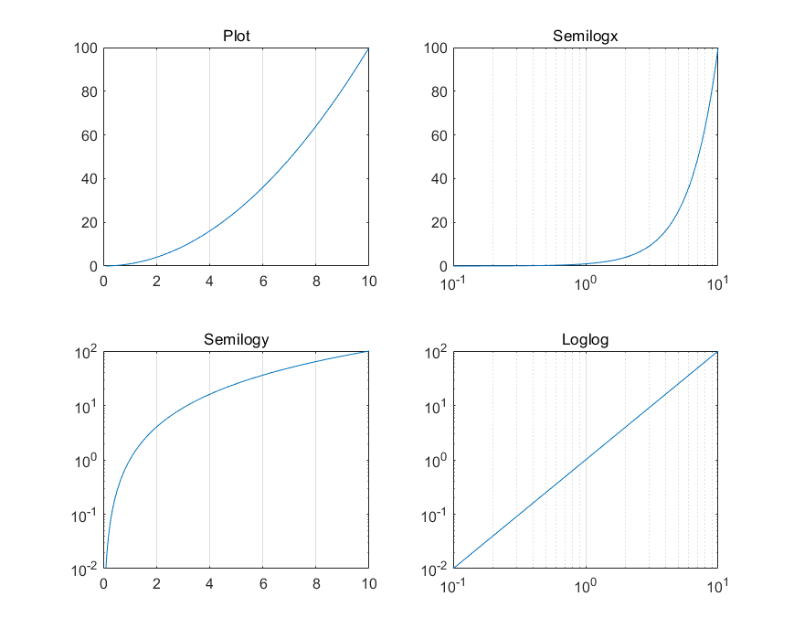
前三个是对数图,后两个是线图
演示:
x = logspace(-1,1,100); y = x.^2;

subplot(2,2,1);
plot(x,y);
title('Plot');
set(gca, 'XGrid','on');

subplot(2,2,2);
semilogx(x,y);
title('Semilogx');
set(gca, 'XGrid','on');

subplot(2,2,3);
semilogy(x,y);
title('Semilogy');
set(gca, 'XGrid','on');

subplot(2,2,4);
loglog(x, y);
title('Loglog');
set(gca, 'XGrid','on');
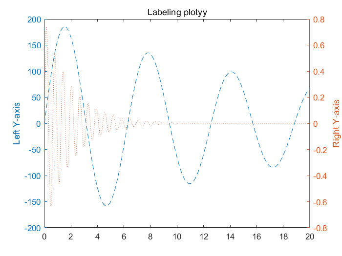
双y轴图线
plotyy()的返回值为数组[ax,hlines1,hlines2],其中:
ax为一个向量,保存两个坐标系对象的句柄.hlines1和hlines2分别为两个图线的句柄.
x = 0:0.01:20;
y1 = 200*exp(-0.05*x).*sin(x);
y2 = 0.8*exp(-0.5*x).*sin(10*x);
[AX,H1,H2] = plotyy(x,y1,x,y2);
set(get(AX(1),'Ylabel'),'String','Left Y-axis')
set(get(AX(2),'Ylabel'),'String','Right Y-axis')
title('Labeling plotyy');
set(H1,'LineStyle','--'); set(H2,'LineStyle',':');
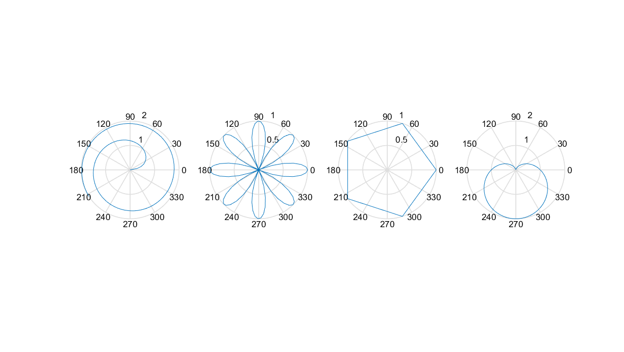
极坐标图线
% 螺旋线
x = 1:100; theta = x/10; r = log10(x);
subplot(1,4,1); polar(theta,r);

% 花瓣
theta = linspace(0, 2*pi); r = cos(4*theta);
subplot(1,4,2); polar(theta, r);

% 五边形
theta = linspace(0, 2*pi, 6); r = ones(1,length(theta));
subplot(1,4,3); polar(theta,r);

% 心形线
theta = linspace(0, 2*pi); r = 1-sin(theta);
subplot(1,4,4); polar(theta , r);
统计图表
| 函数 | 图形描述 |
|---|---|
hist() |
直方图 |
bar() |
二维柱状图 |
pie() |
饼图 |
stairs() |
阶梯图 |
stem() |
针状图 |
直方图
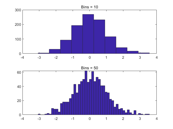
使用hist()绘制直方图,语法如下:
hist(x,nbins)
1
其中:
x表示原始数据nbins表示分组的个数
x = randn(1,1000);
subplot(2,1,1);
hist(x,10);
title('Bins = 10');
subplot(2,1,2);
hist(x,50);
title('Bins = 50');
柱状图
-
使用
bar()和bar3()函数分别绘制二维和三维直方图x = [1 2 5 4 8]; y = [x;1:5]; subplot(1,3,1); bar(x); title('A bargraph of vector x'); subplot(1,3,2); bar(y); title('A bargraph of vector y'); subplot(1,3,3); bar3(y); title('A 3D bargraph');
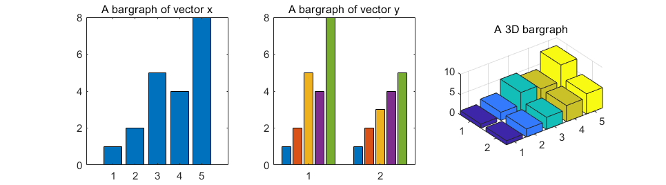
hist主要用于查看变量的频率分布,而bar主要用于查看分立的量的统计结果
-
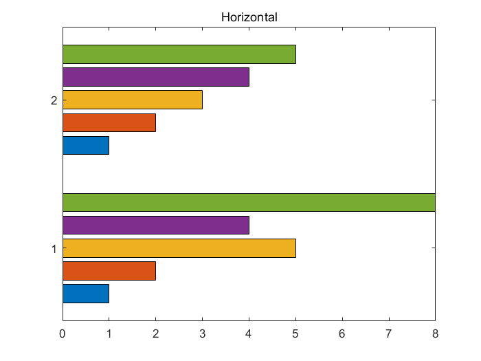
使用
barh()函数可以绘制纵向排列的柱状图x = [1 2 5 4 8]; y = [x;1:5]; barh(y); title('Horizontal');