matplotlib简单整理
安装:
pip install matplotlib
入门
简单介绍:
举个例子,在现实中,我们想要画一个图表,首先需要找一个可以画的地方来画,譬如一张纸,一块黑板等,这些承载图像的东西,称之为:figure
然后,你需要画图,以黑板为例子,一个黑板上面可以画多个坐标轴,坐标轴即带有x,y轴 (Axis,即轴) 的区域。这个区域称之为 Axes 。每个坐标轴(Axes)中都可以画多条线(当然也可以画柱状图等数据),这每条线都是一个Line2D(顾名思义,二维线条)对象。
好了,现在,一个 Figure 可以有多个 Axes,每个 Axes 都有两条 Axis轴,每个 Axes 也可以画有多个 Line2D。
对于 Figure,可以设置 背景色,边框粗细,边框颜色等内容。
对于 Line2D,可以设置 线条的粗细,颜色,线上数据点的样式(也就是marker,标记点)等。
对于 Axes,可以绘制数据,设置标题,设置图例等。
对于Axis,每个 Axis 都有刻度(tick),刻度值(ticklabel) 等,并且可以设置主刻度(Major),副刻度等。
图表组成
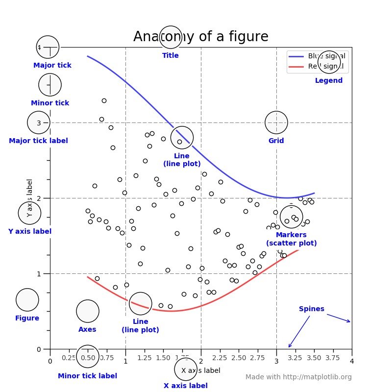
spines:也就是图表的上下左右四个边框
Marker:要画图,要先有数据,如果要将这些数据在图线上凸显出来,就是 marker,marker 控制数据点的显示样式,如圆点,三角形等。
Legend:图例,给每条图线显示一个图例
简单的例子:
import matplotlib.pyplot as plt
import numpy as np

fig, ax = plt.subplots()  # subplots() 可以创建 figure 以及 Axes
ax.plot([1, 2, 3, 4], [1, 4, 2, 3])  # 在 axes 上画一些数据:(x轴,y轴)
plt.show()  # 显示绘制的图表
plot()接受的输入参数格式,是 numpy.array or numpy.ma.masked_array ,如果用户输入的是列表,如上例所示,plt 内部会自动进行转换。
Figure
可以看作一个作图区域,也就是一张画布,一个 figure 可以包含多个 axes(坐标轴),每个 Axes 可以绘制多个数据
fig = plt.figure()  # 创建一个空白 figure
fig, ax = plt.subplots()  # 默认在 figure 上只创建一个 Axes
fig, axs = plt.subplots(2, 2)  # 创建一个拥有两行两列,共4个 Axes 的 figure
Axes
也就是一个坐标轴。一个 Axes 包含两个 Axis (轴),Axis 轴可以设置数据的限制: axes.Axes.set_xlim(0,20)(比如设置横坐标范围为:0-20),axes.Axes.set_ylim();每一个轴都有一个轴的名字,可以通过 set_xlabel(), set_ylabel() 设置。Axes 对象也可以使用 .plot 绘制数据。
Axis
轴,可以设置坐标的范围限制,可以设置 ticks (标记,也就是轴上的刻度),也可以设置 ticklabels (刻度的标签,或者叫刻度值),刻度由 Locator 对象控制,刻度值由 Formatter 控制。
两种代码风格:
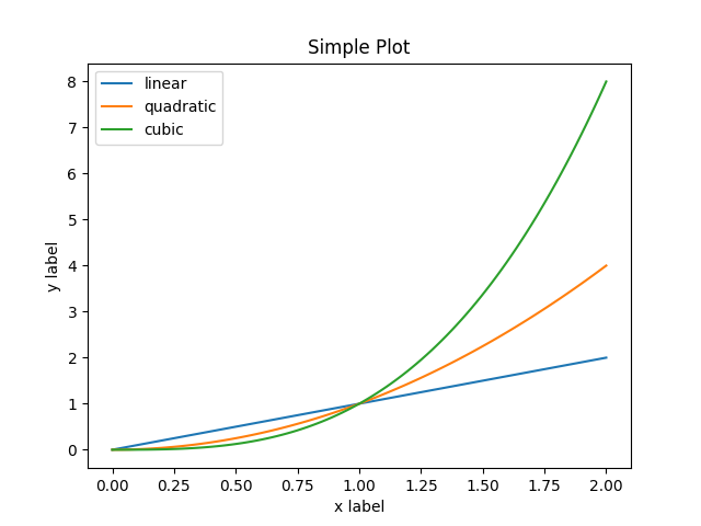
- 面向对象
这种风格是官方推荐的风格,就是使用面向对象的方法,来绘制图表。
x = np.linspace(0, 2, 100)

# 尽管是面向对象的方式, 我们依然要使用 `.pyplot.figure` 来创建 Figure.
fig, ax = plt.subplots()  # Create a figure and an axes.
ax.plot(x, x, label='linear')  # 在 ax 这个坐标轴上画一个线条
ax.plot(x, x**2, label='quadratic')  # 在这个 ax 上继续再画一条线
ax.plot(x, x**3, label='cubic')  # 再画一条折线
ax.set_xlabel('x label')  # 给 x轴 设置一个名字
ax.set_ylabel('y label')  # 给 y轴 加一个名字
ax.set_title("Simple Plot")  # 给 Axes 添加一个标题
ax.legend()  # 添加一个图例
- pyplot形式
pyplot形式,就是一切都用 plt 来操作,其实本质是,它后台调用了一些方法,譬如: plt.gca() 来获取当前的 axes 对象,然后再用 axes.plot 来绘图或者设置轴标签等。很多 plt 的操作,都是这样做的:先获取当前激活的 figure 对象或者 axes 对象,然后调用它们的方法。
x = np.linspace(0, 2, 100)

plt.plot(x, x, label='linear')  # 画一个线,名字叫 linear
plt.plot(x, x**2, label='quadratic')  # 再画一个线
plt.plot(x, x**3, label='cubic')
plt.xlabel('x label')
plt.ylabel('y label')
plt.title("Simple Plot")
plt.legend()
互动模式
正常情况下写代码,需要在代码最后手动调用 plt.show() 来让图像显示,但是在互动模式下,你每输入一行代码,就可以实时让图表跟着变化。
开启互动模式:
import matplotlib.pyplot as plt
plt.ion()
plt.plot([1.6, 2.7])  # 此时就会显示图像了,不用 plt.show()
关闭互动:
import matplotlib.pyplot as plt
plt.ioff()
plt.plot([1.6, 2.7]) # 此时不会显示,需要执行一句 : plt.show()
pyplot模式
pyplot模式,基本上就是直接作图,不用面向对象的方式。具体对比可以看上文的”两种代码风格“
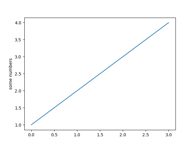
快速图表
import matplotlib.pyplot as plt

plt.plot([1, 2, 3, 4])      # 只提供了一列数据,会默认是y轴的数据,plt会据此自动生成一个x轴数据
plt.ylabel('some numbers')
plt.show()
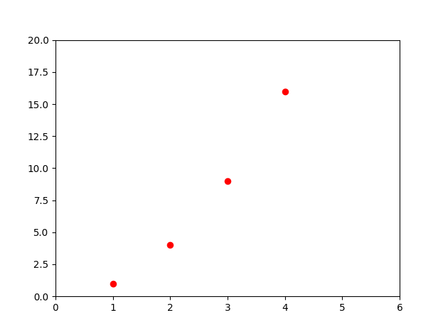
定制图表
plt.plot([1, 2, 3, 4], [1, 4, 9, 16], 'ro') # (x轴,y轴,格式);格式中的 r 代表 red 红色,o 表示用 圆点 标记数据点
plt.axis([0, 6, 0, 20])    # 设置x轴和y轴的刻度范围 :[xmin, xmax, ymin, ymax]
plt.show()
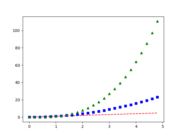
一次性画多条线
import numpy as np

# evenly sampled time at 200ms intervals
t = np.arange(0., 5., 0.2)

# red dashes, blue squares and green triangles
plt.plot(t, t, 'r--', t, t**2, 'bs', t, t**3, 'g^') # 一次性画了三条线,plot() 返回的是个元组(line1,line2,line3)
plt.show()
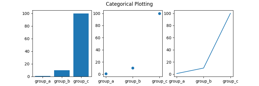
不同类型图表
names = ['group_a', 'group_b', 'group_c']
values = [1, 10, 100]

plt.figure(figsize=(9, 3)) # 设置画布大小,单位英寸

plt.subplot(131)	# 绘制 1*3 个Axes,此时激活的是第1个Axes。也就是画出三个Axes,排列方式是1行3列,当前选中这三个的第一个。
plt.bar(names, values) # 在这第一个 Axes 上画一个柱状图
plt.subplot(132)       # 激活 1*3 中的第2个Axes
plt.scatter(names, values)  # 第二个上画散点图
plt.subplot(133)
plt.plot(names, values)  # 第三个默认用折线图
plt.suptitle('Categorical Plotting')
plt.show()
画图参数
import matplotlib.pyplot as plt
import numpy as np

plt.plot(x, y, linewidth=2.0) # 参数 linewidth, 设置绘制的线条的宽度

fig, ax = plt.subplots()  # 创建一个只有一个 axes 的 figure
ax.plot([1, 2, 3, 4], [1, 4, 2, 3])
ax.set_xlabel("MY x") # 也可以使用函数设置某些参数,譬如这里设置 x 轴的标签名。
下面是绘图时的参数,你可以在 plt.plot() 中传递这些参数,来控制绘制的图形的样式
| Property | Value Type |
|---|---|
| alpha | float :设置线条透明度 |
| animated | [True | False] |
| antialiased or aa | [True | False] |
| clip_box | a matplotlib.transform.Bbox instance |
| clip_on | [True | False] |
| clip_path | a Path instance and a Transform instance, a Patch |
| color or c | any matplotlib color :线条颜色 |
| contains | the hit testing function |
| dash_capstyle | ['butt' |
| dash_joinstyle | ['miter' |
| dashes | sequence of on/off ink in points |
| data | (np.array xdata, np.array ydata) |
| figure | a matplotlib.figure.Figure instance |
| label | any string:线条名称;这个名称可以用在图例上面 |
| linestyle or ls | [ '-' |
| linewidth or lw | float value in points : 线宽 |
| marker | [ '+' 数据标记点的样式 |
| markeredgecolor or mec | any matplotlib color 数据标记点的边缘颜色 |
| markeredgewidth or mew | float value in points 标记点的边缘线条宽度 |
| markerfacecolor or mfc | any matplotlib color |
| markersize or ms | float :marker的显示大小 |
| markevery | [ None | integer | (startind, stride) ] |
| picker | used in interactive line selection |
| pickradius | the line pick selection radius |
| solid_capstyle | ['butt' |
| solid_joinstyle | ['miter' |
| transform | a matplotlib.transforms.Transform instance |
| visible | [True | False]:是否可见 |
| xdata | np.array |
| ydata | np.array |
| zorder | any number:似乎是设置线条图层顺序的,譬如多条线互相遮盖时能用到 |
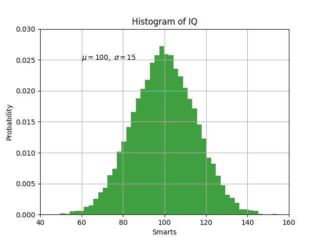
添加文本
在图表中,可以在任意位置添加文本
import matplotlib.pyplot as plt
import numpy as np


mu, sigma = 100, 15
x = mu + sigma * np.random.randn(10000)

# the ogram of the data
n, bins, patches = plt.hist(x, 50, density=1, facecolor='g', alpha=0.75) # 柱状图


plt.xlabel('Smarts')  # x 轴标签
plt.ylabel('Probability')  # y 轴标签
plt.title('ogram of IQ')  # 图表标题
plt.text(60, .025, r'$\mu=100,\ \sigma=15$') # 在坐标(60,0.025)处设置文本:mu=100.., $等字符是 TeX表达式 格式。
plt.axis([40, 160, 0, 0.03])  # 设置坐标轴的刻度值范围
plt.grid(True) # 添加背景网格
plt.show()
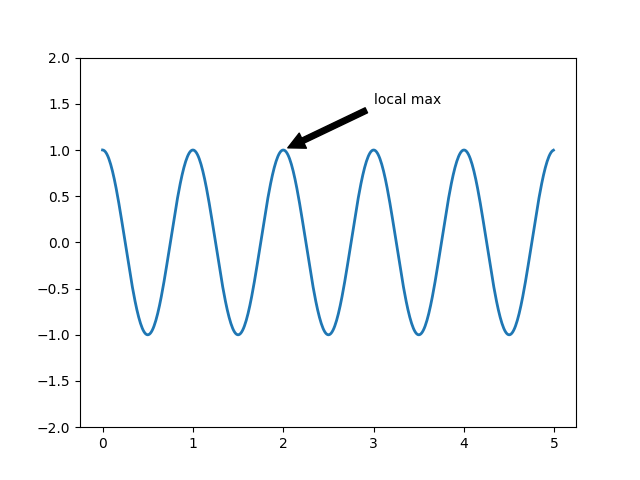
数据标注
可以给某个数据点添加标注
ax = plt.subplot()

t = np.arange(0.0, 5.0, 0.01)
s = np.cos(2*np.pi*t)
line, = plt.plot(t, s, lw=2)

# 标注文字:local max, 要标注的数据的位置是:(2,1), 文本放置在坐标 (3,1.5)处,给文字添加了一个箭头,指向 (2,1) 坐标点
plt.annotate('local max', xy=(2, 1), xytext=(3, 1.5),arrowprops=dict(facecolor='black', shrink=0.05),)

plt.ylim(-2, 2)  # 设置 y 轴的刻度范围
plt.show()
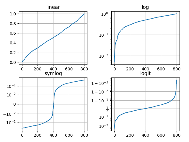
非线性坐标轴
如果你有一些特殊数据,是指数型增长的,可以使用特殊坐标轴,看下图的 y轴 就明白了。
# Fixing random state for reproducibility
np.random.seed(19680801)

# make up some data in the open interval (0, 1)
y = np.random.normal(loc=0.5, scale=0.4, size=1000)
y = y[(y > 0) & (y < 1)]
y.sort()
x = np.arange(len(y))

# plot with various axes scales
plt.figure()

# linear
plt.subplot(221)
plt.plot(x, y)
plt.yscale('linear')  # 设置 y 轴线性增长
plt.title('linear')
plt.grid(True)

# log
plt.subplot(222)
plt.plot(x, y)
plt.yscale('log')  # 指数增长
plt.title('log')
plt.grid(True)

# symmetric log
plt.subplot(223)
plt.plot(x, y - y.mean())
plt.yscale('symlog', linthresh=0.01)
plt.title('symlog')
plt.grid(True)

# logit
plt.subplot(224)
plt.plot(x, y)
plt.yscale('logit')
plt.title('logit')
plt.grid(True)
# Adjust the subplot layout, because the logit one may take more space
# than usual, due to y-tick labels like "1 - 10^{-3}"
plt.subplots_adjust(top=0.92, bottom=0.08, left=0.10, right=0.95, hspace=0.25,
                    wspace=0.35)

plt.show()
matplotlib.pyplot.plot
plot的几种用法:
plot(x, y)        # 用默认样式画 x,y
plot(x, y, 'bo')  # 画x,y,用蓝色圆点标记数据,b代表蓝色,o代表 marker 的样式为圆点
plot(y)           # 绘制 y 轴的数据,x 轴的数据会默认自动分配(0,1,2,...)
plot(y, 'r+')     # 同上,r代表红色,+代表某种 marker 样式

plot(x, y, 'go--', linewidth=2, markersize=12) # 也可以用 line2D 对象的属性作为关键字参数,来控制线条的样式
plot([x], y, [fmt], *, data=None, **kwargs)
plot([x], y, [fmt], [x2], y2, [fmt2], ..., **kwargs)
参数:
x, y : x轴和y轴的数据,列表类型或者 numpy.array
fmt :可选。字符串类型,表示图形的样式。fmt = '[marker][line][color]',如:“o-r"
返回值:plot() 返回一组表达图形的 line2D 对象。因为 plot 默认画的就是折线图
Line2D
plot() 方法返回的一组图形对象,就是Line2D,譬如:
import matplotlib.pyplot as plt

line, = plt.plot([1,2,3,4]) # line 就是一个 Line2D 对象,它就是绘画出来的图表(因为返回值是个list,所以用,来解包)
plt.show()
Line2D有很多属性,用来控制绘制的图表的样式,这些属性可以作为关键字参数,传递给plot()。如:
import matplotlib.pyplot as plt
plt.ion()

line, = plt.plot([1,2,3,4],linewidth=2,color='red',label="fig1")
针对这些属性,line2D 对象还有get_xx, set_xx 方法,来设置这些属性。更多请见:https://matplotlib.org/stable/api/_as_gen/matplotlib.lines.Line2D.html#matplotlib.lines.Line2D
譬如:
>>> import matplotlib.pyplot as plt
>>> plt.ion()
>>> line, = plt.plot([1,2,3,4],linewidth=2,color='red',label="fig1")
>>> line.set_color("green") # 上面设置颜色为红色,此处重新设置为绿色
>>> print(line.get_color())
green
属性:
| Property | Description |
|---|---|
agg_filter |
a filter function, which takes a (m, n, 3) float array and a dpi value, and returns a (m, n, 3) array |
alpha |
scalar or None:设置线条透明度 |
animated |
bool |
antialiased or aa |
bool |
clip_box |
Bbox |
clip_on |
bool |
clip_path |
Patch or (Path, Transform) or None |
color or c |
color |
contains |
unknown |
dash_capstyle |
CapStyle or |
dash_joinstyle |
JoinStyle or |
dashes |
sequence of floats (on/off ink in points) or (None, None) |
data |
(2, N) array or two 1D arrays |
drawstyle or ds |
{'default', 'steps', 'steps-pre', 'steps-mid', 'steps-post'}, default: 'default' |
figure |
Figure |
fillstyle |
|
gid |
str |
in_layout |
bool |
label |
object:线条标签,这个名字可以用来作为图例中显示的名字 |
linestyle or ls |
{'-', '--', '-.', ':', '', (offset, on-off-seq), ...}:线条样式 |
linewidth or lw |
float |
marker |
marker style string, Path or MarkerStyle |
markeredgecolor or mec |
color |
markeredgewidth or mew |
float |
markerfacecolor or mfc |
color |
markerfacecoloralt or mfcalt |
color |
markersize or ms |
float |
markevery |
None or int or (int, int) or slice or list[int] or float or (float, float) or list[bool] |
path_effects |
AbstractPathEffect |
picker |
float or callable[[Artist, Event], tuple[bool, dict]] |
pickradius |
float |
rasterized |
bool |
sketch_params |
(scale: float, length: float, randomness: float) |
snap |
bool or None |
solid_capstyle |
CapStyle or |
solid_joinstyle |
JoinStyle or |
transform |
matplotlib.transforms.Transform |
url |
str |
visible |
bool |
xdata |
1D array |
ydata |
1D array |
zorder |
float:多个图表绘制在一个Axes上,可能有重叠,此处设置顺序 |
marker 属性的可选值:
Markers
| character | description |
|---|---|
'.' |
point marker |
',' |
pixel marker |
'o' |
circle marker |
'v' |
triangle_down marker |
'^' |
triangle_up marker |
'<' |
triangle_left marker |
'>' |
triangle_right marker |
'1' |
tri_down marker |
'2' |
tri_up marker |
'3' |
tri_left marker |
'4' |
tri_right marker |
'8' |
octagon marker |
's' |
square marker |
'p' |
pentagon marker |
'P' |
plus (filled) marker |
'*' |
star marker |
'h' |
hexagon1 marker |
'H' |
hexagon2 marker |
'+' |
plus marker |
'x' |
x marker |
'X' |
x (filled) marker |
'D' |
diamond marker |
'd' |
thin_diamond marker |
| `' | '` |
'_' |
hline marker |
linestyle 属性的可选值:
Line Styles
| character | description |
|---|---|
'-' |
实线 |
'--' |
虚线 |
'-.' |
虚线和. |
':' |
点组成的线 |
color 属性的值:
除了下方这些,还可以设置成全名如:color = "green",或者16进制颜色字符串:color="#008000"
| character | color |
|---|---|
'b' |
blue |
'g' |
green |
'r' |
red |
'c' |
cyan |
'm' |
magenta |
'y' |
yellow |
'k' |
black |
'w' |
white |
常用方法:
get_color(self)
返回线条的颜色
See also set_color.
get_data(self, orig=True)[source]
返回线条的数据: (xdata, ydata).
If orig is True, return the original data.
get_linestyle(self)[source]
返回线条样式
See also set_linestyle.
get_linewidth(self)[source]
Return the linewidth in points.See also set_linewidth.
get_ls(self)
Alias for get_linestyle.
get_lw(self)
Alias for get_linewidth.
get_xdata(self, orig=True)[source]
获取x轴数据
If orig is True, return the original data, else the processed data.
get_xydata(self)[source]
Return the xy data as a Nx2 numpy array.
get_ydata(self, orig=True)[source]
Return the ydata.If orig is True, return the original data, else the processed data.
set_color(self, color)[source]
Set the color of the line.
set_linestyle(self, ls)[source]
Set the linestyle of the line.
set_linewidth(self, w)[source]
Set the line width in points.
set_marker(self, marker)[source]
Set the line marker.
set_markersize(self, sz)[source]
Set the marker size in points.
set_xdata(self, x)[source]
Set the data array for x.
set_ydata(self, y)[source]
Set the data array for y.
matplotlib.pyplot.subplot
新增一个 Axes 到当前 figure
基本用法:
subplot(nrows, ncols, index, **kwargs)
subplot(pos, **kwargs)
subplot(**kwargs)
subplot(ax)
最常用的参数:
arg:一个3位数,或者(rows,cols,index)类型,譬如:subplot(221); 意思是:绘制2x2个空白的Axes,当前默认是2x2中的第1*个Axes。也就是两行,两列四个Axes,当前默认是第一个Axes。也可以写成:subplot(2,2,1)。特殊用法如:subplot(2,2,(1,2))代表创建2x2个Axes,当前的Axes横跨了第1,2个Axes,也就是说当前的Axes相当于合并了第一行的Axes,此时创建的是上面一个占据两个位置的Axes,下面两个正常的Axes,共3个Axes。
sharex, sharey: Axes 类型,和传递的 Axes 实例共享 x,y轴的设置。
返回值:一个Axes实例
举例:
plt.subplot(221)

# 和上一句代码作用一样
ax1 = plt.subplot(2, 2, 1)

# 添加一个没有边框的 axes
ax2 = plt.subplot(222, frameon=False)

# 添加一个极坐标图
plt.subplot(223, projection='polar')

# 添加一个和 ax1 共享 x 轴的子图
plt.subplot(224, sharex=ax1, facecolor='red')

# 从 figure 删除某个子图
plt.delaxes(ax2)

# 再次添加(可能会报错,这明明是官方的代码,不清楚为啥)
plt.subplot(ax2)

# 让第一个子图处于激活状态
plt.subplot(221)
matplotlib.pyplot.subplots
matplotlib.pyplot.subplots(nrows=1, ncols=1, *, sharex=False, sharey=False, squeeze=True, subplot_kw=None, gridspec_kw=None, **fig_kw)
参数:
nrows,ncols: 数字。创建几行几列的图表区域
返回值:fig,axes; 返回一个figure,一组 axes。
# 默认创建一个 axes
fig, ax = plt.subplots()

# 创建多个axes:2 行 2 列
fig, axs = plt.subplots(2, 2)

# 使用元组解包多个数据
fig, (ax1, ax2) = plt.subplots(1, 2)
fig, ((ax1, ax2), (ax3, ax4)) = plt.subplots(2, 2)
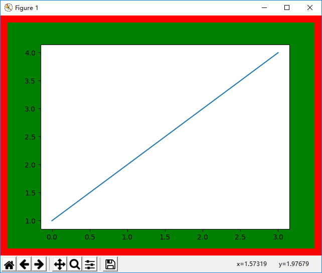
matplotlib.figure
常用参数:
figsize: 浮点数元组:(num1,num2), 设置图表的宽,高。单位英寸数,默认:[6.4, 4.8]
dpi:浮点数,设置每英寸的点数(可以理解为像素),默认:100
facecolor: 设置 figure 的背景色,默认:白色
edgecolor: figure 边框的颜色,默认:白色
frameon: figure 边框开关选项,布尔类型,默认:True
import matplotlib.pyplot as plt

fig = plt.figure(edgecolor='red',linewidth=20,frameon=True,facecolor="green")
ax1 = fig.add_subplot()
ax1.plot([1,2,3,4])
plt.show()
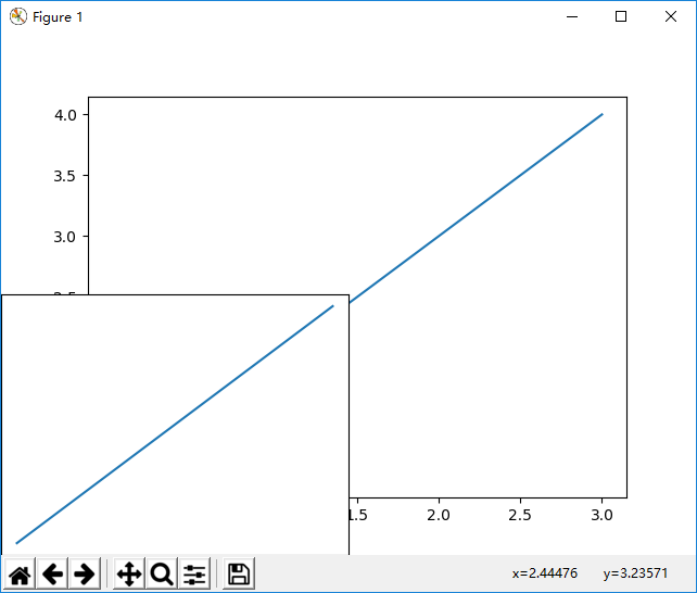
Figure可能会用到的方法:
add_axes(rect, projection=None, polar=False, **kwargs)
在 figure 中新增一个 axes 对象。
参数:
rect:一组浮点数,如[0.2,0.3,0.4,0.6],代表[left, bottom, width, height],即 axes 距离 figure 左侧要有 20% 的距离,距离底部 30% 的距离,axes 的宽度要是 figure 宽度的 40%, 高度是 figure 高度的 60%;
返回值:Axes
import matplotlib.pyplot as plt

fig = plt.figure()
ax1 = fig.add_subplot()  # add_subplot 下面会说
ax1.plot([1,2,3,4])

ax2 = fig.add_axes([0,0,0.5,0.5])
ax2.plot([1,2,3,4])

plt.show()
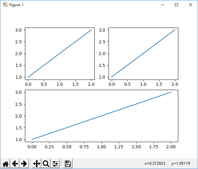
add_subplot(nrows, ncols, index, **kwargs)
添加一个 Axes 到 figure,返回这个 Axes 对象。
参数:
nrows,ncols: 创建一个几行几列的 Axes 矩阵。
Index: 当前是这个矩阵中的第几个 Axes 区域
sharex, sharey:和给定的 Axes 共享x/y轴。
label: Axes 的 label
**kwargs:
| Property | Description |
|---|---|
adjustable |
|
agg_filter |
a filter function, which takes a (m, n, 3) float array and a dpi value, and returns a (m, n, 3) array |
alpha |
scalar or None |
anchor |
2-tuple of floats or |
animated |
bool |
aspect |
{'auto', 'equal'} or float |
autoscale_on |
bool |
autoscalex_on |
bool |
autoscaley_on |
bool |
axes_locator |
Callable[[Axes, Renderer], Bbox] |
axisbelow |
bool or 'line' |
box_aspect |
float or None |
clip_box |
Bbox |
clip_on |
bool |
clip_path |
Patch or (Path, Transform) or None |
contains |
unknown |
facecolor or fc |
color |
figure |
Figure |
frame_on |
bool |
gid |
str |
in_layout |
bool |
label |
object |
navigate |
bool |
navigate_mode |
unknown |
path_effects |
AbstractPathEffect |
picker |
None or bool or float or callable |
position |
[left, bottom, width, height] or Bbox |
prop_cycle |
unknown |
rasterization_zorder |
float or None |
rasterized |
bool |
sketch_params |
(scale: float, length: float, randomness: float) |
snap |
bool or None |
title |
str |
transform |
Transform |
url |
str |
visible |
bool |
xbound |
unknown |
xlabel |
str |
xlim |
(bottom: float, top: float) |
xmargin |
float greater than -0.5 |
xscale |
{"linear", "log", "symlog", "logit", ...} or ScaleBase |
xticklabels |
unknown |
xticks |
unknown |
ybound |
unknown |
ylabel |
str |
ylim |
(bottom: float, top: float) |
ymargin |
float greater than -0.5 |
yscale |
{"linear", "log", "symlog", "logit", ...} or ScaleBase |
yticklabels |
unknown |
yticks |
unknown |
zorder |
float |
import matplotlib.pyplot as plt

fig = plt.figure()
ax1 = fig.add_subplot(2,2,1)
ax2 = fig.add_subplot(2,2,2)
ax3 = fig.add_subplot(2,2,(3,4)) # 第三个 Axes 横跨第3和第4个子图,所以它占据两个 axes 位置,相当于Excel合并单元格
ax1.plot([1,2,3])
ax2.plot([1,2,3])
ax3.plot([1,2,3])
plt.show()
align_labels
同时对齐 x轴和y轴。
align_xlabels(self, axs=None)
对齐同一列subplots的x轴
align_ylabels(self, axs=None)
对齐同一列subplots的y轴
autofmt_xdate(self, bottom=0.2, rotation=30, ha='right', which='major')
针对日期格式的坐标轴,设置格式。
bottom:距离底部的距离。
rotation:是刻度值标签(ticklabel)旋转角度,防止刻度值互相遮盖。
ha:{'left', 'center', 'right'}, 默认: 'right',x轴标签的水平排列方式(horizontalalignment )
which:{'major', 'minor', 'both'}, 默认: 'major', 针对哪种标签进行设置,是主刻度的标签,还是更小子刻度的标签
clear(self, keep_observers=False)
清除当前figure所有的内容,和 clf() 相同。
delaxes(self, ax)
从 figure 中删除 Axes
gca(self, **kwargs)
Get the current Axes,获取当前的Axes,如果没有会自动创建一个。
**kwargs:
| Property | Description |
|---|---|
adjustable |
|
agg_filter |
a filter function, which takes a (m, n, 3) float array and a dpi value, and returns a (m, n, 3) array |
alpha |
scalar or None |
anchor |
2-tuple of floats or |
animated |
bool |
aspect |
{'auto', 'equal'} or float |
autoscale_on |
bool |
autoscalex_on |
bool |
autoscaley_on |
bool |
axes_locator |
Callable[[Axes, Renderer], Bbox] |
axisbelow |
bool or 'line' |
box_aspect |
float or None |
clip_box |
Bbox |
clip_on |
bool |
clip_path |
Patch or (Path, Transform) or None |
contains |
unknown |
facecolor or fc |
color |
figure |
Figure |
frame_on |
bool |
gid |
str |
in_layout |
bool |
label |
object |
navigate |
bool |
navigate_mode |
unknown |
path_effects |
AbstractPathEffect |
picker |
None or bool or float or callable |
position |
[left, bottom, width, height] or Bbox |
prop_cycle |
unknown |
rasterization_zorder |
float or None |
rasterized |
bool |
sketch_params |
(scale: float, length: float, randomness: float) |
snap |
bool or None |
title |
str |
transform |
Transform |
url |
str |
visible |
bool |
xbound |
unknown |
xlabel |
str |
xlim |
(bottom: float, top: float) |
xmargin |
float greater than -0.5 |
xscale |
{"linear", "log", "symlog", "logit", ...} or ScaleBase |
xticklabels |
unknown |
xticks |
unknown |
ybound |
unknown |
ylabel |
str |
ylim |
(bottom: float, top: float) |
ymargin |
float greater than -0.5 |
yscale |
{"linear", "log", "symlog", "logit", ...} or ScaleBase |
yticklabels |
unknown |
yticks |
unknown |
zorder |
float |
get_axes(self)
返回当前 figure 的所有 Axes 列表。
legend(self, **args*, **kwargs)
添加图例
三种方式:
legend()  # 自动根据 axes 的 label 设置图例
legend(labels)
legend(handles, labels)
import matplotlib.pyplot as plt
fig = plt.figure()
ax = fig.add_subplot()

# 1. 添加图例,使用 默认的 label
ax.plot([1, 2, 3], label='Inline label')  # label 会在图例中作为线条的名字
fig.legend()

# 2. 设置label后,legend使用这个值作为默认值
line, = ax.plot([1, 2, 3])
line.set_label('Label via method')
fig.legend()

# 3. 批量给每条线配置一个名称作为图例上显示的名称,会覆盖之前设置的 label
line1, = ax.plot([2,3,4],label="aaa") # 此处的aaa会被下面的 label1 覆盖掉
line2, = ax.plot([2,3,9])
line3, = ax.plot([2,3,23])

fig.legend([line1, line2, line3], ['label1', 'label2', 'label3'])
.lengend() 常用的参数:
loc: 图例在figure中的位置。字符串或者数字,可选参数如下
| Location String | Location Code | mean |
|---|---|---|
| 'best' | 0 | 自适应 |
| 'upper right' | 1 | 右上角 |
| 'upper left' | 2 | 左上角 |
| 'lower left' | 3 | .. |
| 'lower right' | 4 | .. |
| 'right' | 5 | 右侧 |
| 'center left' | 6 | |
| 'center right' | 7 | |
| 'lower center' | 8 | |
| 'upper center' | 9 | |
| 'center' | 10 |
更高级的设置 legend 位置,可以搜索:bbox_to_anchor 选项。
ncol: 数字。将图例分成几列显示,适用于很多图例排列太长的情况
savefig(self, fname, ***, transparent=None, **kwargs)
保存当前的figure
savefig(fname, dpi=None, facecolor='w', edgecolor='w',
        orientation='portrait', papertype=None, format=None,
        transparent=False, bbox_inches=None, pad_inches=0.1,
        frameon=None, metadata=None)
set_alpha(self, alpha)
设置 alpha的值。可以理解为透明度。范围0-1
show(self, warn=True)
展示图形窗口
subplots(self, nrows=1, ncols=1, ***, sharex=False, sharey=False, squeeze=True, subplot_kw=None, gridspec_kw=None)
添加一组 subplots 到 figure
参数:
nrows:几行子图
ncols:几列子图
sharex,sharey:bool or {'none', 'all', 'row', 'col'}, 默认: False;all代表所有子图共享某个坐标轴,row 代表每个子图共享x轴.......
返回值:一个Axes,或者一组Axes
实例:
# 创建数据
x = np.linspace(0, 2*np.pi, 400)
y = np.sin(x**2)

# 创建 figure
plt.figure()

# 创建子图
ax = fig.subplots()
ax.plot(x, y)
ax.set_title('Simple plot')

# 创建两个子图
ax1, ax2 = fig.subplots(1, 2, sharey=True)
ax1.plot(x, y)
ax1.set_title('Sharing Y axis')
ax2.scatter(x, y)

# 创建四个子图,并通过数组索引来访问子图
axes = fig.subplots(2, 2, subplot_kw=dict(projection='polar'))
axes[0, 0].plot(x, y)  # 0 行 0列位置的子图
axes[1, 1].scatter(x, y)  # 1 行 1 列位置的子图

# 每一列都共享 x 轴
fig.subplots(2, 2, sharex='col')

# 每行共享 y 轴
fig.subplots(2, 2, sharey='row')

# 所有子图共享 x,y 轴
fig.subplots(2, 2, sharex='all', sharey='all')

# 也是共享 xy 轴
fig.subplots(2, 2, sharex=True, sharey=True)
subplots_adjust(self, left=None, bottom=None, right=None, top=None, wspace=None, hspace=None)
调整 Axes 的位置。
left,bottom,right,top:是子图Axes距离figure边缘的距离。类型:分数(小数)如0.25,即距离 25%
wspace: 子图左右之间的间距,类型:分数
hspace:子图上下之间的间距
suptitle(self, t, **kwargs)
给 figure 添加一个居中的子标题。
参数:
t:字符串。标题内容
x:浮点数。默认0.5,标题文本所在的x坐标
y:浮点树。默认0.98,标题文本所在的y坐标
ha:{'center', 'left', 'right'}, default: center; 水平对齐方式(依据x,y)
va:{'top', 'center', 'bottom', 'baseline'}, default: top; 垂直对齐方式
fontsize: 字体大小。float or {'xx-small', 'x-small', 'small', 'medium', 'large', 'x-large', 'xx-large'}
返回值:标题文本
text(self, x, y, s, fontdict=None, **kwargs)
添加一个文本到 figure,返回值:这段文本
x,y: 放置文本的位置,[0-1]之间的浮点数。
s:文本内容
tight_layout(self, ***, pad=1.08, h_pad=None, w_pad=None, rect=None)
调整subplots之间的间距(子图上下左右之间)
matplotlib.axes
折线图:Axes.plot()
见上文 matplotlib.pyplot.plot
散点图:Axes.scatter()
Axes.scatter(self, x, y, s=None, c=None, marker=None, cmap=None, norm=None, vmin=None, vmax=None, alpha=None, linewidths=None, *, edgecolors=None, plotnonfinite=False, data=None, **kwargs)
参数:
x,y: x,y轴数据,列表或者 numpy.array 类型的数据
s:每个数据点对应的 marker 的尺寸大小;可以是一个浮点类型,也可以浮点数的列表
c:每个数据点的颜色;可以是单个颜色,也可以是一组颜色
marker: 数据点的样式,markerstyle
cmap:colormap,只有当 c 参数是一组浮点数时才会用到此参数,用来指定使用的色系名称,譬如:'Blues'
alpha:浮点数;0-1,0代表透明,1代表不透明
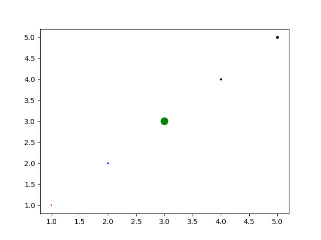
import matplotlib.pyplot as plt
import numpy as np


x = [1,2,3,4,5]
y = [1,2,3,4,5]
s = [1,2,100,4,10] # 给每个不同的数据点设置大小
c = ['r','b','g','k','k'] # 设置颜色

fig, ax = plt.subplots()
ax.scatter(x, y, s, c,marker='o')

plt.show()
柱状图:Axes.bar()
Axes.bar(self, x, height, width=0.8, bottom=None, *, align='center', data=None, **kwargs)
参数:
x: 浮点或列表
height: 浮点或列表;每个柱的高度,y轴的值
width: 浮点或列表;每个柱的宽度,默认0.8
bottom: 柱的底部 y 轴所在位置。默认0; 如果你想要堆叠柱状图,可以将一个柱子的 bottom 设置成前面柱子 y 轴的值。
align:{'center', 'edge'}, default: 'center';edge代表将柱状图的左侧和x坐标对齐。如果想要右边对齐,传递一个负数的宽度
color:颜色,或者颜色列表
edgecolor:颜色或者颜色列表;设置柱边缘颜色
linewidth:柱边缘宽度,浮点数或者浮点树列表。
tick_label: 字符串或字符串列表来设置柱子的坐标标签
xerr, yerr: float or array-like of shape(N,) or shape(2, N), optional。暂且理解为一个数据点的误差范围,xerr会基于数据点画一条横线,yerr会会一条竖线
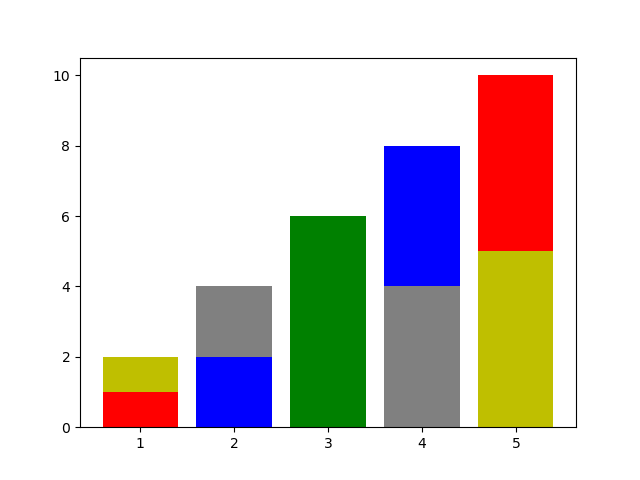
import matplotlib.pyplot as plt
import numpy as np


x = [1,2,3,4,5]
h = [1,2,3,4,5]
c = ['r','b','g','grey','y']

fig, ax = plt.subplots()
ax.bar(x, h,color=c,tick_label=x) # 第一组数据,默认以0为底部起点
ax.bar(x,h,bottom=h,color=c[::-1]) # 第二组数据,以第一组数据值的高度为起点,这样就叠加起了两组数据

plt.show()
水平横向柱状图:Axes.barh()
Axes.barh(self, y, width, height=0.8, left=None, *, align='center', **kwargs)
参数:
y: 浮点或列表
height: 浮点或列表;每个柱的高度,y轴的值
width: 浮点或列表;每个柱的宽度,默认0.8
left: 柱的底部x轴所在位置。默认0
align:{'center', 'edge'}, default: 'center';edge代表将柱状图的左侧和x坐标对齐。如果想要右边对齐,传递一个负数的宽度
color:颜色,或者颜色列表
edgecolor:颜色或者颜色列表;设置柱边缘颜色
linewidth:柱边缘宽度,浮点数或者浮点树列表。
tick_label: 字符串或字符串列表。
xerr, yerr: float or array-like of shape(N,) or shape(2, N), optional。暂且理解为一个数据点的误差范围,xerr会基于数据点画一条横线,yerr会会一条竖线
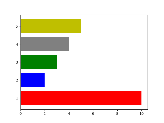
import matplotlib.pyplot as plt
import numpy as np


y = [1,2,3,4,5]
h = [10,2,3,4,5]
c = ['r','b','g','grey','y']

fig, ax = plt.subplots()
ax.barh(y, h,color=c,tick_label=y) # 默认以0为底部起点

plt.show()
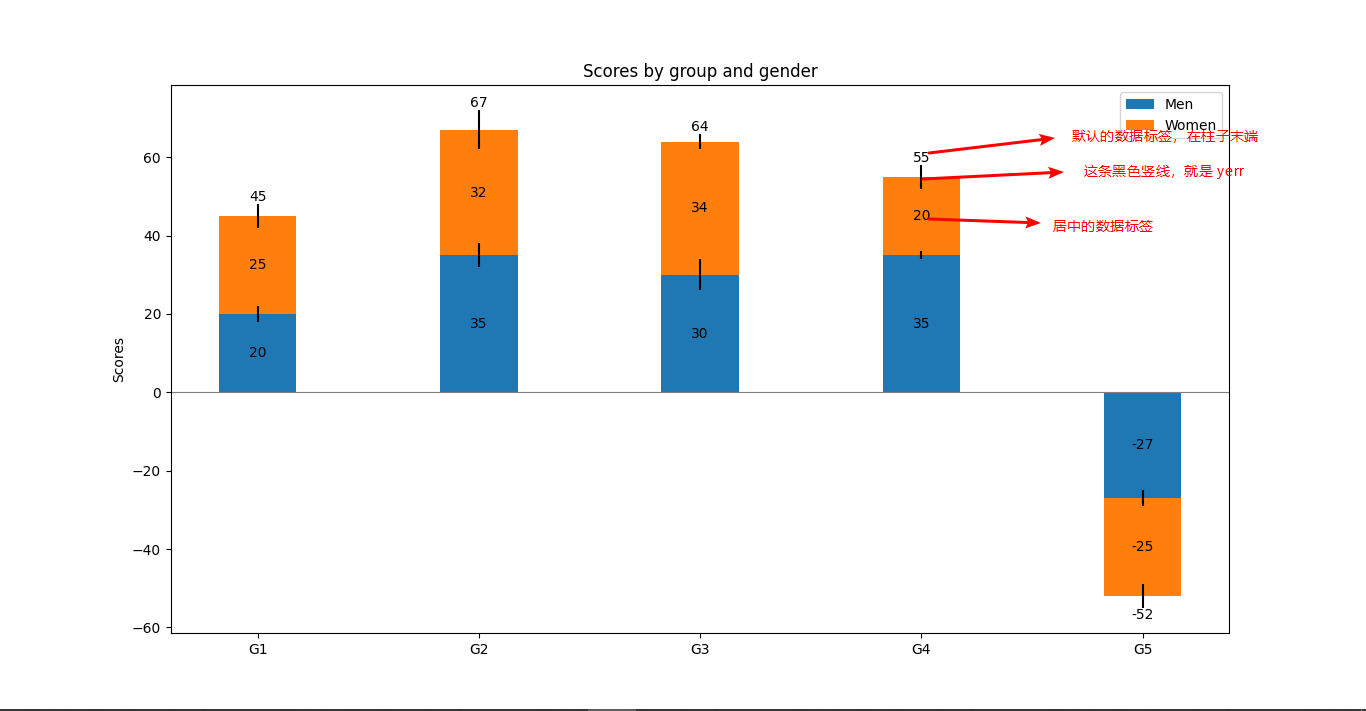
柱状图数据标签:Axes.bar_label()
Axes.bar_label(self, container, labels=None, *, fmt='%g', label_type='edge', padding=0, **kwargs)
给柱状图的每个数据添加标签
参数:
container: bar(),barh() 返回的数据容器
labels: 数组类型的文本,如果没有提供文本内容,会用数据值来作为标签。
fmt:字符串。默认“%g"
label_type: {'edge', 'center'}, default: 'edge'; center会在柱状图的柱子中间添加数据标签,edge会在柱子的末端添加数据标签
padding: float, default: 0,数据标签距离柱子末端的距离
import matplotlib.pyplot as plt
import numpy as np

N = 5
menMeans = (20, 35, 30, 35, -27)
womenMeans = (25, 32, 34, 20, -25)
menStd = (2, 3, 4, 1, 2) # 值的误差
womenStd = (3, 5, 2, 3, 3)
ind = np.arange(N)    # x轴值
width = 0.35       # 柱子宽度

fig, ax = plt.subplots()

p1 = ax.bar(ind, menMeans, width, yerr=menStd, label='Men')
p2 = ax.bar(ind, womenMeans, width,bottom=menMeans, yerr=womenStd, label='Women')

ax.axhline(0, color='grey', linewidth=0.8) # 添加一条水平横线,位置是y轴0处...
ax.set_ylabel('Scores')
ax.set_title('Scores by group and gender')
ax.set_xticks(ind)  # 设置 x 轴的刻度
ax.set_xticklabels(('G1', 'G2', 'G3', 'G4', 'G5'))  # 设置刻度显示的标签
ax.legend()

# Label with label_type 'center' instead of the default 'edge'
ax.bar_label(p1, label_type='center') # 给柱子中间加上数据值标签
ax.bar_label(p2, label_type='center') # 给第二组数据也加上标签
ax.bar_label(p2) # 不知道为啥,再加一遍标签,竟然是汇总的数据值

plt.show()
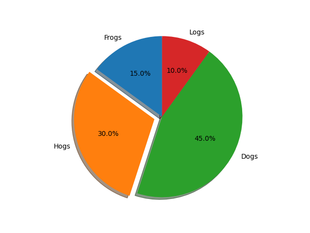
饼图:Axes.pie
Axes.pie(self, x, explode=None, labels=None, colors=None, autopct=None, pctdistance=0.6, shadow=False, labeldistance=1.1, startangle=0, radius=1, counterclock=True, wedgeprops=None, textprops=None, center=0, 0, frame=False, rotatelabels=False, *, normalize=None, data=None)
参数:
x:一维数组。存储每个区域的数值
explode:长度和x相同的一维数组,默认None;设置区域的分离突出,即各个扇区离圆心的距离,可以让扇区之间分开一些。
labels:列表,默认None;每个区域的label
colors:数组类型,默认None;每个区域的颜色
autopct:None或者可调用的函数或字符串。默认None;譬如:%.2f%% 可以让百分比显示为: 20.22% 这种格式
pctistance:浮点数,默认:0.6;即百分比数离圆心的距离
shadow:bool类型,是否加阴影
normalize:None或bool。如果是True,总会让x正常化(x之和=1),然后画一个全饼图;如果是False,当 sum(x) <= 1时,画一个缺失的饼图(不补全,因为和<1),如果 sum(x) >1,会报错!
labeldistance:浮点或者None;默认1.1;每个区域 label 到饼图圆心的距离,如果None,则不显示label。
startangle:浮点数,默认0度;饼图的旋转角度。
radius:浮点,默认1;饼图半径。
counterclock:bool,默认True;每一块的顺序,是顺时针还是逆时针方向。
wedgeprops:字典类型;默认:none;每一块对象的属性,如 wedgeprops = {'linewidth': 3} 设置每一块区域的边缘线宽度。
center:(浮点,浮点),默认(0,0);图表中心点的坐标。
frame:bool,默认:False;如果是True,会画出Axes的边框。
totatelabels:bool,默认:False;如果是True,自动旋转每一块区域的label一定的角度。
注意:
如果饼图不是正圆型,可以通过:Axes.set_aspect('equal')来设置。
import matplotlib.pyplot as plt

# 每个扇区是逆时针绘制的:
labels = 'Frogs', 'Hogs', 'Dogs', 'Logs'
sizes = [15, 30, 45, 10]
explode = (0, 0.1, 0, 0)  # only "explode" the 2nd slice (i.e. 'Hogs')

fig1, ax1 = plt.subplots()
ax1.pie(sizes, explode=explode, labels=labels, autopct='%1.1f%%',
        shadow=True, startangle=90)
ax1.axis('equal')  # Equal aspect ratio ensures that pie is drawn as a circle.

plt.show()
直方图:Axes.hist
Axes.hist(self, x, bins=None, range=None, density=False, weights=None, cumulative=False, bottom=None, histtype='bar', align='mid', orientation='vertical', rwidth=None, log=False, color=None, label=None, stacked=False, *, data=None, **kwargs)
参数:
x:(n,) array or sequence of (n,) arrays;直方图的输入值
bins:int or sequence or str, default: rcParams["hist.bins"] (default: 10);条少个条形
range:tuple or None, default: None ; 直方图的上下边缘范围
density:bool, default: False ; 直方图的密度
weights:(n,) array-like or None, default: None;权重
cumulative:bool or -1, default: False;是否需要计算累计频数或频率;
bottom:array-like, scalar, or None, default: None; 每个直方图的底部边缘位置
histtype:{'bar', 'barstacked', 'step', 'stepfilled'}, default: 'bar'
align:{'left', 'mid', 'right'}, default: 'mid'
orientation:{'vertical', 'horizontal'}, default: 'vertical'
rwidth:float or None, default: None;设置直方图条形宽度的百分比
log:bool, default: False;True的话,会将坐标轴设置成对数型
color:color or array-like of colors or None, default: None
label:str or None, default: None
stacked:bool, default: False;如果有多组数据,会将多组数据叠在一起的形式
竖线:Axes.vlines
Axes.vlines(self, x, ymin, ymax, colors=None, linestyles='solid', label='', *, data=None, **kwargs)
参数:
x:浮点或数组类型。在哪些x轴值上画线
ymin,ymax:浮点或数组。线的开头和结尾。
colors:颜色的列表。
linestyles:{'solid', 'dashed', 'dashdot', 'dotted'}, optional
label:字符串。默认“”
横线:Axes.hlines
Axes.hlines(self, y, xmin, xmax, colors=None, linestyles='solid', label='', *, data=None, **kwargs)[source]
参数:
y:浮点或数组类型。在哪些y轴值上画线
xmin,xmax:浮点或数组。线的开头和结尾。
colors:颜色的列表。
linestyles:{'solid', 'dashed', 'dashdot', 'dotted'}, optional
label:字符串。默认:“”
注释:Axes.annotate
Axes.annotate(self, text, xy, *args, **kwargs)
在xy位置处放一个注释点
参数:
text:字符串,注释内容
xy:(浮点,浮点);要注释的数据点的位置
xytext:(浮点,浮点);默认xy处。
xycoords:默认data;就是xy这个值所处的坐标系统,类型可以是字符串,函数,(浮点,浮点)或者Artist等。有以下这些字符串类型:
| Value | Description |
|---|---|
| 'figure points' | Points from the lower left of the figure |
| 'figure pixels' | Pixels from the lower left of the figure |
| 'figure fraction' | Fraction of figure from lower left |
| 'subfigure points' | Points from the lower left of the subfigure |
| 'subfigure pixels' | Pixels from the lower left of the subfigure |
| 'subfigure fraction' | Fraction of subfigure from lower left |
| 'axes points' | Points from lower left corner of axes |
| 'axes pixels' | Pixels from lower left corner of axes |
| 'axes fraction' | Fraction of axes from lower left |
| 'data' | Use the coordinate system of the object being annotated (default) |
| 'polar' | (theta, r) if not native 'data' coordinates |
textcoords:xytext所处的坐标系。默认xycoords;
arrowprops:字典;在 xy 和 xytext 之间画一条箭头线。
remain
剩下的干不动了,有需求就看API文档吧


【推荐】国内首个AI IDE,深度理解中文开发场景,立即下载体验Trae
【推荐】编程新体验,更懂你的AI,立即体验豆包MarsCode编程助手
【推荐】抖音旗下AI助手豆包,你的智能百科全书,全免费不限次数
【推荐】轻量又高性能的 SSH 工具 IShell:AI 加持,快人一步
· .NET Core 中如何实现缓存的预热?
· 从 HTTP 原因短语缺失研究 HTTP/2 和 HTTP/3 的设计差异
· AI与.NET技术实操系列:向量存储与相似性搜索在 .NET 中的实现
· 基于Microsoft.Extensions.AI核心库实现RAG应用
· Linux系列:如何用heaptrack跟踪.NET程序的非托管内存泄露
· TypeScript + Deepseek 打造卜卦网站:技术与玄学的结合
· 阿里巴巴 QwQ-32B真的超越了 DeepSeek R-1吗?
· 【译】Visual Studio 中新的强大生产力特性
· 10年+ .NET Coder 心语 ── 封装的思维:从隐藏、稳定开始理解其本质意义
· 【设计模式】告别冗长if-else语句:使用策略模式优化代码结构