


WEB笔记-3、盒子模型+定位+显示
3.1 盒子模型
边距控制
margin/padding:上 右 下 左;
padding:内容和边距之间的空间
margin:”盒子“外撑开的空间,两个相邻标签外边距会出现重叠和累加的现象,呈现出来的效果将是:对于垂直相邻的标签而言90+10=90,水平相邻的标签而言:90+10=100
四个值缺少某一个,使用对边的值
每个盒子的属性也分三种粒度,到底选哪个粒度的属性,要看你想要选择的边,以及到那条边的哪个属性
border\border-left-width\border-right;
盒子边框
边框(border) 有三个相关属性:
border-width:
border-style: 有none、hidden、dotted、dashed、solid、double、groove、ridge、inset和outset等文本值
border-color:
一、 没有width的元素始终会将宽度扩展填满其父元素为止。添加水平边框、内外边距,会导致内容宽度减少,减少量等于边框+边距
二、 设定了宽度的盒子添加边框、边距,会导致盒子扩展得更宽,实际上盒子的width属性只是设置了盒子内容区的宽度,而非盒子要占据的水平宽度
box-sizing:(新特性)可以将盒子的行为设置成默认auto宽度的状态
浮动与清除
float:
clear:
- 为父元素应用 overflow:hidden
- 浮动父元素
- 在父元素的末尾添加非浮动元素,可以直接在标记中加,亦可以通过给父元素加clearfix类来加(需要一个clearfix的样式规则)
.class:after{
clear:both;
}
//避免添加多余的文档结构
定位:
css中position包含3个值:static 、relative、absolute、fixed 默认值是static。
相对定位
position:relative
之后可以使用top、left来改变其位置
这里的相对定位是指DOM节点相对于正常的定位而言的,即原始位置为该节点在文档流里面应该正常渲染所在的位置
绝对定位
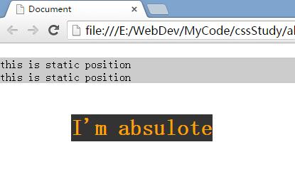
绝对定位会将文档彻底从文档流中拿出来。
使用 absolute 来作为绝对定位的标识,top,left都指定的是相对页面左上角的位置偏移量,而不是在文档流中偏移。定位的导航
<!DOCTYPE html>
<html lang="en">
<head>
	<meta charset="UTF-8">
	<title>Document</title>

	<style type="text/css">
		*{ margin:0; padding:0;}
		div{background:#ccc;}
		.absolute-test{position:absolute; top:100px; left:100px;}
		.absolute-test h1{background:#333; color:orange;}
		body{margin-top: 30px  !important;}
	</style>
</head>
<body>
	<div>this is static position</div>
	<div class="absolute-test"><h1>I'm absulote</h1></div>
	<div>this is static position</div>
</body>
</html>
 >>bottom=0就是页脚了 ^。^
固定定位
从完全移除文档刘的角度说,固定定位和绝对定位类似。
但是 fixed 不同的地方在于,固定定位是定位元素相对视口(浏览器窗口或手持设备的屏幕),因此他不会随一面滚动而移动随视窗滚动的导航、插件、搜索等
<!DOCTYPE html>
<html lang="en">
<head>
	<meta charset="UTF-8">
	<title>Document</title>
	<style type="text/css">
		*{ margin:0; padding:0;}
		div{background:#ccc;}
		.absolute-test{position:fixed; top:0px; left:100px;}
		.absolute-test h1{background:#333; color:orange;}
		body{margin-top: 30px  !important;}
	</style>
</head>
<body>
	<div>this is static position</div>
	<div class="absolute-test"><h1>I'm absulote</h1></div>
	<div>this is static position</div>
	<div>this is static position</div>
	<div>this is static position</div>
	<div>this is static position</div>
	<div>this is static position</div>
	<div>this is static position</div>
	<div>this is static position</div>
	<div>this is static position</div>
	<div>this is static position</div>
	<div>this is static position</div>
	<div>this is static position</div>
	<div>this is static position</div>
	<div>this is static position</div>
	<div>this is static position</div>
	<div>this is static position</div>
	<div>this is static position</div>
	<div>this is static position</div>
	<div>this is static position</div>
	<div>this is static position</div>
	<div>this is static position</div>
	<div>this is static position</div>
	<div>this is static position</div>
	<div>this is static position</div>
	<div>this is static position</div>
	<div>this is static position</div>
	<div>this is static position</div>
	<div>this is static position</div>
	<div>this is static position</div>
	<div>this is static position</div>
	<div>this is static position</div>
	<div>this is static position</div>
	<div>this is static position</div>
	<div>this is static position</div>
	<div>this is static position</div>
	<div>this is static position</div>
	<div>this is static position</div>
	<div>this is static position</div>
	<div>this is static position</div>
	<div>this is static position</div>
	<div>this is static position</div>
	<div>this is static position</div>
	<div>this is static position</div>
	<div>this is static position</div>
	<div>this is static position</div>
	<div>this is static position</div>
	<div>this is static position</div>
	<div>this is static position</div>
	<div>this is static position</div>
	<div>this is static position</div>
	<div>this is static position</div>
</body>
</html>
 >>对了,这个东西拿来做导航很不错^。^...
定位上下文
如果父标签为relative,子标签的absolute将以父标签为标准定位;
第一个代码body加上relative就是下面的效果

3.2 显示属性
元素的display属性尽管很多,但是大多数元素display属性默认不是block,就是inline。
块级元素,段落、标题等,在浏览器中上下堆叠显示。
行内元素,比如a、span和img,在浏览器中左右并排显示,只有前一行没有空间时才会显示到下一行。
使用:display:inline(or)block;可以将块级元素和行内元素相互切换。
display:none;元素的空间被回收,页面也不显示。
visibility:hidden; 元素不显示,但是占据空间;

