CSS3基础
内容:
1.圆角 border-radius
2.阴影 text-shadow、box-shadow
3.渐变 linear、radial
4.rgba rgb+alpha opacity
5.transform
6.动画 transition、animation
1.圆角 border-radius
通过设置元素的border-radius值,可以轻松给元素设置圆角边框,甚至实现绘制圆、半圆、四分之一的圆等各种圆角图形:
(1)只设置一个值
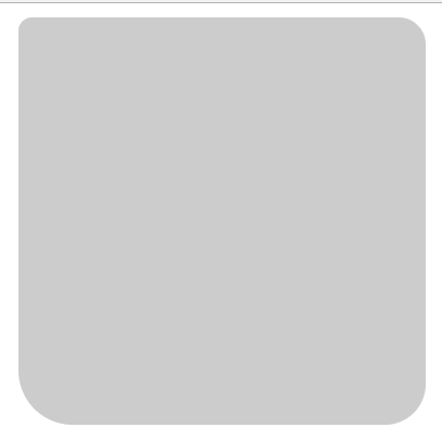
只设置一个值得情况常用来给button加圆角边框,或者画一个圆形按钮,仅需设置一个数值,即可给元素的四个边角设置统一的圆角弧度
1 .box {width:300px; height:300px; background:#CCC; margin:10px auto 0; border-radius:10px;}
效果:

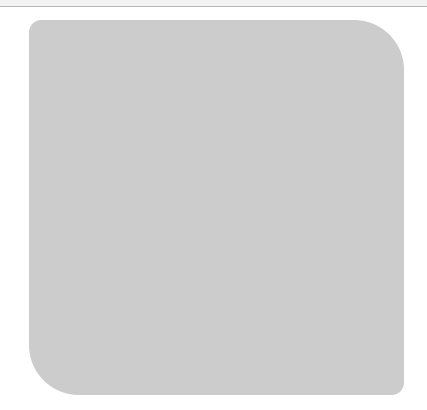
(2)四个方向的值分别设置
border-radius属性其实是border-top-left-radius、border-top-right-radius、border-bottom-right-radius、border-bottom-left-radius四个属性的简写模式,因此,border-radius : 30px;,其实等价于border-radius : 30px 30px 30px 30px;
这里要注意四个数值的书写顺序,不同于padding和margin的“上、右、下、左”的顺序,border-radius采用的是左上角、右上角、右下角、左下角的顺序
1 .box {width:300px; height:300px; background:#CCC; margin:10px auto 0; border-radius:10px 20px 30px 40px;}
效果:
(3)省略部分值
与padding和margin一样,border-radius同样可以省略部分值,省略时同样是采用对角线相等的原则
1 .box {width:300px; height:300px; background:#CCC; margin:10px auto 0; border-radius:10px 40px;}
效果:
(4)横向纵向分开写
border-radius还可以用/分为横向和纵向这样写:
.box {width:300px; height:300px; background:#CCC; margin:10px auto 0; border-radius:10px/50px;}
效果:

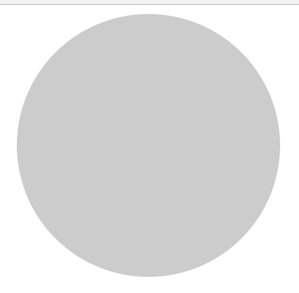
(5)百分比
除了像上面用px作为单位外还可以使用百分比:
1 .box {width:300px; height:300px; background:#CCC; margin:10px auto 0; border-radius:50%;}
效果:
2.阴影 text-shadow、box-shadow
- text-shadow:向文本添加一个或多个阴影
- box-shadow:向框添加一个或多个阴影
(1)语法
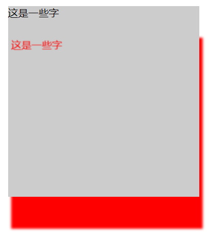
- text-shadow:x-shadow y-shadow distance color
- box-shadow:x-shadow y-shadow distance size color inset/outset
注:x-shadow和y-shadow均是必需的,其他可选,x-shadow y-shadow分别表示水平和垂直方向
(2)实例
 1 <!DOCTYPE html>
 2 <html>
 3 <head>
 4     <meta charset="utf-8">
 5     <title></title>
 6     <style media="screen">
 7         .box {width:300px; height:300px; background:#CCC; margin:10px auto 0; text-shadow:5px 50px 1px red; box-shadow: 5px 50px 5px red}
 8     </style>
 9 </head>
10 <body>
11 <div class="box">这是一些字</div>
12 </body>
13 </html>
效果:
3.渐变 linear、radial
注意:渐变其实本质上是图片
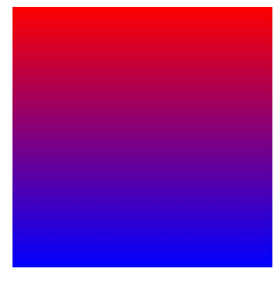
(1)从上到下的线性渐变
1 .box {
2     width:300px; height:300px; margin:10px auto 0;
3     /*background-image:-webkit-linear-gradient(red, green);*/
4     background: -webkit-linear-gradient(red, blue); /* Safari 5.1 - 6.0 */
5     background: -o-linear-gradient(red, blue); /* Opera 11.1 - 12.0 */
6     background: -moz-linear-gradient(red, blue); /* Firefox 3.6 - 15 */
7     background: linear-gradient(red, blue); /* 标准的语法 */
8 }
效果:
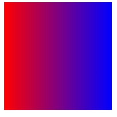
(2)线性渐变 - 从左到右
1 .box {
2     width:300px; height:300px; margin:10px auto 0;
3     background: -webkit-linear-gradient(left, red , blue); /* Safari 5.1 - 6.0 */
4     background: -o-linear-gradient(right, red, blue); /* Opera 11.1 - 12.0 */
5     background: -moz-linear-gradient(right, red, blue); /* Firefox 3.6 - 15 */
6     background: linear-gradient(to right, red , blue); /* 标准的语法 */
7 }
效果:
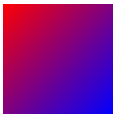
(3)线性渐变 - 对角
1 .box {
2     width:300px; height:300px; margin:10px auto 0;
3     /* 从左上角开始(到右下角)的线性渐变 */
4     background: -webkit-linear-gradient(left top, red , blue); /* Safari 5.1 - 6.0 */
5     background: -o-linear-gradient(bottom right, red, blue); /* Opera 11.1 - 12.0 */
6     background: -moz-linear-gradient(bottom right, red, blue); /* Firefox 3.6 - 15 */
7     background: linear-gradient(to bottom right, red , blue); /* 标准的语法 */
8 }
效果:
(4)更多渐变
更多渐变看此:http://www.runoob.com/css3/css3-gradients.html
4.rgba opacity
(1)两者区别
RGBA 和 opacity 都能实现透明效果,但是两者有明显不同的区别,区别如下:
- rgba:RGAB实现透明效果,只改变元素本身的透明效果,文字没有变透明,另外rgba实际上就是 rgb(颜色)+alpha(透明度。取值0-1之间)
- opacity:元素透明其子元素也都透明,如:div在红色背景透明度为0.5于是div里的文字也变得透明
(2)实例
1 body {background:#F0F}
2 .box {
3     width:300px; height:300px; margin:10px auto 0; color:white;
4     background:rgba(0,0,0,0.1);
5     /*opacity: 0.5;*/
6 }
说明:此时box中的文字没有变透明,但是如果把opacity的注释去掉那么文字就会变透明
5.transform
(1)transform作用
- rotate 旋转
- scale 缩放
- translate 平移(移动端特别爱用translate)
- skew 倾斜
**transform一定要加初始值
(2)实例
1 /* CSS3写法 */
2 transform: rotate(90deg);
3
4 /* 兼任写法如下 */
5 -webkit-transform: rotate(90deg);
6 -moz-transform: rotate(90deg);
7 -o-transform: rotate(90deg);
8 -ms-transform: rotate(90deg);
 1 /* rotate 旋转 */
 2 .box {
 3     width: 300px;
 4     height: 300px;
 5     background: #CCC;
 6     margin: 100px auto 0;
 7     transition: 1s all ease;    /* transition指定过渡效果 */
 8     transform: rotate(0deg);
 9 }
10
11 .box:active {
12     transform: rotate(90deg);
13 }
 1 /* scale 缩放 */
 2 .box {
 3     width: 300px;
 4     height: 300px;
 5     background: #CCC;
 6     margin: 100px auto 0;
 7     transition: 1s all ease;
 8     transform: scale(1, 1);
 9 }
10
11 .box:active{transform:scale(2,2);}    /* 沿x轴y轴均放大两倍 */
12 .box:active{transform:scale(1,0);}    /* 沿y轴缩小直至不见 */
13 .box:active {                           /* 翻转 */
14     transform: scale(1, -1);
15 }
 1 /* translate 平移 */
 2 .box {
 3     width: 300px;
 4     height: 300px;
 5     background: #CCC;
 6     margin: 100px auto 0;
 7     transition: 1s all ease;
 8     transform: translate(0, 0);
 9 }
10
11 .box:active {
12     transform: translate(100px, 200px);    /* 向右平移100px  向下平移200px*/
13 }
 1 /* skew 倾斜 */
 2 .box {
 3     width: 300px;
 4     height: 300px;
 5     background: #CCC;
 6     margin: 100px auto 0;
 7     transition: 1s all ease;
 8     transform: skew(0, 0);
 9 }
10
11 .box:active {
12     transform: skew(0, 30deg);      /* 倾斜30度 */
13 }
(3)补充
多个transform一起用:
 1 .box {
 2     width: 200px;
 3     height: 200px;
 4     background: #CCC;
 5     margin: 100px auto 0;
 6 }
 7
 8 /* 下面两种写法显示效果不一样 */
 9 /* 多个一起用的时候transform会从后往前走 先执行后面的 再执行前面的 */
10 .box:active {
11     transform: scale(2, 1) rotate(45deg)
12 }
13
14 .box:active {
15     transform: rotate(45deg) scale(2, 1)
16 }
3D变化:
1 2d              3d
2 rotate          rotateX/rotateY/rotateZ
3 translate       translateX/translateY/translateZ
1 .box {
2     width:200px; height:200px; background:#CCC; margin:100px auto 0;
3     transition: 1s all ease;
4     /* perspective -> 相当于定义景深 然后可以产生透视 出现3D效果 这个值越小3D效果越明显 */
5     transform:perspective(1000px) rotateX(0);
6 }
7 .box:active {transform:perspective(1000px) rotateX(60deg);}
6.动画 transition、animation
两者区别:
- transition 简单、容易、方便 常用
- animation 强大、麻烦 复杂的链式动画
(1)transition
兼容性:
1 IE10、Firefox、Chrome、Opera 支持 transition 属性。
2 Safari 需要前缀 -webkit-。
3 Chrome 25 以及更早版本需要前缀 -webkit-。
4 IE9 以及更早版本不支持 transition 属性
语法:
 1 transition:
 2 1.动画时间
 3 2.改变的样式
 4 3.动画形式
 5
 6 eg: transition: 1s all ease
 7 当然也可以分别指定动画要改变的样式:transition: 2s width ease, 1s height ease
 8
 9 动画形式:
10 ease :慢速开始,中间变快,慢速结束
11 liner:匀速运动
12 ease-in:慢速开始
13 ease-out:慢速结束
14 ease-in-out:慢速开始,慢速结束
实例:
1 .box {
2     width: 200px;
3     height: 200px;
4     background: #CCC;
5     margin: 100px auto 0;
6     transition: 1s all ease;   /* 动画发生1s */
7 }
8
9 .box:active {width:400px; height:400px; background:yellow; font-size:30px;}
(2)animation
animation使用:先定义一个animation然后使用
详细使用看这里:https://blog.csdn.net/u013243347/article/details/79976352
当然animation也可以和js配合起来一起操作动画
