pure框架
内容:
1.介绍与入门
2.基础使用
参考资料:
pure中文文档:https://www.purecss.cn/
pure实例:https://www.purecss.cn/layouts.html
一、介绍与入门
1.pure介绍
pure框架是美国雅虎公司出品的一组轻量级、响应式纯css模块,适用于任何Web项目,其只提供很简单的样式
2.pure框架入门使用
(1)在head中引入pure(当然你也可以去官网上下载pure)
1 <link rel="stylesheet" href="https://unpkg.com/purecss@0.6.1/build/pure-min.css" integrity="sha384-CCTZv2q9I9m3UOxRLaJneXrrqKwUNOzZ6NGEUMwHtShDJ+nCoiXJCAgi05KfkLGY" crossorigin="anonymous">
(2)添加 Viewport Meta 元素到head中
1 <meta name="viewport" content="width=device-width, initial-scale=1">
(3)引入grids-responsive.css
1 <!--[if lte IE 8]>
2 <link rel="stylesheet" href="https://unpkg.com/purecss@0.6.1/build/grids-responsive-old-ie-min.css">
3 <![endif]-->
4 <!--[if gt IE 8]><!-->
5 <link rel="stylesheet" href="https://unpkg.com/purecss@0.6.1/build/grids-responsive-min.css">
6 <!--<![endif]-->
(4)引入Normalize.css
1 <link rel="stylesheet" href="https://unpkg.com/purecss@0.6.1/build/base-min.css">
二、基础使用
1.栅格系统
(1)常见概念
- 栅格class与单元格class:Pure栅格系统有两种class组成:栅格 class(
pure-g) 和 单元格 (pure-u或pure-u-*)。栅格类似Excel的表格,由单元格组成 - 单元格的宽度是分数:单元格用不同的class名表示宽度。比如
pure-u-1-2表示宽1/2即50%, 同样pure-u-1-5表示宽1/5即20% - 栅格的所有子元素必须是单元格栅格:class名包含
pure-g的元素,它的子元素必须是单元格即class名包含pure-u或pure-u-*的元素 - 内容在单元格中:所有需要显示的内容都要放在单元格中。这样才能保证内容正确的显示
(2)栅格单元格大小
Pure栅格默认支持5列和24列
(3)响应式栅格设计
Pure同时提供一个移动设备优先的响应式的栅格系统,通过添加class名即可使用。它是一个强大并灵活的系统,基于默认的栅格系统
先引入以下文件:
1 <!--[if lte IE 8]>
2     <link rel="stylesheet" href="http://yui.yahooapis.com/pure/0.6.0/grids-responsive-old-ie-min.css">
3 <![endif]-->
4 <!--[if gt IE 8]><!-->
5     <link rel="stylesheet" href="http://yui.yahooapis.com/pure/0.6.0/grids-responsive-min.css">
6 <!--<![endif]-->
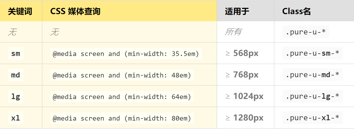
不同大小的屏幕对应的类名如下:
(4)使用实例
下面是一组响应式栅格,元素在小屏幕上宽width: 100%,在中等屏幕变为width: 33.33%
1 <div class="pure-g">
2     <div class="pure-u-1 pure-u-md-1-3"> ... </div>
3     <div class="pure-u-1 pure-u-md-1-3"> ... </div>
4     <div class="pure-u-1 pure-u-md-1-3"> ... </div>
5 </div>
(5)其他说明
Pure的栅格系统默认移动端优先。想要在移动端使用栅格系统,加pure-u-*在相应的元素上就可以了
使用响应式栅格时,你肯定也希望图片能够伸缩,以保持正确的比例。给图片加个class(pure-img) 就可以
2.表单及按钮
(1)表单系列
详细内容直接看:https://www.purecss.cn/forms.html
(2)按钮系列
详细内容直接看:https://www.purecss.cn/buttons.html
3.表格及菜单
(1)表格系列
详细内容直接看:https://www.purecss.cn/tables.html
(2)菜单系列
详细内容直接看:https://www.purecss.cn/menus.html
