python-matplotlib绘图入门
主要使用matplotlib包里的pyplot函数进行绘图
写在前面
通过python进行绘图经常会遇到图中的中文无法正常显示,坐标轴的负数无法正常显示问题,以下是解决方案:
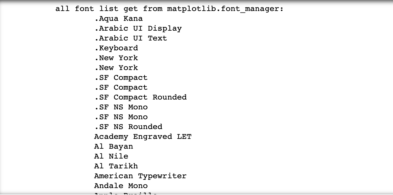
先查看当下系统有哪些字体
import matplotlib
mpl_fonts=sorted([f.name for f in matplotlib.font_manager.fontManager.ttflist])
print('all font list get from matplotlib.font_manager:')
for fonts in mpl_fonts:
    print('\t' + fonts)
打印结果:
绘图函数中进行相应设置
从上述打印出来的结果选择合适字体
import matplotlib.pyplot as plt
# plt.rcParams['font.family'] = 'SimHei' # windows系统可选
plt.rcParams['font.sans-serif'] = ['Arial Black']
plt.rcParams['axes.unicode_minus'] = False # 解决负数无法正常显示的问题
matplotlib.pyplot.figure()函数
# 创建一个新画布,或者激活一个现有画布
matplotlib.pyplot.figure(num=None,
                        figsize=None,             # 设置画布的宽度和高度 eg:(4,6)
                        dpi=None,                 # 设置图形分辨率 默认值
                        facecolor=None,        # 背景色,默认'white'
                        edgecolor=None,       # 边框颜色,默认'white'
                        frameon=True,          # bool,如果为False,则禁止绘制图形框
                        FigureClass=<class 'matplotlib.figure.Figure'>,
                        clear = False,
                        **kwargs
                        )
常用函数
plt.rcParams["font.family"]="SimHei"   # win系统设置字体
plt.rcParams['font.sans-serif'] = ['Arial Black'] # mac系统设置字体
plt.rcParams['axes.unicode_minus'] = False  # 作用就是解决负号'-'显示为方块的问题

#设置刻度范围
ax.set_xlim(1,7.1)      #x轴从1到7.1
ax.set_ylim(40,100)  #y轴从40到100

ax.set_xticks() # 设置显示的刻度
ax.set_yticks()

# 设置刻度标签
ax.set_xticklebels()
ax.set_yticklebels()

# 添加坐标轴标签
ax.set_xlabel()
ax.set_ylabel()

# 设置表头
ax.set_title()

# 添加图例
ax.legend()

# 可以装修轴上的刻度线和轴标签
ax.tick_params()

ax.spines["top"].set_visible(False)        # 不显示图的上轴
ax.spines["right"].set_visible(False)      # 右
ax.spines["left"].set_visible(False)        # 左
ax.spines["bottom"].set_linewidth(3)     # 底轴线条宽度设置
ax.spines["left"].set_color("darkblue")   # 设置左轴的颜色

ax.text()                           # 指定位置添加标签
ax.annotate()                    # 添加箭头的标注函数annotate()

# 保存为jpg文件
plt.savefig("figure.jpg")#我这里填的是相对路径,如果想保存在指定文件夹下,填写绝对路径。
# 保存为png文件
plt.savefig("figure.png")
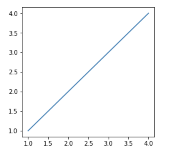
创建画布
import matplotlib.pyplot as plt
import pandas as pd
import numpy as np
fig = plt.figure(num=1,figsize=(4,4))
plt.plot([1,2,3,4],[1,2,3,4])
plt.show()
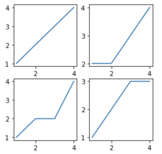
新增画布
fig=plt.figure(num=1,figsize=(4,4))
ax1=fig.add_subplot(221)###可从图中看到,我们的画布是分为2x2的区域
ax1.plot([1,2,3,4],[1,2,3,4])
ax2=fig.add_subplot(222)
ax2.plot([1,2,3,4],[2,2,3,4])
ax3=fig.add_subplot(223)
ax3.plot([1,2,3,4],[1,2,2,4])
ax4=fig.add_subplot(224)
ax4.plot([1,2,3,4],[1,2,3,3])

plt.show()
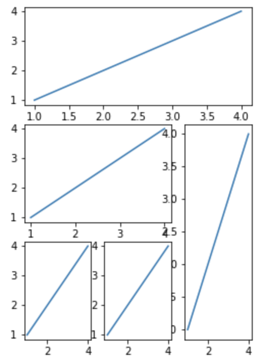
import matplotlib.gridspec as gridspec #调用网格

fig=plt.figure(figsize=(4,6)) #创建画布
gs=gridspec.GridSpec(3,3)#设定网格

ax1=fig.add_subplot(gs[0,:])#选定网格
ax1.plot([1,2,3,4],[1,2,3,4])

ax2=fig.add_subplot(gs[1,:-1])
ax2.plot([1,2,3,4],[1,2,3,4])

ax3=fig.add_subplot(gs[1:,-1])
ax3.plot([1,2,3,4],[1,2,3,4])

ax4=fig.add_subplot(gs[2,0])
ax4.plot([1,2,3,4],[1,2,3,4])

ax5=fig.add_subplot(gs[2,1])
ax5.plot([1,2,3,4],[1,2,3,4])

plt.show()
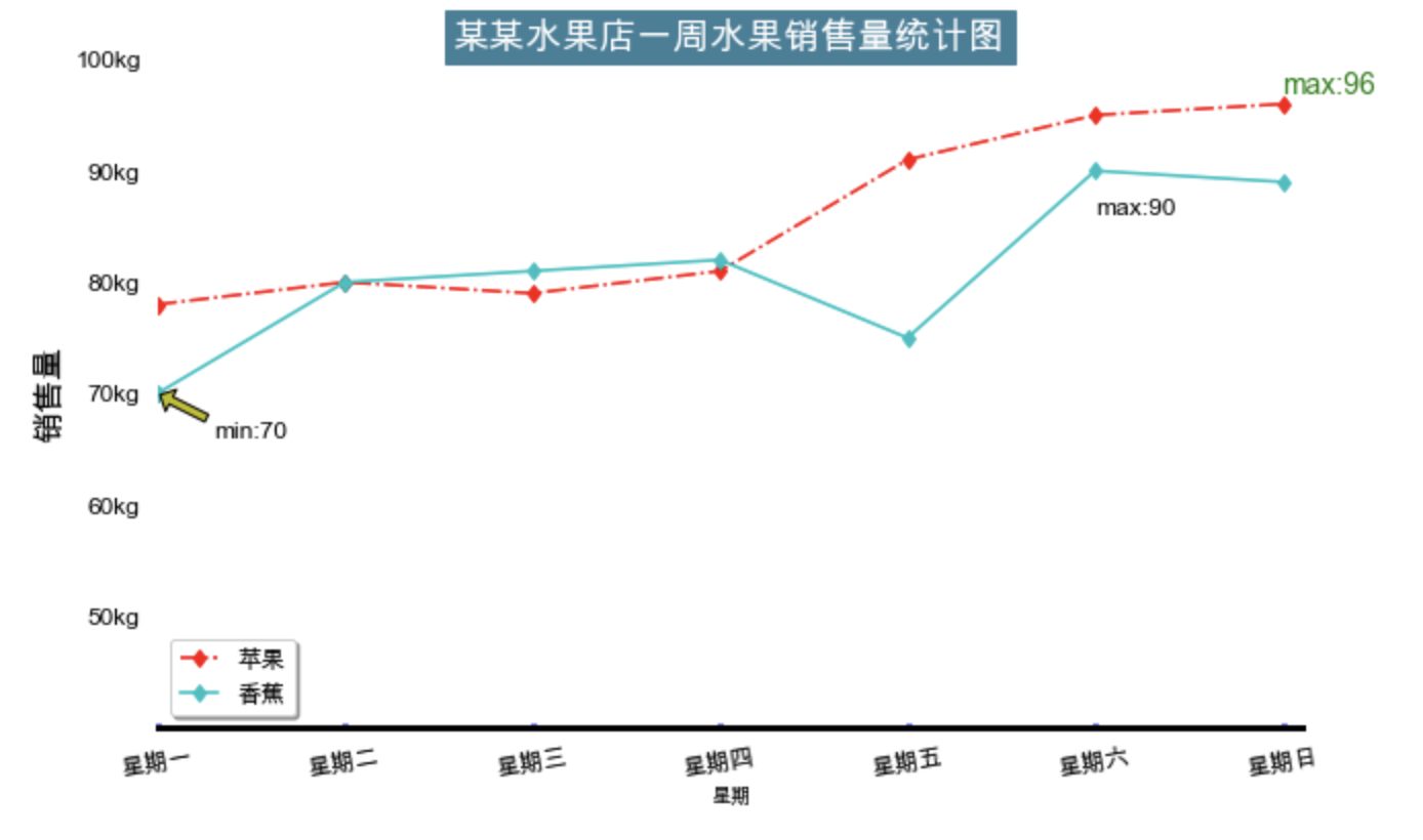
栗子
import pandas as pd
import numpy as np
import matplotlib.pyplot as plt

import warnings
warnings.filterwarnings('ignore')

# plt.rcParams['font.family'] = 'SimHei'
plt.rcParams['font.sans-serif'] = ['Arial Unicode MS'] # mac系统
plt.rcParams['axes.unicode_minus'] = False  # 作用就是解决负号'-'显示为方块的问题


# 创建数据
app=[78,80,79,81,91,95,96]
x=np.arange(1,8)


# 创建画布
fig=plt.figure(figsize=(10,6))

# 创建子画布
ax=fig.add_subplot(111)
# ax.plot(x,app)
ax.plot(x,app,"r-.d",label="苹果")#在原来的基础上添加“r-.d”

# 在原图上新增其他线条
ban=[70,80,81,82,75,90,89]
ax.plot(x,ban,"c-d",label="香蕉")

# 设置轴范围
ax.set_xlim([1,7.1])
ax.set_ylim([40,100])
ax.set_xticks(np.linspace(1,7,7))
ax.set_yticks(np.linspace(50,100,6))#可调控字体大小,样式,

# 设置刻度标签
ax.set_xticklabels(["星期一","星期二","星期三","星期四","星期五","星期六","星期日"],fontproperties='Arial Unicode MS',\
fontsize=12,rotation=10) #参数rotation=10,可以使得类标旋转值为10的角度
ax.set_yticklabels(["50kg","60kg","70kg","80kg","90kg","100kg"])

# 设置刻度参数
ax.tick_params(left=False,pad=8,direction="in",length=2,width=3,color="b",labelsize=12)
ax.tick_params("x",labelrotation=10)#类标旋转

# 设置轴标签
ax.set_xlabel("星期")#添加x轴坐标标签,后面看来没必要会删除它,这里只是为了演示一下。
ax.set_ylabel("销售量",fontsize=16)#添加y轴标签,设置字体大小为16,这里也可以设字体样式与颜色

# 设置图标题
ax.set_title("某某水果店一周水果销售量统计图",fontsize=18, backgroundcolor='#3c7f99',fontweight='bold',color='white',verticalalignment="baseline")#标题(表头)

# 设置轴线条宽度
ax.spines["bottom"].set_linewidth(3)#底轴线条宽度设置
ax.spines["top"].set_visible(False)#上轴不显示
ax.spines["right"].set_visible(False)#右
ax.spines["left"].set_visible(False)#左


# 设置图例
ax.legend(loc=3,labelspacing=0.5,handlelength=1.5,fontsize=12,shadow=True)
# ax.legend(["苹果"],loc=3,labelspacing=0.5,handlelength=1.5,fontsize=12,shadow=True)
# 一般添加图例时,会在画图的函数里,比如ax.plot()函数中添加一个label参数,则后面直接ax.legend(loc="")
# 不需要第一个参数了。
# loc的可取"best",1或者"upper right",2或"upper left",3或"lower left",4或"lower right",代表放不同位置

ax.annotate(s="min:70",xy=(1,70),xytext=(1.3,66),arrowprops=dict(facecolor="y",shrink=0.05,
                                                              headwidth=12,headlength=6,width=4),fontsize=12)

# 标记特殊值
ax.text(7,97,"max:96",fontsize=14,color="g",alpha=1)
ax.text(6,86,"max:90",fontsize=12,alpha=1)

plt.show()

# plt.savefig(r"D:\Users\Desktop\python\figure.png")