【python爬虫课程设计】大数据分析———Apple AppStore Android 应用数据分析
一、选题背景
随着智能手机的普及,移动应用市场持续繁荣,其中苹果App Store和谷歌Google Play是全球最大的两大应用商店。这两大平台汇聚了数十亿的活跃用户,为开发者提供了展示和分发应用的平台。对于开发者而言,了解应用在App Store和Google Play上的表现和用户行为至关重要,这有助于他们优化应用、提高用户体验、制定有效的市场策略。然而,目前针对苹果App Store和Android应用在Google Play上的比较分析相对较少。尽管有一些研究关注了应用商店的某些方面,但缺乏对两大平台整体表现的综合评估。此外,随着移动设备的不断更新换代和用户行为的不断变化,两大平台的数据也在不断演变。因此,进行一次全面的、与时俱进的应用数据分析显得尤为重要。
因此,本选题旨在通过对苹果App Store和Android应用在Google Play上的数据进行深入挖掘和分析,为开发者、市场分析师和相关行业人士提供有价值的洞察。通过对比分析两大平台上的应用表现、用户行为和市场趋势,我们将揭示隐藏在数据背后的真相,为未来移动应用的发展提供参考和启示。
二、选题意义
随着智能手机的普及和移动互联网的快速发展,移动应用已经成为了人们日常生活中不可或缺的一部分。苹果的App Store和谷歌的Google Play作为全球最大的两大应用商店,拥有数以亿计的用户和海量的应用。因此,对这些应用商店中的数据进行分析,具有重要的实际意义和价值。通过对App Store和Google Play的数据分析,可以深入了解当前移动应用市场的发展趋势、热点领域以及未来可能的发展方向。这对于开发者来说,能够指导其开发方向、优化产品设计和制定市场策略。通过数据分析,可以评估各类应用的性能、受欢迎程度、用户反馈等,为开发者提供关于应用优化的建议,同时帮助投资者和合作伙伴更好地理解应用的商业价值。对用户下载、使用、反馈等数据的分析,可以深入了解用户的偏好、习惯和需求,从而为应用的优化提供有力的依据,提升用户体验和忠诚度。对相似或竞品应用的比较分析,可以评估各类应用的竞争优势和劣势,帮助开发者明确自己在市场中的定位,制定有效的竞争策略。在学术领域,这样的数据分析还可以为研究者提供丰富的数据资源,帮助他们深入研究移动应用的相关领域。
综上所述,对Apple App Store和Android应用在Google Play的数据进行深入分析,不仅有助于提高应用的性能和市场表现,还能为整个移动应用行业的发展提供有力的支持。
三、数据集简介
本数据源包含:
App_Id:应用ID
App_Name:应用名称
AppStore_Url:App Store链接
Primary_Genre:主要类型
Content_Rating:内容评级
Size_Bytes:大小(字节)
Required_IOS_Version:所需的iOS版本
Released:发布日期
Updated:更新日期
Version:版本号
Price:价格
Currency:货币类型
Free:是否免费
DeveloperId:开发者ID
Developer:开发者名称
Developer_Url:开发者链接
Developer_Website:开发者网站
Average_User_Rating:平均用户评分
Reviews:评论数
Current_Version_Score:当前版本评分
Current_Version_Reviews:当前版本评论数
使用数据集:appleAppData.csv

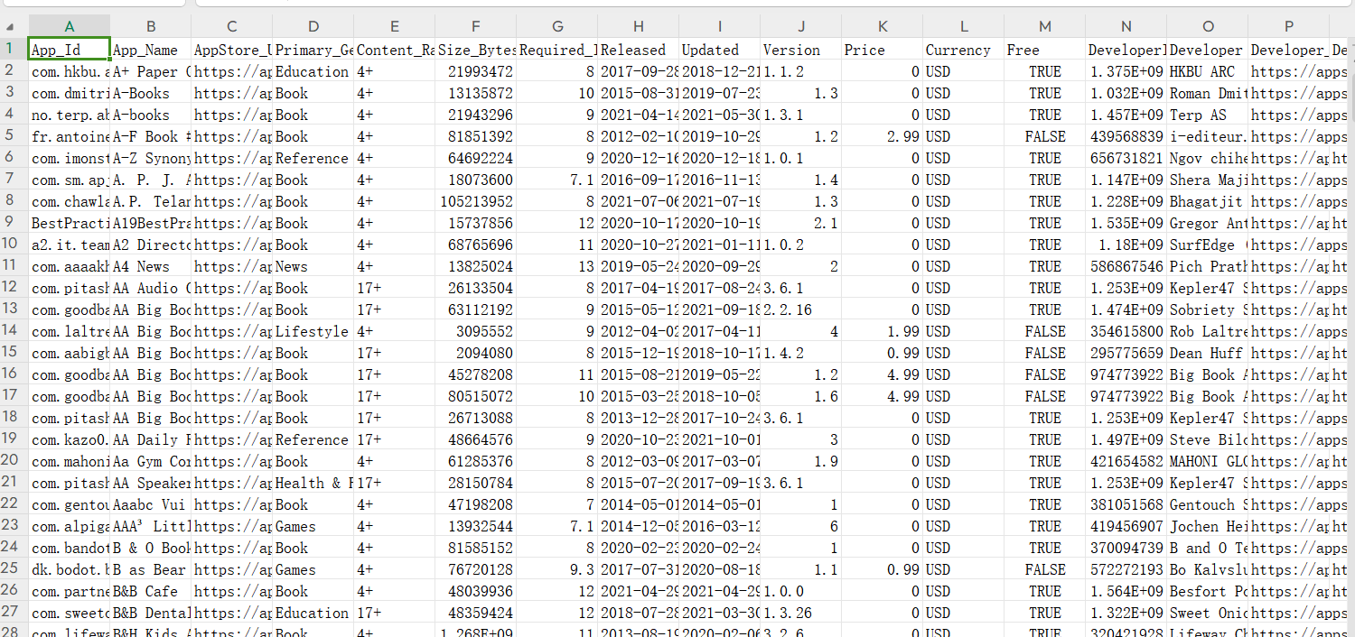
数据截图:
四、大数据分析
4.1导入数据库
#导入库
import pandas as pd
import numpy as np
import matplotlib.pyplot as plt
import seaborn as sns
import scipy as sp
 #导入数据库
df = pd.read_csv("appleAppData.csv")
4.2数据分析
查看 DataFrame 的前几行
#查看 DataFrame 的前几行
df.head()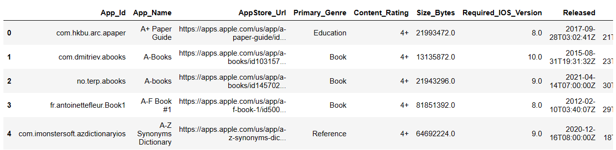
查看DataFrame 的大小
#查看DataFrame 的大小
df.shape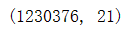
获取列名
# 获取列名
df.columns 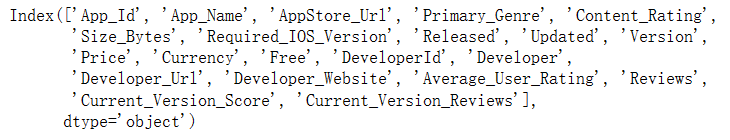
对 DataFrame 的列进行描述性统计
#对 DataFrame 的列进行描述性统计
df.describe()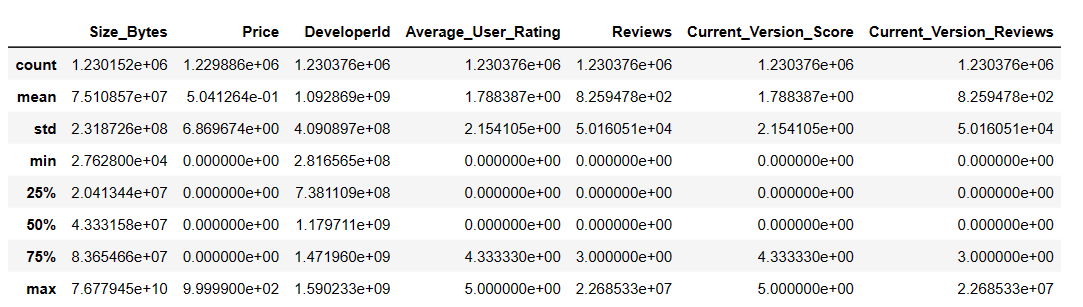
数据的完整性和缺失情况,并对缺失值进行处理
import pandas as pd
import matplotlib.pyplot as plt
# 读取数据
df = pd.read_csv("appleAppData.csv")
# 检查数据完整性和缺失值
print("数据完整性检查:")
print("数据帧中的总行数:", len(df))
print("数据帧中的总列数:", len(df.columns))
# 检查每一列的缺失值情况
missing_data = df.isnull().sum()
print("\n每一列的缺失值情况:")
print(missing_data)
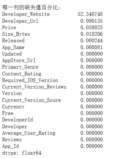
# 计算每一列的缺失值百分比
missing_perc = (df.isnull().sum()/len(df)*100).sort_values(ascending=False)
print("\n每一列的缺失值百分比:")
print(missing_perc)
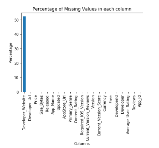
# 绘制条形图展示缺失值百分比
missing_perc.plot(kind='bar')
plt.xlabel("Columns")
plt.ylabel("Percentage")
plt.title('Percentage of Missing Values in each column')
plt.show()
# 处理缺失值,例如填充平均值、中位数或使用插值等。这里仅作示例,具体处理方式取决于你的数据和需求。
df.fillna(df.mean(), inplace=True) # 用平均值填充缺失值
# 再次检查和处理后的数据
print("\n处理后的数据完整性:")
print("处理后的数据帧中的总行数:", len(df))
print("处理后的数据帧中的总列数:", len(df.columns))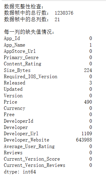
计算每一列的缺失值百分比,并使用条形图展示缺失值百分比大于0的列
import pandas as pd
import matplotlib.pyplot as plt
# 读取数据
df = pd.read_csv("appleAppData.csv")
# 计算每一列的缺失值百分比
missing_perc = (df.isnull().sum()/len(df)*100).sort_values(ascending=False)
# 筛选出缺失值百分比大于0的列,并绘制条形图
plt.figure(figsize=(10, 5))
 # 绘制条形图,设置颜色、边框颜色和条形宽度
missing_perc[missing_perc > 0].plot(kind='bar', color='skyblue', edgecolor='black', width=0.9)
plt.xlabel("Columns")  # 设置x轴标签
plt.ylabel("Percentage")  # 设置y轴标签
plt.title('Missing Values (%) in columns having less than 1% null values')  # 设置图标题
plt.show()  # 显示图形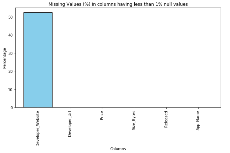
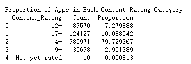
应用在内容评级类别中的分布情况,计算每个内容评级类别的应用比例(即该类别的应用数量占总应用数量的百分比),打印出包含新计算出的比例列的数据框
import pandas as pd
import seaborn as sns
import matplotlib.pyplot as plt
df = pd.read_csv('appleAppData.csv')
# 检查数据框中是否存在 'Content_Rating' 列
if 'Content_Rating' not in df.columns:
    print("The DataFrame does not contain the 'Content_Rating' column.")
    exit()
# 计算每个内容评级类别的应用数量
grouped = df.groupby('Content_Rating').size().reset_index(name='Count')
# 打印每个内容评级类别的应用数量
print("Number of Apps in Each Content Rating Category:")
print(grouped)
# 绘制条形图
plt.figure(figsize=(10, 6))
sns.barplot(x='Content_Rating', y='Count', data=grouped)
plt.title("Distribution of Apps across Content Rating Categories")
plt.xlabel("Content Rating")
plt.ylabel("Number of Apps")
plt.xticks(rotation=45)
plt.show()
# 输出数据框中每个内容评级类别的比例
print("Proportion of Apps in Each Content Rating Category:")
# 计算比例并将其乘以100以获得百分比值
grouped['Proportion'] = grouped['Count'] / grouped['Count'].sum() * 100
print(grouped) 
条形图(由 barplot 生成):显示了每种“Primary_Genre”的数量分布。条形的高度表示该类型的应用程序数量。
饼图(由 pie 生成):显示了每种“Primary_Genre”的占比。每个扇形的大小表示该类型的占比,整个饼图的面积表示100%。
可以直观地看到哪种“Primary_Genre”的应用程序数量最多,以及它们在所有应用程序中的占比
import pandas as pd
import matplotlib.pyplot as plt
import seaborn as sns
# 提取“Primary_Genre”列的所有唯一值
unique_genres = df['Primary_Genre'].unique()
# 打印所有唯一的主要类型
print("Unique Primary Genres:")
print(unique_genres)
# 计算每种主要类型的数量
genre_counts = df['Primary_Genre'].value_counts()
# 获取出现次数最多的主要类型的标签和出现次数
most_common_genre = genre_counts.idxmax()
most_common_genre_count = genre_counts.max()
# 打印出现次数最多的主要类型及其出现次数
print("\nGenre with the Highest Number of Apps:")
print(f"{most_common_genre} ({most_common_genre_count} apps)")
# 绘制主要类型的分布图
plt.figure(figsize=(12, 6))
sns.barplot(data=df, x=genre_counts.index, y=genre_counts.values)
plt.title("Distribution of Apps across Primary Genres")
plt.xlabel("Primary Genre")
plt.ylabel("Number of Apps")
plt.xticks(rotation=90)
plt.show()
# 添加更多分析和可视化功能
# 计算每个主要类型的占比
genre_percentages = genre_counts / genre_counts.sum() * 100
print("Percentage of Apps in Each Genre:")
print(genre_percentages)
# 根据占比排序并打印结果
sorted_percentages = genre_percentages.sort_values(ascending=False)
print("Percentage of Apps in Each Genre (Sorted):")
print(sorted_percentages)
# 绘制占比的饼图
plt.figure(figsize=(12, 6))
plt.pie(sorted_percentages, labels=sorted_percentages.index, autopct='%1.1f%%')
plt.title("Percentage of Apps in Each Genre (Sorted)")
plt.show()


绘制应用程序价格的分布图,并统计免费和付费应用程序的数量。它通过筛选数据框df中价格等于0的应用程序来计算免费应用程序的数量,并通过筛选价格大于0的应用程序来计算付费应用程序的数量。最后,它打印出免费和付费应用程序的数量。
plt.figure(figsize=(10, 6))
sns.histplot(data=df, x='Price', bins=30, kde=True)
plt.title("Distribution of App Prices")
plt.xlabel("Price ($)")
plt.ylabel("Number of Apps")
plt.show()
#计算免费应用和付费应用的数量
free_apps = df[df['Price'] == 0].shape[0]
paid_apps = df[df['Price'] > 0].shape[0]
print("Number of Free Apps:", free_apps)
print("Number of Paid Apps:", paid_apps)
分析应用的发布年份和数量,并对其进行可视化。显示每年应用发布数量的条形图,一个列表,其中包含应用发布数量最多的年份。
# 导入必要的库
import pandas as pd
import matplotlib.pyplot as plt
# 将'Released'列转换为datetime类型
df['Released'] = pd.to_datetime(df['Released'])
# 提取'Released'列中的年份
df['Release_Year'] = df['Released'].dt.year
# 计算每年发布的应用数量
yearly_app_counts = df['Release_Year'].value_counts()
# 找到发布应用数量最多的年份
max_released_years = yearly_app_counts[yearly_app_counts == yearly_app_counts.max()]
# 绘制应用发布数量的分布图
plt.figure(figsize=(12, 6))
yearly_app_counts.plot(kind='bar', color='skyblue')
plt.title("Number of Apps Released per Year")
plt.xlabel("Year")
plt.ylabel("Number of Apps Released")
# 将x轴的标签旋转45度,以避免标签重叠
plt.xticks(rotation=45)
plt.show()
print("Years with Maximum App Releases:")
print(max_released_years)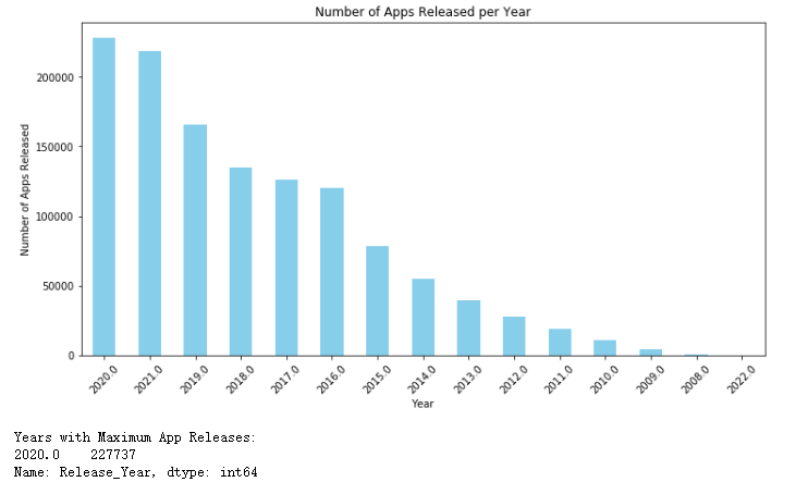
从原始数据集中提取发布日期,并按年和月对应用进行分组统计,创建了两幅线条图来展示年度和月度应用发布趋势
# 将 'Released' 列转换为 datetime 类型
df['Released'] = pd.to_datetime(df['Released'])
# 提取 'Released' 列中的年和月信息
df['Release_Year'] = df['Released'].dt.year
df['Release_Month'] = df['Released'].dt.month
# 按年份分组,并统计每个年份中应用的数量
yearly_app_counts = df.groupby('Release_Year')['App_Id'].count()
# 按年份和月份分组,并统计每个月份中应用的数量
monthly_app_counts = df.groupby(['Release_Year', 'Release_Month'])['App_Id'].count()
# 创建图形,并设置大小
plt.figure(figsize=(12, 6))
# 绘制线条图,显示年度应用发布趋势
yearly_app_counts.plot(kind='line', marker='o', color='skyblue', label='Yearly')
# 设置标题、x轴标签和y轴标签
plt.title("Trend in App Releases Over Years")
plt.xlabel("Year")
plt.ylabel("Number of Apps Released")
# 设置x轴刻度标签的旋转角度,以便它们在图中更好地显示
plt.xticks(rotation=45)
# 显示图例,并设置图例标题为 "Yearly"
plt.legend()
# 显示图形
plt.show()
# 创建图形,并设置大小
plt.figure(figsize=(12, 6))
# 使用 unstack 方法将 monthly_app_counts 数据转换为一个新的 DataFrame,以便月份成为索引,年份成为列名。然后绘制线条图。
monthly_app_counts.unstack().plot(kind='line', marker='o', figsize=(12, 6))
# 设置标题、x轴标签和y轴标签
plt.title("Trend in App Releases Over Months")
plt.xlabel("Month")
plt.ylabel("Number of Apps Released")
# 设置x轴刻度标签的旋转角度,以便它们在图中更好地显示。此处旋转角度设置为90度,以便标签水平显示。
plt.xticks(rotation=90)
# 显示图例,并设置图例标题为 "Year"
plt.legend(title="Year")
# 显示图形
plt.show()
按开发者分组并统计应用数量查找发布应用最多的开发者,筛选相关数据,计算该开发者的应用平均用户评分和平均评价数。从一个应用发布数据集中找出发布应用最多的开发者,并对其应用进行统计和可视化。
# 将 'Released' 列转换为 datetime 类型
df['Released'] = pd.to_datetime(df['Released'])
# 提取 'Released' 列中的年和月信息
df['Release_Year'] = df['Released'].dt.year
df['Release_Month'] = df['Released'].dt.month
# 按开发者分组,并统计每个开发者发布的应用数量
developer_app_counts = df.groupby('Developer')['App_Id'].count()
# 查找发布应用最多的开发者及其应用数量
max_apps_developer = developer_app_counts.idxmax()
max_apps_count = developer_app_counts.max()
# 根据发布应用最多的开发者筛选相关数据
max_apps_df = df[df['Developer'] == max_apps_developer]
# 计算该开发者应用的平均用户评分和平均评价数
avg_rating = max_apps_df['Average_User_Rating'].mean()
avg_reviews = max_apps_df['Reviews'].mean()
print(f"The developer with the highest number of apps is {max_apps_developer} with {max_apps_count} apps.")
print(f"Their apps have an average user rating of {avg_rating:.2f} and an average of {avg_reviews:.2f} reviews.")
# 创建图形,并设置大小和标题
plt.figure(figsize=(10, 6))
plt.title("Average User Rating and Average Reviews for Apps by the Developer with the Most Apps")
plt.ylabel("Value")
# 绘制柱状图,显示平均用户评分和平均评价数
plt.bar(['Average User Rating', 'Average Reviews'], [avg_rating, avg_reviews], color=['skyblue', 'orange'])
plt.xticks(rotation=45)  # 设置x轴刻度标签的旋转角度,以便它们在图中更好地显示。此处旋转角度设置为45度。
plt.show()
绘制散点图,该图显示了"Average User Rating"(平均用户评分)与"Price"(价格)之间的关系
import pandas as pd
# 读取CSV文件
df = pd.read_csv('appleAppData.csv')
# 导入matplotlib.pyplot和numpy库
import matplotlib.pyplot as plt
import numpy as np
# 设置图表大小和背景颜色
plt.figure(figsize=(10, 6), facecolor='w')
# 绘制散点图,使用蓝色圆圈表示数据点
plt.scatter(df['Average_User_Rating'], df['Price'], color='blue', marker='o')
# 设置x轴和y轴的标签
plt.xlabel('Average User Rating')
plt.ylabel('Price')
# 设置图表标题
plt.title('User Rating vs Price')
# 添加图例,以标识数据点
plt.legend()
# 设置x轴和y轴的限制,以确保所有数据点都在图表上可见
plt.xlim([min(df['Average_User_Rating']) - 1, max(df['Average_User_Rating']) + 1])
plt.ylim([min(df['Price']) - 1, max(df['Price']) + 1])
# 添加网格线,以提高图表的可读性
plt.grid(True)
# 显示图表
plt.show()
使用matplotlib库绘制一个散点图,显示“平均用户评分”与“应用大小”之间的关系
import matplotlib.pyplot as plt
import pandas as pd
# 读取数据,这里假设你有一个名为 'data.csv' 的CSV文件,其中包含 'Average_User_Rating' 和 'Size_Bytes' 列
df = pd.read_csv('appleAppData.csv')
# 检查数据
print(df.head())
# 数据预处理:计算平均值并添加到数据框中
df['Average'] = df['Average_User_Rating'].mean()
# 设置图表大小
plt.figure(figsize=(10, 6))
# 使用 matplotlib 的 plot 函数绘制散点图
plt.scatter(df['Average_User_Rating'], df['Size_Bytes'])
# 添加平均线
plt.axhline(y=df['Average'].item(), color='r', linestyle='--', label='Average User Rating')
# 设置 x 轴标签
plt.xlabel('Average User Rating')
# 设置 y 轴标签
plt.ylabel('Size (Bytes)')
# 设置图表标题
plt.title('User Rating vs App Size')
# 添加图例以区分数据点和其他元素(例如,平均线)
plt.legend()
# 显示图表
plt.show()

展示了不同类型的应用的平均价格分布情况,根据应用的“主要类型”(Primary_Genre)对应用的平均价格进行分类并绘制柱状图
import matplotlib.pyplot as plt
import seaborn as sns
import pandas as pd
# 读取数据
df = pd.read_csv('appleAppData.csv')
# 数据预处理:确保'Primary_Genre'和'Price'列存在
if 'Primary_Genre' in df.columns and 'Price' in df.columns:
    # 计算每个类别的平均价格
    df['Average_Price'] = df.groupby('Primary_Genre')['Price'].transform('mean')
else:
    print("Error: 'Primary_Genre' or 'Price' column not found in the data.")
    exit()
# 设置图表大小和比例
plt.figure(figsize=(10, 5))
# 使用seaborn绘制柱状图
sns.barplot(x='Primary_Genre', y='Average_Price', data=df)
# 设置x轴标签的旋转角度,使其垂直显示
plt.xticks(rotation=90)
# 设置图表标题和坐标轴标签
plt.title('Distribution of App Prices Across Different Categories')
plt.xlabel('App Category')
plt.ylabel('Average Price')
# 美化图表:去除轴线、调整字体大小等
plt.tick_params(axis='both', labelsize=14)
plt.grid(False)
# 显示图表
plt.show()
使用Python的Seaborn和Matplotlib库来绘制一个热力图,表示应用属性之间的相关性。热力图将显示应用属性之间的相关性。通过观察颜色和相关系数的值,可以了解不同属性之间的关联程度。
import seaborn as sns
import matplotlib.pyplot as plt
import pandas as pd
# 读取数据
df = pd.read_csv('appleAppData.csv')
# 数据预处理:确保'Primary_Genre'和'Price'列存在
if 'Size_Bytes' in df.columns and 'Price' in df.columns:
    # 计算每个类别的平均价格
    df['Average_Price'] = df.groupby('Primary_Genre')['Price'].transform('mean')
else:
    print("Error: 'Size_Bytes' or 'Price' column not found in the data.")
    exit()
# 定义颜色映射和刻度标签
cmap = sns.diverging_palette(230, 20, as_cmap=True)
scale = [0, 0.2, 0.4, 0.6, 0.8, 1]
labels = ['Very Weak', 'Weak', 'Medium', 'Strong', 'Very Strong']
# 绘制热力图
plt.figure(figsize=(8, 6))
sns.heatmap(df[cols].corr(), cmap=cmap, cbar=True, vmin=scale[0], vmax=scale[-1], annot=True, fmt=".2f", linewidths=.5)
plt.colorbar(label='Correlation Coefficient')
plt.xticks(rotation=45)  # 旋转x轴标签,使其更易于阅读
plt.yticks(rotation=0)  # 保持y轴标签水平
plt.title('Heatmap of Correlation between App Attributes')
plt.xlabel('App Attributes')
plt.ylabel('Correlation Matrix')
plt.show()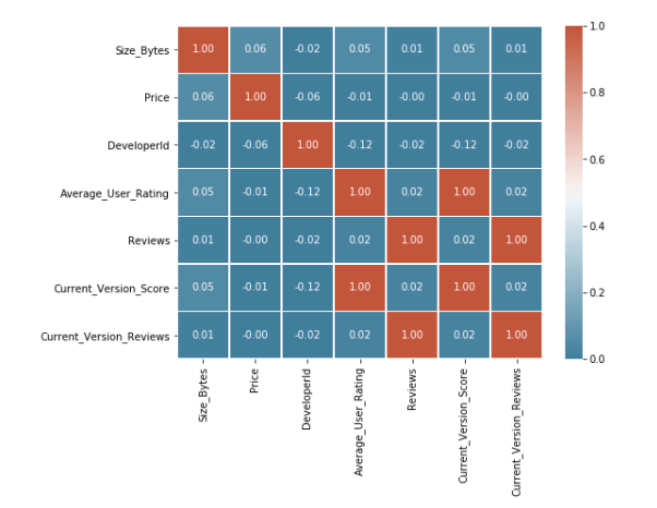
全部代码:
#导入库
import pandas as pd
import numpy as np
import matplotlib.pyplot as plt
import seaborn as sns
import scipy as sp
 #导入数据库
df = pd.read_csv("appleAppData.csv")

#查看 DataFrame 的前几行
df.head()

#查看DataFrame 的大小
df.shape

# 获取列名
df.columns

#对 DataFrame 的列进行描述性统计
df.describe()

# 读取数据
df = pd.read_csv("appleAppData.csv")
# 检查数据完整性和缺失值
print("数据完整性检查:")
print("数据帧中的总行数:", len(df))
print("数据帧中的总列数:", len(df.columns))
# 检查每一列的缺失值情况
missing_data = df.isnull().sum()
print("\n每一列的缺失值情况:")
print(missing_data)
# 计算每一列的缺失值百分比
missing_perc = (df.isnull().sum()/len(df)*100).sort_values(ascending=False)
print("\n每一列的缺失值百分比:")
print(missing_perc)
# 绘制条形图展示缺失值百分比
missing_perc.plot(kind='bar')
plt.xlabel("Columns")
plt.ylabel("Percentage")
plt.title('Percentage of Missing Values in each column')
plt.show()
# 处理缺失值,例如填充平均值、中位数或使用插值等。这里仅作示例,具体处理方式取决于你的数据和需求。
df.fillna(df.mean(), inplace=True)  # 用平均值填充缺失值
# 再次检查和处理后的数据
print("\n处理后的数据完整性:")
print("处理后的数据帧中的总行数:", len(df))
print("处理后的数据帧中的总列数:", len(df.columns))

# 读取数据
df = pd.read_csv("appleAppData.csv")
# 计算每一列的缺失值百分比
missing_perc = (df.isnull().sum()/len(df)*100).sort_values(ascending=False)
# 筛选出缺失值百分比大于0的列,并绘制条形图
plt.figure(figsize=(10, 5))
 # 绘制条形图,设置颜色、边框颜色和条形宽度
missing_perc[missing_perc > 0].plot(kind='bar', color='skyblue', edgecolor='black', width=0.9)
plt.xlabel("Columns")  # 设置x轴标签
plt.ylabel("Percentage")  # 设置y轴标签
plt.title('Missing Values (%) in columns having less than 1% null values')  # 设置图标题
plt.show()  # 显示图形

df = pd.read_csv('appleAppData.csv')
# 检查数据框中是否存在 'Content_Rating' 列
if 'Content_Rating' not in df.columns:
    print("The DataFrame does not contain the 'Content_Rating' column.")
    exit()
# 计算每个内容评级类别的应用数量
grouped = df.groupby('Content_Rating').size().reset_index(name='Count')
# 打印每个内容评级类别的应用数量
print("Number of Apps in Each Content Rating Category:")
print(grouped)
# 绘制条形图
plt.figure(figsize=(10, 6))
sns.barplot(x='Content_Rating', y='Count', data=grouped)
plt.title("Distribution of Apps across Content Rating Categories")
plt.xlabel("Content Rating")
plt.ylabel("Number of Apps")
plt.xticks(rotation=45)
plt.show()
# 输出数据框中每个内容评级类别的比例
print("Proportion of Apps in Each Content Rating Category:")
# 计算比例并将其乘以100以获得百分比值
grouped['Proportion'] = grouped['Count'] / grouped['Count'].sum() * 100
print(grouped)

# 提取“Primary_Genre”列的所有唯一值
unique_genres = df['Primary_Genre'].unique()
# 打印所有唯一的主要类型
print("Unique Primary Genres:")
print(unique_genres)
# 计算每种主要类型的数量
genre_counts = df['Primary_Genre'].value_counts()
# 获取出现次数最多的主要类型的标签和出现次数
most_common_genre = genre_counts.idxmax()
most_common_genre_count = genre_counts.max()
# 打印出现次数最多的主要类型及其出现次数
print("\nGenre with the Highest Number of Apps:")
print(f"{most_common_genre} ({most_common_genre_count} apps)")
# 绘制主要类型的分布图
plt.figure(figsize=(12, 6))
sns.barplot(data=df, x=genre_counts.index, y=genre_counts.values)
plt.title("Distribution of Apps across Primary Genres")
plt.xlabel("Primary Genre")
plt.ylabel("Number of Apps")
plt.xticks(rotation=90)
plt.show()
# 添加更多分析和可视化功能
# 计算每个主要类型的占比
genre_percentages = genre_counts / genre_counts.sum() * 100
print("Percentage of Apps in Each Genre:")
print(genre_percentages)
# 根据占比排序并打印结果
sorted_percentages = genre_percentages.sort_values(ascending=False)
print("Percentage of Apps in Each Genre (Sorted):")
print(sorted_percentages)
# 绘制占比的饼图
plt.figure(figsize=(12, 6))
plt.pie(sorted_percentages, labels=sorted_percentages.index, autopct='%1.1f%%')
plt.title("Percentage of Apps in Each Genre (Sorted)")
plt.show()

plt.figure(figsize=(10, 6))
sns.histplot(data=df, x='Price', bins=30, kde=True)
plt.title("Distribution of App Prices")
plt.xlabel("Price ($)")
plt.ylabel("Number of Apps")
plt.show()
#计算免费应用和付费应用的数量
free_apps = df[df['Price'] == 0].shape[0]
paid_apps = df[df['Price'] > 0].shape[0]
print("Number of Free Apps:", free_apps)
print("Number of Paid Apps:", paid_apps)

# 将'Released'列转换为datetime类型
df['Released'] = pd.to_datetime(df['Released'])
# 提取'Released'列中的年份
df['Release_Year'] = df['Released'].dt.year
# 计算每年发布的应用数量
yearly_app_counts = df['Release_Year'].value_counts()
# 找到发布应用数量最多的年份
max_released_years = yearly_app_counts[yearly_app_counts == yearly_app_counts.max()]
# 绘制应用发布数量的分布图
plt.figure(figsize=(12, 6))
yearly_app_counts.plot(kind='bar', color='skyblue')
plt.title("Number of Apps Released per Year")
plt.xlabel("Year")
plt.ylabel("Number of Apps Released")
# 将x轴的标签旋转45度,以避免标签重叠
plt.xticks(rotation=45)
plt.show()
print("Years with Maximum App Releases:")
print(max_released_years)

# 将 'Released' 列转换为 datetime 类型
df['Released'] = pd.to_datetime(df['Released'])
# 提取 'Released' 列中的年和月信息
df['Release_Year'] = df['Released'].dt.year
df['Release_Month'] = df['Released'].dt.month
# 按年份分组,并统计每个年份中应用的数量
yearly_app_counts = df.groupby('Release_Year')['App_Id'].count()
# 按年份和月份分组,并统计每个月份中应用的数量
monthly_app_counts = df.groupby(['Release_Year', 'Release_Month'])['App_Id'].count()
# 创建图形,并设置大小
plt.figure(figsize=(12, 6))
# 绘制线条图,显示年度应用发布趋势
yearly_app_counts.plot(kind='line', marker='o', color='skyblue', label='Yearly')
# 设置标题、x轴标签和y轴标签
plt.title("Trend in App Releases Over Years")
plt.xlabel("Year")
plt.ylabel("Number of Apps Released")
# 设置x轴刻度标签的旋转角度,以便它们在图中更好地显示
plt.xticks(rotation=45)
# 显示图例,并设置图例标题为 "Yearly"
plt.legend()
# 显示图形
plt.show()
# 创建图形,并设置大小
plt.figure(figsize=(12, 6))
# 使用 unstack 方法将 monthly_app_counts 数据转换为一个新的 DataFrame,以便月份成为索引,年份成为列名。然后绘制线条图。
monthly_app_counts.unstack().plot(kind='line', marker='o', figsize=(12, 6))
# 设置标题、x轴标签和y轴标签
plt.title("Trend in App Releases Over Months")
plt.xlabel("Month")
plt.ylabel("Number of Apps Released")
# 设置x轴刻度标签的旋转角度,以便它们在图中更好地显示。此处旋转角度设置为90度,以便标签水平显示。
plt.xticks(rotation=90)
# 显示图例,并设置图例标题为 "Year"
plt.legend(title="Year")
# 显示图形
plt.show()

# 将 'Released' 列转换为 datetime 类型
df['Released'] = pd.to_datetime(df['Released'])
# 提取 'Released' 列中的年和月信息
df['Release_Year'] = df['Released'].dt.year
df['Release_Month'] = df['Released'].dt.month
# 按开发者分组,并统计每个开发者发布的应用数量
developer_app_counts = df.groupby('Developer')['App_Id'].count()
# 查找发布应用最多的开发者及其应用数量
max_apps_developer = developer_app_counts.idxmax()
max_apps_count = developer_app_counts.max()
# 根据发布应用最多的开发者筛选相关数据
max_apps_df = df[df['Developer'] == max_apps_developer]
# 计算该开发者应用的平均用户评分和平均评价数
avg_rating = max_apps_df['Average_User_Rating'].mean()
avg_reviews = max_apps_df['Reviews'].mean()
print(f"The developer with the highest number of apps is {max_apps_developer} with {max_apps_count} apps.")
print(f"Their apps have an average user rating of {avg_rating:.2f} and an average of {avg_reviews:.2f} reviews.")
# 创建图形,并设置大小和标题
plt.figure(figsize=(10, 6))
plt.title("Average User Rating and Average Reviews for Apps by the Developer with the Most Apps")
plt.ylabel("Value")
# 绘制柱状图,显示平均用户评分和平均评价数
plt.bar(['Average User Rating', 'Average Reviews'], [avg_rating, avg_reviews], color=['skyblue', 'orange'])
plt.xticks(rotation=45)  # 设置x轴刻度标签的旋转角度,以便它们在图中更好地显示。此处旋转角度设置为45度。
plt.show()

# 读取CSV文件
df = pd.read_csv('appleAppData.csv')
# 导入matplotlib.pyplot和numpy库
import matplotlib.pyplot as plt
import numpy as np
# 设置图表大小和背景颜色
plt.figure(figsize=(10, 6), facecolor='w')
# 绘制散点图,使用蓝色圆圈表示数据点
plt.scatter(df['Average_User_Rating'], df['Price'], color='blue', marker='o')
# 设置x轴和y轴的标签
plt.xlabel('Average User Rating')
plt.ylabel('Price')
# 设置图表标题
plt.title('User Rating vs Price')
# 添加图例,以标识数据点
plt.legend()
# 设置x轴和y轴的限制,以确保所有数据点都在图表上可见
plt.xlim([min(df['Average_User_Rating']) - 1, max(df['Average_User_Rating']) + 1])
plt.ylim([min(df['Price']) - 1, max(df['Price']) + 1])
# 添加网格线,以提高图表的可读性
plt.grid(True)
# 显示图表
plt.show()

# 读取数据,这里假设你有一个名为 'data.csv' 的CSV文件,其中包含 'Average_User_Rating' 和 'Size_Bytes' 列
df = pd.read_csv('appleAppData.csv')
# 检查数据
print(df.head())
# 数据预处理:计算平均值并添加到数据框中
df['Average'] = df['Average_User_Rating'].mean()
# 设置图表大小
plt.figure(figsize=(10, 6))
# 使用 matplotlib 的 plot 函数绘制散点图
plt.scatter(df['Average_User_Rating'], df['Size_Bytes'])
# 添加平均线
plt.axhline(y=df['Average'].item(), color='r', linestyle='--', label='Average User Rating')
# 设置 x 轴标签
plt.xlabel('Average User Rating')
# 设置 y 轴标签
plt.ylabel('Size (Bytes)')
# 设置图表标题
plt.title('User Rating vs App Size')
# 添加图例以区分数据点和其他元素(例如,平均线)
plt.legend()
# 显示图表
plt.show()

# 读取数据
df = pd.read_csv('appleAppData.csv')
# 数据预处理:确保'Primary_Genre'和'Price'列存在
if 'Primary_Genre' in df.columns and 'Price' in df.columns:
    # 计算每个类别的平均价格
    df['Average_Price'] = df.groupby('Primary_Genre')['Price'].transform('mean')
else:
    print("Error: 'Primary_Genre' or 'Price' column not found in the data.")
    exit()
# 设置图表大小和比例
plt.figure(figsize=(10, 5))
# 使用seaborn绘制柱状图
sns.barplot(x='Primary_Genre', y='Average_Price', data=df)
# 设置x轴标签的旋转角度,使其垂直显示
plt.xticks(rotation=90)
# 设置图表标题和坐标轴标签
plt.title('Distribution of App Prices Across Different Categories')
plt.xlabel('App Category')
plt.ylabel('Average Price')
# 美化图表:去除轴线、调整字体大小等
plt.tick_params(axis='both', labelsize=14)
plt.grid(False)
# 显示图表
plt.show()

# 读取数据
df = pd.read_csv('appleAppData.csv')
# 数据预处理:确保'Primary_Genre'和'Price'列存在
if 'Size_Bytes' in df.columns and 'Price' in df.columns:
    # 计算每个类别的平均价格
    df['Average_Price'] = df.groupby('Primary_Genre')['Price'].transform('mean')
else:
    print("Error: 'Size_Bytes' or 'Price' column not found in the data.")
    exit()
# 定义颜色映射和刻度标签
cmap = sns.diverging_palette(230, 20, as_cmap=True)
scale = [0, 0.2, 0.4, 0.6, 0.8, 1]
labels = ['Very Weak', 'Weak', 'Medium', 'Strong', 'Very Strong']
# 绘制热力图
plt.figure(figsize=(8, 6))
sns.heatmap(df[cols].corr(), cmap=cmap, cbar=True, vmin=scale[0], vmax=scale[-1], annot=True, fmt=".2f", linewidths=.5)
plt.colorbar(label='Correlation Coefficient')
plt.xticks(rotation=45)  # 旋转x轴标签,使其更易于阅读
plt.yticks(rotation=0)  # 保持y轴标签水平
plt.title('Heatmap of Correlation between App Attributes')
plt.xlabel('App Attributes')
plt.ylabel('Correlation Matrix')
plt.show()
五、总结
通过本次课程设计,我们掌握了使用爬虫技术采集应用市场数据的方法,并通过对数据的分析得出了应用市场的特点和趋势。这些结论可以为应用开发者提供有价值的参考信息,帮助他们更好地了解市场和用户需求,优化产品设计和推广策略。同时,本次课程设计也锻炼了我们的编程能力、数据分析能力和团队协作能力,提高了我们的综合素质。在未来的学习和工作中,我们可以将这些技能运用到更广泛的领域中,为数据的获取、处理和分析提供更加专业和高效的方法。

 浙公网安备 33010602011771号