
如何理解dotplot
如何理解dotplot
这种图,看起来真的费劲。这么费劲的图,只会给人带来无尽的困扰:
dotplot
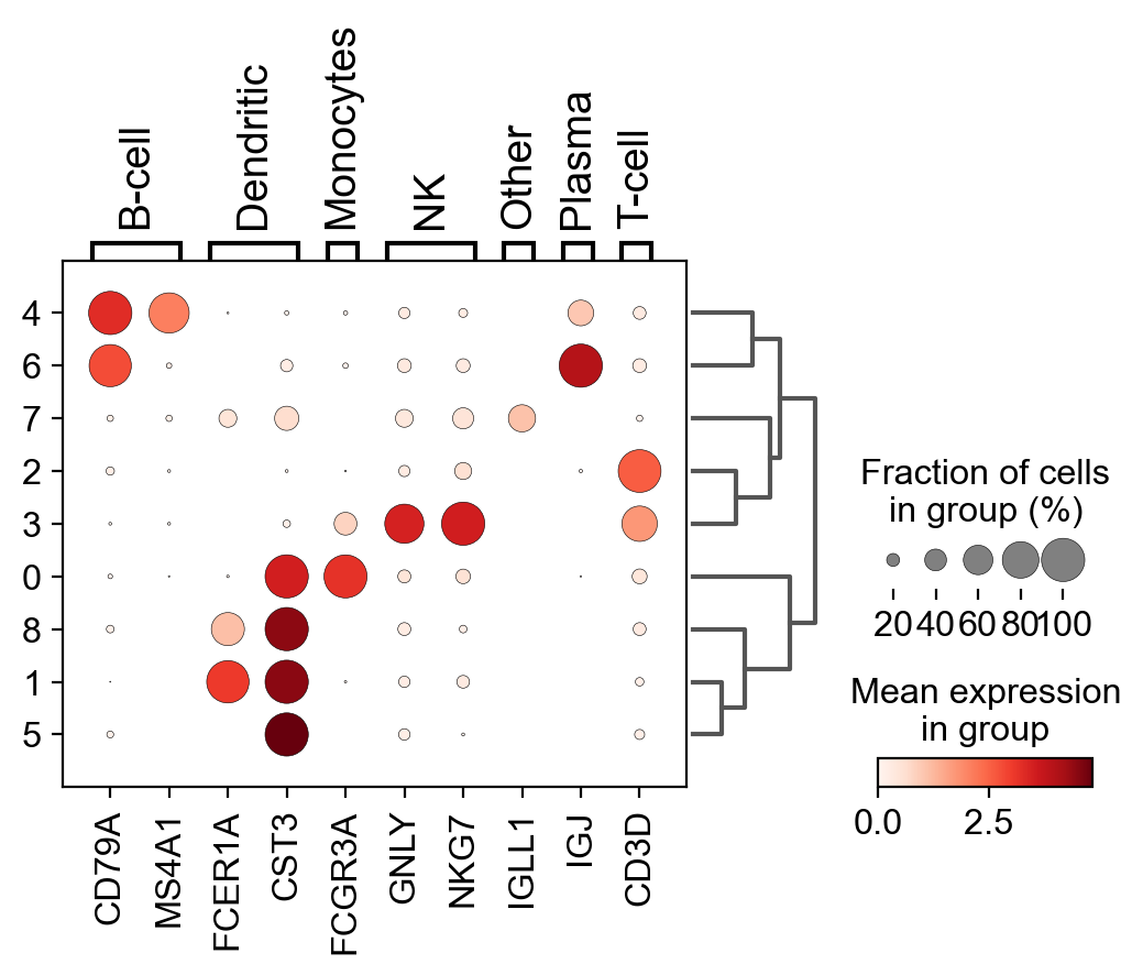
A quick way to check the expression of these genes per cluster is to using a dotplot. This type of plot summarizes two types of information: the color represents the mean expression within each of the categories (in this case in each cluster) and the dot size indicates the fraction of cells in the categories expressing a gene.
Also, it is also useful to add a dendrogram to the graph to bring together similar clusters. The hierarchical clustering is computed automatically using the correlation of the PCA components between the clusters.
Core plotting functions — Scanpy documentation
横着看:就是每个cluster
纵着看:就是每个基因;
点的大小,代表,这个类:有多少了比例的细胞表达了这个基因?
点的颜色,代表,这些表达该基因的细胞,平均表达量是多少?
标签:
python


【推荐】国内首个AI IDE,深度理解中文开发场景,立即下载体验Trae
【推荐】编程新体验,更懂你的AI,立即体验豆包MarsCode编程助手
【推荐】抖音旗下AI助手豆包,你的智能百科全书,全免费不限次数
【推荐】轻量又高性能的 SSH 工具 IShell:AI 加持,快人一步
· TypeScript + Deepseek 打造卜卦网站:技术与玄学的结合
· Manus的开源复刻OpenManus初探
· AI 智能体引爆开源社区「GitHub 热点速览」
· 三行代码完成国际化适配,妙~啊~
· .NET Core 中如何实现缓存的预热?