
Scatter plot with histograms
Scatter plot with histograms
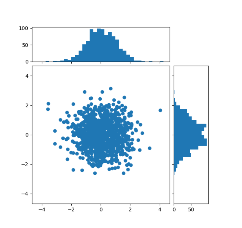
说白了就是搞三个subplot
Start with a square Figure.
fig = plt.figure(figsize=(6, 6))
Add a gridspec with two rows and two columns and a ratio of 1 to 4 between
the size of the marginal axes and the main axes in both directions.
Also adjust the subplot parameters for a square plot.
gs = fig.add_gridspec(2, 2, width_ratios=(4, 1), height_ratios=(1, 4), left=0.1, right=0.9, bottom=0.1, top=0.9, wspace=0.05, hspace=0.05)
Create the Axes.
ax = fig.add_subplot(gs[1, 0]) ax_histx = fig.add_subplot(gs[0, 0], sharex=ax) ax_histy = fig.add_subplot(gs[1, 1], sharey=ax)
Draw the scatter plot and marginals.
scatter_hist(x, y, ax, ax_histx, ax_histy)


【推荐】国内首个AI IDE,深度理解中文开发场景,立即下载体验Trae
【推荐】编程新体验,更懂你的AI,立即体验豆包MarsCode编程助手
【推荐】抖音旗下AI助手豆包,你的智能百科全书,全免费不限次数
【推荐】轻量又高性能的 SSH 工具 IShell:AI 加持,快人一步
· TypeScript + Deepseek 打造卜卦网站:技术与玄学的结合
· Manus的开源复刻OpenManus初探
· AI 智能体引爆开源社区「GitHub 热点速览」
· 三行代码完成国际化适配,妙~啊~
· .NET Core 中如何实现缓存的预热?