绘图笔记
# import matplotlib.pyplot as plt
plt.rcParams['font.sans-serif']=['SimHei'] #用来正常显示中文标签
plt.rcParams['axes.unicode_minus']=False #用来正常显示负号
# jupyer下正常显式图形
%matplotlib inline
Matplotlib简单例子
import matplotlib.pyplot as plt
# plt.plot([1,2,3,5]) # 默认的绘制的是纵坐标,默认的横坐标是自然数
plt.plot([1,2,3,4],[1,2,3,5]) # 如果咱们自定义的话,第一参数是横坐标,第二个参数是纵坐标
plt.ylabel('y值')
plt.xlabel('x值')
plt.show()
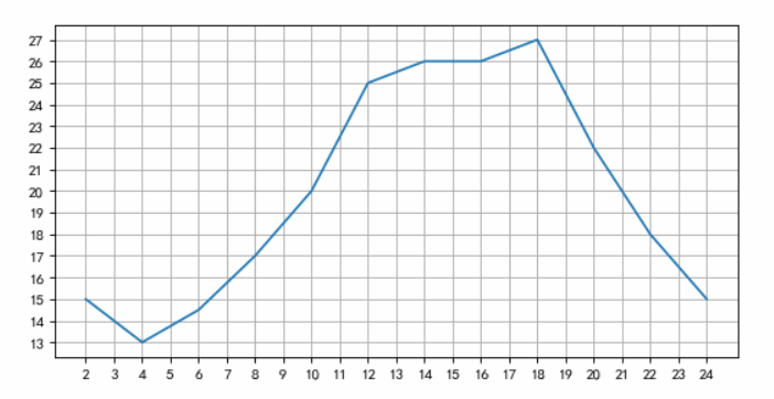
from matplotlib import pyplot as plt
x = range(2,26,2)
y = [15,13,14.5,17,20,25,26,26,27,22,18,15]
#设置图片大小
plt.figure(figsize=(8,4),dpi=80)
plt.xticks(range(2,25))
plt.yticks(range(min(y),max(y)+1))
#绘图
plt.grid()
plt.plot(x,y)
运行结果: [<matplotlib.lines.Line2D at 0x28e600dba90>]
pyplot的绘图区域
import matplotlib.pyplot as plt
import numpy as np
def f(t):
    return np.exp(-t) * np.cos(2*np.cos(2*np.pi*t))
a = np.arange(0.0,5.0,0.02)
plt.subplot(211)
plt.plot(a,f(a))
plt.subplot(2,1,2)
plt.plot(a,np.cos(2*np.pi*a),'r--')
plt.show()

确定坐标范围
%matplotlib inline
import numpy as np
import matplotlib.pyplot as plt
x = np.arange(-5.0, 5.0, 0.02)
y1 = np.sin(x)
#plt.figure(1)
plt.subplot(211)
plt.xlim(-2.5, 2.5)
#设置y轴范围
plt.ylim(-1, 1)
plt.plot(x, y1)
plt.subplot(212)
#设置x轴范围
#plt.xlim(-2.5, 2.5)
#设置y轴范围
#plt.ylim(-1, 1)
plt.axis([-2.5,5,-1,1])
plt.plot(x, y1)

pyplot的plot()函数
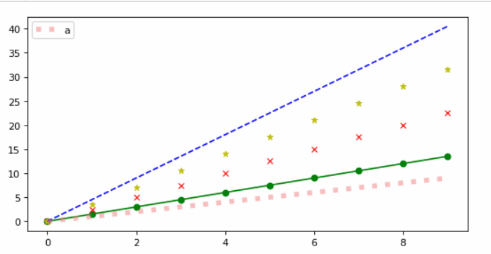
 1 from matplotlib import font_manager
 2 #my_font = font_manager.FontProperties(fname="C:\Windows\Fonts\STKAITI.TTF")
 3 import matplotlib.pyplot as plt
 4 import numpy as np
 5 plt.figure(figsize=(8,4),dpi=80)
 6 import matplotlib.pyplot as plt
 7 import numpy as np
 8 a = np.arange(10)
 9 plt.plot(a,a*1.5,'go-',a,a*2.5,'rx',a,a*3.5,'y*',a,a*4.5,'b--')
10 plt.plot(a,a,label="a",color="#F08080",linestyle=":",linewidth=5,alpha=0.5)
11 plt.legend()
12 plt.show()
pyplot的文本显示
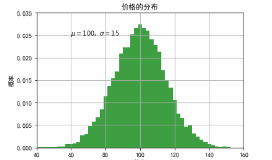
 1 import numpy as np
 2 import matplotlib.pyplot as plt
 3 mu, sigma = 100, 15
 4 x = mu + sigma * np.random.randn(10000)
 5 # 数据的直方图
 6 plt.hist(x, 50, normed=1, facecolor='g', alpha=0.75)
 7 plt.xlabel('价格')
 8 plt.ylabel('概率')
 9 #添加标题
10 plt.title('价格的分布')
11 #添加文字
12 plt.text(60, .025, r'$\mu=100,\ \sigma=15$')
13 plt.axis([40, 160, 0, 0.03])
14 plt.grid(True)
15 plt.show()
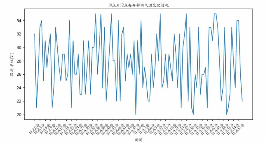
# coding=utf-8
from matplotlib import pyplot as plt
import random
import matplotlib
from matplotlib import font_manager

#另外一种设置字体的方式
my_font = font_manager.FontProperties(fname="C:\Windows\Fonts\STKAITI.TTF",size=10)

x = range(0,120)
y = [random.randint(20,35) for i in range(120)]

plt.figure(figsize=(10,5),dpi=80)

plt.plot(x,y)

#调整x轴的刻度
_xtick_labels = ["10点{}分".format(i) for i in range(60)]
_xtick_labels += ["11点{}分".format(i) for i in range(60)]
#取步长,数字和字符串一一对应,数据的长度一样
plt.xticks(list(x)[::3],_xtick_labels[::3],rotation=45,fontproperties=my_font) #rotaion旋转的度数

#添加描述信息
plt.xlabel("时间",fontproperties=my_font)
plt.ylabel("温度 单位(℃)",fontproperties=my_font)
plt.title("10点到12点每分钟的气温变化情况",fontproperties=my_font)

plt.show()
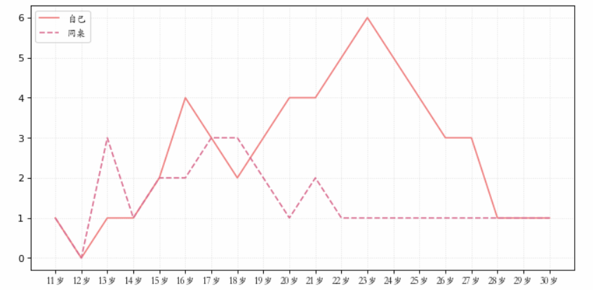
from matplotlib import pyplot as plt
from matplotlib import font_manager

my_font = font_manager.FontProperties(fname="C:\Windows\Fonts\STKAITI.TTF")

y_1 = [1,0,1,1,2,4,3,2,3,4,4,5,6,5,4,3,3,1,1,1]
y_2 = [1,0,3,1,2,2,3,3,2,1 ,2,1,1,1,1,1,1,1,1,1]

x = range(11,31)

#设置图形大小
plt.figure(figsize=(10,5),dpi=80)

plt.plot(x,y_1,label="自己",color="#F08080")
plt.plot(x,y_2,label="同桌",color="#DB7093",linestyle="--")

#设置x轴刻度
_xtick_labels = ["{}岁".format(i) for i in x]
plt.xticks(x,_xtick_labels,fontproperties=my_font)
# plt.yticks(range(0,9))

#绘制网格
plt.grid(alpha=0.4,linestyle=':')

#添加图例
plt.legend(prop=my_font,loc="upper left")

#展示
plt.show()
散点图
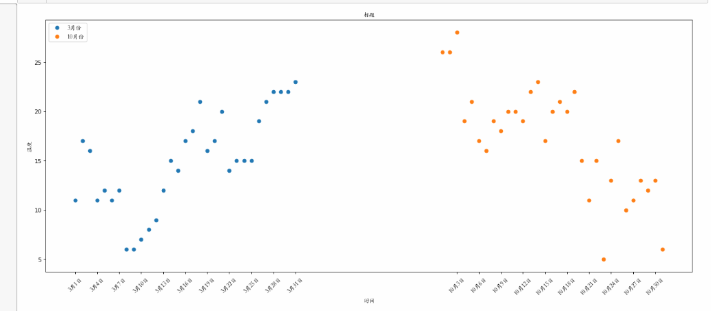
from matplotlib import pyplot as plt
from matplotlib import font_manager

my_font = font_manager.FontProperties(fname="C:\Windows\Fonts\STKAITI.TTF")
y_3 = [11,17,16,11,12,11,12,6,6,7,8,9,12,15,14,17,18,21,16,17,20,14,15,15,15,19,21,22,22,22,23]
y_10 = [26,26,28,19,21,17,16,19,18,20,20,19,22,23,17,20,21,20,22,15,11,15,5,13,17,10,11,13,12,13,6]

x_3 = range(1,32)
x_10 = range(51,82)

#设置图形大小
plt.figure(figsize=(20,8),dpi=80)

#使用scatter方法绘制散点图,和之前绘制折线图的唯一区别
plt.scatter(x_3,y_3,label="3月份")
plt.scatter(x_10,y_10,label="10月份")

#调整x轴的刻度
_x = list(x_3)+list(x_10)
_xtick_labels = ["3月{}日".format(i) for i in x_3]
_xtick_labels += ["10月{}日".format(i-50) for i in x_10]
plt.xticks(_x[::3],_xtick_labels[::3],fontproperties=my_font,rotation=45)

#添加图例
plt.legend(loc="upper left",prop=my_font)

#添加描述信息
plt.xlabel("时间",fontproperties=my_font)
plt.ylabel("温度",fontproperties=my_font)
plt.title("标题",fontproperties=my_font)
#展示
plt.show()
柱状图
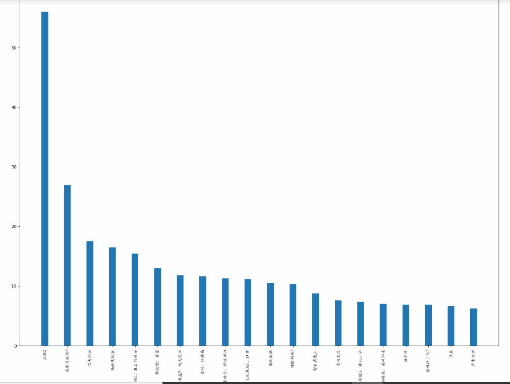
from matplotlib import pyplot as plt
from matplotlib import font_manager
my_font = font_manager.FontProperties(fname="C:\Windows\Fonts\STKAITI.TTF")


a = ["战狼2","速度与激情8","功夫瑜伽","西游伏妖篇","变形金刚5:最后的骑士","摔跤吧!爸爸","加勒比海盗5:死无对证","金刚:骷髅岛","极限特工:终极回归","生化危机6:终章","乘风破浪","神偷奶爸3","智取威虎山","大闹天竺","金刚狼3:殊死一战","蜘蛛侠:英雄归来","悟空传","银河护卫队2","情圣","新木乃伊",]

b=[56.01,26.94,17.53,16.49,15.45,12.96,11.8,11.61,11.28,11.12,10.49,10.3,8.75,7.55,7.32,6.99,6.88,6.86,6.58,6.23]


#设置图形大小
plt.figure(figsize=(20,15),dpi=80)
#绘制条形图
plt.bar(range(len(a)),b,width=0.3)
#设置字符串到x轴
plt.xticks(range(len(a)),a,fontproperties=my_font,rotation=90)

plt.savefig("./movie.png")

plt.show()
#绘制横着的条形图
from matplotlib import pyplot as plt
from matplotlib import font_manager
my_font = font_manager.FontProperties(fname="C:\Windows\Fonts\STKAITI.TTF")


a = ["战狼2","速度与激情8","功夫瑜伽","西游伏妖篇","变形金刚5:最后的骑士","摔跤吧!爸爸","加勒比海盗5:死无对证","金刚:骷髅岛","极限特工:终极回归","生化危机6:终章","乘风破浪","神偷奶爸3","智取威虎山","大闹天竺","金刚狼3:殊死一战","蜘蛛侠:英雄归来","悟空传","银河护卫队2","情圣","新木乃伊",]

b=[56.01,26.94,17.53,16.49,15.45,12.96,11.8,11.61,11.28,11.12,10.49,10.3,8.75,7.55,7.32,6.99,6.88,6.86,6.58,6.23]


#设置图形大小
plt.figure(figsize=(20,8),dpi=80)
#绘制条形图
plt.barh(range(len(a)),b,height=0.3,color="orange")
#设置字符串到x轴
plt.yticks(range(len(a)),a,fontproperties=my_font)

plt.grid(alpha=0.3)
# plt.savefig("./movie.png")

plt.show()

# coding=utf-8
from matplotlib import pyplot as plt
from matplotlib import font_manager
my_font = font_manager.FontProperties(fname="C:\Windows\Fonts\STKAITI.TTF")


a = ["猩球崛起3:终极之战","敦刻尔克","蜘蛛侠:英雄归来","战狼2"]
b_16 = [15746,312,4497,319]
b_15 = [12357,156,2045,168]
b_14 = [2358,399,2358,362]

bar_width = 0.2

x_14 = list(range(len(a)))
x_15 =  [i+bar_width for i in x_14]
x_16 = [i+bar_width*2 for i in x_14]

#设置图形大小
plt.figure(figsize=(20,8),dpi=80)

plt.bar(range(len(a)),b_14,width=bar_width,label="9月14日")
plt.bar(x_15,b_15,width=bar_width,label="9月15日")
plt.bar(x_16,b_16,width=bar_width,label="9月16日")

#设置图例
plt.legend(prop=my_font)

#设置x轴的刻度
plt.xticks(x_15,a,fontproperties=my_font)

plt.show()

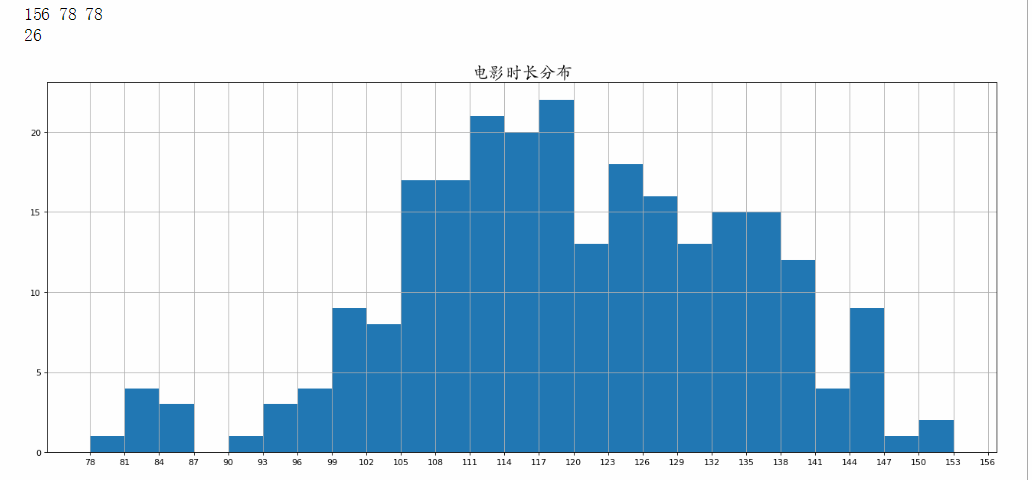
# coding=utf-8
from matplotlib import pyplot as plt
from matplotlib import font_manager
my_font = font_manager.FontProperties(fname="C:\Windows\Fonts\STKAITI.TTF",size=20)
a=[131,  98, 125, 131, 124, 139, 131, 117, 128, 108, 135, 138, 131, 102,
107, 114, 119, 128, 121, 142, 127, 130, 124, 101, 110, 116, 117, 110, 128, 128,
115,  99, 136, 126, 134,  95, 138, 117, 111,78, 132, 124, 113, 150, 110, 117,
86,  95, 144, 105, 126, 130,126, 130, 126, 116, 123, 106, 112, 138, 123,  86, 101,
  99, 136,123, 117, 119, 105, 137, 123, 128, 125, 104, 109, 134, 125, 127,105, 120,
 107, 129, 116, 108, 132, 103, 136, 118, 102, 120, 114,105, 115, 132, 145, 119, 121,
 112, 139, 125, 138, 109, 132, 134,156, 106, 117, 127, 144, 139, 139, 119, 140,  83,
110, 102,123,107, 143, 115, 136, 118, 139, 123, 112, 118, 125, 109, 119, 133,112, 114,
122, 109, 106, 123, 116, 131, 127, 115, 118, 112, 135,115, 146, 137, 116, 103, 144,  83,
123, 111, 110, 111, 100, 154,136, 100, 118, 119, 133, 134, 106, 129, 126, 110, 111, 109,
141,120, 117, 106, 149, 122, 122, 110, 118, 127, 121, 114, 125, 126,114, 140, 103, 130,
141, 117, 106, 114, 121, 114, 133, 137,  92,121, 112, 146,  97, 137, 105,  98, 117, 112,
 81,  97, 139, 113,134, 106, 144, 110, 137, 137, 111, 104, 117, 100, 111, 101, 110,105, 129,
 137, 112, 120, 113, 133, 112,  83,  94, 146, 133, 101,131, 116, 111,  84, 137, 115, 122, 106, 144, 109, 123, 116, 111,111, 133, 150]

#计算组数
d = 3  #组距
num_bins = (max(a)-min(a))//d
print(max(a),min(a),max(a)-min(a))
print(num_bins)


#设置图形的大小
plt.figure(figsize=(20,8),dpi=80)

# normed=False意味着纵坐标为频数
# normed=True意味着纵坐标为频率
#plt.hist(a,num_bins,normed=True)
plt.hist(a,[min(a)+i*d for i in range(num_bins)])


#设置x轴的刻度
plt.xticks(range(min(a),max(a)+d,d))
plt.title("电影时长分布",fontproperties=my_font)
plt.grid()

plt.show()
# coding=utf-8
from matplotlib import pyplot as plt
from matplotlib import font_manager

interval = [0,5,10,15,20,25,30,35,40,45,60,90]
width = [5,5,5,5,5,5,5,5,5,15,30,60]
quantity = [836,2737,3723,3926,3596,1438,3273,642,824,613,215,57]


print(len(interval),len(width),len(quantity))

#设置图形大小
plt.figure(figsize=(20,8),dpi=80)


plt.bar(range(12),quantity,width=1)

#设置x轴的刻度
_x = [i-0.5 for i in range(13)]
_xtick_labels =  interval+[150]
plt.xticks(_x,_xtick_labels)

plt.grid(alpha=0.4)
plt.show()

print(_x)
print(_xtick_labels)

# coding=utf-8
from matplotlib import pyplot as plt
from matplotlib import font_manager

interval = [0,5,10,15,20,25,30,35,40,45,60,90]
width = [5,5,5,5,5,5,5,5,5,15,30,60]
quantity = [836,2737,3723,3926,3596,1438,3273,642,824,613,215,57]


print(len(interval),len(width),len(quantity))

#设置图形大小
plt.figure(figsize=(20,8),dpi=80)


plt.bar(interval,quantity,width=width)

#设置x轴的刻度

temp_d = [5]+ width[:-1]
print(temp_d)
_x = [i-temp_d[interval.index(i)]*0.5 for i in interval]
print(_x)
plt.xticks(_x,interval)

plt.grid(alpha=0.4)
plt.show()
print(interval)

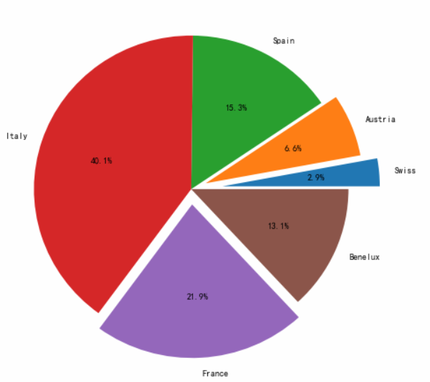
饼状图

import matplotlib.pyplot as plt
plt.figure(figsize=(8,8));
x = [4, 9, 21, 55, 30, 18]
labels = ['Swiss', 'Austria', 'Spain', 'Italy', 'France',
'Benelux']
#将某部分爆炸出来, 使用括号,将第一块分割出来,数值的大小是分割出来的与其他两块的间隙
explode = [0.2, 0.1, 0, 0, 0.1, 0]
plt.pie(x,explode=explode,labels=labels,labeldistance = 1.1,autopct = '%1.1f%%',shadow = False)
#labeldistance,文本的位置离圆心有多远,1.1指1.1倍半径的位置
#autopct,圆里面的文本格式,%1.1f%%表示小数有一位的浮点数
#shadow,饼是否有阴影

plt.show()