AvaloniaUI(三、样式篇)
avalonia的样式和wpf有不小的区别,它与css样式表很像,wpf的样式是使用定义的key 或者 类型 来使用样式的,avalonia是与css一样 是使用选择器来使用样式的,选择器有很多种,几乎与css的选择器一样,有类选择器,Id选择器,伪类选择器等,几乎常用的就那么几种,虽然他的使用方法与css类似,但是写法还是与wpf很相似了
类型选择器

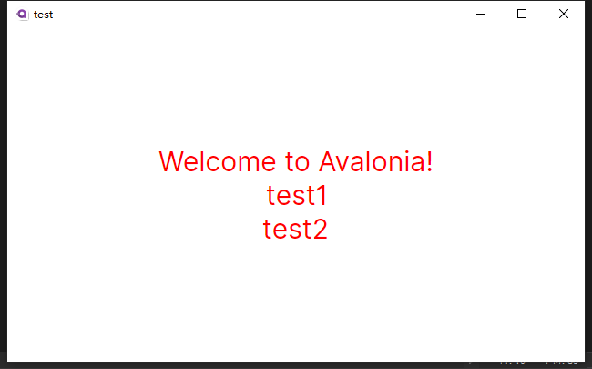
<UserControl xmlns="https://github.com/avaloniaui"
             xmlns:x="http://schemas.microsoft.com/winfx/2006/xaml"
             xmlns:d="http://schemas.microsoft.com/expression/blend/2008"
             xmlns:mc="http://schemas.openxmlformats.org/markup-compatibility/2006"
             xmlns:vm="clr-namespace:test.ViewModels"
             mc:Ignorable="d" d:DesignWidth="800" d:DesignHeight="450"
             x:Class="test.Views.MainView"
             x:DataType="vm:MainViewModel">
  <Design.DataContext>
    <!-- This only sets the DataContext for the previewer in an IDE,
         to set the actual DataContext for runtime, set the DataContext property in code (look at App.axaml.cs) -->
    <vm:MainViewModel />
  </Design.DataContext>
    <UserControl.Styles>
        <Style Selector="TextBlock">
            <Setter Property="Foreground" Value="Red"></Setter>
            <Setter Property="FontSize" Value="30"></Setter>
            <Setter Property="HorizontalAlignment" Value="Center"></Setter>
            <Setter Property="VerticalAlignment" Value="Center"></Setter>
        </Style>
    </UserControl.Styles>
    <StackPanel VerticalAlignment="Center">
        <TextBlock Text="{Binding Greeting}"/>
        <TextBlock>test1</TextBlock>
        <TextBlock>test2</TextBlock>
    </StackPanel>


</UserControl>
从上面的style的写法上看的出来,avalonia的样式只有个Selector 字段用来表明选择器的类型,与wpf不同,不需要写明 TargetType 上面的是类型选择器,Selector=“TextBlock” 表明所有的TextBlock都会应用这个样式
类选择器
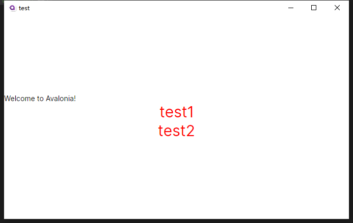
<UserControl xmlns="https://github.com/avaloniaui"
             xmlns:x="http://schemas.microsoft.com/winfx/2006/xaml"
             xmlns:d="http://schemas.microsoft.com/expression/blend/2008"
             xmlns:mc="http://schemas.openxmlformats.org/markup-compatibility/2006"
             xmlns:vm="clr-namespace:test.ViewModels"
             mc:Ignorable="d" d:DesignWidth="800" d:DesignHeight="450"
             x:Class="test.Views.MainView"
             x:DataType="vm:MainViewModel">
  <Design.DataContext>
    <!-- This only sets the DataContext for the previewer in an IDE,
         to set the actual DataContext for runtime, set the DataContext property in code (look at App.axaml.cs) -->
    <vm:MainViewModel />
  </Design.DataContext>
    <UserControl.Styles>
        <Style Selector="TextBlock.test">
            <Setter Property="Foreground" Value="Red"></Setter>
            <Setter Property="FontSize" Value="30"></Setter>
            <Setter Property="HorizontalAlignment" Value="Center"></Setter>
            <Setter Property="VerticalAlignment" Value="Center"></Setter>
        </Style>
    </UserControl.Styles>
    <StackPanel VerticalAlignment="Center">
        <TextBlock Text="{Binding Greeting}"/>
        <TextBlock Classes="test">test1</TextBlock>
        <TextBlock Classes="test">test2</TextBlock>
    </StackPanel>


</UserControl>
类选择器只需要在Selector="TextBlock.test" 加.test 使用的时候 需要使用 Classes=“test” 来标识一下就可以了
Id选择器
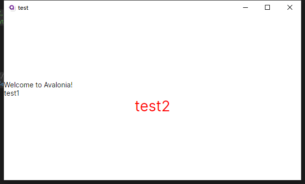
<UserControl xmlns="https://github.com/avaloniaui"
             xmlns:x="http://schemas.microsoft.com/winfx/2006/xaml"
             xmlns:d="http://schemas.microsoft.com/expression/blend/2008"
             xmlns:mc="http://schemas.openxmlformats.org/markup-compatibility/2006"
             xmlns:vm="clr-namespace:test.ViewModels"
             mc:Ignorable="d" d:DesignWidth="800" d:DesignHeight="450"
             x:Class="test.Views.MainView"
             x:DataType="vm:MainViewModel">
  <Design.DataContext>
    <!-- This only sets the DataContext for the previewer in an IDE,
         to set the actual DataContext for runtime, set the DataContext property in code (look at App.axaml.cs) -->
    <vm:MainViewModel />
  </Design.DataContext>
    <UserControl.Styles>
        <Style Selector="TextBlock#test2">
            <Setter Property="Foreground" Value="Red"></Setter>
            <Setter Property="FontSize" Value="30"></Setter>
            <Setter Property="HorizontalAlignment" Value="Center"></Setter>
            <Setter Property="VerticalAlignment" Value="Center"></Setter>
        </Style>
    </UserControl.Styles>
    <StackPanel VerticalAlignment="Center">
        <TextBlock Text="{Binding Greeting}"/>
        <TextBlock Classes="test">test1</TextBlock>
        <TextBlock x:Name="test2">test2</TextBlock>
    </StackPanel>


</UserControl>
与类选择器类似,只不过.需要改成# 就是id选择器了 Selector=“TextBlock#test2” 使用的时候就不能用Classes了,需要加上x:Name=“test2”,这个x:Name才是id
现在问题来了,wpf的样式可以直接重写模板样式,avalonia可不可以呢?答案是 当然可以,这个时候就需要加上targettype 的关键字了
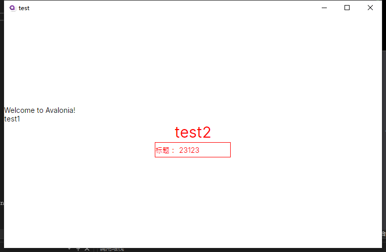
<UserControl xmlns="https://github.com/avaloniaui"
             xmlns:x="http://schemas.microsoft.com/winfx/2006/xaml"
             xmlns:d="http://schemas.microsoft.com/expression/blend/2008"
             xmlns:mc="http://schemas.openxmlformats.org/markup-compatibility/2006"
             xmlns:vm="clr-namespace:test.ViewModels"
             mc:Ignorable="d" d:DesignWidth="800" d:DesignHeight="450"
             x:Class="test.Views.MainView"
             x:DataType="vm:MainViewModel">
    <Design.DataContext>
        <!-- This only sets the DataContext for the previewer in an IDE,
         to set the actual DataContext for runtime, set the DataContext property in code (look at App.axaml.cs) -->
        <vm:MainViewModel />
    </Design.DataContext>
    <UserControl.Styles>
        <Style Selector="TextBlock#test2">
            <Setter Property="Foreground" Value="Red"></Setter>
            <Setter Property="FontSize" Value="30"></Setter>
            <Setter Property="HorizontalAlignment" Value="Center"></Setter>
            <Setter Property="VerticalAlignment" Value="Center"></Setter>

        </Style>

        <Style Selector="TextBox#test3">
            <Setter Property="BorderBrush" Value="Red"></Setter>
            <Setter Property="BorderThickness" Value="1"></Setter>
            <Setter Property="Foreground" Value="Red"></Setter>
            <Setter Property="Width" Value="150"></Setter>
            <Setter Property="Height" Value="30"></Setter>
            <Setter Property="Tag" Value="test"></Setter>
            <Setter Property="Text" Value="23123"></Setter>
            <Setter Property="VerticalAlignment" Value="Center"></Setter>
            <Setter Property="Template">
                <Setter.Value>
                    <ControlTemplate TargetType="{x:Type TextBox}">
                        <Border BorderBrush="{TemplateBinding BorderBrush}"
                                Width="{TemplateBinding Width}"
                                Height="{TemplateBinding Height}"
                                BorderThickness="{TemplateBinding BorderThickness}">

                            <Grid>
                                <Grid.ColumnDefinitions>
                                    <ColumnDefinition Width="auto"></ColumnDefinition>
                                    <ColumnDefinition></ColumnDefinition>
                                </Grid.ColumnDefinitions>
                                <TextBlock Grid.Column="0" Text="{TemplateBinding Tag}"
                                           VerticalAlignment="Center"
                                           HorizontalAlignment="Center"></TextBlock>
                                <Grid Grid.Column="1" Margin="5,0,0,0">
                                    <TextPresenter  Name="PART_TextPresenter"

                                                   HorizontalAlignment="Left"
                                                   VerticalAlignment="{TemplateBinding VerticalAlignment}"
                                       CaretBrush="{TemplateBinding CaretBrush}"
                                       CaretIndex="{TemplateBinding CaretIndex}"
                                       LineHeight="{TemplateBinding LineHeight}"
                                       LetterSpacing="{TemplateBinding LetterSpacing}"
                                       PasswordChar="{TemplateBinding PasswordChar}"
                                       RevealPassword="{TemplateBinding RevealPassword}"
                                       SelectionBrush="{TemplateBinding SelectionBrush}"
                                       SelectionEnd="{TemplateBinding SelectionEnd}"
                                       SelectionForegroundBrush="{TemplateBinding SelectionForegroundBrush}"
                                       SelectionStart="{TemplateBinding SelectionStart}"
                                       Text="{TemplateBinding Text,Mode=TwoWay}"
                                       TextAlignment="{TemplateBinding TextAlignment}"
                                       TextWrapping="{TemplateBinding TextWrapping}" />
                                </Grid>
                            </Grid>
                        </Border>
                    </ControlTemplate>
                </Setter.Value>
            </Setter>
        </Style>

        <Style Selector="TextBox#test3:pointerover:focus">
            <Setter Property="BorderBrush" Value="Red"></Setter>
            <Setter Property="BorderThickness" Value="1"></Setter>
            <Setter Property="Foreground" Value="Red"></Setter>

        </Style>

    </UserControl.Styles>
    <StackPanel VerticalAlignment="Center">
        <TextBlock Text="{Binding Greeting}"/>
        <TextBlock Classes="test">test1</TextBlock>
        <TextBlock x:Name="test2">test2</TextBlock>
        <TextBox x:Name="test3"></TextBox>
    </StackPanel>


</UserControl>
上面就重写了一个textbox文本框的样式,并加上了 前面的标题
今天就写到这里吧,我的鼠标老跟我捣乱,没心情了。。。。。
上次忘了写样式表如何使用
只需要在使用的元素中的Style 标签中使用 <StyleInclude></StyleInclude>将需要使用的样式文件引入即可:
<StyleInclude Source="avares://项目名称/样式文件路径"></StyleInclude>
<Application.Styles>
        <FluentTheme />

        <StyleInclude Source="avares://omc64_aval/Styles/TextBlockStyles.axaml"></StyleInclude>
        <StyleInclude Source="avares://omc64_aval/Styles/ButtonStyles.axaml"></StyleInclude>

</Application.Styles>


【推荐】国内首个AI IDE,深度理解中文开发场景,立即下载体验Trae
【推荐】编程新体验,更懂你的AI,立即体验豆包MarsCode编程助手
【推荐】抖音旗下AI助手豆包,你的智能百科全书,全免费不限次数
【推荐】轻量又高性能的 SSH 工具 IShell:AI 加持,快人一步
· 被坑几百块钱后,我竟然真的恢复了删除的微信聊天记录!
· 没有Manus邀请码?试试免邀请码的MGX或者开源的OpenManus吧
· 【自荐】一款简洁、开源的在线白板工具 Drawnix
· 园子的第一款AI主题卫衣上架——"HELLO! HOW CAN I ASSIST YOU TODAY
· Docker 太简单,K8s 太复杂?w7panel 让容器管理更轻松!