移动web——bootstrap媒体对象
基本模板
1、这些组件都具有在文本内容的左或右侧对齐的图片(就像博客评论或 Twitter 消息等)
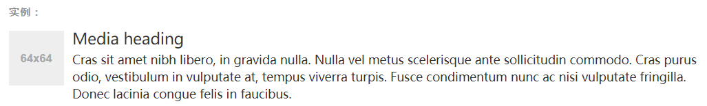
<div class="media">
  <div class="media-left">
    <a href="#">
      <img class="media-object" src="..." alt="...">
    </a>
  </div>
  <div class="media-body">
    <h4 class="media-heading">Media heading</h4>
    ...
  </div>
</div>
基本使用
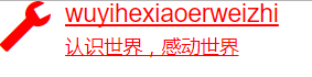
<!DOCTYPE html>
<html lang="zh-CN">
<head>
    <meta charset="utf-8">
    <meta http-equiv="X-UA-Compatible" content="IE=edge">
    <meta name="viewport" content="width=device-width, initial-scale=1">
    <!-- 上述3个meta标签*必须*放在最前面,任何其他内容都*必须*跟随其后! -->
    <title>Bootstrap 101 Template</title>

    <!-- Bootstrap -->
    <link href="css/bootstrap.min.css" rel="stylesheet">
    <style>
        .zhi:hover {
            color: red;
        }

        .glyphicon.glyphicon-wrench {
            font-size: 37px;
        }
    </style>
    <!-- HTML5 shim and Respond.js for IE8 support of HTML5 elements and media queries -->
    <!-- WARNING: Respond.js doesn't work if you view the page via file:// -->
    <!--[if lt IE 9]>
    <script src="https://cdn.bootcss.com/html5shiv/3.7.3/html5shiv.min.js"></script>
    <script src="https://cdn.bootcss.com/respond.js/1.4.2/respond.min.js"></script>
    <![endif]-->
</head>
<body>
<a class="media zhi">
    <div class="media-left ">
        <!--<a href="#">-->
        <!--<img class="media-object" src="" alt="...">-->
        <!--</a>-->
        <span class="glyphicon glyphicon-wrench"></span>
    </div>
    <div class="media-body">
        <h4 class="media-heading">wuyihexiaoerweizhi</h4>
        认识世界,感动世界
    </div>
</a>

<!-- jQuery (necessary for Bootstrap's JavaScript plugins) -->
<script src="js/jquery.min.js"></script>
<!-- Include all compiled plugins (below), or include individual files as needed -->
<script src="js/bootstrap.min.js"></script>
</body>
</html>