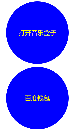
html5——3D案例(音乐盒子、百度钱包)
1、音乐盒子:触碰盒子,盖子会打开
2、百度钱包:触碰钱包,钱包,会180度旋转
<!DOCTYPE html>
<html lang="en">
<head>
    <meta charset="UTF-8">
    <title>Title</title>
    <style>
        * {
            padding: 0;
            margin: 0;
        }

        body {
            height: 2000px;
        }

        /*音乐盒*/
        .music {
            width: 200px;
            height: 200px;
            position: relative;
            margin: 10px 0 0 200px;
        }

        .music::before, .music::after {
            content: "音乐盒";
            width: 100%;
            height: 100%;
            font: 400 20px/200px "Microsoft YaHei";
            color: yellow;
            text-align: center;
            border-radius: 50% 50% 50% 50%;
            position: absolute;
            top: 0;
            left: 0;
            background-color: #cccccc;
        }

        .music::after {
            content: "打开音乐盒子";
            background-color: blue;
            transform-origin: left;
            transition: all 1s;
        }

        .music:hover.music::after {
            transform: rotateY(-180deg);
        }

        /*百度钱包*/
        .money {
            width: 200px;
            height: 200px;
            position: relative;
            margin: 10px 0 0 200px;
        }

        .money::before, .money::after {
            content: "基本没用";
            width: 100%;
            height: 100%;
            font: 400 20px/200px "Microsoft YaHei";
            color: yellow;
            text-align: center;
            border-radius: 50% 50% 50% 50%;
            position: absolute;
            top: 0;
            left: 0;
            background-color: #cccccc;
            transition: all 1s;
            /*盒子背面不可见*/
            backface-visibility: hidden;
        }

        .money::before {
            transform: rotateY(-180deg);
        }

        .money::after {
            content: "百度钱包";
            background-color: blue;
            /*transform: translateZ(400px);*/
        }

        .money:hover.money::before {
            transform: rotateY(-360deg);
        }

        .money:hover.money::after {
            transform: rotateY(-180deg);
        }
    </style>
</head>
<body>
<!--音乐盒-->
<div class="music"></div>
<!--百度钱包-->
<div class="money"></div>
</body>
</html>