margin/padding的值为百分比时,以其父元素的宽度来计算
概念:当设置padding-bottom的值为75%时,该值为父级元素宽度的75%,可以达到自适应的效果
应用:
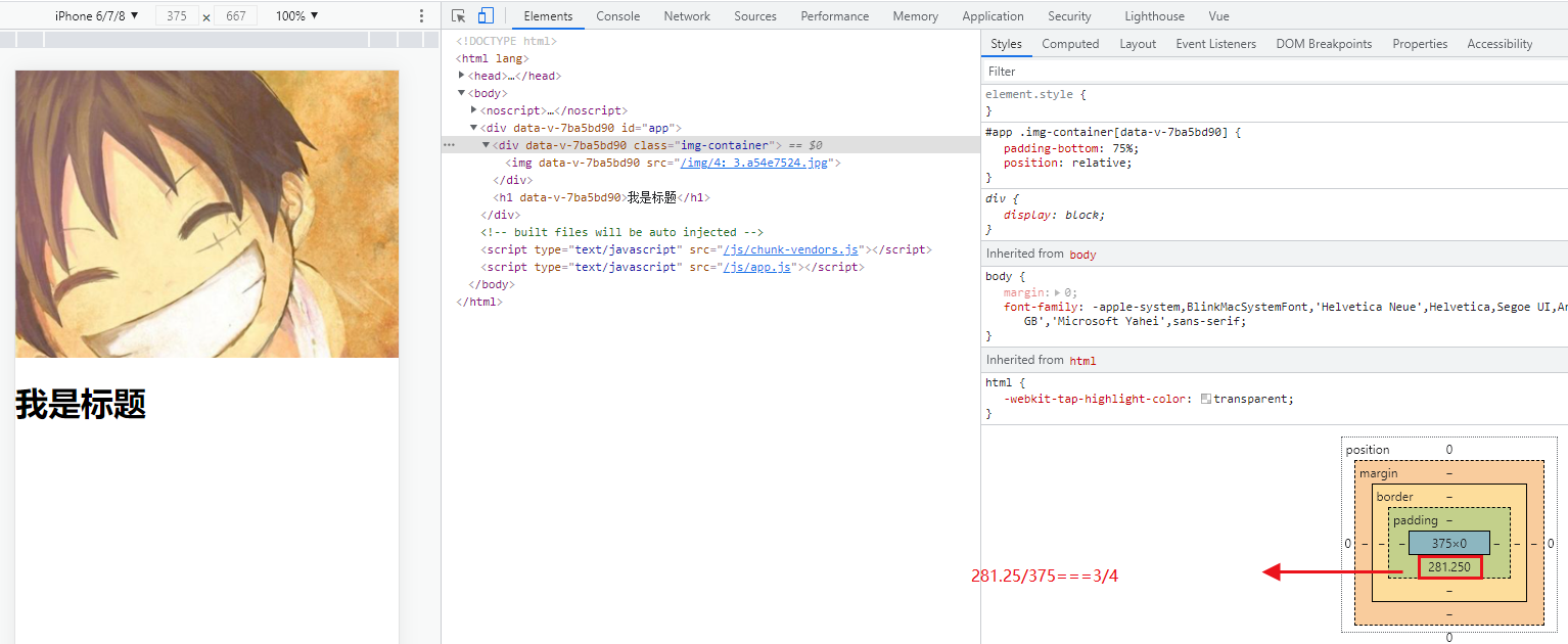
<template>
  <div id="app">
    <div class="img-container"><img src="./assets/images/4:3.jpg"></div>
    <h1>我是标题</h1>
  </div>
</template>
<style lang="less" scoped>
#app {
  .img-container {
    padding-bottom: 75%; // #app的宽度为100%,iPhone6时padding-bottom为281.25,iPhone6Plus时padding-bottom为310.5
    position: relative;
  }
  img {
    width: 100%;
    position: absolute;
  }
}
</style>
如果没有img-container容器:
<template>
  <div id="app">
    <img src="./assets/images/4:3.jpg">
    <h1>我是标题</h1>
  </div>
</template>
<style lang="less" scoped>
#app {
  img {
    width: 100%;
  }
}
</style>
此时刷新页面时,先加载出来h1标签再加载出来img,img再将h1标签挤下来页面会有一个闪动
用padding-bottom将图片的高度预留出来,再用定位将图片定位到预留的位置上。h1的位置就固定在img下面了,不会有闪动
这里图片的宽高比是4比3,所以预留父级宽度的75%

 浙公网安备 33010602011771号