css网格布局
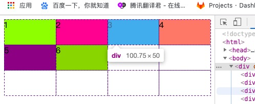
先来一段基本布局

<!doctype html>
<html>
<head>
<meta charset="utf-8">
<title>无标题文档</title>
    <style>
        .container {
            display: grid;
            grid-template-columns: 100px 100px 100px;// 三个100px分别是第一列、第二列、第三列div的宽度
            grid-template-rows: 50px 50px;// 第一个50px是第一行的高度,第二个50px是第二行的高度
        }
        .container>div:nth-of-type(1){background-color: greenyellow;}
        .container>div:nth-of-type(2){background-color: deeppink;}
        .container>div:nth-of-type(3){background-color: deepskyblue;}
        .container>div:nth-of-type(4){background-color: salmon;}
        .container>div:nth-of-type(5){background-color: purple;}
        .container>div:nth-of-type(6){background-color: yellowgreen;}
    </style>
</head>

<body>
    <div class="container">
        <div>1</div>
        <div>2</div>
        <div>3</div>
        <div>4</div>
        <div>5</div>
        <div>6</div>
    </div>
<script src="https://libs.baidu.com/jquery/2.1.4/jquery.min.js"></script>
<script>

</script>
</body>
</html>
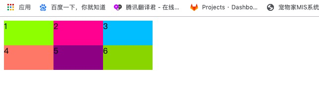
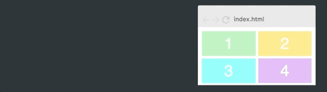
效果是这样的:
现在开始修改css语句:
grid-template-columns: 1fr 1fr 1fr;
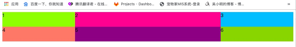
只改了这一行,效果如下,直接就是响应式了:

再稍作修改:
grid-template-columns: 1fr 2fr 1fr;
也就是说,fr控制宽度的比例。
repeat()函数
grid-template-columns: repeat(3,100px);
grid-template-rows: repeat(2,50px);
效果如下:
和grid-template-columns: 100px 100px 100px;grid-template-rows: 50px 50px;效果一样。
auto-fit
grid-template-columns: repeat(auto-fit,100px);
grid-template-rows: repeat(3,50px);
效果如下:
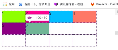
现在布局成了自适应数量,这里将宽度设置成了100px,则很大概率右边会有留白。
minmax()
grid-template-columns: repeat(auto-fit, minmax(100px, 1fr));
它会在100px的基础上,稍作添加,不留白。
minmax()定义的范围大于等于min,小于等于max,因此,现在每列的宽最少为100px,如果有多余的空间,会均匀的分配给每列。
在div里放入图片:
        <div><img src="./syz.jpg" /></div>
        <div><img src="./syz.jpg" /></div>
        <div><img src="./syz.jpg" /></div>
        <div><img src="./syz.jpg" /></div>
        <div><img src="./syz.jpg" /></div>
        <div><img src="./syz.jpg" /></div>
设置图片样式:
        .container>div>img{
            width: 100%;
            height: 100%;
            object-fit: cover;
        }
效果:


【推荐】国内首个AI IDE,深度理解中文开发场景,立即下载体验Trae
【推荐】编程新体验,更懂你的AI,立即体验豆包MarsCode编程助手
【推荐】抖音旗下AI助手豆包,你的智能百科全书,全免费不限次数
【推荐】轻量又高性能的 SSH 工具 IShell:AI 加持,快人一步
· 10年+ .NET Coder 心语,封装的思维:从隐藏、稳定开始理解其本质意义
· .NET Core 中如何实现缓存的预热?
· 从 HTTP 原因短语缺失研究 HTTP/2 和 HTTP/3 的设计差异
· AI与.NET技术实操系列:向量存储与相似性搜索在 .NET 中的实现
· 基于Microsoft.Extensions.AI核心库实现RAG应用
· 10年+ .NET Coder 心语 ── 封装的思维:从隐藏、稳定开始理解其本质意义
· 【设计模式】告别冗长if-else语句:使用策略模式优化代码结构
· 提示词工程——AI应用必不可少的技术
· 字符编码:从基础到乱码解决
· 地球OL攻略 —— 某应届生求职总结