【css】常用的几种水平垂直居中方式与盒子模型,面试经常问到!
div水平垂直居中
假设结构为此,2个div嵌套
<div class="box">
    <div class="content"></div>
</div>
实现方式1:
absolute绝对定位+margin位移实现
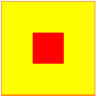
这种方式适用于内外2个div的宽高是已知时使用。外层使用相对定位,内层使用绝对定位50%,并使用位移宽高的一半使之居中
.box{
    background-color: yellow;
    width: 300px;
    height: 300px;
    position: relative;
    border: 1px solid red;
}
.content{
    background-color: red;
    width: 100px;
    height: 100px;
    position: absolute;
    top: 50%;
    left: 50%;
    margin: -50px 0 0 -50px;
}
实现方式2:
transform实现
这种方式,几乎和上一直一样。但是如果子div宽高不定时,也可以实现居中。比第一种好点。
.box{
    background-color: yellow;
    width: 300px;
    height: 300px;
    position: relative;
    border: 1px solid red;
}
.content{
    background-color: red;
    position: absolute;
    width: 100px;
    height: 100px;
    top: 50%;
    left: 50%;
    transform: translate(-50%,-50%);
}
实现方式3:
flex布局实现,使用justify-content和align-items实现
.box{
    background-color: yellow;
    width: 300px;
    height: 300px;
    display: flex;/*flex布局*/
    justify-content: center;/*水平居中*/
    align-items: center;/*垂直居中*/
    border: 1px solid red;
}
.content{
    background-color: red;
    width: 100px;
    height: 100px;
}
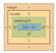
盒子模型
盒子模型由内容、内边距、边框、外边距组成。
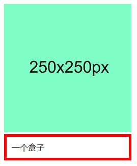
上方是一张图,下方是盒子模型
<img src="https://www.runoob.com/try/demo_source/250x250px.gif" width="250" height="250">
<div class="ex">一个盒子</div>
.ex{
    width: 220px;
    padding: 10px;
    border: 5px solid red;
    margin: 0;
}
这是盒子结构:
这是内容:
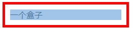
这是内边距:
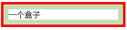
这是边框:
外边距为0:
博客园作者:herry菌朋友,看到这里,关注作者的公众号吧,不漏掉更新哦


