css-transition过渡动画写法
<!DOCTYPE html>
<html>
<head>
<meta charset="utf-8">
<title></title>
<!--
transition-property 对哪个属性做改变 all(全部)
transition-duration过渡时间端,分为毫秒/秒
transition-delay 延迟
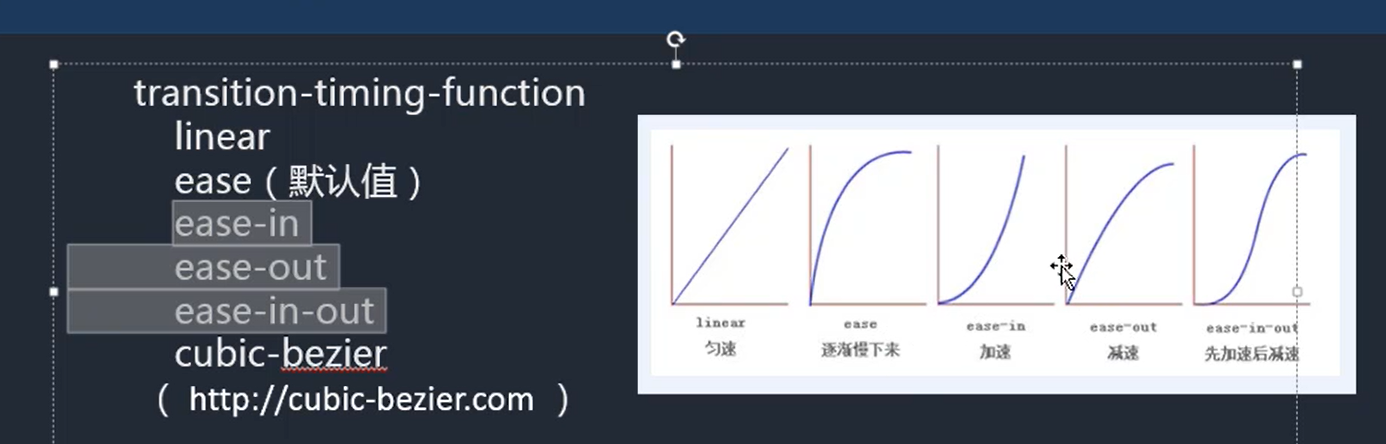
transition-timing-function: 曲线
linear(匀速)
ease(默认值)逐渐慢下来
cubic-bezier(0,1.98,1,-0.17) 网址copy:https://cubic-bezier.com/#0,1.98,1,-0.17
-->
<style type="text/css">
div{
width: 0px;
height: 100px;
border: 1px solid red;
margin-left: 100px;
/* transition-property: all;
transition-duration: 10s;
transition-delay: 0.1s;
transition-timing-function:cubic-bezier(0,1.98,1,-0.17); */
/* 综合写法 1:全部属性 2.过渡 3.延迟 4.速度曲线*/
transition: all 10s 0.1s ease;
}
div:hover{
width: 0;
height: 100px;
border: 1px solid blue;
}
</style>
</head>
<body>
<div></div>
</body>
</html>