

渐变线段流动效果CSS+SVG
第二次出现的线段还有些问题没有完善好,先上传代码作为备份吧!
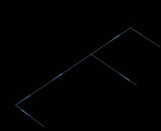
技术呈现:CSS实现线段的动画,SVG画出蓝色线段,
1 | offset-path:线段的路径; |
1 | offset-distance:动画; |
1 2 3 4 5 6 7 8 9 10 11 12 13 14 15 16 17 18 19 20 21 22 23 24 25 26 27 28 29 30 31 32 33 34 35 36 37 38 39 40 41 42 43 44 45 46 47 48 49 50 51 52 53 54 55 56 57 58 59 60 61 62 63 64 65 66 67 68 69 70 71 72 73 74 75 76 77 78 79 80 81 82 83 84 85 86 87 88 89 90 91 92 93 94 95 96 97 98 99 100 101 102 103 104 105 106 107 108 109 110 111 112 113 114 115 116 117 118 119 120 121 122 123 124 125 126 127 128 129 130 131 132 133 134 135 136 137 138 139 140 141 142 143 144 145 146 147 148 149 150 151 152 153 154 155 156 157 158 159 160 161 162 163 164 165 166 167 168 169 170 171 172 173 174 175 176 177 178 179 180 181 182 183 184 185 186 187 188 189 190 191 192 193 194 195 196 197 198 199 200 201 202 203 204 205 206 207 208 209 210 211 212 213 214 | <template> <div class="left"> <div class="login-mark"> <img src="../assets/img/loginmark.png" /> </div> <div class="line"></div> <div class="line01"></div> <div class="line02"></div> <div class="line03"></div> <div class="line04"></div> <div class="line05"></div> <svg width="100%" height="100%" version="1.1" xmlns="http://www.w3.org/2000/svg"> <path class="svgline" d="M175 595 L79 522 L470 260 L569 325" /> <path class="svgline" d="M335 350 L490 455 " /> </svg> <div class="logo"> <router-link class="blue" to="/login"> <img src="../assets/img/logo.png" /> </router-link> </div> </div></template><style scoped>.svgline { fill-opacity: 0; stroke-linecap: round; stroke-width: 2; stroke: rgba(94, 213, 254, 0.4);}.line { background: linear-gradient( to left, rgba(94, 214, 255, 1), rgba(94, 214, 255, 0) ); height: 2px; width: 50px; border-radius: 5px; overflow: hidden; position: absolute; offset-path: path("M175 595 L98 537"); animation: myfirst 4s; animation-timing-function: linear; offset-distance: 100%; animation-iteration-count: infinite; opacity: 0;}@keyframes myfirst { 0% { offset-distance: 0%; opacity: 1; } 80% { offset-distance: 100%; opacity: 1; } 100% { opacity: 0; }}.line04 { background: linear-gradient( to left, rgba(94, 214, 255, 1), rgba(94, 214, 255, 0) ); height: 2px; width: 50px; border-radius: 5px; overflow: hidden; position: absolute; offset-path: path("M79 522 L449 273"); animation: myfirst01 15s; animation-timing-function: linear; offset-distance: 100%; animation-delay: 7.2s; opacity: 0; animation-iteration-count: infinite;}.line05 { background: linear-gradient( to left, rgba(94, 214, 255, 1), rgba(94, 214, 255, 0) ); height: 2px; width: 50px; border-radius: 5px; overflow: hidden; position: absolute; offset-path: path("M79 522 L449 273"); animation: myfirst01 15s; animation-timing-function: linear; offset-distance: 100%; animation-delay: 11.2s; opacity: 0; animation-iteration-count: infinite;}.line01 { background: linear-gradient( to left, rgba(94, 214, 255, 1), rgba(94, 214, 255, 0) ); height: 2px; width: 50px; border-radius: 5px; overflow: hidden; position: absolute; offset-path: path("M79 522 L449 273"); animation: myfirst01 15s; animation-timing-function: linear; offset-distance: 100%; animation-delay: 3.2s; opacity: 0; animation-iteration-count: infinite;}@keyframes myfirst01 { 0% { offset-distance: 0%; opacity: 0; } 10% { opacity: 1; offset-distance: 10%; } 90% { opacity: 1; offset-distance: 100%; } 100% { opacity: 0; offset-distance: 100%; }}.line02 { background: linear-gradient( to left, rgba(94, 214, 255, 1), rgba(94, 214, 255, 0) ); height: 2px; width: 50px; border-radius: 5px; overflow: hidden; position: absolute; offset-path: path("M470 260 L549 312"); animation: myfirst02 4s; animation-timing-function: linear; offset-distance: 100%; animation-delay: 17.4s; opacity: 0; animation-iteration-count: infinite;}@keyframes myfirst02 { 0% { offset-distance: 0%; opacity: 0; } 5% { opacity: 0; offset-distance: 3%; } 10% { opacity: 0; offset-distance: 5%; } 90% { opacity: 1; offset-distance: 100%; } 100% { opacity: 0; offset-distance: 100%; }}.line03 { background: linear-gradient( to left, rgba(94, 214, 255, 1), rgba(94, 214, 255, 0) ); height: 2px; width: 50px; border-radius: 5px; overflow: hidden; position: absolute; offset-path: path("M335 350 L469 441"); animation: myfirst03 4s; animation-timing-function: linear; offset-distance: 100%; animation-delay: 11.4s; opacity: 0; animation-iteration-count: infinite;}@keyframes myfirst03 { 0% { offset-distance: 0%; opacity: 0; } 10% { opacity: 1; offset-distance: 15%; } 90% { opacity: 1; offset-distance: 100%; } 100% { opacity: 0; offset-distance: 100%; }}</style> |
分类:
SVG

posted on 2022-04-12 15:09 caicai2015 阅读(1669) 评论(0) 编辑 收藏 举报


【推荐】国内首个AI IDE,深度理解中文开发场景,立即下载体验Trae
【推荐】编程新体验,更懂你的AI,立即体验豆包MarsCode编程助手
【推荐】抖音旗下AI助手豆包,你的智能百科全书,全免费不限次数
【推荐】轻量又高性能的 SSH 工具 IShell:AI 加持,快人一步
· 分享一个免费、快速、无限量使用的满血 DeepSeek R1 模型,支持深度思考和联网搜索!
· 基于 Docker 搭建 FRP 内网穿透开源项目(很简单哒)
· ollama系列01:轻松3步本地部署deepseek,普通电脑可用
· 25岁的心里话
· 按钮权限的设计及实现