


网页根据屏幕宽度请求不同的CSS文件
 网页根据屏幕宽度请求不同的CSS文件。
media="only screen and (min-width: 960px)"当屏幕宽度大于960px时请求的CSS文件
media="only screen and (max-width: 960px)"当屏幕宽度小于960px时请求的CSS文件
网页根据屏幕宽度请求不同的CSS文件。
media="only screen and (min-width: 960px)"当屏幕宽度大于960px时请求的CSS文件
media="only screen and (max-width: 960px)"当屏幕宽度小于960px时请求的CSS文件
网页根据屏幕宽度请求不同的CSS文件
前言:重在记录,可能出错。
一、代码
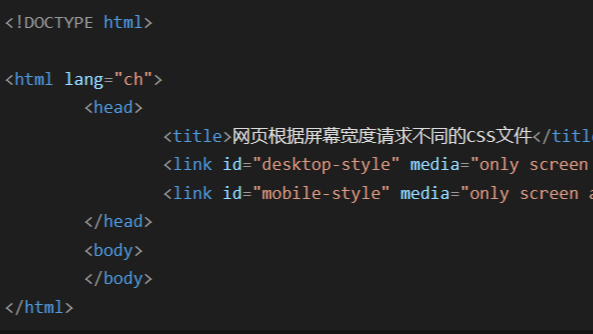
<!DOCTYPE html> <html lang="ch"> <head> <title>网页根据屏幕宽度请求不同的CSS文件</title> <link id="desktop-style" media="only screen and (min-width: 960px)" type="text/css" rel="stylesheet" href="./css/desktop-common.css?version=0.1.4"> <link id="mobile-style" media="only screen and (max-width: 960px)" type="text/css" rel="stylesheet" href="./css/mobile-common.css?version=0.1.4"> </head> <body> </body> </html>
二、解释
media="only screen and (min-width: 960px)"当屏幕宽度大于960px时请求的CSS文件
media="only screen and (max-width: 960px)"当屏幕宽度小于960px时请求的CSS文件

【推荐】国内首个AI IDE,深度理解中文开发场景,立即下载体验Trae
【推荐】编程新体验,更懂你的AI,立即体验豆包MarsCode编程助手
【推荐】抖音旗下AI助手豆包,你的智能百科全书,全免费不限次数
【推荐】轻量又高性能的 SSH 工具 IShell:AI 加持,快人一步