HTML+CSS+JS制作一个黑灰色简约时钟,这次借鉴了网络上的代码,利用JS动态创建元素,减少html语句的数量,也便于与vue、react等语言进行结合。
HTML+CSS+JS制作一个黑灰色简约时钟
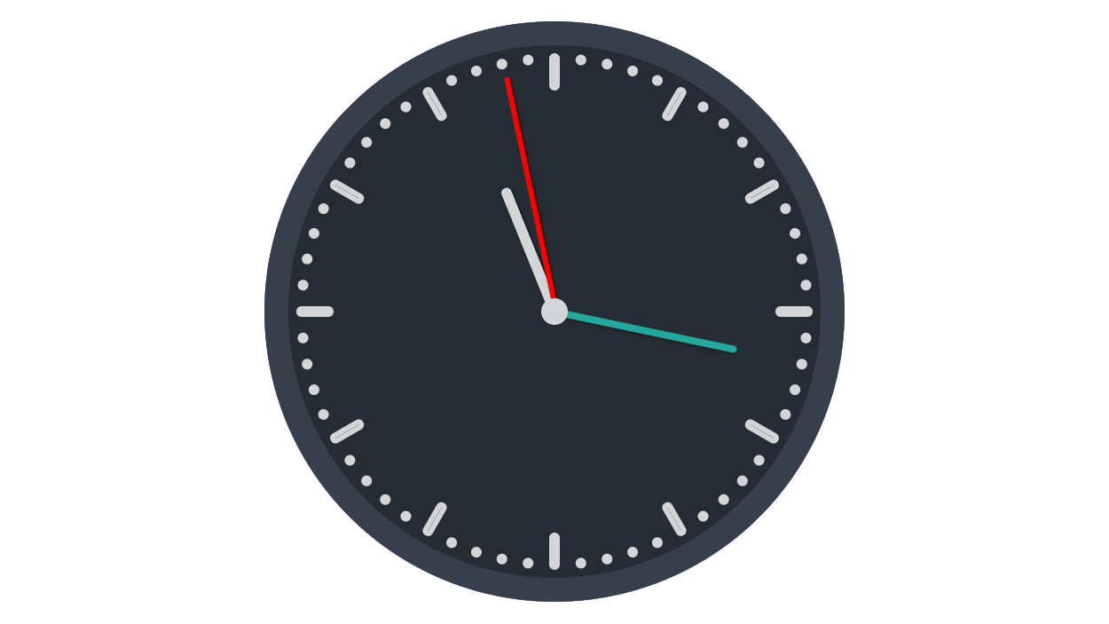
1. 效果图:
2. 特点:这次借鉴了网络上的代码,利用JS动态创建元素,减少html语句的数量,也便于与vue、react等语言进行结合。
3. 代码实现:
<!DOCTYPE html>
<head>
<meta http-equiv="Content-Type" content="text/html; charset=gb2312" />
<title>黑灰色简约时钟</title>
<style lang="css">
	.clock {
		position: absolute;
		margin: auto;
		width: 400px;
		height: 400px;
		padding: 0;
		background-color: #262c33;
		border: 18px solid #373f4a;
		border-radius: 50%;
		background-clip: border-box;
	}
	.point{
		position: absolute;
		width: 400px;
		height: 400px;
		top: 0;
	}
	.s,.m,.h{
		position: absolute;
		box-shadow: 1px 1px 2px rgba(0, 0, 0, 0.4);
		border-radius: 10px;
		left: 50%;
		bottom: 50%;
		transform-origin: center bottom;
	}

	.s{
		height: 180px;
		width: 4px;
		background: red;
		margin-left: -1px;
		z-index: 110;
	}

	.m{
		height: 140px;
		width: 5px;
		background: #26a79d;
		margin-left: -2.5px;
		z-index: 100;
	}

	.h{
		height: 100px;
		width: 8px;
		background: #d4d5d6;
		margin-left: -4px;
		z-index: 90;
		border-left: 1px solid rgba(255, 255, 255, 0.1);
		box-sizing: border-box;
	}
	.clock-center{
		width: 20px;
		height: 20px;
		margin: -10px 0 0 -10px;
		border-radius: 50%;
		background-color: #d4d5d6;
		position: absolute;
		top: 50%;
		left: 50%;
		z-index: 999;
	}
	.minute-marks {
		display: inline-block;
		padding: 0;
		margin: 0;
		list-style-type: none;
		width: 0px;
		height: 0px;
	}
	.minute-marks li {
		position: absolute;
		top: 0;
		bottom: 0;
		left: 0;
		right: 0;
		margin: auto;
		display: inline-block;
		width: 200px;
		height: 200px;
	}
	.minute-marks li:before,
	.minute-marks li:after {
		content: '';
		position: absolute;
		top: 0;
		bottom: 0;
		left: 0;
		right: 0;
		margin: auto;
		width: 0px;
		height: 0px;
		display: inline-block;
		border-color: #d4d5d6;
		border-width: 4px;
		border-style: solid;
		border-radius: 4px;
		background-clip: padding-box;
		opacity: 1;
	}
	.minute-marks li:before {top: -380px;}
	.minute-marks li:after {bottom: -380px;}
	.minute-marks li.five:before,.minute-marks li.five:after {width: 0px;height: 20px;}
	.minute-marks li.five:before {top: -360px;}
	.minute-marks li.five:after {bottom: -360px;}
</style>
</head>
<body>
		<div class='clock'>
			<ul class='minute-marks'></ul>
			<div class='point'>
				<div class="m"></div><div class="h"></div><div class="s"></div>
				<div class="clock-center"></div>
			</div>
		</div>
<script>
	// autor:戈小戈
	for (var i = 1; i <= 6; i++){
		for(var m = 1;m<=5;m++){
			var div=document.createElement('li');
			if(m==1){div.className = 'five';}
			div.style.transform = 'rotate('+(i*5-6+m)*6+'deg )';//设置每一分钟点所在位置
			document.getElementsByClassName("minute-marks")[0].appendChild(div);//添加分钟点
		}

	}
	function setTime() {
		const sHand = document.querySelector('.s');
		const mHand = document.querySelector('.m');
		const hHand = document.querySelector('.h');

		const d = new Date();
		const s = d.getSeconds();//秒
		const m = d.getMinutes();//分
		const h = d.getHours();//时

		const sDeg = (( s / 60 ) * 360 );
		const mDeg = (( m / 60 ) * 360 ) + (( s / 60 ) * 6 );
		const hDeg = (( h / 12 ) * 360 ) + (( m / 60 ) * 30 );

		sHand.style.transform = 'rotate('+sDeg+'deg )';
		mHand.style.transform = 'rotate('+mDeg+'deg )';
		hHand.style.transform = 'rotate('+hDeg+'deg )';

	}
	setInterval( setTime, 1000 );
</script>
</body>
</html>


