HTML+CSS+JS制作一个灰白色简约时钟,这次借鉴了网络上的代码,利用JS动态创建元素,减少html语句的数量,也便于与vue、react等语言进行结合。
HTML+CSS+JS制作一个灰白色简约时钟
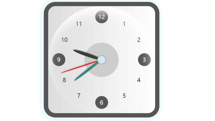
1. 效果图:

2. 特点:这次借鉴了网络上的代码,利用JS动态创建元素,减少html语句的数量,也便于与vue、react等语言进行结合。
3. 代码实现:
<!DOCTYPE html>
<html lang="ch">
  <head>
    <meta charset="UTF-8">
    <meta name ="viewport" content ="width = device-width" />
    <meta name="author" content="戈小戈">
    <title>灰白色简约时钟</title>
  </head>
  <style lang="css">
    .clock {
        width: 250px;
        height: 250px;
        background: #eee;
        background: linear-gradient(to right, #ddd, #fff);
        border-radius: 10%;
        margin:0 auto;
        position: relative;
        border: 10px solid #555;
        box-sizing: content-box;
        box-shadow: -2px 1px 8px rgba(0, 0, 0, 0.4);
      }


      .clock_number span{
        display: inline-block;
        width: 30px;
        height: 30px;
        line-height: 30px;
        text-align: center;
        color: #333;
        border-radius: 50%;
        font-size: 13px;
        position: absolute;
      }
      .clock_number :nth-child(3),.clock_number :nth-child(6),.clock_number :nth-child(9),.clock_number :nth-child(12) {background: #555;color: #fff;}
      .clock_number :nth-child(1){right: 72px;margin-right: -15px;top: 26px;}
      .clock_number :nth-child(2){right: 38px;margin-right: -15px;top: 63px;}
      .clock_number :nth-child(3){top: 125px;margin-top: -15px;right: 10px;}
      .clock_number :nth-child(4){right: 38px;margin-right: -15px;bottom: 63px;}
      .clock_number :nth-child(5){right: 72px;margin-right: -15px;bottom: 26px;}
      .clock_number :nth-child(6){left: 125px;margin-left: -15px;bottom: 10px;}
      .clock_number :nth-child(7){left: 72px;margin-left: -15px;bottom: 26px;}
      .clock_number :nth-child(8){left: 38px;margin-left: -15px;bottom: 63px;}
      .clock_number :nth-child(9){top: 125px;margin-top: -15px;left: 10px;}
      .clock_number :nth-child(10){left: 38px;margin-left: -15px;top: 63px;}
      .clock_number :nth-child(11){left: 72px;margin-left: -15px;top: 26px;}
      .clock_number :nth-child(12){left: 125px;margin-left: -15px;top: 10px;}


      .clock_number_point span{
        width: 1px;
        height: 6px;
        background: #999;
        display: inline-block;
        position: absolute;
        z-index: 100;
        box-sizing: border-box;
      }
      .clock_number_point :nth-child(1){top: 18px;right: 60px;transform: rotate(30deg);width: 3px;height: 10px;}
      .clock_number_point :nth-child(2){top: 60px;right: 19.5px;transform: rotate(60deg);width: 3px;height: 10px;}
      .clock_number_point :nth-child(3){top: 180px;right: 20px;transform: rotate(120deg);width: 3px;height: 10px;}
      .clock_number_point :nth-child(4){bottom: 18px;right: 61px;transform: rotate(150deg);width: 3px;height: 10px;}
      .clock_number_point :nth-child(5){bottom: 18px;left: 61px;transform: rotate(210deg);width: 3px;height: 10px;}
      .clock_number_point :nth-child(6){top: 180px;left: 20px;transform: rotate(240deg);width: 3px;height: 10px;}
      .clock_number_point :nth-child(7){top: 60px;left: 19.5px;transform: rotate(300deg);width: 3px;height: 10px;}
      .clock_number_point :nth-child(8){top: 18px;left: 60px;transform: rotate(330deg);width: 3px;height: 10px;}

      .bg{
        width: 250px;
        height: 250px;
        border-radius: 50%;
        position: absolute;
        box-shadow: inset -4px 14px 25px rgba(255, 255, 255, 1);
      }
      .clock-logo{
          position: absolute;
          left: 125px;
          top: 125px;
          width: 80px;
          border-radius: 50%;
          height: 80px;
          padding: 10px;
          margin-left: -40px;
          margin-top: -40px;
          text-align: center;
          background: #ccc;
          color: #16a085;
          font-size: 12px;
          text-align: center;
          box-sizing: border-box;
          z-index: 0;
      }
      .clock-center{
        width: 20px;
        height: 20px;
        margin: -10px 0 0 -10px;
        border-radius: 50%;
        background-color: #d6e2ea;
        background-image: linear-gradient(90deg, #d6e2ea 0%, #e6e7f8 100%);
        position: absolute;
        top: 125px;
        left: 125px;
        z-index: 999;
        border: 1px solid #16a085;
        box-sizing: border-box;

      }

      .s,.m,.h{
          position: absolute;
          box-shadow: 1px 1px 2px rgba(0, 0, 0, 0.4);
          border-radius: 50%;
          transform-origin: center bottom;
      }

      .s{
          height: 100px;
          width: 2px;
          background: red;
          left: 125px;
          margin-left: -1px;
          top: 25px;
          z-index: 110;
      }

      .m{
          height: 80px;
          width: 5px;
          background: #348781;
          left: 125px;
          margin-left: -2.5px;
          top: 45px;
          z-index: 100;
      }

      .h{
          height: 70px;
          width: 8px;
          background: #3D3C3A;
          left: 125px;
          margin-left: -4px;
          top: 55px;
          z-index: 90;
          border-left: 1px solid rgba(255, 255, 255, 0.1);
          box-sizing: border-box;
      }


      .clock-logo span{
        display: block;
          font-size: 7px;
          color: #333;
          margin-top: 26px;

      }
  </style>
 <body>
    <div class="clock">
    <div class="clock_number"></div>
    <div class='clock_number_point'></div>
    <div class="bg"></div>
    <div class="clock-logo"></div>
    <div class="m"></div><div class="h"></div><div class="s"></div>
    <div class="clock-center"></div>

   </div>
   <script>
      // autor:戈小戈
      for (var i = 1; i <= 12; i++)
      {
        var div=document.createElement('span');
        if(i<=8){document.getElementsByClassName("clock_number_point")[0].appendChild(div); }//插入数字方块子元素
        div.innerHTML=''+i;
        document.getElementsByClassName("clock_number")[0].appendChild(div);
      }
      function setTime() {
          const sHand = document.querySelector('.s');
          const mHand = document.querySelector('.m');
          const hHand = document.querySelector('.h');

          const d = new Date();
          const s = d.getSeconds();//秒
          const m = d.getMinutes();//分
          const h = d.getHours();//时

          const sDeg = (( s / 60 ) * 360 );
          const mDeg = (( m / 60 ) * 360 ) + (( s / 60 ) * 6 );
          const hDeg = (( h / 12 ) * 360 ) + (( m / 60 ) * 30 );

          sHand.style.transform = 'rotate('+sDeg+'deg )';
          mHand.style.transform = 'rotate('+mDeg+'deg )';
          hHand.style.transform = 'rotate('+hDeg+'deg )';

      }
      setInterval( setTime, 1000 );
</script>
 </body>
</html>


