HTML+CSS+JS制作一个象牙色简约时钟,这次使用了单纯的CSS进行效果时间,更加容易理解,并实现了更简洁美观的效果。
HTML+CSS+JS制作一个象牙色简约时钟
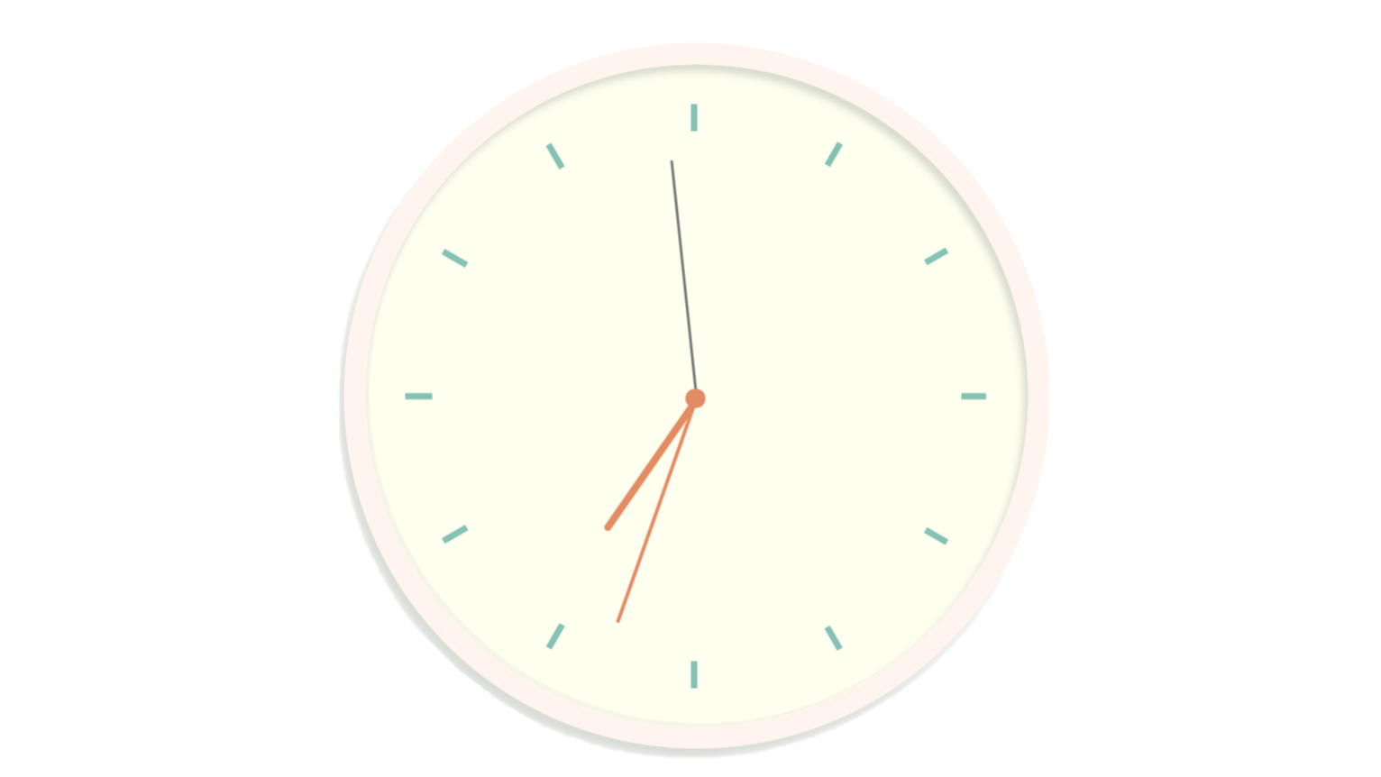
1. 效果图:
2. 特点:这次使用了单纯的CSS进行效果实现,更加容易理解,并实现了更简洁美观的效果。
3. 代码实现:
<!DOCTYPE html>
<html lang="ch">

<head>
    <meta charset="UTF-8">
    <meta name ="viewport" content ="width = device-width" />
    <meta name="author" content="戈小戈">
    <title>象牙色简约时钟</title>
</head>
    <style lang="css">
        .clock {
            max-width: 50vmin;
            height: 50vmin;
            position: relative;
            padding: 1rem;
            border: 10px solid #FFF5EE;
            box-shadow: 5px -5px 5px 0px rgba(255, 255, 255, 0.5), -5px 8px 8px 0px rgba(177, 185, 173, 0.5),
                inset -3.5px 5.5px 6px 0px rgba(177, 185, 173, 0.5),
                inset 3px -3px 1px 0px rgba(190, 197, 186, 0.15);
            border-radius: 50%;
            margin: 50px auto;
            background: #FFFFF0;
        }

        .clockborder {
            position: relative;
            background: #FFFFF0;
            overflow: hidden;
            width: 100%;
            height: 100%;
            border-radius: 100%;
        }

        .clockborder::after {
            -webkit-transform: rotate(90deg);
            -moz-transform: rotate(90deg);
            transform: rotate(90deg);
        }

        .clockborder::after,
        .clockborder::before,
        .clockborder div {
            content: '';
            position: absolute;
            width: 2px;
            height: 100%;
            background: #84c2b3;
            z-index: 0;
            left: 49%;
        }

        .clockborder .marking {
            background: #9bc5bb;
            width: 3px;
        }

        .clockborder div:nth-child(1){
            -webkit-transform: rotate(30deg);
            -moz-transform: rotate(30deg);
            transform: rotate(30deg);
        }

        .clockborder div:nth-child(2){
            -webkit-transform: rotate(60deg);
            -moz-transform: rotate(60deg);
            transform: rotate(60deg);
        }

        .clockborder div:nth-child(3){
            -webkit-transform: rotate(120deg);
            -moz-transform: rotate(120deg);
            transform: rotate(120deg);
        }

        .clockborder div:nth-child(4){
            -webkit-transform: rotate(150deg);
            -moz-transform: rotate(150deg);
            transform: rotate(150deg);
        }

        .clockpointer {
            position: absolute;
            top: 15%;
            left: 15%;
            width: 70%;
            height: 70%;
            background: #FFFFF0;
            -webkit-border-radius: 100%;
            -moz-border-radius: 100%;
            border-radius: 100%;
            z-index: 1;
        }

        .clockpointer::before {
            content: '';
            position: absolute;
            top: 50%;
            left: 50%;
            width: 16px;
            height: 16px;
            border-radius: 18px;
            margin-left: -9px;
            margin-top: -6px;
            background: #e38c63;
            z-index: 11;
        }

        .hand {
            width: 50%;
            right: 50%;
            height: 5px;
            background: #e38c63;
            position: absolute;
            top: 50%;
            border-radius: 6px;
            transform-origin: 100%;
            transform: rotate(90deg);
            transition-timing-function: cubic-bezier(0.1, 2.7, 0.58, 1);
        }

        .h {
            width: 40%;
            z-index: 1;
        }

        .m {
            height: 3px;
            z-index: 2;
            width: 50%;
        }

        .s {
            background: #767b78;
            width: 60%;
            height: 2px;
            z-index: 3;
        }


    </style>
    <body>
        <div class="clock">
            <div class="clockborder">
                <div></div>
                <div></div>
                <div></div>
                <div></div>
            </div>

            <div class="clockpointer">
                <div class="hand h"></div>
                <div class="hand m"></div>
                <div class="hand s"></div>
            </div>
        </div>

        <script>
            // autor:戈小戈
            function setTime() {
                const sHand = document.querySelector('.s');
                const mHand = document.querySelector('.m');
                const hHand = document.querySelector('.h');

                const d = new Date();
                const s = d.getSeconds();//秒
                const m = d.getMinutes();//分
                const h = d.getHours();//时

                const sDeg = (( s / 60 ) * 360 ) + 90;
                const mDeg = (( m / 60 ) * 360 ) + (( s / 60 ) * 6 ) + 90;
                const hDeg = (( h / 12 ) * 360 ) + (( m / 60 ) * 30 ) + 90;

                sHand.style.transform = 'rotate('+sDeg+'deg )';
                mHand.style.transform = 'rotate('+mDeg+'deg )';
                hHand.style.transform = 'rotate('+hDeg+'deg )';

            }
            setInterval( setTime, 1000 );
        </script>
    </body>
</html>


