【Python高级应用课程设计】大数据分析——苹果公司股票分析
一、选题背景
随着股票市场的发展,我逐渐认识到股票分析在投资中的重要性。首先,通过对股票进行价值评估,我能够判断一支股票是否被低估或高估。通过仔细研究公司的财务状况、盈利能力和市场地位等因素,我可以更准确地评估股票的潜在价值,从而找到具有投资潜力的股票。股票分析对于我的投资决策至关重要。通过分析股票的基本面、技术指标和市场动态,我能够更好地预测股票价格的走势和未来表现。这使我能够做出明智的买入、持有或卖出决策,并根据市场变化及时调整我的投资策略。股票分析还有助于我管理风险。通过分析股票的波动性、市场情绪和公司风险,我能够评估投资的风险水平,并采取相应的风险控制策略。这包括设置止损位、分散投资和建立合理的资产配置,以降低投资风险。
二、大数据分析设计方案
1.本数据集的数据内容与数据特征分析

2.数据分析的课程设计方案概括(包括实现思路与技术难点)
准备数据:获取苹果公司股份数据,包括一段时间内的开盘价、最高价、最低价、收盘价、调整后的收盘价以及成交量等。使用工具如Excel、Python的Pandas库、或其他数据处理工具整理和清理数据。
选择关键指标:从财务报表中选择关键的财务指标,例如最高价、最低价、收盘价。 确定分析方向:定义希望分析的方向,例如每天收盘价的变化图,日期对收盘开盘的影响等。确定关键的业务问题,以便有针对性地进行可视化分析。
选择可视化工具:选择适当的可视化工具,如Matplotlib、Seaborn、Plotly(Python库)、Tableau、Power BI等。根据分析需求选择合适的图表类型,如折线图、柱状图、饼图等。
创建可视化图表:根据选定的指标和分析方向,创建相应的可视化图表。可以制作趋势图、对比图、饼图、雷达图等,以展示不同财务指标的变化。
三.数据分析步骤
1.数据源
本次数据集来自Kaggle :https://www.kaggle.com/datasets/komalkhetlani/apple-iphone-data
2.数据清洗
数据全都用到,无冗余数据 ,无需清洗。
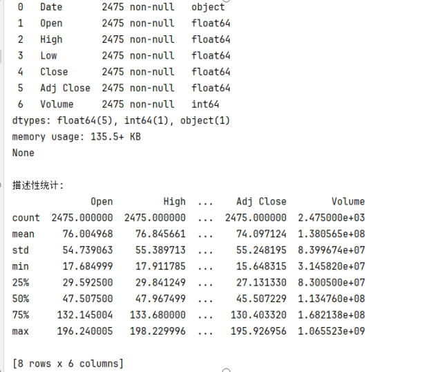
import pandas as pdimport matplotlib.pyplot as pltimport seaborn as sns df = pd.read_csv('apple_stock.csv')
# 查看基本信息
print("基本信息:")
print(df.info())
print("\n描述性统计:")
print(df.describe())
3.数据可视化
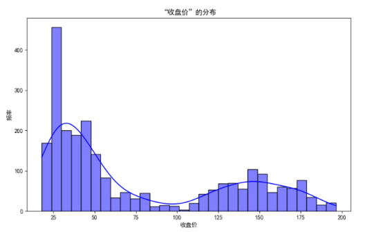
“收盘价”的分布
plt.figure(figsize=(10, 6))
sns.histplot(df['Close'], bins=30, kde=True, color='blue')
plt.title('“收盘价”的分布')
plt.xlabel('收盘价')
plt.ylabel('频率')
plt.show()
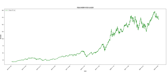
# “收盘价”随时间变化的趋势
plt.figure(figsize=(20, 8))
plt.plot(df['Date'], df['Close'], label='Close Price', color='green')
plt.title('收盘价格随时间变化的趋势')
plt.xlabel('时间')
plt.ylabel('变化趋势')
# 使用日期子集
date_subset = df['Date'].iloc[::int(len(df['Date']) / 10)]
plt.xticks(date_subset, rotation=45, ha='right')
plt.legend()
plt.tight_layout()
plt.show()
#高”和“低”价格之间的相关性
correlation_high_low = df['High'].corr(df['Low'])
print(f"\n高”和“低”价格之间的相关性: {correlation_high_low}")
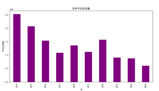
#历年平均交易量
average_volume_by_year = df.groupby(df['Date'].str.extract(r'(\d{4})')[0])['Volume'].mean()
plt.figure(figsize=(12, 6))
average_volume_by_year.plot(kind='bar', color='purple')
plt.title('历年平均交易量')
plt.xlabel('年')
plt.ylabel('平均交易量')
plt.show()
# 方框图,用于识别“体积”列中的异常值
plt.figure(figsize=(8, 6))
sns.boxplot(x=df['Volume'], color='orange')
plt.title('方框图')
plt.xlabel('方框')
plt.show()
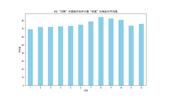
#从“日期”中提取月份并计算“收盘”价格的月平均值
df['Month'] = pd.to_datetime(df['Date']).dt.month
monthly_average_close = df.groupby('Month')['Close'].mean()
plt.figure(figsize=(10, 6))
monthly_average_close.plot(kind='bar', color='skyblue')
plt.title('#从“日期”中提取月份并计算“收盘”价格的月平均值')
plt.xlabel('月份')
plt.ylabel('平均值')
plt.xticks(rotation=0)
plt.show()
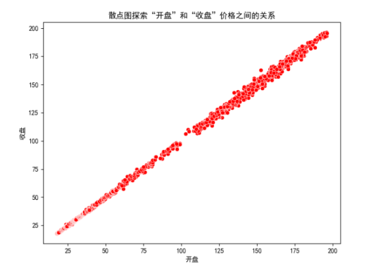
# 散点图探索“开盘”和“收盘”价格之间的关系
plt.figure(figsize=(8, 6))
sns.scatterplot(x='Open', y='Close', data=df, color='red')
plt.title('散点图探索“开盘”和“收盘”价格之间的关系')
plt.xlabel('开盘')
plt.ylabel('收盘')
plt.show()
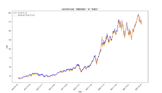
#一段时间内比较“调整收盘价”和“收盘价”
plt.figure(figsize=(15, 8))
plt.plot(df['Date'], df['Close'], label='Close Price', color='blue')
plt.plot(df['Date'], df['Adj Close'], label='Adjusted Close Price', color='orange', linestyle='dashed')
plt.title('一段时间内比较“调整收盘价”和“收盘价”')
#使用日期子集
date_subset = df['Date'].iloc[::int(len(df['Date']) / 10)]
plt.xticks(date_subset, rotation=45, ha='right')
plt.xlabel('时间')
plt.ylabel('价格')
plt.xticks(rotation=45)
plt.legend()
plt.show()
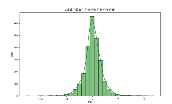
#计算“收盘”价格的每日百分比变化
df['Daily_Return'] = df['Close'].pct_change() * 100
# Distribution of daily price changes
plt.figure(figsize=(10, 6))
sns.histplot(df['Daily_Return'].dropna(), bins=30, kde=True, color='green')
plt.title('#计算“收盘”价格的每日百分比变化')
plt.xlabel('变化')
plt.ylabel('频率')
plt.show()
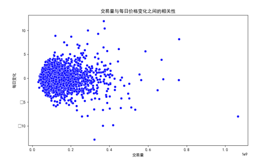
#交易量与每日价格变化之间的相关性
correlation_volume_return = df['Volume'].corr(df['Daily_Return'].dropna())
print(f"\n交易量与每日价格变化之间的相关性: {correlation_volume_return}")
# Scatter plot to visualize the relationship
plt.figure(figsize=(10, 6))
sns.scatterplot(x='Volume', y='Daily_Return', data=df, color='blue')
plt.title('交易量与每日价格变化之间的相关性')
plt.xlabel('交易量')
plt.ylabel('每日变化')
plt.show()
完整代码:
import pandas as pd
import matplotlib.pyplot as plt
import seaborn as sns
plt.rcParams['font.sans-serif'] = ['SimHei']

df = pd.read_csv('apple_stock.csv')

# 查看基本信息
print("基本信息:")
print(df.info())

print("\n描述性统计:")
print(df.describe())


# “收盘价”的分布
plt.figure(figsize=(10, 6))
sns.histplot(df['Close'], bins=30, kde=True, color='blue')
plt.title('“收盘价”的分布')
plt.xlabel('收盘价')
plt.ylabel('频率')
plt.show()

# “收盘价”随时间变化的趋势
plt.figure(figsize=(20, 8))
plt.plot(df['Date'], df['Close'], label='Close Price', color='green')
plt.title('收盘价格随时间变化的趋势')
plt.xlabel('时间')
plt.ylabel('变化趋势')

# 使用日期子集
date_subset = df['Date'].iloc[::int(len(df['Date']) / 10)]
plt.xticks(date_subset, rotation=45, ha='right')

plt.legend()
plt.tight_layout()
plt.show()

#高”和“低”价格之间的相关性
correlation_high_low = df['High'].corr(df['Low'])
print(f"\n高”和“低”价格之间的相关性: {correlation_high_low}")

#历年平均交易量
average_volume_by_year = df.groupby(df['Date'].str.extract(r'(\d{4})')[0])['Volume'].mean()
plt.figure(figsize=(12, 6))
average_volume_by_year.plot(kind='bar', color='purple')
plt.title('历年平均交易量')
plt.xlabel('年')
plt.ylabel('平均交易量')
plt.show()


# 方框图,用于识别“体积”列中的异常值
plt.figure(figsize=(8, 6))
sns.boxplot(x=df['Volume'], color='orange')
plt.title('方框图')
plt.xlabel('方框')
plt.show()


#从“日期”中提取月份并计算“收盘”价格的月平均值
df['Month'] = pd.to_datetime(df['Date']).dt.month
monthly_average_close = df.groupby('Month')['Close'].mean()
plt.figure(figsize=(10, 6))
monthly_average_close.plot(kind='bar', color='skyblue')
plt.title('#从“日期”中提取月份并计算“收盘”价格的月平均值')
plt.xlabel('月份')
plt.ylabel('平均值')
plt.xticks(rotation=0)
plt.show()


# 散点图探索“开盘”和“收盘”价格之间的关系
plt.figure(figsize=(8, 6))
sns.scatterplot(x='Open', y='Close', data=df, color='red')
plt.title('散点图探索“开盘”和“收盘”价格之间的关系')
plt.xlabel('开盘')
plt.ylabel('收盘')
plt.show()


#一段时间内比较“调整收盘价”和“收盘价”
plt.figure(figsize=(15, 8))
plt.plot(df['Date'], df['Close'], label='Close Price', color='blue')
plt.plot(df['Date'], df['Adj Close'], label='Adjusted Close Price', color='orange', linestyle='dashed')
plt.title('一段时间内比较“调整收盘价”和“收盘价”')

#使用日期子集
date_subset = df['Date'].iloc[::int(len(df['Date']) / 10)]
plt.xticks(date_subset, rotation=45, ha='right')

plt.xlabel('时间')
plt.ylabel('价格')
plt.xticks(rotation=45)
plt.legend()
plt.show()


# # Seasonal decomposition plot to identify seasonality in stock prices
# # from statsmodels.tsa.seasonal import seasonal_decompose
#
# df['Date'] = pd.to_datetime(df['Date'])
# df.set_index('Date', inplace=True)
#
# plt.figure(figsize=(15, 10))
# # decomposition = seasonal_decompose(df['Close'], period=252)  # Assuming 252 trading days in a year
# # trend = decomposition.trend
# # seasonal = decomposition.seasonal
# # residual = decomposition.resid
#
# plt.subplot(4, 1, 1)
# plt.plot(df['Close'], label='Original')
# plt.legend(loc='upper left')
#
# plt.subplot(4, 1, 2)
# # plt.plot(trend, label='Trend')
# plt.legend(loc='upper left')
#
# plt.subplot(4, 1, 3)
# plt.plot(seasonal, label='Seasonality')
# plt.legend(loc='upper left')
#
# plt.subplot(4, 1, 4)
# plt.plot(residual, label='Residuals')
# plt.legend(loc='upper left')
#
# plt.tight_layout()
# plt.show()


#计算“收盘”价格的每日百分比变化
df['Daily_Return'] = df['Close'].pct_change() * 100

# Distribution of daily price changes
plt.figure(figsize=(10, 6))
sns.histplot(df['Daily_Return'].dropna(), bins=30, kde=True, color='green')
plt.title
('#计算“收盘”价格的每日百分比变化')
plt.xlabel('变化')
plt.ylabel('频率')
plt.show()


#交易量与每日价格变化之间的相关性
correlation_volume_return = df['Volume'].corr(df['Daily_Return'].dropna())
print(f"\n交易量与每日价格变化之间的相关性: {correlation_volume_return}")

# Scatter plot to visualize the relationship
plt.figure(figsize=(10, 6))
sns.scatterplot(x='Volume', y='Daily_Return', data=df, color='blue')
plt.title
('交易量与每日价格变化之间的相关性')
plt.xlabel
('交易量')
plt.ylabel
('每日变化')
plt.show()


# 计算收盘价格的10日移动平均线
df['MA10'] = df['Close'].rolling(10).mean()

plt.figure(figsize=(20, 8))
plt.plot(df['Date'], df['Close'], label='Close Price', color='green')
plt.plot(df['Date'], df['MA10'], label='10-day Moving Average', color='blue')

plt.title
('收盘价格随时间变化的趋势')
plt.xlabel
('时间')
plt.ylabel
('变化趋势')

# 使用日期子集
date_subset = df['Date'].iloc[::int(len(df['Date']) / 10)]
plt.xticks(date_subset, rotation=45, ha='right')

plt.legend()
plt.tight_layout()
plt.show()


plt.figure(figsize=(10, 6))
sns.scatterplot(x='Volume', y='Close', data=df, color='red')
plt.title('收盘价格和成交量的关系')
plt.xlabel('成交量')
plt.ylabel('收盘价格')
plt.show()


#每日百分比的变化
plt.figure(figsize=(10, 6))
sns.scatterplot(x='Daily_Return', y='Volume', data=df, color='purple')
plt.title('每日百分比变化和交易量的关系')
plt.xlabel('每日百分比变化')
plt.ylabel('交易量')
plt.show()


#价格分布
plt.figure(figsize=(10, 6))
sns.kdeplot(df['Close'], shade=True, color='green', label='Close Price')
sns.kdeplot(df['Open'], shade=True, color='blue', label='Open Price')
plt.title('收盘价格和开盘价格的分布')
plt.xlabel('价格')
plt.ylabel('概率密度')
plt.legend()
plt.show()


df_yearly = df.copy()
df_yearly['Year'] = pd.to_datetime(df_yearly['Date']).dt.year
df_yearly = df_yearly[['Year', 'High', 'Low']].groupby('Year').agg({'High': 'max', 'Low': 'min'})

plt.figure(figsize=(10, 6))
plt.plot(df_yearly.index, df_yearly['High'], label='Highest Close Price', color='green')
plt.plot(df_yearly.index, df_yearly['Low'], label='Lowest Close Price', color='blue')

plt.title('每年的最高收盘价格和最低收盘价格')
plt.xlabel('年份')
plt.ylabel('价格')

plt.legend()
plt.show()


# 计算收盘价格的30日移动平均线和标准差
df['MA30'] = df['Close'].rolling(30).mean()
df['STD'] = df['Close'].rolling(30).std()

plt.figure(figsize=(20, 8))
plt.plot(df['Date'], df['Close'], label='Close Price', color='green')
plt.plot(df['Date'], df['MA30'], label='30-day Moving Average', color='blue')
plt.fill_between(df['Date'], df['MA30'] - df['STD'], df['MA30'] + df['STD'], color='gray', alpha=0.3)

plt.title('收盘价的趋势线和波动性')
plt.xlabel('时间')
plt.ylabel('收盘价')

# 使用日期子集
date_subset = df['Date'].iloc[::int(len(df['Date']) / 10)]
plt.xticks(date_subset, rotation=45, ha='right')

plt.legend()
plt.tight_layout()
plt.show()


# 提取月份和年份
df['Year'] = pd.to_datetime(df['Date']).dt.year
df['Month'] = pd.to_datetime(df['Date']).dt.month

plt.figure(figsize=(12, 6))
sns.boxplot(x='Month', y='Close', data=df, color='purple')
plt.title('各月份的收盘价箱线图')
plt.xlabel('月份')
plt.ylabel('收盘价')
plt.xticks(rotation=0)
plt.show()


plt.figure(figsize=(10, 6))
sns.scatterplot(x='Close', y='Volume', data=df, color='orange')
plt.title('收盘价和成交量的分布')
plt.xlabel('收盘价')
plt.ylabel('成交量')
plt.show()

#开盘与最高级的关系
plt.figure(figsize=(10, 6))
sns.scatterplot(x='Open', y='High', data=df, color='blue')
plt.title('开盘价和最高价的关系')
plt.xlabel('开盘价')
plt.ylabel('最高价')
plt.show()


plt.figure(figsize=(15, 8))
plt.plot(df['Date'], df['Close'], label='Close Price', color='blue')
plt.plot(df['Date'], df['Adj Close'], label='Adjusted Close Price', color='orange')

#收盘价格比较
plt.title('收盘价和调整收盘价的比较')
plt.xlabel('时间')
plt.ylabel('价格')

# 使用日期子集
date_subset = df['Date'].iloc[::int(len(df['Date']) / 10)]
plt.xticks(date_subset, rotation=45, ha='right')

plt.legend()
plt.show()
四.总结
通过对苹果公司股票的大数据分析和挖掘,我得到了一下的结论:通过绘制收盘价格随时间变化的趋势图,我们可以观察到收盘价格的大致走势,并使用移动平均线来平滑数据;通过绘制收盘价格和成交量的散点图,我们可以看到收盘价格和成交量之间的关系。这可以帮助我们分析价格上涨或下跌时的成交情况;通过绘制每日百分比变化和交易量的散点图,我们可以观察到每日百分比变化与交易量之间的关系。这可以帮助我们分析价格波动和交易活跃度之间的关联。在自己完成此设计的过程中,尽管自己遇到了诸多的困难,但是在同学的帮助在也是顺利完成,通过大数据分析的此次课程作业,加深了对大数据分析的认识和理解。希望自己在学习的道路上继续前进!

 浙公网安备 33010602011771号