
DevExpress
疑问总结
-
注意看designer.cs中的内容,了解代码形式怎么编写
-
TextEdit的高级模式找不到
UseAdvancedMode属性——版本问题 -
LabelControl.UseMnemonic属性设置后,无法使用ALT+助记键选中相应label——
-
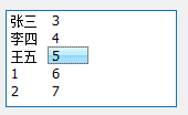
SearchControl搜索设定在某一行上搜索时。绑定的表格是什么控件???
-
怎么给template添加图片??(CheckListBoxControl)
-
TimeEdit和TimeSpanEdit的DisplayFormat和Mask
-
ImageComboBoxEdit选择下拉框中项目无法改变???
-
使用BehaviorManager绑定WindowsUIButtonPanel和NavigationFrame时,不知道为什么WindowUIButtonPanel的Button无法显示????
博客汇总
DEVExpress资深开发者:https://blog.csdn.net/u012097590/category_6418648.html
https://zhuanlan.zhihu.com/p/34037924
零散知识点
截图,用画图打开,可用吸管获取精确颜色
吸管吸取,然后编辑颜色,可得蓝色为(137,240,92)
安装
1. 汉化
https://www.devexpresscn.com/post/1081.html
将汉化包zh-Hans放到项目文件bin/Debug中,在Program.cs的Main函数中添加一句代码
//汉化代码 System.Threading.Thread.CurrentThread.CurrentUICulture = new System.Globalization.CultureInfo("zh-Hans"); System.Threading.Thread.CurrentThread.CurrentCulture = new System.Globalization.CultureInfo("zh-Hans");
皮肤
数据绑定——Excel、数据库、JSON、XML等
https://docs.devexpress.com/WindowsForms/2395/common-features/data-binding-common-concepts
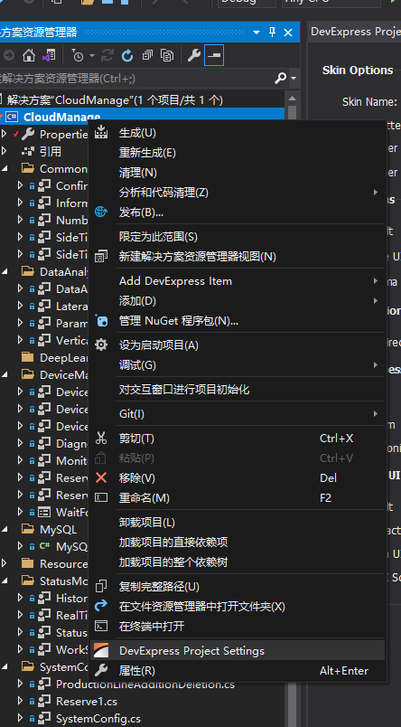
Project Settings
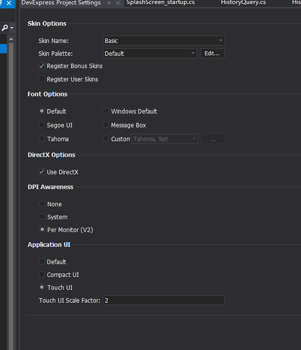
1. 高DPI
https://docs.devexpress.com/WindowsForms/116666/common-features/high-dpi-support
2. DirectX加速
窗体
1. XtraForm
-
XtraForm.FormBorderEffect——设置边框被选中时发光或是阴影。ActiveGlowColor设定选中时边框的发光颜色,InactiveGlowColor设定未选中时边框的发光颜色。
-
Opacity——设定窗体透明度
-
FormBorderStyle——设置是否有标题栏
-
IconOptions.ShowIcon——是否显示标题栏图标
2. Ribbon Form
(1)问题
-
修改标题的RibbonControl.ApplicationCaption和[RibbonControl.ApplicationDocumentCaption 两个属性不存在
-
增加边框宽度的
WindowsFormsSettings.FormThickBorder的WindowsFormsSettings找不到是什么? -
Quick Access Toolbar 找不到在哪
-
StatusBar找不到
-
ribbon display mode selector找不到
(2)注意
-
2个标题字体可以分别使用
defaultBarAndDockingController1.Controller.AppearancesRibbon.FormCaption.ForeColor和defaultBarAndDockingController1.Controller.AppearancesRibbon.FormCaptionForeColor2来设置,前者在AppearanceRibbon.FormCaption中,一个在AppearanceRibbon中。 -
add page/add page group/add item
(3)页面组成
backstageViewControl——在RibbonForm右上角三角形处add backstage view
backstageViewClientControl——backstageViewControl右侧的空白部分
ribbon——RibbonForm上方的菜单栏和图标快捷方式
3. Tabbed Form
怎么添加??
4. Fluent Design Form
(1)属性
enableAcrylicAccent——鼠标在左侧element移动时有光效
官方Demo
常用控件
1. XtraEditors.SimpleButton——按钮
2. XtraEditors.MessageBox
3. XtraEditors.TextEdit——文本框(TextBox)
4. PictureEdit
5. LabelControl
XtraEditors.ComboBoxEditor——下拉框
XtraEditors.CheckEdit——复选框
XtraEditors.TimeEdit——日期
XtraBars.Navigation.TileBarItem.TileBarItem
XtraCharts——图表
DevExpress.XtraNavBar.navBarControl——侧面按钮面板
- add group
- add item
- add separator
- run designer
Common Controls——通用控件
1. SimpleButton——按钮
不支持添加背景图片backgroundimage,会被压在skin或Appearance后面。若想实现图片按钮,使用pictureEdit
(1)属性
AllowFocus——True时鼠标点击时可选中,出现虚线选中框;false时没有虚线框。

Appearance
BackColor——当BackColor2为Color.Empty时,指定背景色。当BackColor2指定颜色时,背景色为渐变色,指定渐变的起始色
BackColor2——指定背景渐变色的终止色
BorderColor——指定边框颜色
Font
StrikeOut——划掉
UnderLine——下划线
GradientMode——渐变色类型:水平、垂直、前对角线、后对角线
ForeColor——Text颜色
Options——设定是否使用相关设置
UseBackColor——使用BackColor指定的值
...
TextOptions
HAlignment——Text的水平位置
VAlignment——Text的垂直位置
WordWrap——是否换行
Trimming——
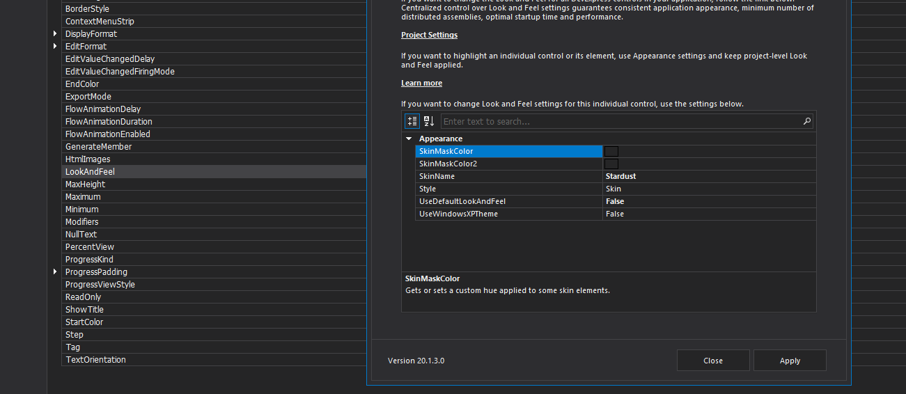
LookAndFeel——
优先级:UseDefaultLookAndFeel > UseWindowsXPTheme > Style
拖动defaulLookAndFell控件,可设定全局的LookAndFeel。
UseDefaultLookAndFeel——TRUE时,LookAndFeel被屏蔽,使用defaulLookAndFell控件设定的。优先级最高
UseWindowsXPTheme——当UseDefaultLookAndFeel==FALSE时,若设为TRUE,且系统使用XP皮肤,则使用XP主题
Style——当UseDefaultLookAndFeel和UseWindowsXPTheme均设为FALSE时,有效。
一旦Style使用skin,Appearance中设置的渐变效果就会失效,只保留BackColor1的效果。使用其他时,Appearance的渐变才有效
Flat——按钮有一点立体边缘,按钮按下时有细微按下效果
UltraFlat——按钮完全没有边框,鼠标移到上方时按钮整体变淡蓝色,按下时蓝色变深
Style3D——按钮有明显立体效果,按下时有明显按下效果
DialogResult——按钮按下时返回给parent form的结果:OK/Cancel/Yes/No
Dock——按钮在窗口锚定的位置
Font——与Appearance中Font是同一个,不要在这里设置
ImageOption——是否屏蔽了BackGroundImage??不支持BackGroundImage!!!
Image——位图bmp
ImageToTextAlignment——图片位于文字的四边,选择三个位置中的某一个
SVGImage——矢量图vector
Location——位于按钮四边的某一个位置
//添加外部多张图片,通过imageList和imageIndex指定显示哪一张 //多张位图改变 this.simpleButton20.ImageOptions.ImageList = this.imageList1; private void simpleButton20_Click(object sender, EventArgs e) { indexSimpleButton20ImageChanged = (++indexSimpleButton20ImageChanged) % 3; //不要写成(indexSimpleButton20ImageChanged++) % 3 if (indexSimpleButton20ImageChanged == 0) { this.simpleButton20.ImageOptions.ImageIndex = 0; }else if (indexSimpleButton20ImageChanged == 1) { this.simpleButton20.ImageOptions.ImageIndex = 1; }else if (indexSimpleButton20ImageChanged == 2) { this.simpleButton20.ImageOptions.ImageIndex = 2; } }
//添加单张矢量图 this.simpleButton19.ImageOptions.SvgImage = ((DevExpress.Utils.Svg.SvgImage)(resources.GetObject("simpleButton19.ImageOptions.SvgImage"))); this.simpleButton19.ImageOptions.SvgImageSize = new System.Drawing.Size(20, 20);
//选择矢量图时将其添加到Project.Properties.Resource中,即可通过代码改变显示的矢量图 this.simpleButton21.ImageOptions.SvgImage = global::DevExpressDemo1.Properties.Resources.actions_arrow1left; private void simpleButton21_Click(object sender, EventArgs e) { indexSimpleButton21SvgImageChanged = (++indexSimpleButton21SvgImageChanged) % 4; if (indexSimpleButton21SvgImageChanged == 0) { this.simpleButton21.ImageOptions.SvgImage = global::DevExpressDemo1.Properties.Resources.actions_arrow1up; } else if (indexSimpleButton21SvgImageChanged == 1) { this.simpleButton21.ImageOptions.SvgImage = global::DevExpressDemo1.Properties.Resources.actions_arrow1right; } else if (indexSimpleButton21SvgImageChanged == 2) { this.simpleButton21.ImageOptions.SvgImage = global::DevExpressDemo1.Properties.Resources.actions_arrow1down; } else if (indexSimpleButton21SvgImageChanged == 3) { this.simpleButton21.ImageOptions.SvgImage = global::DevExpressDemo1.Properties.Resources.actions_arrow1left; } }
//选择单张位图 this.simpleButton1.ImageOptions.Image = ((System.Drawing.Image)(resources.GetObject("simpleButton1.ImageOptions.Image")));
ShowFocusRectangle——focus按钮时,是否显示选中虚线框
ToolTip——鼠标放置在控件上时的提示文本
ToolTipTitle——鼠标放置控件上时的标题
ToolTipIconType——设置提示文本的图标
SuperTip——该属性优先级高于ToolTip,该属性设置时ToolTip被屏蔽。这个属性是设置鼠标放在按钮旁边时,按钮是否有提示信息的属性,以及需要显示的信息。默认为空。
PaintStyle——
AppearanceDisable——按钮被disabled时
AppearanceHover——鼠标通过按钮时
AppearancePressed——按钮被按下
//如果真想修改Style,比较好的建议是在运行时修改其值,例如: private void simpleButton1_Click(object sender, EventArgs e) { this.defaultLookAndFeel1.LookAndFeel.UseWindowsXPTheme = false; this.defaultLookAndFeel1.LookAndFeel.Style = LookAndFeelStyle.Office2003;//要使用命名空间using DevExpress.LookAndFeel; }
2. XtraMessageBox——消息框
Messages,Notification,Dialogs——代替普通messageBox,可以使用DevExpress skins
DialogResult r = XtraMessageBox.Show(); //r是一个DialogResult类型枚举
(1)属性
(2)计时自动关闭
XtraMessageBoxArgs args = new XtraMessageBoxArgs(); args.AutoCloseOptions.Delay = 5000; //计时单位ms args.Caption = "Auto-close message"; args.Text = "This message closes automatically after 5 seconds."; args.Buttons = new DialogResult[] { DialogResult.OK, DialogResult.Cancel }; XtraMessageBox.Show(args).ToString(); //XtraMessageBox.Show(XtraMessageBoxArgs)
(3)显示"do not ask again"复选框
args.DoNotShowAgainCheckBoxVisible = true; //显示do not ask again
(4)自定义按钮Icon
上面用code添加的按钮都无icon。这里使用SvgImageCollection来存储图片,该控件可选择自带矢量图或导入。
args.Showing += argsShowing; private void argsShowing(object sender, XtraMessageShowingArgs e) { foreach (var control in e.Form.Controls) { SimpleButton button = control as SimpleButton; if (button != null) { button.ImageOptions.SvgImageSize = new Size(16, 16); //设定按钮中icon的尺寸 //button.Height = 25; switch (button.DialogResult.ToString()) { case ("OK"): button.ImageOptions.SvgImage = svgImageCollection1[0]; //按钮图片 break; case ("Cancel"): button.ImageOptions.SvgImage = svgImageCollection1[1]; break; case ("Retry"): button.ImageOptions.SvgImage = svgImageCollection1[2]; break; } } } }
3. TextEdit——文本框(TextBox)
(1)属性
-
EditValue——编辑文本。可选类型。
Text只能输入文本
-
Properties.Options下(DevExpress.XtraEditors.Repository文本编辑控件都有的属性)
-
RepositoryItemTextEdit.CharacterCasing——EditValue的大小写
-
RepositoryItemTextEdit.MaxLength——指定用户输入时可以输入的最多字符数
-
RepositoryItem.NullText——设置editor为空时默认显示的文本
-
RepositoryItemTextEdit.NullValuePrompt——设置editor为空时默认显示的文本
NullText和NullValuePrompt两者区别:
-
ShowNullValuePrompt——显示NullText的情形
-
UseSystemPasswordChar——是否使用密码形式
-
-
不在Options中,直接使用代码指定
-
TextEdit.SelectionStart——设置或获取被选择的字符的信息
public int SelectionStart { get; set; } -
TextEdit.SelectionLength——设置或获取被选择字符的长度
-
TextEdit.SelectedText——设置或获取被选择的文本
private void textEdit1_MouseClick(object sender, MouseEventArgs e) { //string str = textEdit1.SelectedText; //MessageBox.Show(str); textEdit1.SelectionStart = 1; textEdit1.SelectionLength = 3; }
-
(2)方法
-
TextEdit.Copy——将被选中的文本拷贝到剪切板
public void Copy(); -
TextEdit.Cut——剪切
-
TextEdit.Paste——黏贴
(3)高级模式(从V20.2开始才有)
从 TextEdit 类派生的所有编辑器(除了TokenEdit、RepositoryItemHypertextLabel和HyperLinkEdit)都可以在高级模式下运行。在这种模式下,编辑器使用自定义 DevExpress 文本框而不是标准的 Windows 窗体屏蔽框。此自定义文本框支持独特的功能,例如嵌入式编辑器标签和自定义插入符号动画。
4.SvgImageBox——SVG图片框(ICON)
https://docs.devexpress.com/WindowsForms/DevExpress.XtraEditors.SvgImageBox?v=20.1
(1)属性
BackColor——设置背景颜色,设置Transparent时背景其实黑色。直接放在form上时默认白色,放进容器时背景默认transparent。
BackgroundImage——为啥设置背景图不显示???
Dock——锚定位置
ForeColor——文本的字体颜色(怎么添加文本???)
ItemHitTestType——图标选中是需要精确选中,还是选中边框即可
Precious
BoundingBox
SvgImage——图片
Size——尺寸
SizeMode——图片显示模式
Squeeze
Clip
Zoom
Location——位置
LookAndFeel——设置皮肤。皮肤会和初始的外观叠加,改变图标的原本颜色。未研究这种叠加会造成的效果,最好不修改皮肤。
TabIndex——Tab键选择的顺序
OptionSelection
OptionsSelection.SelectionMode——单选或多选
OptionsSelection.UseCtrlToMultiSelect——
ItemAppearance——设置所有Image element的默认外观
Normal.FillColor = System.Drawing.Color.Lime;——设置默认的填充颜色
Hovered.BorderColor = System.Drawing.Color.Red;——设置所有Image element的悬停时边框的颜色,Hovered的设定是针对每一个element的
Selected.FillColor = System.Drawing.Color.Lime;——设置所有Image element被选中时填充的颜色,若图片由多个元素组成,需要分别选中
小三角Customize——自定义Image element外观等属性
Appearance——进入Customize后,设置具体的某个Image element的外观,覆盖ItemAppearance设置的默认外观
ID——默认是""
Tag——默认是null
(2)自定义SvgImage
Image的每一个元素都是SvgImageItem类型,由Group element和regular element组成,其中后者组成前者。若element是Group element,则SvgImageItem.IsGroup=true;
-
初始时属性设置
小三角处点击Customize,可访问SvgImageBox设计器。
可更改Normal/Hovered/Selected时的item的Appearance。
-
代码设置运行时设置
//RootItems访问Image element的根节点,可以是Group或regular,都可访问到 SvgImageBox.RootItems[0].Visible = false; //若RootItems访问到的element是Grope element时,通过RootItems.Items访问Group内部元素 SvgImageBox.RootItems[0].Items[1].Visible = false; svgImageBox5.RootItems[0].Items[1].Visible = false; svgImageBox5.RootItems[0].Items[0].Appearance.Normal.FillColor = Color.Aqua;
(3)指定Image element
-
查找Image element常用函数
//通过ID查找,未找到时返回null public SvgImageItem FindItemById(string id) //通过tag查找,未找到时返回null public SvgImageItem FindItemById(string id) //通过委托方式遍历所有image element,返回一个item public SvgImageItem FindItem(Predicate<SvgImageItem> predicate); //通过委托凡是遍历所有image element,返回一个item集合items //通过ForEach再遍历items中的所有item public SvgImageItem FindItems(Predicate<SvgImageItem> predicate); //返回符合指定条件的item的 public List<SvgImageItem> SvgImageItem.FindAncestors(Predicate<SvgImageItem>) -
通过ID属性
ID属性为String类型,在尖括号中显示,<11>
//遍历image element,找出所有Id="13"的item组成的集合 var itemsId = svgImageBox5.FindItems(item => item.Id != null && item.Id.Equals("13")); //若不设置Id,则默认为null itemsId.ForEach(item => item.Visible = false); //已知遍历的结果只有一个element时 var itemId = svgImageBox5.FindItem(item => item.Id!=null && item.Id.Equals("13")); //返回一个元素 -
通过Tag属性
Tag是object类型,所以在设置时可选择类型再设value
//遍历image element,找出Tag="shining"的将其Appearan.Normal.FillColor设为DarkRed var itemsTag = svgImageBox5.FindItems(item => item.Id != null && item.Tag.Equals("shining")); //若不设置Tag,则默认为null itemsTag.ForEach(item => item.Appearance.Normal.FillColor=Color.DarkRed);
(4)事件
SvgImageBox.QueryHoveredItem——当您将鼠标光标移动到项目上时,允许您将自定义项目指定为“悬停”,而不管它们的Visibility。例如,当您将鼠标悬停在组的项目上时,您可以将组指定为“悬停”。
SvgImageBox.ItemEnter——鼠标光标进入图形路径或边界矩形时触发。
SvgImageBox.ItemLeave——鼠标光标离开图形路径或边界矩形时触发。
SvgImageBox.ItemClick——单击项目时触发。
(5)设定悬停效果
默认不会突出悬停Hovered效果
-
初始时属性中设置
svgImageBox6.ItemAppearance.Hovered.BorderColor = Color.Red; //设置的是每个item被鼠标划过时的悬停效果
- 使用
SvgImageBox.ItemHitTestType属性指定鼠标选中时的精度要求。 - 使用
SvgImageBox.HoveredItem属性访问当前悬停的项目 - 要判断item是否悬停,使用bool变量
SvgImageItem.Hovered。
(6)选中效果
-
SvgImageBox.OptionsSelection.SelectionMode——默认多选、可选择单选
-
单击item时会被选中,但是默认没有选中效果
SvgImageBox.ItemAppearance.Selected设定被选中的item的外观变化
-
选中相关属性
SvgImageItem.Selected - 获取或设置项目是否被选中
public bool Selected { get; set; } //将Id为0的item设为选中 var itemsTag = svgImageBox6.FindItems(item => item.Id != null && item.Id.Equals("0")); itemsTag.ForEach(item => item.Selected=true); 注意和ItemAppearance中的Selected区别
SvgImageBox.Selection——返回被选中item的集合
foreach(var item in svgImageBox.Selection) { string itemDisplayName = string.Format("Seat number: {0}", ((string)item.Tag).ToUpper()); selectedItemsListBox.Items.Add(itemDisplayName); }
SvgImageBox.Select - 选择指定的item
public void Select(SvgImageItem item)
//通过Select(item)设定被选择的item var itemId = svgImageBox6.FindItem(item => item.Id != null && item.Id.Equals("1")); svgImageBox6.Select(itemId);
SvgImageBox.Unselect - 取消选择指定的item
public void Unselect(SvgImageItem item)
SvgImageBox.SelectionChanged - 通知事件,被选中的item改变时触发
void OnSvgImageBoxSelectionChanged(object sender, EventArgs e) { selectedItemsListBox.Items.Clear(); foreach(var item in svgImageBox.Selection) { string itemDisplayName = string.Format("Seat number: {0}", ((string)item.Tag).ToUpper()); selectedItemsListBox.Items.Add(itemDisplayName); } }
- SvgImageBox.SelectionChanging - 当项目选择即将改变时触发。允许您取消当前操作..
(7)demo
-
SVG图片是SVG是一种图像文件格式,它的英文全称为Scalable Vector Graphics,意思为可缩放的矢量图形,基于XML描述的图片,用户可以直接用代码来描绘图像,可以用任何文字处理工具打开SVG图像。用来描述二维矢量及矢量/栅格图形。SVG提供了3种类型的图形对象:矢量图形(vectorgraphicshape例如:由直线和曲线组成的路径)、图象(image)、文本(text)。
-
添加Svg资源
ImagePicker中Import,添加到Resource文件夹中。
-
注意区分:SvgImageBox.ItemAppearance和item.Appearance
5. PictureEdit——图片框
(1)属性
-
Image/SvgImage——选择图片
-
Properties.SizeMode——显示方式:Zoom、Stretch等
-
Properties.PictureAlignment——图片显示位置
-
Properties.ShowMenu——右键时是否显示菜单(copy、paste、delete、cut、open)
-
Properties.ShowZoomSubMenu——右键菜单是否显示放缩按钮
-
Properties.ZoomingOperationMode——鼠标滚轮控制放缩
-
Properties.ShowEditMenuItem——右键菜单显示编辑按钮。打开
图片编辑器。代码中:打开图片编辑器,使用PictureEdit.ShowImageEditorDialog
-
Properties.ShowCameraMenuItem——右键菜单是否显示
take picutre from camera,允许最终用户从网络摄像头拍摄照片Auto——插入网络摄像头时自动显示按钮
Never——默认。永远不显示按钮
Always——始终显示
代码中:ShowTakePictureDialog
-
Properties.Options.OptionsMask——掩膜
MaskLayoutMode——在图片上的布局位置
MaskType——设置是否有Mask以及Mask的形状
Offset——在图片上的偏移
Size——掩膜的尺寸,容纳的图片的像素数
(2)事件
- LoadCompleted
- TakePictureDialogShowing——当TakePictureDialog显示之前触发
- TakePictureDialogClosed——当TakePictureDialog关闭时触发
- ImageEditorDialogClosed——
- ImageEditorDialogShowing——
(3)图像Mask
Properties.Options.OptionsMask.MaskType——Mask的形状
6. ImageSlider——图片滑动框
7. LabelControl——标签
(1)属性
-
AllowHTMLString——是否在Text中允许HTML格式文本。
HTML文本以LabelControl.HyperlinkClick事件响应,并设置事件函数。
-
AllowHmltextInToolTip——是否允许在ToolTip中显示Html文本
-
Appearance——默认情况的外观
TextOptions
HAlignment——Text的水平位置。默认是Near
VAlignment——Text的垂直位置。默认是Center
-
ImageAlignToText——Icon显示在文本的位置
-
ImageOptions——图片相关设置
Alignment——图片位置(和ImageAlignToText有啥区别??)
HoveredImage——悬停时显示的图片
PressedImage——按下时显示的图片
Image——ImageList。以ImageIndex选择图片
LineVisible——当LabelControl尺寸大于文本时,会在文本旁显示
线LineLocation——线的位置:Top、Center、Bottom。默认Center
LineOrientation——线的方向:Vertical、Horizontal。默认Horizontal。
LineStyle——线型
LineColor——线颜色
ToolTip——提示内容
ToolTipIconType——提示内容的Icon
ToolTipTitle——提示内容的标题
UseMnemonic——设为true时,可在Text中以&标记助记键。 ALT + 助记键会将焦点设置到 Label tab 键顺序中跟随的控件(不知道为啥,ATL加助记键无效)
(2)事件
- HyperlinkClick——用户单击包含在当前LabelControl 中的超链接时触发
8. ListBoxControl——列表框
可填充来自data source的数据。
默认将item呈现为string
每个item都可以显示多个图片或文本,并设置为不同的外观和排版。
(1)属性
- Items——ListBoxItem的集合,未绑定数据源时,使用索引增加、删除、访问元素
使用Items可访问ListBoxItemCollection对象
ListBoxControl.Items.ListBoxItemCollection //item的集合
-
BaseListBoxControl.DataSource——绑定数据源。绑定数据源后,Items集合为空。使用GetItem访问元素,返回数据源中的单个记录
public object GetItem(int index) //index从0开始 -
DataSource属性改变时,会触发DataSourceChanged事件
-
-
MultiColumn——设置是否可以多列显示。若false,则item多到行数无法显示时,会出现滑动条。若true,则可多列显示
-
SelectionMode——设置可同时选择单个/多个item
public SelectionMode SelectionMode { get; set; } //类型是SelectionMode枚举 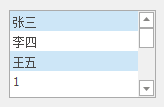
-
ContextButtons——调用ContextButton管理器
BaseListBoxControl.ContextButtonClick——以集中方式处理context button的单击
RatingContextButton——五角星评级
- RatingContextButton.ItemCount——设定星的个数。默认5个
- RatingContextButton.Rating——获取当前选择的等级
- RatingContextButton.FillPrecision——可设置使用半整数。默认是整数
-
ContextButtonsOptions——ContextButtons设置
-
DataSource——绑定数据源
-
HighlightentedItemStyle——高亮item的风格:宽或窄
-
SortOrder——item的升序/降序
-
Templates——模板编辑器
(2)事件
-
SelectedIndexChanged——选择的item改变时触发
-
BaseListBoxControl.ContextButtonClick
(3)DataSource绑定数据源
<1> Access
<2>MySQL
(4)搜索、过滤器
使用SearchControl——将ListBoxControl与之关联
SearchControl.Client = listBoxControl1;
(5)模板
-
当Templates非空时使用模板,要不使用模板,需清空Templates
-
默认时,Templates的第一个模板被用于当前ListBox的所有item
可创建多个模板,分别用于不同的item。或通过BaseListBoxControl.CustomItemTemplate事件让不同情况下使用不同的模板
//不同item指定不同模板 //CustomItem.Template事件指定不同模板 -
模板可用于ListBoxControl、CheckedListBoxControl和ImageListBoxControl
-
若ListBoxControl绑定了DataSource,则Columns会显示数据源中所有可访问的字段以待使用
-
Elements——用来显示添加到模板中的元素
可用加号添加,也可以直接从Columns中拖到下方的模板编辑中。
数据源中有的字段用拖曳的方法直接从Columns将需要的拖进模板编辑中,因为加号添加的时候都重叠在一个地方然后还要拖曳。
添加数据源中没有的字段,用添加的方法
-
Merge——合并单元格,Umerge——取消合并,Hide Grid——隐藏/取消隐藏网格线
右键添加/删除单元格
网格尺寸可以拖动改变
拖动多个element到同一个单元格时,会重叠,需要设置AnchorAlignment
AnchorElement——AnchorAlignment的基准Element
-
保存模板——BaseListBoxControl.CustomItemTemplate事件,动态使用不同模板
9. SearchControl——搜索栏
搜索框,过滤数据
(1)属性
-
SearchControl.Client——绑定要过滤数据的控件
-
Properties.Options.AllowAutoApply——false为按下Enter后才触发搜索
-
Search.Properties.Options.FindDelay——在非自动搜索的情况下,设置延迟搜索
-
ShowDefaultButtonsMode——搜索按钮、清除按钮的显示模式
AutoChangeSearchToClear/Default——搜索框无文本时显示搜索按钮,有文本时显示清除按钮
AutoShowClear——搜索按钮一直显示。当搜索框有文本时显示清除按钮
Always——两个按钮都一直显示
-
ShowMRUButton——搜索历史按钮
-
NullValuePrompt——搜索框中显示提示信息(按下Enter,当前文本添加进提示信息)
(2)事件
https://docs.devexpress.com/WindowsForms/DevExpress.XtraEditors.SearchControl.QueryIsSearchColumn
-
SearchControl.QueryIsSearchColumn——设定在某一行进行搜索
每列都会触发
读取Caption获得列标题,FieldName获取字段名,DataType获取数据类型
设置IsSearchColumn=false,设置某列不在搜索范围,从而设定在搜索范围内的列
private void searchControl1_QueryIsSearchColumn(object sender, QueryIsSearchColumnEventArgs args) { if (args.FieldName != "ShipCountry") args.IsSearchColumn = false; }
10. CheckEdit——复选框
(1)属性
- Properties.Options.AllowGrayed——是否显示不确定框Indeterminate
- CheckState——指定复选框的状态:Unchecked、Checked或Indeterminate枚举值
- Checked——get/set,Checked状态
this.checkEdit42.Location = new System.Drawing.Point(401, 234); this.checkEdit42.Name = "checkEdit42"; this.checkEdit42.Properties.Caption = "hide button"; this.checkEdit42.Size = new System.Drawing.Size(106, 19); this.checkEdit42.TabIndex = 1;
(2)样式
-
Properties.Options.CheckBoxOptions.Style——设置样式
Custom——自定义。通过ImageOptions设置Checked/Unchecked的图片、图片大小。
-
Style是Svg时
Properties.CheckBoxOptions——用于在相应状态中绘制矢量字形的颜色、尺寸(Style是Svg是前提)
SvgColorUnchecked
SvgColorChecked
SvgColorGrayed
SvgImageSize——默认18*18
private void checkEdit43_CheckStateChanged(object sender, EventArgs e) { if (this.checkEdit43.Checked == true) { this.checkEdit43.Properties.CheckBoxOptions.SvgImageSize = new Size(50,50); } else { this.checkEdit43.Properties.CheckBoxOptions.SvgImageSize = new Size(16, 16); //svg默认大小16*16 } } -
复选框根据当前应用的皮肤和调色板呈现
-
GlyphAlignment——设定文字和框的相对位置
11. CheckedListBoxControl——复选框列表
(1)属性
BaseCheckedListBoxControl.Items - 允许您在未绑定模式下使用项目填充控件。
BaseListBoxControl.DataSource - 使用此属性可使用数据源中的项目填充控件。
BaseListBoxControl.Templates - 此属性支持项模板功能。请参阅模板化列表框项目以了解更多信息。
BaseListBoxControl.CustomizeItem - 允许您动态自定义模板化项目。
BaseListBoxControl.CustomItemTemplate - 允许您为列表框项目提供自定义模板。
BaseListBoxControl.ValueMember - 获取或设置绑定数据源中的字段名称,其内容分配给项目值。
BaseListBoxControl.DisplayMember - 获取或设置为列表框项提供显示文本的数据源字段的名称。当列表框项基于项模板呈现时,不支持此属性
BaseListBoxControl.MultiColumn - 获取或设置列表框项是否可以跨多列排列。
BaseListBoxControl.SelectionMode - 获取或设置是可以选择单个还是多个项目。
BaseListBoxControl.ContextButtons - 提供对控件中显示的上下文按钮集合的访问。
BaseListBoxControl.SelectedIndexChanged - 允许您响应项目选择。
BaseListBoxControl.ItemHeight - 获取或设置项目的高度。
BaseCheckedListBoxControl.GetItemEnabled - 使您能够在绑定模式下禁用特定项目。
(2)事件
- BaseListBoxControl.SelectedIndexChanged - 允许您响应项目选择
- BaseCheckedListBoxControl.GetItemEnabled - 使您能够在绑定模式下禁用特定项目
(3)热跟踪
-
HotTrackItems——设置为true,有热跟踪效果
-
无法在SelectedMode=multi时使用
-
HotTrackSelectMode——
SelectItemOnClick——虽然有热跟踪,但是高亮框需要Click才选中
SelectItemOnHotTrack——热跟踪,高亮框跟着鼠标走
SelectItemOnHotTrackEx
(4)API
12. ComboBoxEditor——下拉框
(1)属性
-
TextEditStyle——是否可编辑文本
-
Properties.Items——集合可以是任何类型的。如果项目是字符串类型,则项目值和显示文本匹配。在其他情况下,项目的显示文本由项目的ToString方法确定
-
RepositoryItemComboBox.AutoComplete——true时可输入字符串前几个字符来自动补全字符串。默认为true
-
RepositoryItemComboBox.CycleOnDblClick——
-
ComboBoxEdit.SelectedIndex——获取/设置选择item的index
public virtual int SelectedIndex { get; set; } -
ComboBoxEdit.SelectedItem——当选中某个项目时,将选中item分配给SelectedItem
13. CheckedComboBoxEdit——
14. ImageComboBoxEdit——ComboxBoxEdit可以显示图标
(1)属性
-
Items——ImageComboBoxItem类型
Description——文本
ImageIndex——图片集合的序号
-
图片集合支持
ImageCollection——支持图片透明度
SharedImageCollection——支持图片透明度,可在多个form的控件之间共享图像
SvgImageCollection——存储可在高分辨率设备上放缩的Svg图片
ImageList
- LargeImages——下拉框显示的图片
- SmallImages——编辑框中显示的图片
15. RadioGroup——提供一组单选按钮
(1)属性
-
Items——添加RadioButton
Description——设定按钮文本
Value——设定按钮的值。选中相应按钮时,会将item.Value赋值给Editvalue。若不设置,则Value=null
// Create five items. object[] itemValues = new object[] {10, 11, 12, 13, 14}; string [] itemDescriptions = new string [] {"Circle", "Rectangle", "Ellipse", "Triangle", "Square"}; for(int i = 0; i < itemValues.Length; i++) { radioGroup1.Properties.Items.Add(new RadioGroupItem(itemValues[i], itemDescriptions[i])); //Select the Rectangle item. radioGroup1.EditValue = 11; -
ItemsLayout——设置Item的布局:Column(默认)/Flow
-
SelectedIndex——选中的按钮的index
public int SelectedIndex { get; set; }
(2)事件
-
SelectedIndexChanged——选中的按钮发生改变时触发
-
EditValueChanged——RadioGroup的EditValue被赋予新值
(先触发EditValueChanged再触发SelectedIndexChanged)
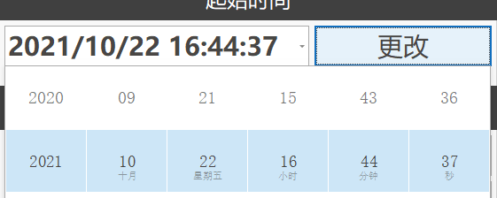
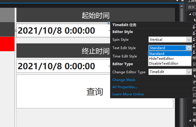
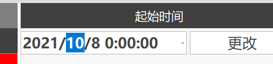
16. XtraEditors.TimeEdit——日期(DataTimePicker)
(1)属性
Properties.SpinStyle——时间编辑按钮是横向还是竖向
Properties.TimeEditStyle——选择触控UI模式
Time——编辑时间
public virtual DateTime Time { get; set; } DisplayFormat——
FormatString——
FormatType——
(2)代码中设定时间
-
Time属性
public Control_TimeEdit() { InitializeComponent(); this.timeEdit4.Time = new DateTime(2021, 7, 13, 10, 30, 25, 670); }
(3)时间显示格式——修改Mask
若要在TextEdit中显示日期,也是使用Mask设置显示。
(4)TimeSpanEdit——时间跨度编辑
- ReadOnly——设置只读
DateTime NYDate = new DateTime(2021, 3, 8, 0, 0, 0, 0); public Control_TimeEdit() { InitializeComponent(); this.timeEdit4.Time = new DateTime(2021, 7, 13, 10, 30, 25, 670); this.timeEdit5.Time = new DateTime(2021, 7, 13, 10, 30, 25, 670); timeSpanEdit2.Properties.DisplayFormat.FormatType = DevExpress.Utils.FormatType.Custom; timeSpanEdit2.Properties.DisplayFormat.FormatString = "{0:dd} days, {0:hh} hours, {0:mm} minutes and {0:ss} seconds"; timeSpanEdit2.Properties.ReadOnly = false; timeSpanEdit2.Properties.Mask.EditMask = "dd:HH:mm:ss"; RefreshTimer(); } private void RefreshTimer() { DateTime currentDate = DateTime.Now; TimeSpan timeToNY = currentDate - NYDate; timeSpanEdit1.EditValue = timeToNY; } private void simpleButton1_Click(object sender, EventArgs e) { RefreshTimer(); } private void simpleButton1_Click_1(object sender, EventArgs e) { labelControl1.Text = timeSpanEdit1.Properties.GetDisplayText(timeSpanEdit1.EditValue) + " left for the New Year!"; }
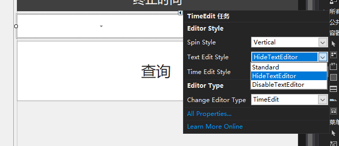
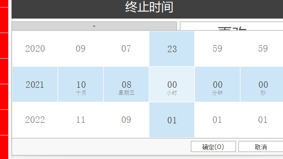
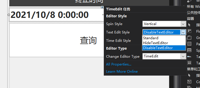
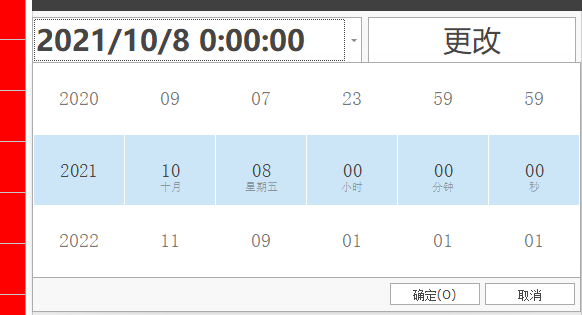
(5)Text Edit Style——时间栏:Standard单击时输入、HideTextEditor不显示时间只显示下拉按钮、DisableTextEditor不可输入单击直接显示下拉菜单
(6)代码中设置——属性、方法
属性
// // 摘要: // Gets or sets the currently edited time value. // // 值: // A System.DateTime object representing the edited time value. [Description("Gets or sets the currently edited time value.")] [DesignerSerializationVisibility(DesignerSerializationVisibility.Hidden)] [DXCategory("Appearance")] public virtual DateTime Time { get; set; }
// // 摘要: // Gets the text string representing the edited time value. // // 值: // A string value representing the editor's value. [Bindable(false)] [Browsable(false)] public override string Text { get; set; }
//返回是否可以显示下拉滑动菜单 protected override bool CanShowPopup { get; }
方法
下拉滑动菜单——BaseSpinEdit类型
// // 摘要: // Displays the DevExpress.XtraEditors.TimeEdit's pop-up window. //显示下拉滑动菜单 [Browsable(true)] [DesignerSerializationVisibility(DesignerSerializationVisibility.Visible)] [EditorBrowsable(EditorBrowsableState.Always)] public override void ShowPopup();
// // 摘要: // Closes the popup window accepting the changes made. // 下拉滑动菜单中的《确认》按钮 [Browsable(true)] [DesignerSerializationVisibility(DesignerSerializationVisibility.Visible)] [EditorBrowsable(EditorBrowsableState.Always)] public override void ClosePopup();
// // 摘要: // Closes the editor's popup window discarding the changes made. // 下拉滑动菜单中的《取消》按钮 [Browsable(true)] [DesignerSerializationVisibility(DesignerSerializationVisibility.Visible)] [EditorBrowsable(EditorBrowsableState.Always)] public override void CancelPopup();
// // 摘要: // Returns the control's popup window. // // 返回结果: // A DevExpress.XtraEditors.Popup.TouchPopupTimeEditForm object that represents // the control's popup window. null (Nothing in VB) if the popup window has not // been opened yet. public TouchPopupTimeEditForm GetPopupEditForm();
事件
// // 摘要: // Occurs when the DevExpress.XtraEditors.TimeEdit control attempts to open its // pop-up window. [Browsable(true)] [Description("Occurs when the TimeEdit control attempts to open its pop-up window.")] [DesignerSerializationVisibility(DesignerSerializationVisibility.Visible)] [DXCategory("Events")] [EditorBrowsable(EditorBrowsableState.Always)] public override event CancelEventHandler QueryPopUp;
// // 摘要: // Occurs after the DevExpress.XtraEditors.TimeEdit control's pop-up window is completely // displayed. [Browsable(true)] [Description("Occurs after the TimeEdit control's pop-up window is completely displayed.")] [DesignerSerializationVisibility(DesignerSerializationVisibility.Visible)] [DXCategory("Events")] [EditorBrowsable(EditorBrowsableState.Always)] public override event EventHandler Popup;
// // 摘要: // Occurs when the current DevExpress.XtraEditors.TimeEdit attempts to close its // pop-up window. [Browsable(true)] [Description("Occurs when the current TimeEdit attempts to close its pop-up window.")] [DesignerSerializationVisibility(DesignerSerializationVisibility.Visible)] [DXCategory("Events")] [EditorBrowsable(EditorBrowsableState.Always)] public override event CancelEventHandler QueryCloseUp;
// // 摘要: // Allows you to accept or discard the modified DevExpress.XtraEditors.TimeEdit // control's value after the pop-up window is closed. [Browsable(true)] [Description("Allows you to accept or discard the modified TimeEdit control's value after the pop-up window is closed.")] [DesignerSerializationVisibility(DesignerSerializationVisibility.Visible)] [DXCategory("Events")] [EditorBrowsable(EditorBrowsableState.Always)] public override event CloseUpEventHandler CloseUp;
// // 摘要: // Occurs when the DevExpress.XtraEditors.TimeEdit control's pop-up window is completely // closed and allows you to specify exactly how it was closed. [Browsable(true)] [Description("Occurs when the TimeEdit control's pop-up window is completely closed and allows you to specify exactly how it was closed.")] [DesignerSerializationVisibility(DesignerSerializationVisibility.Visible)] [DXCategory("Events")] [EditorBrowsable(EditorBrowsableState.Always)] public override event ClosedEventHandler Closed;
17.SeparatorControl——分割线
(1)属性
- LineOrientation——设定分割线的方向
- LineAlignment——分割线的位置:Near、Center、Far
18. SplitContainer——由1条分割线划分得到2个Panel的Panel
分割线可移动
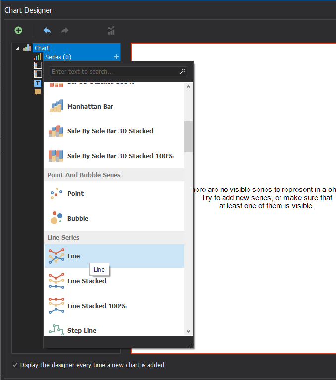
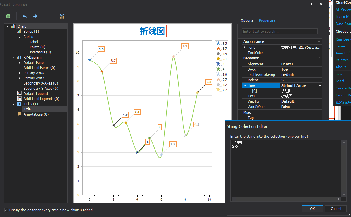
17. ChartControl——图表
https://docs.devexpress.com/WindowsForms/DevExpress.XtraCharts.ChartControl
https://docs.devexpress.com/CoreLibraries/DevExpress.XtraCharts.SeriesBase.ArgumentDataMember
https://docs.devexpress.com/CoreLibraries/DevExpress.XtraCharts.SeriesBase.ValueDataMembers
https://blog.csdn.net/qq_33459369/article/details/79423756
步骤
- 创建一个series,添加到chartControl中
- 一个chartControl中可添加好几个series
- chartControl.DataSource可绑定数据源,series.DataSource也可以绑定数据源,当series设定了数据源后chartControl绑定的数据源就被屏蔽。优先级:series.DataSource > chartControl.DataSource
(1)概念
https://www.cnblogs.com/DamonOnly/p/3668005.html
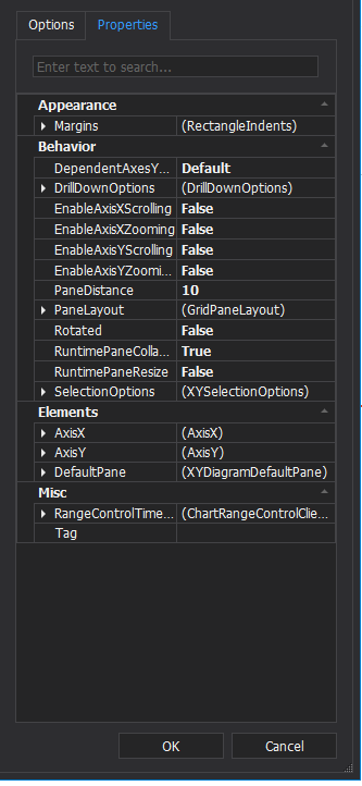
这个控件包含3层,最外面的chartControl层、中间的XYDiagram层、最里面的Series层。功能非常强大,但同时使用起来也相对复杂,需要各个层之间相互协调设置才能达到自己想要的效果。
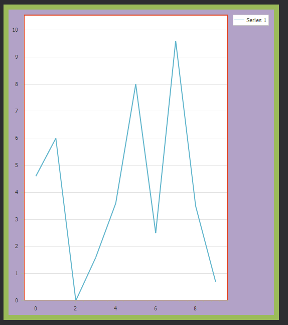
(2)折线图
设定光滑曲线/折线
Series series = new Series("", ViewType.Spline); //光滑
Series series = new Series("", ViewType.line); //折线
设定坐标轴参数类型
series1.ArgumentScaleType = ScaleType.DateTime; //X时间 series1.ValueScaleType = ScaleType.Numerical; //Y数值
设置坐标轴原点数值
diagram.AxisX.WholeRange.SideMarginsValue = 1; //X轴的原点从-1处开始
设置坐标轴范围
diagram.AxisX.WholeRange.SetMinMaxValues(0, 100); //X轴范围为0~100
设置曲线显示小圆点
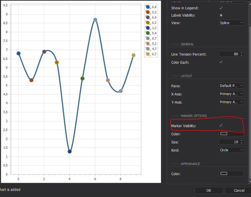
LineSeriesView view = (LineSeriesView)series.View; //view.MarkerVisibility = DevExpress.Utils.DefaultBoolean.True;
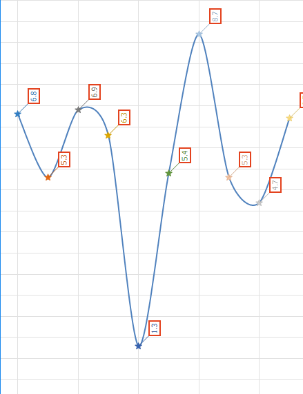
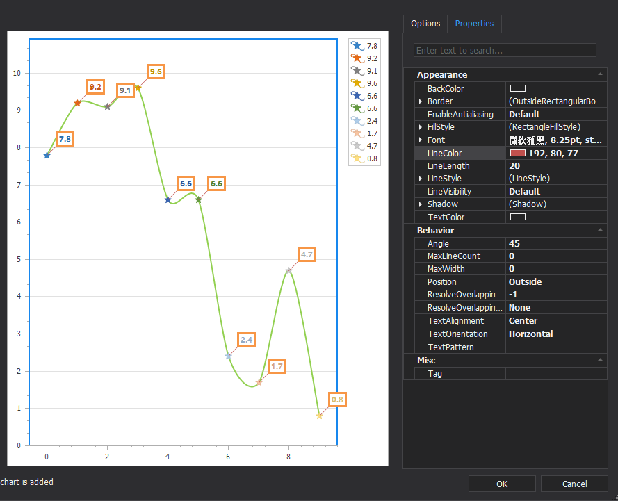
设置曲线显示标签显示每个点的数值
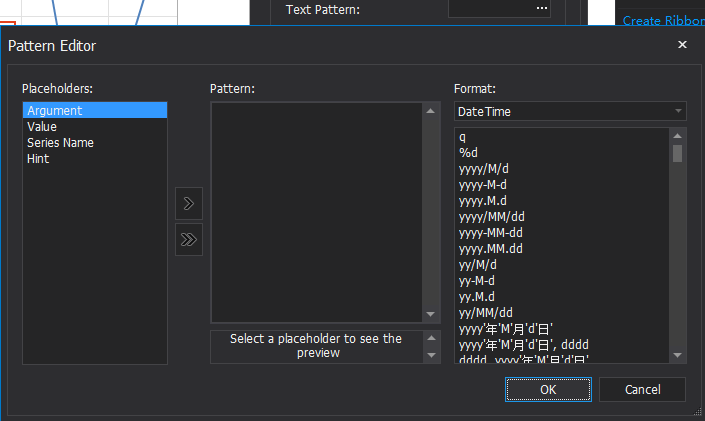
series.LabelsVisibility = DevExpress.Utils.DefaultBoolean.True; //显示数值标签 series.Label.ResolveOverlappingMode = ResolveOverlappingMode.HideOverlapped; //当2个及以上标签出现重叠时,隐藏重叠的标签 series.Label.TextPattern = "{V:#.00}";
series.Label.ResolveOverlappingMode = ResolveOverlappingMode.JustifyAllAroundPoint; //重新布局所有数值标签的位置,令其分布在对应点周围
series.Label.TextPattern = "{V:#.00}"; //V表示数值value,#.00表示小数点后两位数字 或 series.Label.TextPattern = "{V:F2}"; //V表示数值value,F2表示float数据保留小数点后两位数字 series.label.TextPattern = "({A}, {V:#.000})" //A表示横坐标,V表示纵坐标 或 series.label.TextPattern = "({A}, {V:F3})"
设置显示坐标轴所有标签
DevExpress.XtraCharts.XYDiagram diagram = ((DevExpress.XtraCharts.XYDiagram) chartControl1.Diagram); diagram.AxisX.QualitativeScaleOptions.AutoGrid = false; diagram.AxisX.Label.ResolveOverlappingOptions.AllowHide = false;
坐标轴是时间
//X轴为时间的设置 diagram.AxisX.Label.TextPattern = "{A:MMM, d (HH:mm)}"; diagram.AxisX.DateTimeScaleOptions.MeasureUnit = DateTimeMeasureUnit.Hour; diagram.AxisX.DateTimeScaleOptions.GridSpacing = 1;
绑定数据源
官方文档
// Create a line series, bind it to data and add to the chart. Series series = new Series("", ViewType.Line); series.DataSource = CreateChartData(500); this.chartControl_line.Series.Add(series); series.ArgumentScaleType = ScaleType.Numerical; series.ArgumentDataMember = "Argument"; series.ValueScaleType = ScaleType.Numerical; series.ValueDataMembers.AddRange(new string[] { "Value" }); // 显示小圆点 LineSeriesView view = (LineSeriesView)series.View; //view.MarkerVisibility = DevExpress.Utils.DefaultBoolean.True; //显示每个小圆点的数值 //series.LabelsVisibility = DevExpress.Utils.DefaultBoolean.True; series.Label.ResolveOverlappingMode = ResolveOverlappingMode.HideOverlapped; series.Label.TextPattern = "{V:#.00}"; // Create a chart title. ChartTitle chartTitle = new ChartTitle(); chartTitle.Text = "当前重量变化曲线"; chartControl_line.Titles.Add(chartTitle); // Customize axes. XYDiagram diagram = chartControl_line.Diagram as XYDiagram; //as强转关键字,失败时不会引发异常而是返回NULL diagram.AxisX.WholeRange.SetMinMaxValues(0, 100); diagram.AxisX.WholeRange.SideMarginsValue = 1; //X轴的原点从-1处开始 diagram.AxisY.WholeRange.AlwaysShowZeroLevel = false; diagram.AxisY.WholeRange.SetMinMaxValues(0, 20); diagram.EnableAxisXScrolling = true; diagram.EnableAxisYScrolling = true; diagram.EnableAxisXZooming = true; X轴为时间的设置 diagram.AxisX.Label.TextPattern = "{A:MMM, d (HH:mm)}"; diagram.AxisX.DateTimeScaleOptions.MeasureUnit = DateTimeMeasureUnit.Hour; diagram.AxisX.DateTimeScaleOptions.GridSpacing = 1; ((XYDiagram)chartControl_line.Diagram).AxisY.Visibility = DevExpress.Utils.DefaultBoolean.False; chartControl_line.Legend.Visibility = DevExpress.Utils.DefaultBoolean.False; this.chartControl_line.Series[0].DataSource = CreateChartData(50); this.chartControl_line.Series[0].ArgumentScaleType = ScaleType.Numerical; this.chartControl_line.Series[0].ArgumentDataMember = "Argument"; this.chartControl_line.Series[0].ValueScaleType = ScaleType.Numerical; this.chartControl_line.Series[0].ValueDataMembers.AddRange(new string[] { "Value" }); private DataTable CreateChartData(){ DataTable table = new DataTable("Table1"); // Add two columns to the table. table.Columns.Add("Argument", typeof(Int32)); table.Columns.Add("Value", typeof(Int32)); // Add data rows to the table. Random rnd = new Random(); DataRow row = null; for (int i = 0; i < rowCount; i++) { row = table.NewRow(); row["Argument"] = i; row["Value"] = rnd.Next(100); table.Rows.Add(row); } return table; }
通过绑定datatable自己生成曲线
//Series[0]访问第一个Series,Series的DataSource优先级高于ChartControl的DataSource this.chartControl_line.Series[0].DataSource = CreateChartData(50); //绑定Datatable this.chartControl_line.Series[0].ArgumentScaleType = ScaleType.Numerical; //设定Argument的类型 this.chartControl_line.Series[0].ArgumentDataMember = "Argument"; //设定Argument的字段名 this.chartControl_line.Series[0].ValueScaleType = ScaleType.Numerical; //设定Value的类型 this.chartControl_line.Series[0].ValueDataMembers.AddRange(new string[] { "Value" });
通过向Series上手动添加点Point生成曲线
DataTable dt = CreateChartData(50); SeriesPoint point = null; foreach (DataRow row in dt.Rows) { if (row["Argument"] != null) //字段名Argument { point = new SeriesPoint(row["Argument"].ToString()); double[] vals = { Convert.ToDouble(row["Value"]) }; //字段名Value point.Values = vals; this.chartControl_line.Series[0].Points.Add(point); } }
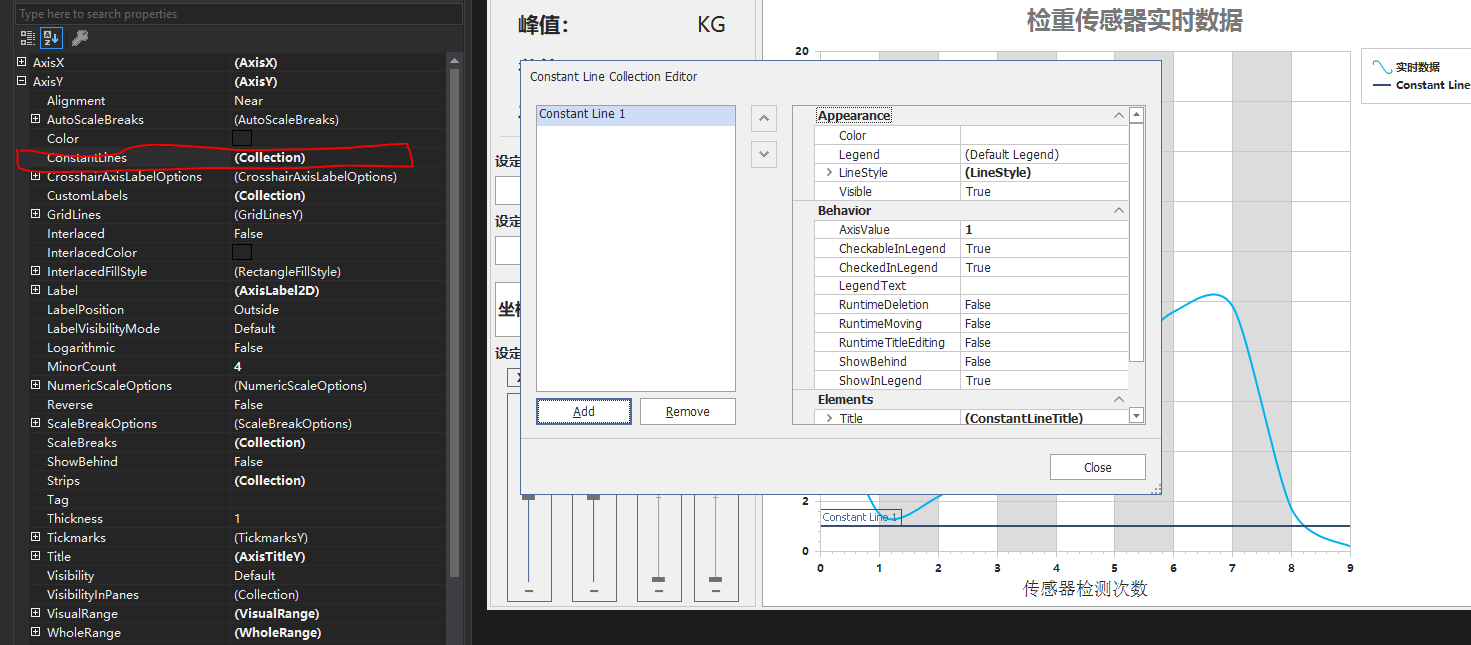
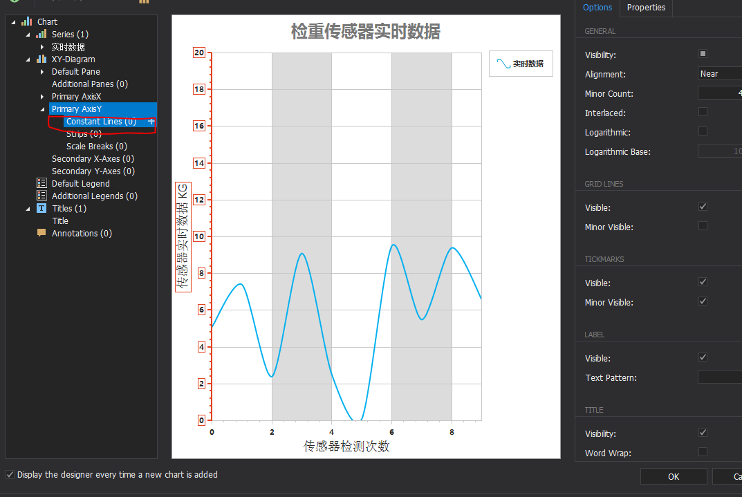
常数线——峰值、谷值、平均值线(垂直x轴和垂直y轴直线)
XYDiagram diagram1 = ((XYDiagram)(chartControl_weighterSensorRealTimeData.Diagram)); diagram1.AxisY.ConstantLines.Clear(); ConstantLine clYPeak = new ConstantLine("峰值:", Global.sensorRealTimeDataPeak); ConstantLine clYValley = new ConstantLine("谷值:", Global.sensorRealTimeDataValley); ConstantLine clYAvg = new ConstantLine("平均值:", Global.sensorRealTimeDataAvg); clYPeak.Color = Color.FromArgb(111, 186, 208); clYValley.Color = Color.FromArgb(230, 108, 125); clYAvg.Color = Color.FromArgb(94, 196, 104); diagram1.AxisY.ConstantLines.Add(clYPeak); diagram1.AxisY.ConstantLines.Add(clYValley); diagram1.AxisY.ConstantLines.Add(clYAvg);
坐标轴和放大设置
useTouchDevice——可触摸放大
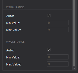
AxisX.VisualRange.MinValue——横轴的可见范围的最小值
AxisX.VisualRange.MaxValue——横轴的可见范围的最大值
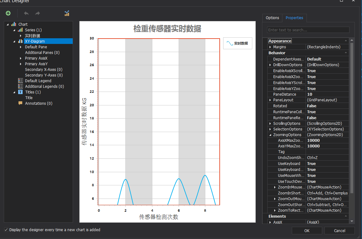
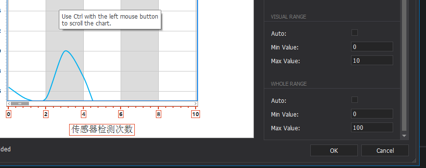
Visual Range——坐标轴显示的部分。必须比Whole Range范围小。本质是放大,通过放大显示Whole Range的一部分,可通过滚轮缩放将Visual Range改变。
Whole Range——整个坐标轴的范围。
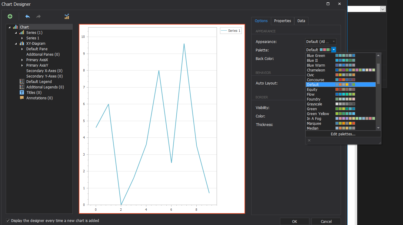
(3)设计器
组成
Series——可包含多个Series(Line、Pie等)
XY-Diagram——坐标轴
Pane
AxisX
AxisY
Legend
Title
<1> Chart
-
Series类型——折线、柱状、饼状等
-
配色方案
-
背景色
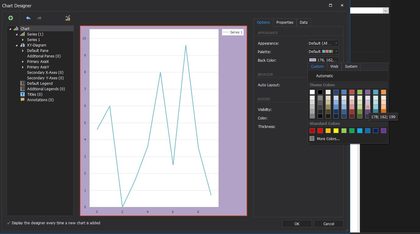
-
图表边框
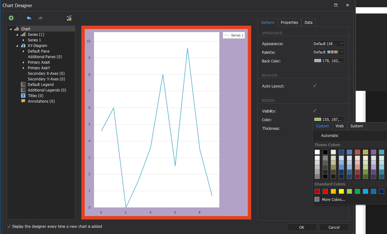
-
图表边框宽度
<2> Series
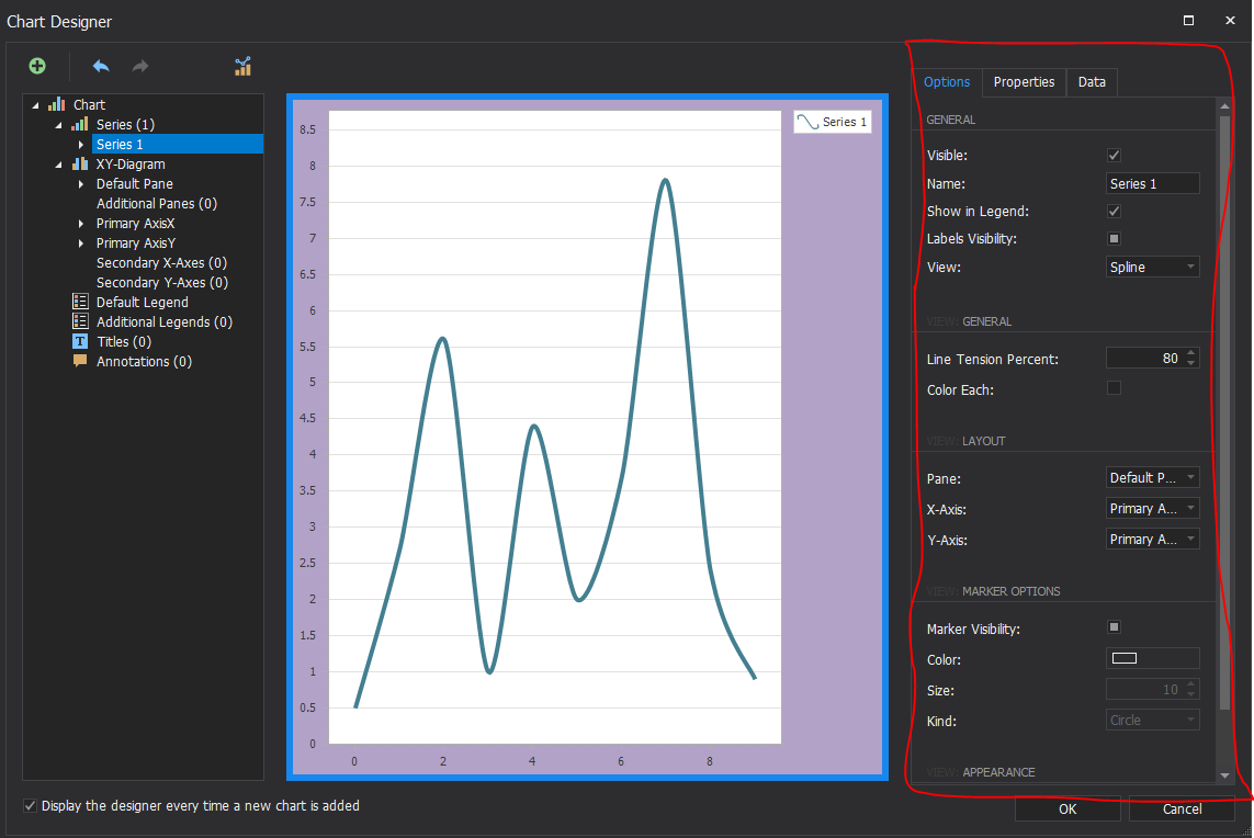
-
Visible——Series1是否可见
-
Name——Series名称,改变的话Legend也会发生改变
-
Show in Legend——Series是否显示在Legend中
-
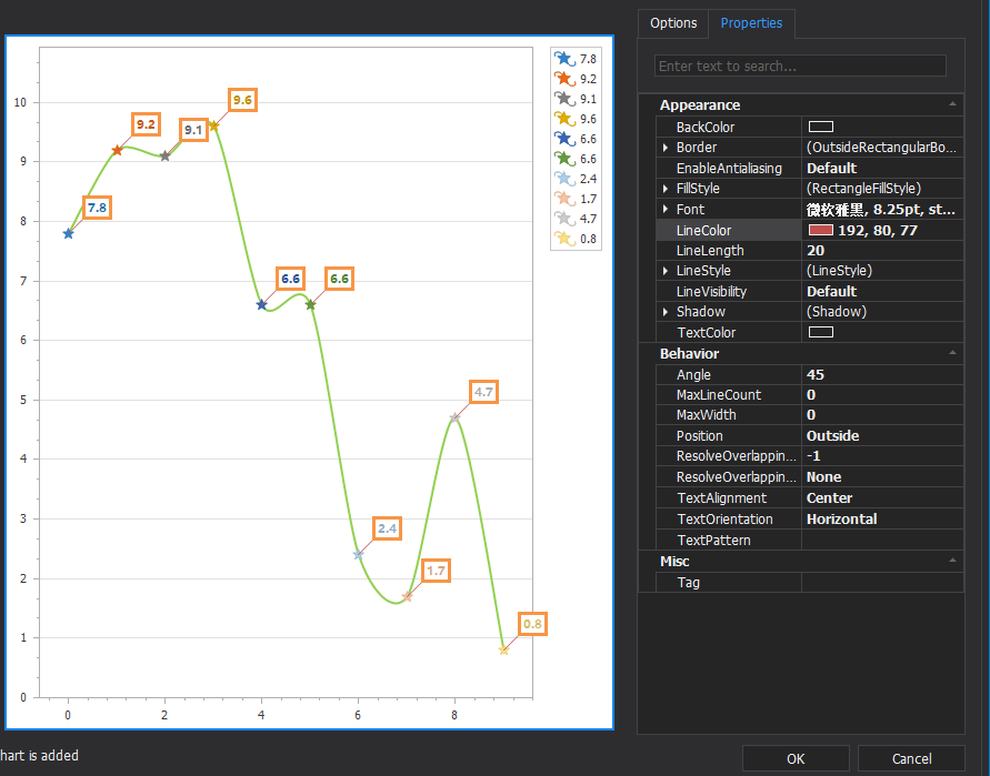
Labels Visibility——显示每个点的标签
Labels Visibility为true时,可设置Label
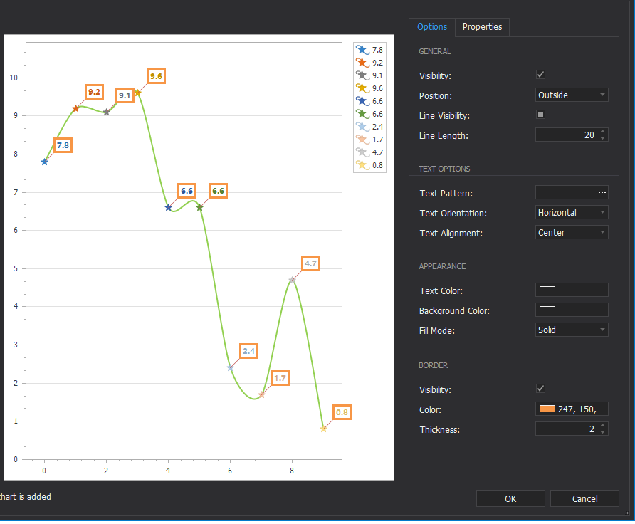
Position——label位置:曲线外/曲线上
Line Visibility——点与框之间的线是否可见
Line Length——点与框之间的线的长度
Text Pattern——label显示格式
Text Orientation——label中文本的方向
Text Color——label文本颜色
Background Color——label背景色
Fill Mode——颜色填充方式
Gradient——渐变
Hatch——斜线
Visibility——label边界是否可见
Color——label边界的颜色
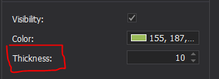
Thickness——label边界的宽度
-
View——线型
Bar——柱状图
Bar3D——3D柱状图
Point——点状图
Bubble——气泡
Line——折线
Spline——平滑曲线
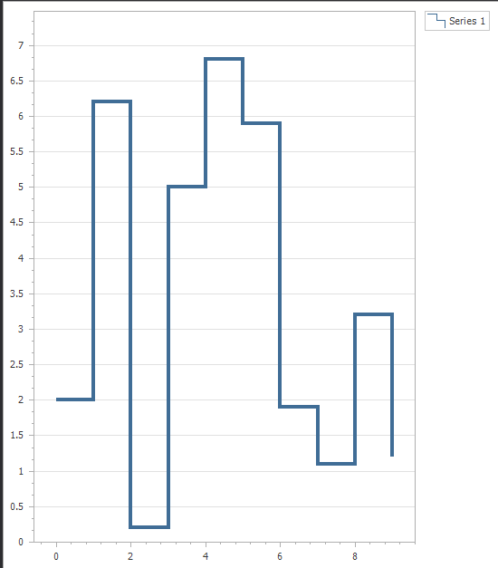
Step Line——
Area——曲线与坐标轴所围面积
Pie——饼图
Nested Doughnut——甜甜圈图
Pie3D——3D饼图
Radar——雷达图
,可由
Color Each设置:Point、Bubble、Radar等图每个点以不同颜色表示,Line、Spline等不同曲线以不同颜色,Bar等不同柱以不同颜色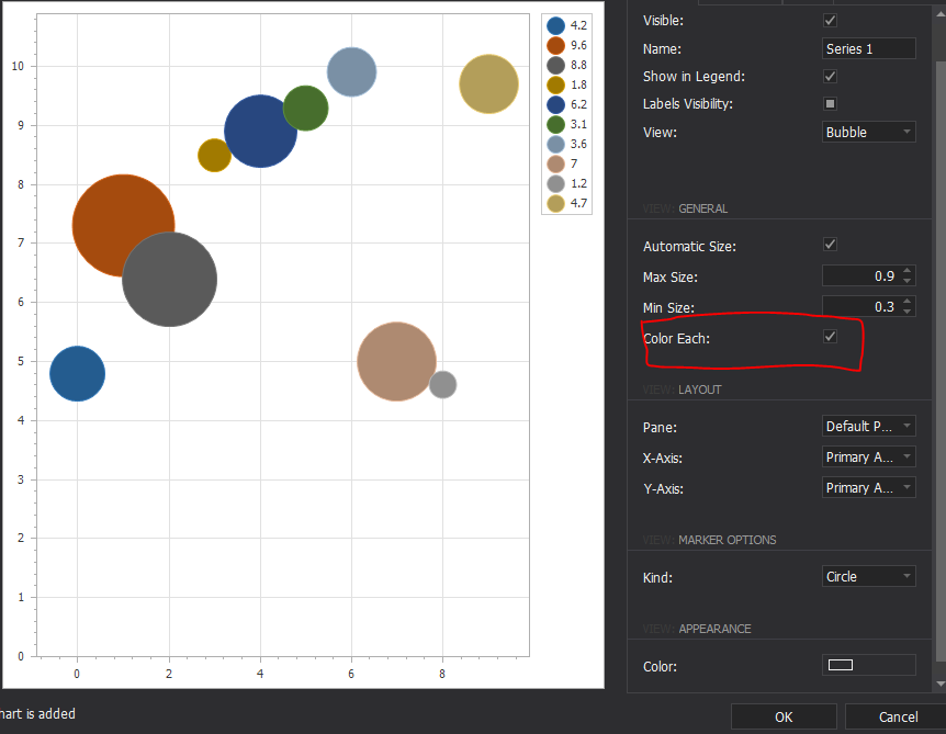

-
Marker Visibility——曲线上是否显示小圆点
-
Color——小圆点颜色(Automatic时跟随曲线颜色或由Color Each自动生成)
-
Size——小圆点尺寸
-
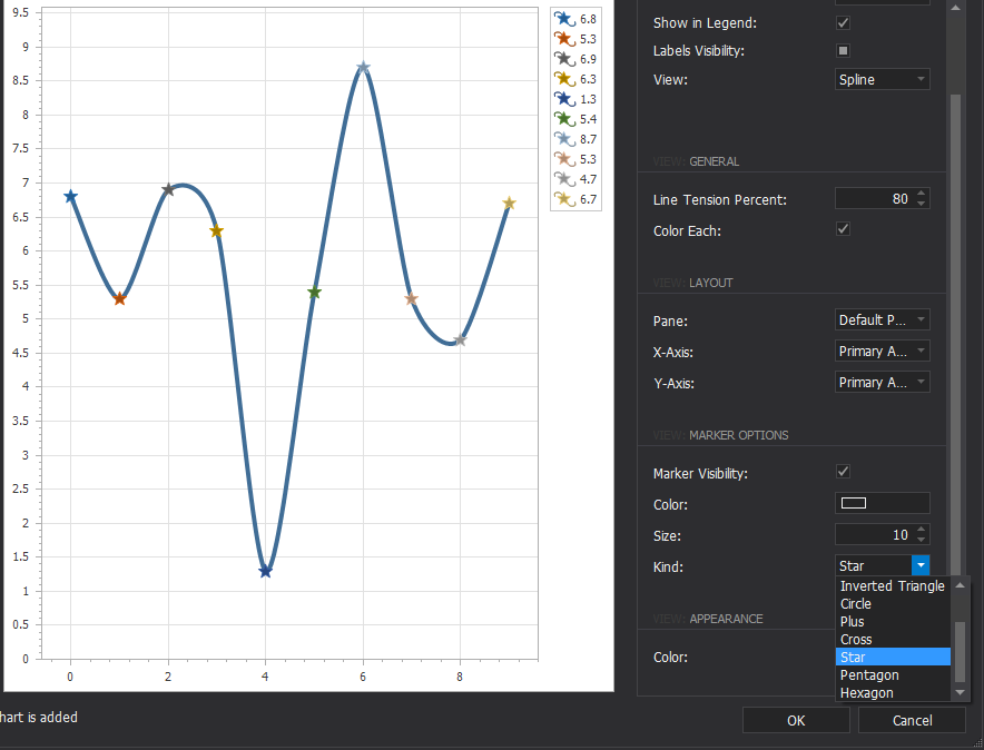
Kind——小圆点的类型
- Color——Series颜色
Font——字体
LineColor——方框和点之间线的颜色
LineLength——线长
Angle——线的角度
<3>XY-Diagram
-
EnableAxisXScrolling——X轴是否可滚动
-
EnableAxisXZooming——X轴是否可缩放
-
Rotated——翻转
-
SelectionOptions——缩放快捷键设置
-
坐标轴设置
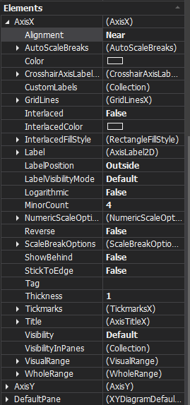
Alignment——坐标轴位置
Color——坐标轴颜色
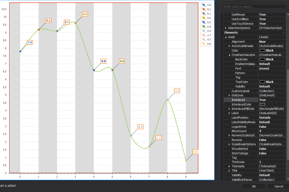
Interlaced——
LabelPosition——数字标签位置在图表外还是内
Reverse——坐标轴翻转
Thickness——坐标轴粗细


<4> AxisX/AxisY
- VisualRange的范围应 小于等于 WholeRange范围
- WholeRange——整个坐标轴的范围
WholeRange.Auto = true时会自动根据数据点的坐标设定坐标轴范围。
要想可以手动设定坐标轴范围,需要WholeRange.Auto = false
((XYDiagram)(chartControl_weighterSensorRealTimeData.Diagram)).AxisX.WholeRange.Auto = false; ((XYDiagram)(chartControl_weighterSensorRealTimeData.Diagram)).AxisY.WholeRange.Auto = false; ((XYDiagram)(chartControl_weighterSensorRealTimeData.Diagram)).AxisX.WholeRange.SetMinMaxValues(xMinWholeRange, xMaxWholeRange); ((XYDiagram)(chartControl_weighterSensorRealTimeData.Diagram)).AxisY.WholeRange.SetMinMaxValues(yMinWholeRange, yMaxWholeRange);
min出现大于max的情况时会报错
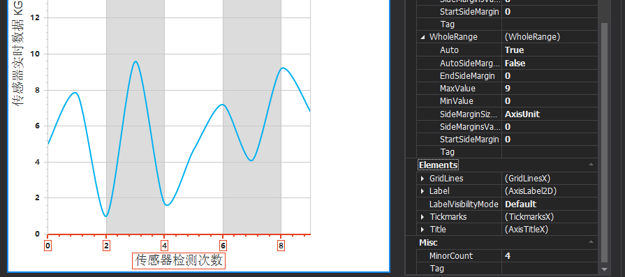
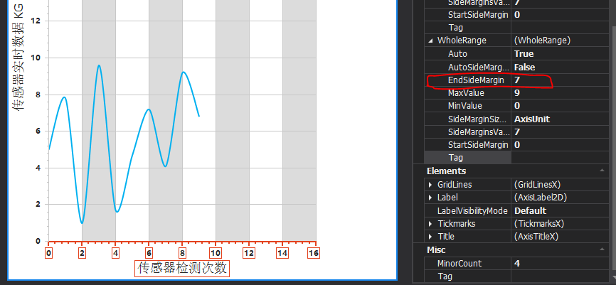
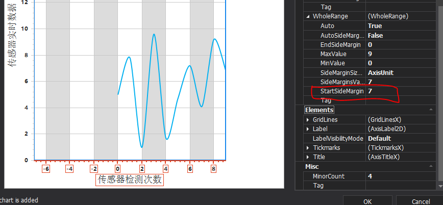
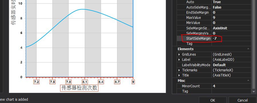
- VisualRange——坐标轴的可见范围(缩放,可通过拖动滑动条改变显示)
同上,Auto设为true时范围自动
((XYDiagram)(chartControl_weighterSensorRealTimeData.Diagram)).AxisX.VisualRange.Auto = true; ((XYDiagram)(chartControl_weighterSensorRealTimeData.Diagram)).AxisY.VisualRange.Auto = true; ((XYDiagram)(chartControl_weighterSensorRealTimeData.Diagram)).AxisX.WholeRange.SetMinMaxValues(xMinWholeRange, xMaxWholeRange); ((XYDiagram)(chartControl_weighterSensorRealTimeData.Diagram)).AxisY.WholeRange.SetMinMaxValues(yMinWholeRange, yMaxWholeRange);
但是,VisualRange的min和max设定需保证不超过WholeRange的范围
若VisualRangeMin<WholeRangeMin或VisualRangeMax>WholeRangeMax,则整个VisualRange将会变为WholeRange。
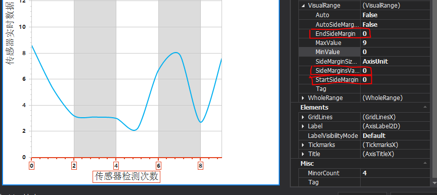
StartSideMargin和EndSideMargin同上。
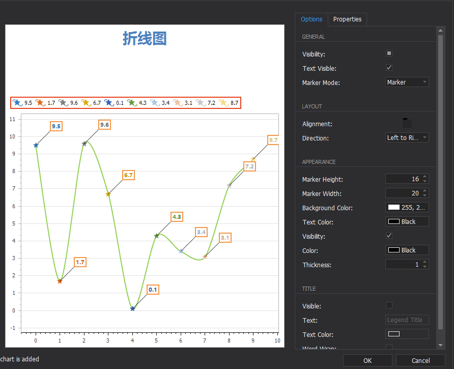
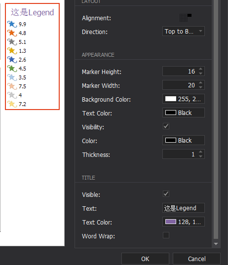
<5> Legend
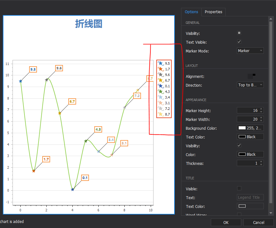
-
Visibility——是否可见
-
Text Visible——文本数字是否可见
-
Marker Mode——选择类型
-
Alignment——Legend相对图表的位置
-
Direction——排列方向
-
Marker Height——高度
-
Marker Width——宽度
-
Background Color——Legend框背景色
-
Text Color——Legend数字颜色
-
Visibility——Legend边框是否可见
-
Color——Legend边框颜色
-
Thickness——Legend边框粗细
-
Visible——Legend标题是否可见
-
Text——Legend标题文本
-
Text Color——Legend标题文本颜色
-
Word Wrap——Legend标题文本换行
<5> Title
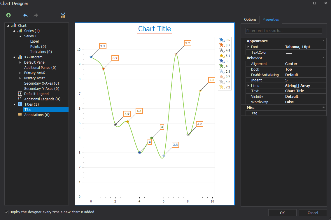
-
TextColor——标题颜色
-
Alignment——标题位置:居左、居中、居右
-
Dock——图表的上下左右
-
Visibility——标题是否可见
-
多行标题
(4)饼图
https://www.cnblogs.com/xumingyang/p/4600443.html
https://blog.csdn.net/qq_36248777/article/details/105745481
方案一
-
绑定到DataTable,2列分别代表饼片、饼片的值,各行代表各个饼片。
-
饼图自动根据数值计算占比。若
Legend.Visible=true但不设置Legend的格式LegendTextPattern则默认会在Legend中显示各部分占比。
-
设置Legend格式
// Series1.LegendPointOptions.PointView = PointView.ArgumentAndValues中LegendPointOptions属性已被弃用 //图例格式"Argument:Value"。V:n2为Value:numeric小数点后2位,显示原始数值 this.chartControl_pie.Series[0].LegendTextPattern = "{A}:{V:n2}"; 此时显示的Value为原始数值
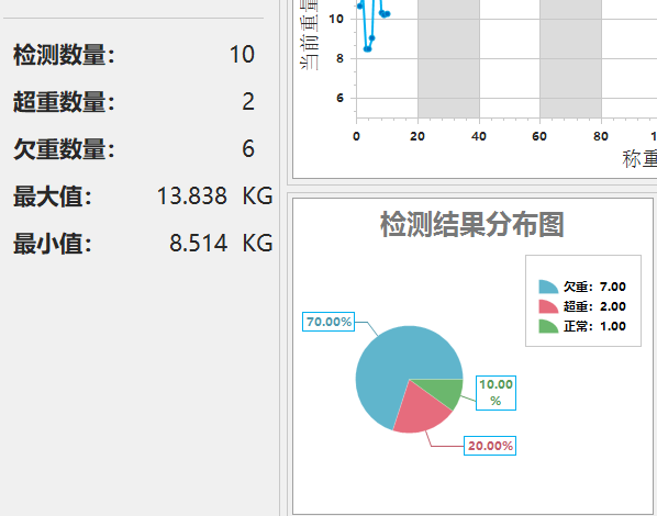
//VP:p2为Value:percent小数点后2位,显示百分比 this.chartControl_pie.Series[0].LegendTextPattern = "{A}:{VP:p2}";
方案二
不用DataTable,手动添加点
https://www.cnblogs.com/xumingyang/p/4600443.html
- demo
private DataTable dtPie = new DataTable("tablePie"); //饼图数据源,只要不更换brand就一直累计 dtPie.Columns.Add("status", typeof(String)); dtPie.Columns.Add("countCur", typeof(Int32)); private void bindPieData() { this.chartControl_pie.Series[0].DataSource = dtPie; this.chartControl_pie.Series[0].ArgumentDataMember = "status"; this.chartControl_pie.Series[0].ArgumentScaleType = ScaleType.Auto; this.chartControl_pie.Series[0].ValueDataMembers.AddRange(new string[] { "countCur" }); this.chartControl_pie.Series[0].ValueScaleType = ScaleType.Numerical; this.chartControl_pie.Series[0].LegendTextPattern = "{A}:{VP:p2}"; //图例格式"Argument:Value"。V:n2为Value:numeric小数点后2位,VP:p2为Value:percent小数点后2位 } private void updateChartPieData() { if (dtPie.Rows.Count == 0) { DataRow drCountUnderWeight = dtPie.NewRow(); drCountUnderWeight["status"] = "欠重"; drCountUnderWeight["countCur"] = Global.curStatus.countUnderWeight; dtPie.Rows.Add(drCountUnderWeight); DataRow drCountOverWeight = dtPie.NewRow(); drCountOverWeight["status"] = "超重"; drCountOverWeight["countCur"] = Global.curStatus.countOverWeight; dtPie.Rows.Add(drCountOverWeight); DataRow drCountNormal = dtPie.NewRow(); drCountNormal["status"] = "正常"; drCountNormal["countCur"] = Global.curStatus.countDetection - Global.curStatus.countOverWeight - Global.curStatus.countUnderWeight; dtPie.Rows.Add(drCountNormal); } else { dtPie.Rows[0]["countCur"] = Global.curStatus.countUnderWeight; dtPie.Rows[1]["countCur"] = Global.curStatus.countOverWeight; dtPie.Rows[2]["countCur"] = Global.curStatus.countDetection - Global.curStatus.countOverWeight - Global.curStatus.countUnderWeight; } }
18. WebChartControl
19. navBarControl——侧面按钮面板
20. 缩放滑动条——ZoomTrackBarControl
Value——设置滑动条位置
Properties.Maximum——设置Value最大可到的值

Navigation & Layout——容器
1. PanelControl——容器,提供边框
https://docs.devexpress.com/WindowsForms/DevExpress.XtraEditors.PanelControl?p=netframework
(1)与TileBar一起用时,边缘不能和TileBar的边缘重合,否则边框无法显示
在设置时,一般将panelControl的边缘设置比内部多1像素
-
TileBar:239
PanelControl:240
窗口Control:240
-
TileBar:240
PanelControl:240
窗口Control:250
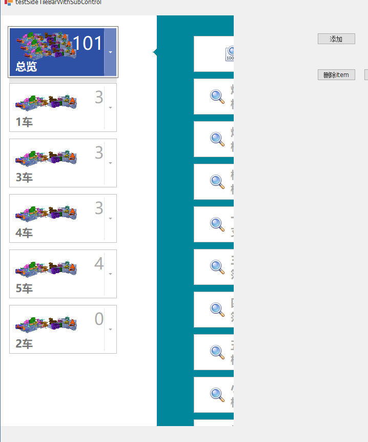
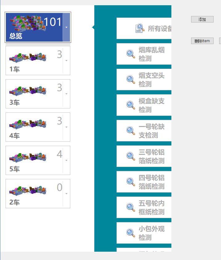
2. TileBar——磁贴
(1)属性
tilebar内添加tileGroup,在tileGroup中添加tileBar
在tileBarGroup的Text中设置标题
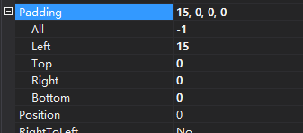
Visible设置文字是否显示——Visible会影响最上面Item的Top间距(由tileBar.Padding设置,注意和tileBarItem.Padding的区别)
一般而言,Visible不要设为false。在Visible=true的基础上,将Text设为空,然后设置Padding调整tileBarGroup的间距
AppearanceGroupText——tileBarGroup上文字的颜色格式
Padding——设置TileBarGroup的间距
设置按钮在菜单中居中位置,Size是菜单尺寸,WideTileWidth为按钮尺寸,Size-WideTileWidth/2分到Padding上作为边距
子菜单的有颜色的菜单的尺寸实际由DropDownContainer决定,而不是tileBar_sub

ScrollMode——滑动模式
AllowSelectedItem——设为true,才允许磁贴被选中
AllowItemHover——设为true时,磁贴有Hover效果。false时没有
Orientation——磁贴排列的方向,水平/垂直
SelectionColorMode——TileBarItem被选中时外框的颜色
SelectionColor——被选中TileBarItem的外框颜色
SelectionBorderWidth——TileBarItem被选中时外框宽度
VerticalContentAlignment——tileItem的水平对齐方式
HorizontalContentAlignment——设置水平对齐方式
IndentBetweenItems——设置磁贴间距
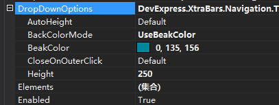
每个tileBarItem——DropDownControl,设置该tileBarItem磁贴的下拉菜单。用tileBarDropDownContainer,再往里添加控件(还可以添加tileBar)
每个TileBarItem的DropDownOptions——设置下拉菜单
AutoHeight——是否自动设置高度/宽度(Orientation为Vertical时为宽度,为Horizontal时为高度)
True——运行效果,子菜单高度/宽度和拖曳的tileBarItem_sub宽度/高度相同(不取决于tileBarDropDownContainer的宽度)
False——运行效果,宽度/高度取决于Height设定值
BackColorMode——下拉菜单的背景色
UseTileBackColor——使用磁贴颜色作为下拉菜单颜色
UseBeakColor——使用BeakColor
ImageOptions
ImageAlignment——图片位置
TextAlignment——文字位置

Hover、selected效果由AppearanceItem设置
将tileBarDropDownContainer置于底层,tileBar置于顶层
WideTileWidth——磁贴宽度
ItemSize——磁贴高度
在磁贴中放多个文本和图像
-
文字位置
-
图片位置
通过坐标设置图片位置:
ItemSize——设置磁贴是正方形/长方形
ItemPadding——所有磁贴,文字和图片相对于磁贴的左右上下的距离
(2)tileBarItem
AppearanceItem.Selected.BorderColor——选中后外框内按钮外一圈细细的边框颜色(图中红色部分)
Padding——设置单个tileBarItem中文字和图片的位置
imageToTextIndent——图标不动,文字距图标的距离
imageToTextAlignment——图标相对于文本的位置
控制DropDownWindow显示/隐藏
this.tileBar_mainMenu.ShowDropDown(this.tileBarItem_statusMonitoring); //显示tileBarItem_statusMonitoring对应的子页面
this.tileBar_mainMenu.HideDropDownWindow(false); //隐藏tileBar_mainMenu对应的子页面 //false——使用动画效果 //true——立即关闭,不使用动画效果
3. tileNavPane——分层次磁贴(最多三层)
(1)概念
-
按钮分类
TileNavCategory——顶层按钮
TileNavItem——二层按钮
TileNavSubItem——三层按钮
-
默认三层,可设置显示两层,将
TileNavPane.DefaultCategory设为ShowDefaultCategoryItems
4. WindowsUIButtonPanel
使用时,一定要注意Button是PushButton还是CheckButton。若是Checkbutton,则需要把GroupIndex设为同一正整数,通过每个button的Tag搭配ButtonChecked事件使用,可触发每个按钮被按下时的动作
(1)属性
-
Orientation——设定按钮排列是水平/垂直
-
BackColor——面板的背景颜色
-
ForeColor——按钮和文本颜色
-
UseButtonBackgroundImages——去掉按钮圆圈
Hover效果手动设置——有圆圈时自带hover效果。去掉圆圈,设置
AppearanceButton.Hover.ForeColor,可改变Hover效果的图标和文本颜色时,选中效果手动设置——BackColor是图标色,ForeColor是文本色(Hover中ForeColor可同时设置文本和图标颜色)
-
Buttons
Add WindowsUIButton——添加按钮
Add WindowsUISeparator——添加分割线
Style——设定是pushbutton/checkbutton
Caption——文本
UseCaption——使用文本
GroupIndex——pushbutton时设定按钮的index。checkbutton设为同一值则所有checkbutton设为一组
-
ButtonInterval——按钮间距
-
Dock——锚定
(2)事件
-
ButtonCheckd——通过
((WindowsUIButton)e.Button访问按下的按钮using DevExpress.XtraBars.Docking2010; //checkButton void windowsUIButtonPanel1_ButtonChecked(object sender, ButtonEventArgs e) { string tag = ((WindowsUIButton)e.Button).Tag.ToString(); //checkButton时Caption被禁用了 switch(tag) { case "Ad1": /* Navigate to page A */ break; case "Ad2": /* Navigate to page B */ break; case "Ad3": /* Navigate to page C*/ break; case"Ad4": /* Navigate to page D */ break; case "Ad5": /* Navigate to page E */ break; } }
5. BehaviorManager——将换页按钮绑定到页面
(1)target为tileBar/imageSlider
通过BehaviorManager中的Pager Navigation Behavior将pager和target绑定,target可为TileControl、TileBar、ImageSider、NavigationFrame,pager可为RadioGroup和WindowsUIButtonPanel
//代码绑定target和pager BehaviorManager bm = new BehaviorManager(this.components); bm.Attach<PagerBehavior>(navigationFrame1, behavior => { behavior.Properties.Pager = windowsUIButtonPanel1; behavior.CustomizePagerItem += Behavior_CustomizePagerItem; });
(2)target为 NavigationFrame
使用BehaviorManager绑定WindowsUIButtonPanel和NavigationFrame时,不知道为什么WindowUIButtonPanel的Button无法显示????
6. NavigationFrame——可翻页页面
(1)属性
-
Pages——保存着NavigationPage,NavigationPage可容纳其他各种控件
-
SelectedPage——当前展示的NavigationPage
通过WindowUIButtonPanel设定翻页
设置在底层,翻页时WindowUIButtonPanel不消失。设置在上层时,翻页动画时消失,动画结束时重新出现。
private void windowsUIButtonPanel2_ButtonChecked(object sender, DevExpress.XtraBars.Docking2010.ButtonEventArgs e) { string tag = ((WindowsUIButton)e.Button).Tag.ToString(); //checkButton时Caption被禁用了 switch (tag) { case "Contacts": navigationFrame1.SelectedPage = navigationPage1; break; case "Calendar": navigationFrame1.SelectedPage = navigationPage2; break; case "Mail": navigationFrame1.SelectedPage = navigationPage3; break; } } -
TransitionType——页面切换的不同效果
-
TransitionAnimationProperties——设置切换效果的切换速度
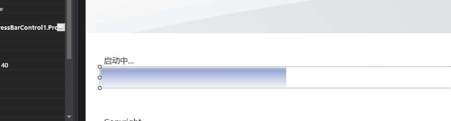
7. SplashScreenManager——添加启动加载窗口和等待提示窗口
https://blog.csdn.net/clearloveq/article/details/80885796
重要——Devexpress控件的SplashScreen界面上的文字和进度条动态更新
- SplashScreenManager很好的封装了日常WInform程序中用到的启动闪屏窗口和在耗时操作中进行等待提示的信息窗口,合理使用可以增加程序界面的友好交换
- SplashScreenManager显示在单独的线程中。启动画面由启动画面管理器在单独的线程中显示。
- 您可以在启动画面中更改控件的布局、删除或添加自定义控件、更改默认标签和图像等。
- 启动画面管理器将在主窗体启动时自动显示活动启动画面,并在主窗体完全初始化和显示后关闭它。
(1)启动加载窗口——splashScreen
要通过代码与启动窗体交互,您可以通过SendCommand方法向它发送命令。要响应命令,请覆盖启动窗体的SplashFormBase.ProcessCommand方法并实现所需的功能。
自定义进度条控件被添加到启动画面。该示例显示了如何通过从启动画面管理器发送命令来动态更新此进度条控件。启动画面由启动画面管理器在单独的线程中显示。与启动画面的交互可以通过命令机制来执行。您可以通过 SplashScreenManager.SendCommand 方法发送命令,并通过覆盖 SplashScreen.ProcessCommand 方法来处理此命令。在示例中,自定义命令被发送到启动画面以推进启动画面的进度条控件的进度。
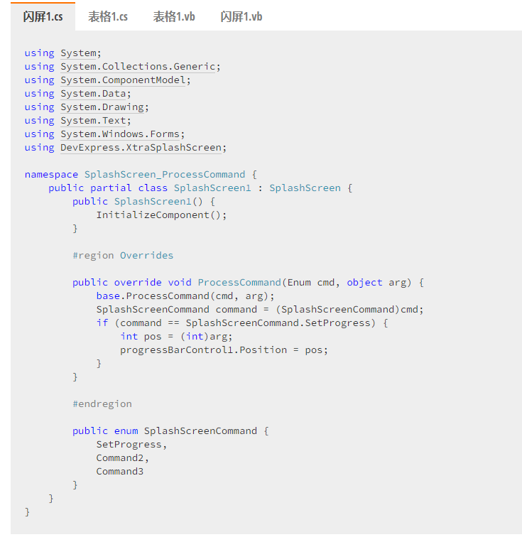
//SplashScreen1页面,ProcessCommand和SplashScreenCommand都自动生成 using DevExpress.XtraSplashScreen; using System; using System.Collections.Generic; using System.ComponentModel; using System.Data; using System.Drawing; using System.Text; using System.Windows.Forms; namespace CloudManage { public partial class SplashScreen1 : SplashScreen { public SplashScreen1() { InitializeComponent(); this.labelCopyright.Text = "Copyright © 1998-" + DateTime.Now.Year.ToString(); } #region Overrides public override void ProcessCommand(Enum cmd, object arg) { base.ProcessCommand(cmd, arg); SplashScreenCommand command = (SplashScreenCommand)cmd; if(command == SplashScreenCommand.SetProgress) { int pos = (int)arg; progressBarControl1.Position = pos; } } #endregion public enum SplashScreenCommand { SetProgress //设置progressBar的position } } }
(2)等待窗口——Wait Form
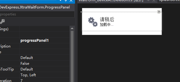
窗口中包含一个progressPanel,progressPanel显示动态图片效果。
使用方法
https://www.cnblogs.com/wuyifu/p/3373504.html
/*第一步: 在程序中拖入: splashScreenManager1 控件 在需要处理的地方 使用以下语句来打开 WaitForm窗体(当然需要在 splashScreenManager1控件中绑定一个 WaitForm窗体(自己添加或者直接在这个控件属性里就可以添加))*/ //第二步: splashScreenManager1.ShowWaitForm(); //第三步: //在过程可以通过以下语句来更改运行过程中的 WaitForm的 Caption 和 Msg splashScreenManager1.SetWaitFormCaption("请稍后,正在加载中...."); // 标题 splashScreenManager1.SetWaitFormDescription("正在初始化....."); // 信息 //第四步: //最后通过以下语句来关闭 WaitForm splashScreenManager1.CloseWaitForm(); //注意: 第三步最好开启另一个线程来操作. 或者添加 Application.DoEvents(); 来保证 WaitForm界面 刷新流畅
https://www.cnblogs.com/haowuji/p/3469529.html
//先创建一个WaitForm1 类 using System; using System.Collections.Generic; using System.ComponentModel; using System.Data; using System.Drawing; using System.Text; using System.Windows.Forms; using DevExpress.XtraWaitForm; namespace Taxinfo.TaxOA.AppBaseControls { public partial class LoadWaitForm : WaitForm { public LoadWaitForm() { InitializeComponent(); this.progressPanel1.AutoHeight = true; } #region Overrides public override void SetCaption(string caption) { base.SetCaption(caption); this.progressPanel1.Caption = caption; } public override void SetDescription(string description) { base.SetDescription(description); this.progressPanel1.Description = description; } public override void ProcessCommand(Enum cmd, object arg) { base.ProcessCommand(cmd, arg); } #endregion public enum WaitFormCommand { } } }
//然后使用它的时候 DevExpress.XtraSplashScreen.SplashScreenManager.ShowForm(typeof(AppBaseControls.LoadWaitForm)); //.......... DevExpress.XtraSplashScreen.SplashScreenManager.CloseForm();
(3)ProgressPanel
https://docs.devexpress.com/WindowsForms/DevExpress.XtraWaitForm.ProgressPanel
8. ProgressBarControl——进度条
https://docs.devexpress.com/WindowsForms/DevExpress.XtraEditors.ProgressBarControl
可显示进度
LookAndFeel——皮肤

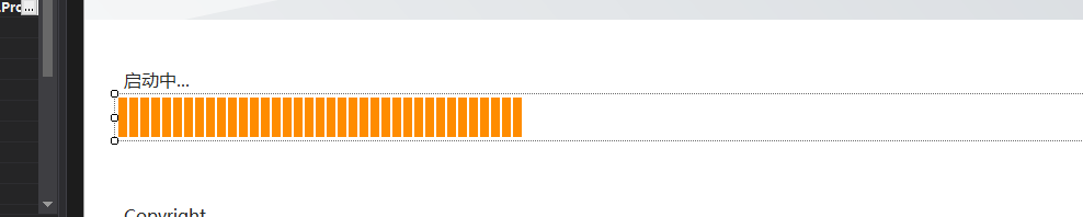
ProgressBarControl.Position——设置进度
整数值,要设置在Maximum和Minimum之间。
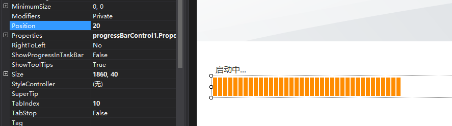
progressBarControl1.Properties.Step = 1; progressBarControl1.Properties.PercentView = true; progressBarControl1.Properties.Maximum = 100; progressBarControl1.Properties.Minimum = 0; progressBarControl1.Position = 0;
Maximum和Minimum——进度最小值、最大值

Step——自增步长
PerformStep——按照Step设定值改变进度条
ProgressViewStyle——设定进度条是实心还是一格一格

9. MarqueeProgressBarControl——循环滚动进度条
该控件不显示进度,而是通过循环显示动画表现操作正在执行。
(1)RepositoryItemMarqueeProgressBar.MarqueeAnimationSpeed——进度条运动速度
数值越小,运动越快

(2)RepositoryItemBaseProgressBar.ShowTitle——在进度条上显示文本/数值EditValue


(3)当MarqueeProgressBarControl被嵌入GridControl中,ColumnViewOptionsView.AnimationType可设置动画效果作用于所有行或仅作用于focusd的行
10. LayoutControl——
(1)属性
11. AccordionControl——
12. TabPane
13. SearchPanel
14. SidePanel
15. splitContainerControl——侧边栏收起
DataAndAnalytics
1. GridControl——GridView
(1)类型
-
tileView——磁贴类型
-
GridView——表格类型
(2)tileView
概念
- GridControl——控件
//gridControl1 private GridControl gridControl1.Cursor = System.Windows.Forms.Cursors.Default; this.gridControl1.MainView = this.tileView1; //form this.Controls.Add(gridControl1);
- TileView——页面
private TileView tileview1 = new DevExpress.XtraGrid.Views.Tile.TileView(); this.tileView1.GridControl = this.gridControl1;
-
tile template——每个tile的模板
-
TileElement——每个tile中显示的部分
gridControl由tileView组成,tileView中设定tile模板
Views——页面
Columns
注意——动态绑定数据源时,dt中添加的表的字段名要在Columns.FieldName中选择
dtCigarettePackaging.Columns.Add("nameCigarette", typeof(String)); //这里设定的表的字段,要和设计器的Column的fieldName保持一致 dtCigarettePackaging.Columns.Add("detection", typeof(String)); dtCigarettePackaging.Columns.Add("missingBranch", typeof(String)); dtCigarettePackaging.Columns.Add("CPUtemperature", typeof(Double)); dtCigarettePackaging.Columns.Add("CPUusage", typeof(Double)); dtCigarettePackaging.Columns.Add("memoryUsage", typeof(Double)); dtCigarettePackaging.Columns.Add("state", typeof(String)); dtCigarettePackaging.Columns.Add("img", typeof(Image));
-
字段
显示已关联的DataSource中的字段
-
表格的列
将字段添加到列中
可重复、可自定义顺序、可只添加某几个字段
Layout
TileTemplate——磁贴布局模板
磁贴形式,需要将表格中的列在磁贴上进行布局
用Columns生成TileElement,拖拽Columns中列放到磁贴上作为Element
(3)设置层级视图
https://www.cnblogs.com/wuhuacong/p/8796898.html
(4)DataSource
DataTime字段时的显示格式设置
选中GridControl控件,点击“RunDesigner”,进入Columns编辑,选中要编辑的列,找到DisPlayFormat属性,展开,点击FormatType选择“DateTime”,然后把FormatString中自动生成的d去掉即可。。。
看到有的人提供的方法是把d改成t,我试了发现这种方法显示的结果只有时跟分,连日期都没了。。。
————————————————
版权声明:本文为CSDN博主「Dummy-0394」的原创文章,遵循CC 4.0 BY-SA版权协议,转载请附上原文出处链接及本声明。
原文链接:https://blog.csdn.net/wk0394/article/details/41575489
2. GridControl——WinExplorerView
https://www.freesion.com/article/64241388773/
public string picOKPath = @"D:\WorkSpace\deeplearning\train\OK"; //OK路径 public string picNGPath = @"D:\WorkSpace\deeplearning\train\NG"; //NG路径 class Pics { public string picName { get; set; } public Image pic { get; set; } public Pics(string name, Image img) { this.picName = name; this.pic = img; } } List<Pics> picsOK = new List<Pics>(); List<Pics> picsNG = new List<Pics>(); public void initDataPreparation() { bindPicsOKToGrid(); bindPicsNGToGrid(); } public void bindPicsOKToGrid() { this.gridControl_displayOKPics.BeginUpdate(); readPicsOKToList(); this.gridControl_displayOKPics.DataSource = picsOK; this.gridControl_displayOKPics.EndUpdate(); } private void readPicsOKToList() { DirectoryInfo dirPics = new DirectoryInfo(picOKPath); FileInfo[] fileInfos = dirPics.GetFiles(); foreach(var item in fileInfos) { string itemName = item.Name; string itemPath = item.FullName; picsOK.Add(new Pics(itemName, Image.FromFile(itemPath))); } } public void bindPicsNGToGrid() { this.gridControl_displayNGPics.BeginUpdate(); readPicsNGToList(); this.gridControl_displayNGPics.DataSource = picsNG; this.gridControl_displayNGPics.EndUpdate(); } private void readPicsNGToList() { DirectoryInfo dirPics = new DirectoryInfo(picNGPath); FileInfo[] fileInfos = dirPics.GetFiles(); foreach (var item in fileInfos) { string itemName = item.Name; string itemPath = item.FullName; picsNG.Add(new Pics(itemName, Image.FromFile(itemPath))); } } private void delPicsInDir(string picPath) { if (System.IO.File.Exists(picPath)) { System.IO.File.Delete(picPath); } } private void delPicsInDirByListIndex(List<Pics> pics, int[] picIndex) { foreach(var i in picIndex) { if(pics.Count >= picIndex.Length) { delPicsInDir(pics.ElementAt(i).picPath); } } } private void simpleButton_delPicsOK_Click(object sender, EventArgs e) { this.gridControl_displayOKPics.BeginUpdate(); int[] delPicsOKIndex = this.winExplorerView_displayPicsOK.GetSelectedRows(); delPicsInDirByListIndex(picsOK, delPicsOKIndex); //删除文件夹中图片 this.winExplorerView_displayPicsOK.DeleteSelectedRows(); //删除控件显示的pic以及DataSource中元素 this.gridControl_displayOKPics.EndUpdate(); if (this.winExplorerView_displayPicsOK.RowCount > 0) { this.winExplorerView_displayPicsOK.SelectRow(0); //删除当前选中图片后,默认选中index=0的图片 } }
3. sqlDataSource绑定数据库
对数据源进行了重新封装产生了只读数据源SqlDataSource,使用它来提供对DevExpress.XtraGrid.GridControl,DevExpress.XtraTreeList.TreeList,DevExpress.XtraCharts.ChartControl或可以通过数据源配置向导配置的任何其他DevExpress控件的数据库访问。
Scheduling
TimeZoneEdit——时区选择


【推荐】国内首个AI IDE,深度理解中文开发场景,立即下载体验Trae
【推荐】编程新体验,更懂你的AI,立即体验豆包MarsCode编程助手
【推荐】抖音旗下AI助手豆包,你的智能百科全书,全免费不限次数
【推荐】轻量又高性能的 SSH 工具 IShell:AI 加持,快人一步
· 基于Microsoft.Extensions.AI核心库实现RAG应用
· Linux系列:如何用heaptrack跟踪.NET程序的非托管内存泄露
· 开发者必知的日志记录最佳实践
· SQL Server 2025 AI相关能力初探
· Linux系列:如何用 C#调用 C方法造成内存泄露
· 震惊!C++程序真的从main开始吗?99%的程序员都答错了
· 别再用vector<bool>了!Google高级工程师:这可能是STL最大的设计失误
· 【硬核科普】Trae如何「偷看」你的代码?零基础破解AI编程运行原理
· 单元测试从入门到精通
· 上周热点回顾(3.3-3.9)