CSS3动画结合伪元素实现边框滚动效果
今天和大家分享一个利用CSS3的animation属性完成的一个边框动画效果。大家都知道,CSS3给我们提供了@keyframes关键字,能让我们在网页中轻松插入动画。一个简单的动画插入,结构如下:
 1 <style>
 2      .wrap{
 3          position: absolute;
 4          left: 200px;
 5          width: 200px;
 6          height: 200px;
 7          animation: run 2s linear infinite;   /*动画名 时间 速度 动画次数*/
 8          background-color: rgb(87, 182, 9);
 9      }
10      @keyframes run{   /* @keyframe 关键字声明动画 */
11        from{  /* 从什么样子 */
12           left: 200px;
13        }
14        to{
15           left: 500px; /*变成什么样子*/
16         }
17      }
18 </style>

19  <body>
20    <div class="wrap"></div>
21  </body>
效果如下:

除了用from to 这种形式之外,我们还可以用百分比,更加细化各个阶段的表现样式,例子如下:
<head>
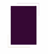
<style> .around{ position: relative; width:200px; height: 300px; margin:50px auto; background-color:#000005; cursor: pointer; } .around::before,.around::after{ content:''; position: absolute; border-style:solid; animation: move 5s linear infinite; opacity: 1; } .around::after{ animation-delay: -2.5s; } @keyframes move{ 0%{ top:-21px; left:-21px; width: 240px; height: 0; border-width:1px 0 0 0; border-color:#a21; } 25%{ top:-21px; left:-21px; width:0; height:340px; border-width:0 0 0 1px; border-color:rgba(40, 201, 40, 0.904); } 50%{ top:318px; left:-21px; width: 240px; height: 0; border-width:0 0 1px 0; border-color:rgb(204, 74, 14); } 75%{ top:-21px; left:218px; width: 0; height: 340px; border-width:0 1px 0 0; border-color:rgb(160, 170, 17); } 100%{ top:-21px; left:-21px; width: 240px; height: 0; border-width:1px 0 0 0; border-color:rgb(224, 53, 224); } } </style> </head> <body> <div class="around"></div> </body>
效果如下:
这样,我们轻松实现了边框滚动效果,只用了一个div标签,很简单吧

 浙公网安备 33010602011771号