Glyph(字形)
A glyph is an element of writing: an individual mark on a written medium that contributes to the meaning of what is written.
glyph是一个独立的标记,用来表达一个它之所以被写出的意思。也就是写了表示一个意思,不写表示另外一个意思。
For example, in most languages written in any variety of the Latin alphabet the dot on a lower-case "i" is not a glyph because it does not convey any distinction, and an i in which the dot has been accidentally omitted is still likely to be read as an "i". In Turkish, however, it is a glyph because that language has two distinct versions of the letter "i", with and without a dot.
例如,在多数语言中,拉丁字符"i",上面带有一个点并不是glyph,因为它没有额外的意思,即使这个点意外被忽略,还是被读作i。土耳其语中,有两个版本的字符“i”,因此这个点就是glyph。
In Japanese syllabaries, a number of the characters are made up of more than one separate mark, but in general these separate marks are not glyphs because they have no meaning by themselves. However, in some cases, additional marks fulfill the role of diacritics, to differentiate distinct characters. Such additional marks constitute glyphs.
在日语的假名表中,很多字符都是由多个mark构成的,但是通常这些mark都不是glyph,因为它们单独都是没有意思的。但是,某些情况下,额外的mark起到了边音符号的作用,以区分不同的字符。这些额外的mark就是glyph。
In general, a diacritic is a glyph, even if (like a cedilla in French, the ogonek in several languages or the stroke on a Polish "Ł") it is "joined up" with the rest of the character.Some characters, such as "æ" in Icelandic and the "ß" in German, would probably be regarded as glyphs: they were originally ligatures but over time have become characters in their own right, and these languages treat them as separate letters. However, a ligature such as "ſi", which is treated in some typefaces as a single unit, is arguably not a glyph as this is just a quirk of the typeface, essentially an allographic feature, and includes more than one grapheme. In normal handwriting, even long words are often written "joined up", without the pen leaving the paper, and the form of each written letter will often vary depending on which letters precede and follow it, but that does not make the whole word into a single glyph.
通常,边音符号是glyph,即使它跟剩余的字符联接在一起。
上面的解释来自于wikipedia,Apple的Doc对其解释是。Although characters must be represented in a display area by a recognizable shape, they are not identical to that shape. That is, a character can be drawn in various forms and remain the same character. For example, an “uppercase A” character can be drawn with a different size or a different stroke thickness, it can lean or be vertical, and it can have certain optional variations in form, such as serifs. Any one of these various concrete forms of a character is called a glyph.
也就是说每个字符的不同写法就是glyph。
Typeface/FontFamily
a typeface (also known as font family) is a set of one or more fonts each composed of glyphs that share common design features. Each font of a typeface has a specific weight, style, condensation, width, slant, italicization, ornamentation, and designer or foundry (and formerly size, in metal fonts).
typeface 又叫font family,是一个或多个font的集合,这个集合中的font由有共同design的glyph构成。typeface中的每个font都有特定的weight,style,....。这些不同就是用来区分不同的font。
(e.g. "ITC Garamond Bold Condensed Italic" is a different font from "ITC Garamond Condensed Italic" and "ITC Garamond Bold Condensed," but all are fonts within the same typeface, "ITC Garamond." However, ITC Garamond is a different typeface than "Adobe Garamond" or "Monotype Garamond.") There are thousands of different typefaces in existence, with new ones being developed constantly.
Every typeface is a collection of glyphs, each of which represents an individual letter, number, punctuation mark, or other symbol. The same glyph may be used for characters from different scripts, e.g. Roman uppercase A looks the same as Cyrillic uppercase А and Greek uppercase alpha. There are typefaces tailored for special applications, such as map-making or astrology and mathematics.
每个typeface是一个glyph的集合,每个glyph表示一个letter,一个number,punctuation mark或者其他的symbol。同样的glyph可以用于不同文字的字符。罗马大写字母A,跟斯拉夫字母大写A以及希腊大写的alpha是一样的。
TypeStyle
是TypeFace的一个可视的特征。
Text Layout
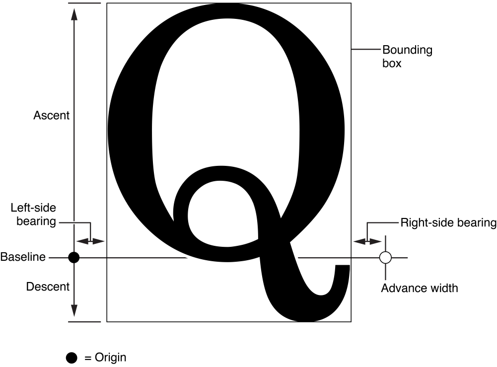
Glyph designers provide a set of measurements with a font, called metrics, which describe the spacing around each glyph in the font. The layout manager uses these metrics to determining glyph placement. In horizontal text, the glyph has a metric called the advance width, which measures the distance along the baseline to the origin point of the next glyph. advance width是沿着baseline的方向,到下一个glyph起点的距离,也就是两个glyph之间的距离。
Typically there is some space between the origin point and the left side of the glyph, which is called the left-side bearing. glyph的起点和glyph的左侧还有一些距离,叫做left-side bearing。
There may also be space between the right side of the glyph and the point described by the advance width, which is called the right-side bearing. glyph的右侧和advace width计算的几点之间的距离叫做right-side bearing。
The vertical dimension of the glyph is provided by two metrics called the ascent and the descent. The ascent is the distance from the origin (on the baseline) to the top of the tallest glyphs in the font. The descent, which is the distance below the baseline to the bottom of the font’s deepest descender. The rectangle enclosing the visible parts of the glyph is called the bounding rectangle or bounding box.
Cocoa Layout系统在lay out 字形时是沿着一个看不见的线的,这条线叫做baseline,大部分glyph是最底部在baseline上,但有的glyph会超过baseline,比如g和Q,baseline上面的部分叫做ascent、下面的部分叫做descent。

By default, in horizontal text, typesetters place glyphs side-by-side using the advance width, resulting in a standard interglyph space. However, in some combinations, text is made more readable by kerning, which is shrinking or stretching the space between two glyphs. A very common example of kerning occurs between an uppercase W and uppercase A。

另外的Layout Text时,还有两个概念叫alignment和justified。 alignment就是对齐,靠左,靠右还是居中,使用word时应该很容易体会这一点。justified是指通过调整word之间的距离或者glyph之间的距离,达到同时向左和向右对齐的目的。
Reference:
1. https://developer.apple.com/library/mac/documentation/TextFonts/Conceptual/CocoaTextArchitecture/TypoFeatures/TextSystemFeatures.html#//apple_ref/doc/uid/TP40009459-CH6-BBCFAEGE


 浙公网安备 33010602011771号