matplotlib的使用
Matplotlib的使用
Matplotlib是一个Python 2D绘图库,可以在各种平台上以各种硬拷贝格式和交互环境生成具有出版品质的图形,它试图让简单的事情变的更简单,只需要几行代码就可以绘制多种图形
常用绘图方法总结如下(这里以折线图为主,其他种类图形用法类似):
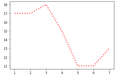
折线图
折线图的颜色和形状
# 折线图
import matplotlib.pyplot as plt

# 确定 x轴y轴
x = range(1,8) # 1-7
y = [17,17,18,15,11,11,13]

# 画折线图 alpha 透明度 0-1
# 线的样式 - 实线(solid)  -- 短线(dashed)  -. 短点相间线(dashdot) : 虚点线(dotted)
plt.plot(x,y,color='red',alpha=0.8,linestyle=':',linewidth=3)
plt.show()
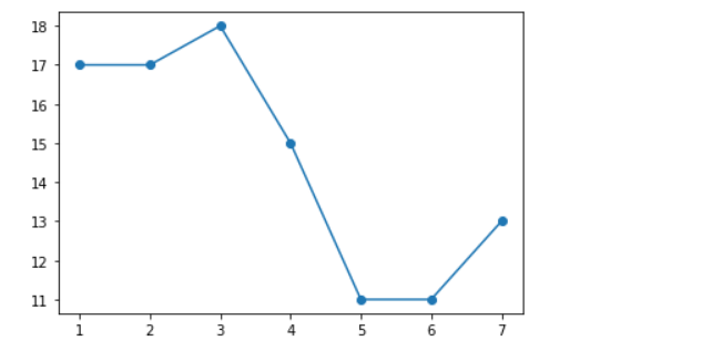
折点样式
# 折点
import matplotlib.pyplot as plt

x = range(1,8) # 1-7
y = [17,17,18,15,11,11,13]

plt.plot(x,y,marker='o')
plt.show()
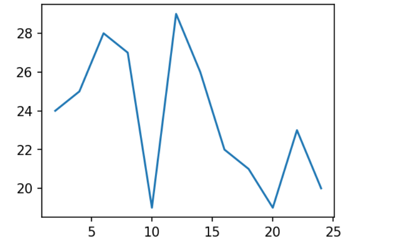
设置图片大小和保存
#  图片的大小
import matplotlib.pyplot as plt
import random
x = range(2,26,2)
# x循环多少次 random.randint(15,30) 就会生成多少次
y = [random.randint(15,30) for i in x]

# 设置图片的大小(获取的是画布对象) 宽和高 英寸 dpi:分辨率
plt.figure(figsize=(4,3),dpi=150)

# 画
plt.plot(x,y)

#  保存
plt.savefig('./t1.png')

plt.show()
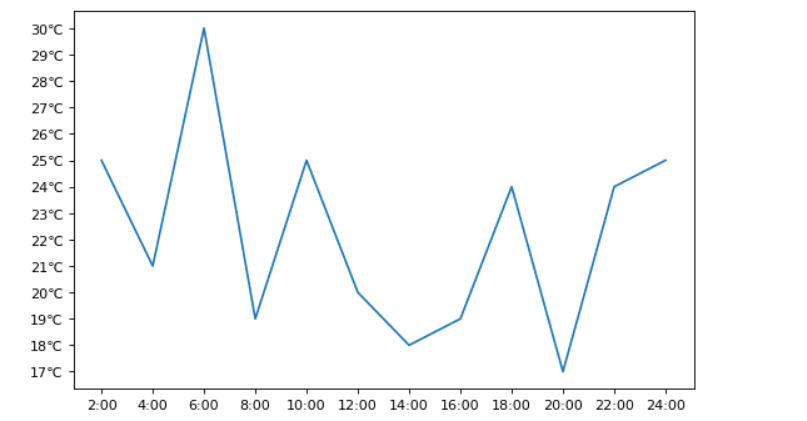
绘制 x,y轴刻度
# 绘制 x,y 的刻度
import matplotlib.pyplot as plt
import random

x = range(2,26,2)
y = [random.randint(15,30) for i in x]

plt.figure(figsize=(8,5),dpi=80)

# x轴的刻度
# plt.xticks(x)
# y轴的刻度
# plt.yticks(y)

# 设置 x轴的标签
x_tick_lable = ['{}:00'.format(i) for i in x]
plt.xticks(x,x_tick_lable)

# 设置 y轴的标签
y_tick_lable = ['{}℃'.format(j) for j in range(min(y),max(y)+1)]
plt.yticks(range(min(y),max(y)+1),y_tick_lable)

# 画
plt.plot(x,y)
plt.show()
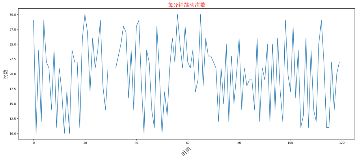
设置显示中文
# 设置中文
# matplotlib默认是英文,想要显示中文,需要修改matplotlib默认字体
# 通过matplotlib下的font_manager可以解决

# 两个小时内的每分钟跳动变化
from matplotlib import pyplot as plt
import matplotlib
import random
from matplotlib import font_manager

x = range(0,120)
y = [random.randint(10,30) for i in range(120)]

plt.figure(figsize=(20,8),dpi=80)
plt.plot(x,y)

my_font = font_manager.FontProperties(fname='C:\Windows\Fonts\SimSun.ttc',size=18)

# rotation 将字体旋转45度
plt.xlabel('时间',rotation=45,fontproperties=my_font)
plt.ylabel('次数',fontproperties=my_font)

# 设置标题
plt.title('每分钟跳动次数', fontproperties=my_font,color='red')

plt.show()
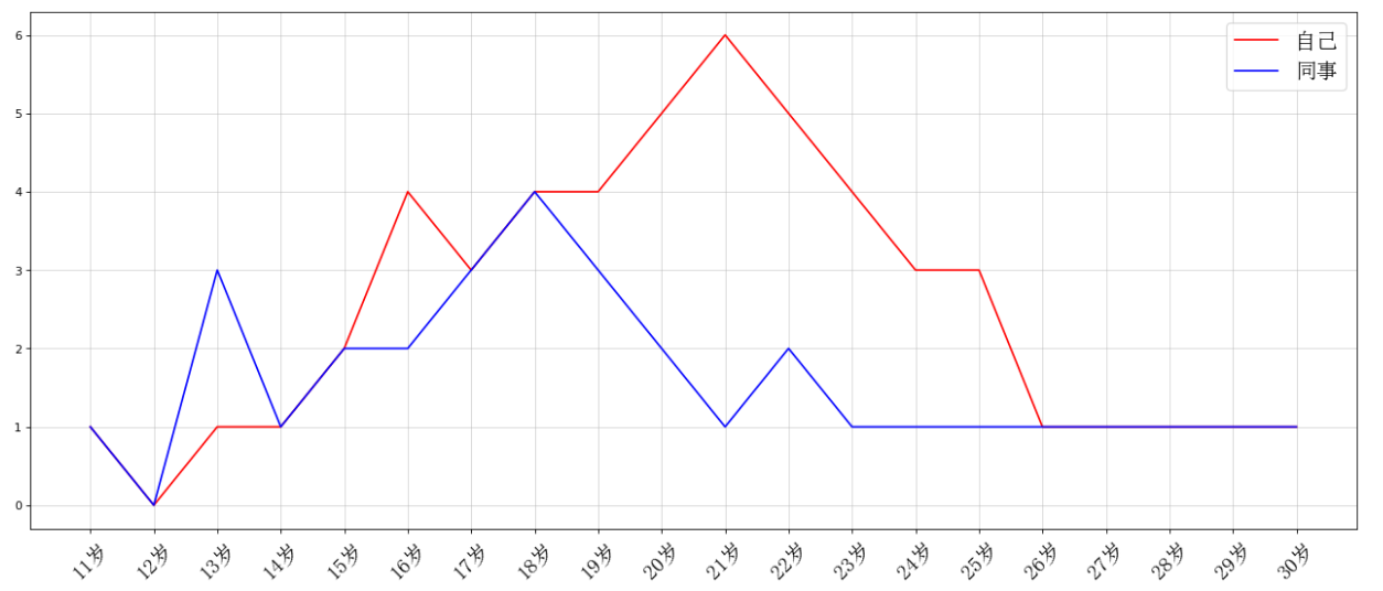
一图多线
# 一图多线
from matplotlib import pyplot as plt
from matplotlib import font_manager
y1 = [1,0,1,1,2,4,3,4,4,5,6,5,4,3,3,1,1,1,1,1]
y2 = [1,0,3,1,2,2,3,4,3,2,1,2,1,1,1,1,1,1,1,1]

x = range(11,31)
plt.figure(figsize=(20,8),dpi=80)

plt.plot(x,y1,color='red',label='自己')
plt.plot(x,y2,color='blue',label='同事')

x_tick_lables=['{}岁'.format(i) for i in x]
my_font = font_manager.FontProperties(fname='C:\Windows\Fonts\SimSun.ttc',size=18)
plt.xticks(x,x_tick_lables,font_properties=my_font,rotation=45)
# 绘制网格
plt.grid(alpha=0.5)

# 添加图例(注意:只有在图例这里需要添加 prop参数显示中文,其他的都用 fontproperties)
# 设置位置 loc : upper left ,lower left,center left,upper center
plt.legend(prop=my_font,loc='upper right')

# 展示
plt.show()
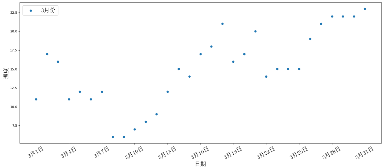
散点图
# 散点图

from matplotlib import pyplot as plt
from matplotlib import font_manager

y = [11,17,16,11,12,11,12,6,6,7,8,9,12,15,14,17,18,21,16,17,20,14,15,15,15,19,21,22,22,22,23]
x = range(1,32)
# 设置图形的大小
plt.figure(figsize=(20,8),dpi=80)
# 使用 scatter 绘制散点图
plt.scatter(x,y,label='3月份')
# 调整 x 的刻度
my_font = font_manager.FontProperties(fname='C:\Windows\Fonts\SimSun.ttc',size=18)
x_tick_lables=['3月{}日'.format(i) for i in x]
plt.xticks(x[::3],x_tick_lables[::3],font_properties=my_font,rotation=30)

plt.xlabel('日期',fontproperties=my_font)
plt.ylabel('温度',fontproperties=my_font)

# 图例
plt.legend(prop=my_font,loc='upper left')
plt.show()
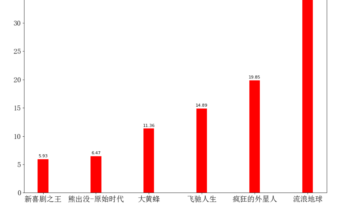
条形图
# 绘制条形图

from matplotlib import pyplot as plt
from matplotlib import font_manager

x = ['新喜剧之王', '熊出没-原始时代', '大黄蜂', '飞驰人生', '疯狂的外星人', '流浪地球']
y = [5.93, 6.47, 11.36, 14.89, 19.85, 38.13]

my_font = font_manager.FontProperties(fname='C:\Windows\Fonts\SimSun.ttc',size=18)

plt.figure(figsize=(13,10),dpi=80)


rects = plt.bar(x,y,width=0.2,color='red')
plt.xticks(range(len(x)),x,font_properties=my_font)
plt.yticks(range(0,int(max(y))+5,5),range(0,int(max(y))+5,5),font_properties=my_font)


# 在条形图上加标注
for rect in rects:
    height = rect.get_height()
    plt.text(rect.get_x() + rect.get_width() / 2 , height + 0.3 , str(height) , ha = 'center')

plt.show()
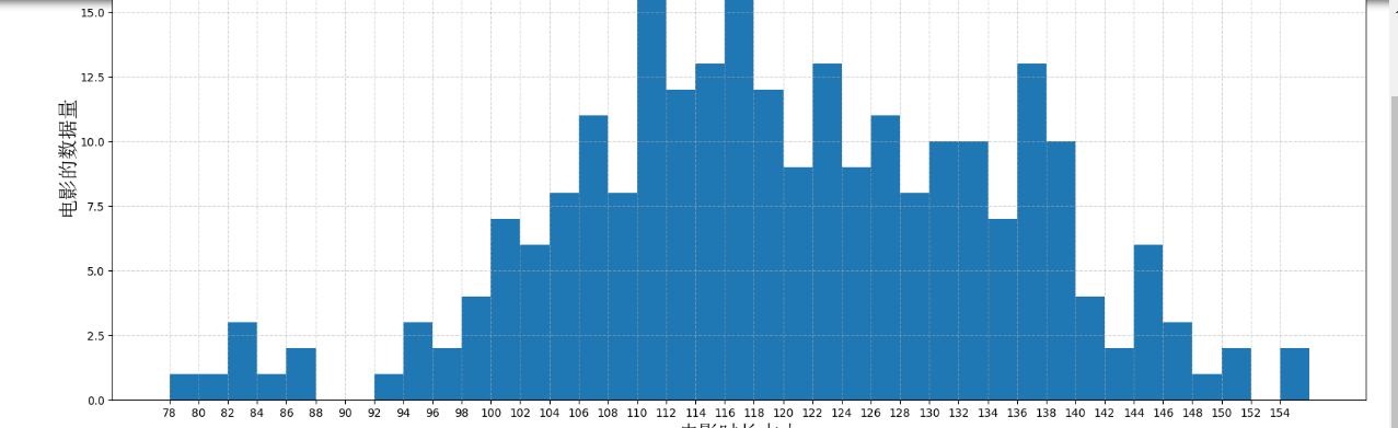
直方图
# 直方图

from matplotlib import pyplot as plt
from matplotlib import font_manager

time = [131,  98, 125, 131, 124, 139, 131, 117, 128, 108, 135, 138, 131, 102, 107, 114,
        119, 128, 121, 142, 127, 130, 124, 101, 110, 116, 117, 110, 128, 128, 115,  99,
        136, 126, 134,  95, 138, 117, 111,78, 132, 124, 113, 150, 110, 117,  86,  95, 144,
        105, 126, 130,126, 130, 126, 116, 123, 106, 112, 138, 123,  86, 101,  99, 136,123,
        117, 119, 105, 137, 123, 128, 125, 104, 109, 134, 125, 127,105, 120, 107, 129, 116,
        108, 132, 103, 136, 118, 102, 120, 114,105, 115, 132, 145, 119, 121, 112, 139, 125,
        138, 109, 132, 134,156, 106, 117, 127, 144, 139, 139, 119, 140,  83, 110, 102,123,
        107, 143, 115, 136, 118, 139, 123, 112, 118, 125, 109, 119, 133,112, 114, 122, 109,
        106, 123, 116, 131, 127, 115, 118, 112, 135,115, 146, 137, 116, 103, 144,  83, 123,
        111, 110, 111, 100, 154,136, 100, 118, 119, 133, 134, 106, 129, 126, 110, 111, 109,
        141,120, 117, 106, 149, 122, 122, 110, 118, 127, 121, 114, 125, 126,114, 140, 103,
        130, 141, 117, 106, 114, 121, 114, 133, 137,  92,121, 112, 146,  97, 137, 105,  98,
        117, 112,  81,  97, 139, 113,134, 106, 144, 110, 137, 137, 111, 104, 117, 100, 111,
        101, 110,105, 129, 137, 112, 120, 113, 133, 112,  83,  94, 146, 133, 101,131, 116,
        111,  84, 137, 115, 122, 106, 144, 109, 123, 116, 111,111, 133, 150]

my_font = font_manager.FontProperties(fname='C:\Windows\Fonts\SimSun.ttc',size=18)
plt.figure(figsize=(20,8),dpi=100)

# 绘制直方图
# 设置组距
distance = 2
# 计算组数
group_num = int((max(time)-min(time))/distance)
# 绘制
plt.hist(time,bins=group_num)

# 修改x轴刻度显示
plt.xticks(range(min(time),max(time))[::2])

# 添加网格表示
plt.grid(linestyle='--',alpha=0.5)

# 添加 x 轴 y 轴 描述信息
plt.xlabel('电影时长大小',fontproperties=my_font)
plt.ylabel('电影的数据量',fontproperties=my_font)

plt.show()
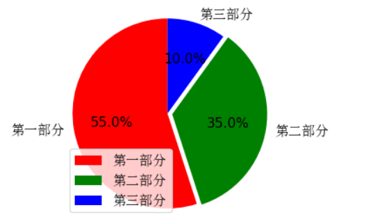
饼图
#  饼状图的绘制

from matplotlib import pyplot as plt
from matplotlib import font_manager

my_font = font_manager.FontProperties(fname='C:\Windows\Fonts\SimSun.ttc',size=14)
plt.figure(figsize=(4,4),dpi=80)

lable_list = ['第一部分','第二部分','第三部分']
size = [55,35,10] # 各部分大小
color = ['red','green','blue'] #各部分颜色
explode=[0,0.05,0] # 各部分突出部分

# 绘制饼图
'''
explode: 设置各部分突出
lable: 设置各部分标签
labledistance: 设置标签文本距圆心位置 1.1 表示1.1 倍半径
autopct: 设置圆圈里面的文本
shadow:  设置是否有阴影
startangle: 起始角度,默认从0开始逆时针转
pctdistance:设置圆内文本距圆心距离
返回值:
patches : matplotlib.patches.Wedge列表(扇形实例)
l_text:  label matplotlib.text.Text列表(标签实例)
p_text:  label matplotlib.text.Text列表(百分比标签实例)
'''
patches,l_text,p_text = plt.pie(size,
                                explode=explode,
                                colors=color,
                                labels=lable_list,
                                labeldistance=1.1,
                                autopct='%1.1f%%',
                                shadow=False,
                                startangle=90,
                                pctdistance=0.6)
for t in l_text:
#     print(dir(t))
    t.set_fontproperties(my_font)

for t in p_text:
    t.set_size(14)

plt.axis('equal') # 设置横轴和纵轴相等,保证是圆的形状
plt.legend(prop=my_font)
plt.show()