

纯CSS打造进度条
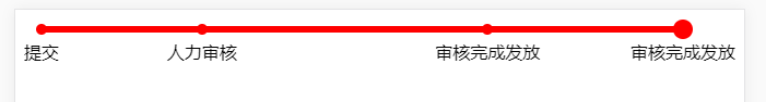
进度条效果如下:
CSS部分
body {
background-color: white;
}
.progress-bar {
display: flex;
flex-direction: row;
}
.item {
display: flex;
width: 1%;
flex-grow: 1;
padding-top: 20px;
justify-content: center;
position: relative;
padding-top: 20px;
}
.item:first-child,
.item:last-child {
width: auto;
flex-grow: 0;
flex-shrink: 0;
}
.item > .cycle {
z-index: 2;
position: absolute;
top: 5px;
left: 50%;
margin-left: -5px;
width: 10px;
height: 10px;
border-radius: 50%;
background-color: red;
}
.item.active > .cycle {
top: 1px;
margin-left: -9px;
width: 18px;
height: 18px;
}
.item:before, .item:after {
z-index: 1;
content: "";
width: 50%;
height: 6px;
position: absolute;
top: 7px;
background-color: red;
}
.item:before {
left: 0;
}
.item:after {
left: 50%;
}
.item:first-child:before,
.item:last-child:after {
display: none;
}
.item.active:after,
.item.active ~ .item:before,
.item.active ~ .item.after,
.item.active ~ .item > .cycle {
background-color: #999;
}
HTML部分
<div class="progress-bar">
<div class="item">
<div class="cycle"></div>
<div class="text">提交</div>
</div>
<div class="item">
<div class="cycle"></div>
<div class="text">人力审核</div>
</div>
<div class="item">
<div class="cycle"></div>
<div class="text">审核完成发放</div>
</div>
<div class="active item">
<div class="cycle"></div>
<div class="text">审核完成发放</div>
</div>
</div>

 浙公网安备 33010602011771号