css实现梯形
- 使用伪元素before和after分别在矩形元素前后加三角形或者直接设置border
- 使用3d旋转矩形,使之看起来像矩形
<html>
  <head>
    <meta charset="utf-8">
    <style>
      .trapezoid-0{
        border-bottom: 100px solid #fb3;
        border-left: 50px solid transparent;
        border-right: 50px solid transparent;
        height: 0;
        width: 100px;
        margin: 0 0 20px 0;
      }
      .trapezoid-1{
        border-radius: .5em .5em 0 0;
        margin: 20px;
        height: 40px;
        width: 100px;
        background: #fb3;
        transform-origin: bottom;
        transform: scaleY(1.3) perspective(.5em) rotateX(5deg);
         /*scaleY: 纵轴放大1.3倍,使梯形高度等于height;perspective:3d透视效果,元素距离视图的距离*/
      }
    </style>
  </head>
  <body>
      <div class="trapezoid-0"></div>
      <div class="trapezoid-1"></div>
  </body>
</html>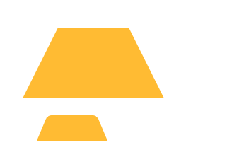

 浙公网安备 33010602011771号