The Shapes of CSS(css的形状)
All of the below use only a single HTML element. Any kind of CSS goes, as long as it's supported in at least one browser.
(下面的所有内容只使用一个HTML元素。任何一种CSS都可以,只要它在至少一个浏览器中支持。)
Square (正方形)
#square { width: 100px; height: 100px; background: red; }
Rectangle (长方形)
#rectangle { width: 200px; height: 100px; background: red; }
Circle (圆形)
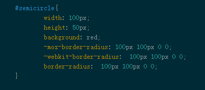
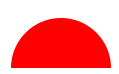
半圆形(Semicircle)
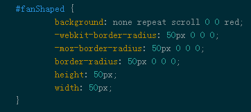
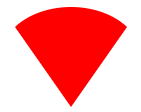
扇形(Fan-Shaped)

https://www.w3cplus.com/css/create-shapes-with-css
Oval (椭圆形;卵形)
Triangle Up
Triangle Down
Triangle Left
Triangle Right
Triangle Top Left
Triangle Top Right
Triangle Bottom Left
Triangle Bottom Right
Curved Tail Arrow (弯曲的尾巴箭头) via Ando Razafimandimby

Trapezoid(梯形)
Parallelogram(平行四边形)
Star (6-points) (六角星)
#star-six { width: 0; height: 0; border-left: 50px solid transparent; border-right: 50px solid transparent; border-bottom: 100px solid red; position: relative; }
#star-six:after { width: 0; height: 0; border-left: 50px solid transparent; border-right: 50px solid transparent; border-top: 100px solid red; position: absolute; content: ""; top: 30px; left: -50px; }
Star (5-points) (五角星) via Kit MacAllister

#star-five {
Pentagon (五角形)
Hexagon (六角形)
Octagon (八边形)
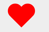
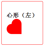
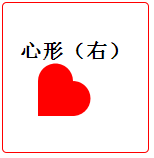
Heart (心形) via Nicolas Gallagher
Diamond Square (钻石形) via Joseph Silber
#diamond { width: 0; height: 0; border: 50px solid transparent; border-bottom-color: red; position: relative; top: -50px; }
Diamond Shield (钻石 盾牌) via Joseph Silber
#diamond-shield { width: 0; height: 0; border: 50px solid transparent; border-bottom: 20px solid red; position: relative; top: -50px; }
Diamond Narrow via Joseph Silber
#diamond-narrow { width: 0; height: 0; border: 50px solid transparent; border-bottom: 70px solid red; position: relative; top: -50px; }
Cut Diamondvia Alexander Futekov
#cut-diamond { border-style: solid; border-color: transparent transparent red transparent; border-width: 0 25px 25px 25px; height: 0; width: 50px; position: relative; margin: 20px 0 50px 0; }
#cut-diamond:after { content: ""; position: absolute; top: 25px; left: -25px; width: 0; height: 0; border-style: solid; border-color: red transparent transparent transparent; border-width: 70px 50px 0 50px; }
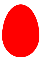
Egg (蛋)
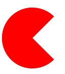
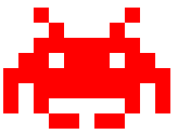
Pac-Man (吃豆人)


https://www.w3cplus.com/css/css-simple-shapes-cheat-sheet
Talk Bubble (对话泡泡)
12 Point Burst (12点破裂) via Alan Johnson
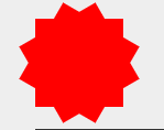
8 Point Burst (8点破裂) via Alan Johnson

Yin Yangvia Alexander Futekov (阴阳图)

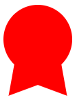
Badge Ribbon (徽章丝带) via Catalin Rosu
TV Screen (电视屏幕)

Chevron (V形肩章) via Anthony Ticknor
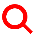
Magnifying Glass (放大镜)
Facebook Icon (Facebook的图标) via Nathan Swartz

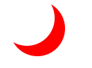
Moon (月亮) via Omid Rasouli
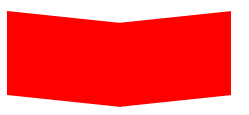
Flag (标志 旗子 ) via Zoe Rooney
Cone (圆锥形) via Omid Rasouli
Cross (十字架) via Kaya Basharan
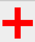
#cross { background: red; height: 100px; position: relative; width: 20px; } #cross:after { background: red; content: ""; height: 20px; left: -40px; position: absolute; top: 40px; width: 100px; }
Base (垒) via Josh Rodgers
Pointer (指针) via Amsakanna Freethinker

#pointer { width: 200px; height: 40px; position: relative; background: red; } #pointer:after { content: ""; position: absolute; left: 0; bottom: 0; width: 0; height: 0; border-left: 20px solid white; border-top: 20px solid transparent; border-bottom: 20px solid transparent; } #pointer:before { content: ""; position: absolute; right: -20px; bottom: 0; width: 0; height: 0; border-left: 20px solid red; border-top: 20px solid transparent; border-bottom: 20px solid transparent; }
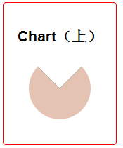
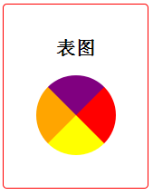
表图(chartColorful)

link:https://css-tricks.com/examples/ShapesOfCSS/

 浙公网安备 33010602011771号