
开启Fluter基础之旅<三>-------Material Design风格组件、Cupertino风格组件、Flutter页面布局篇
Material Design风格组件:
继续接着上一次https://www.cnblogs.com/webor2006/p/12545701.html的Material Design进行学习。
AppBar:
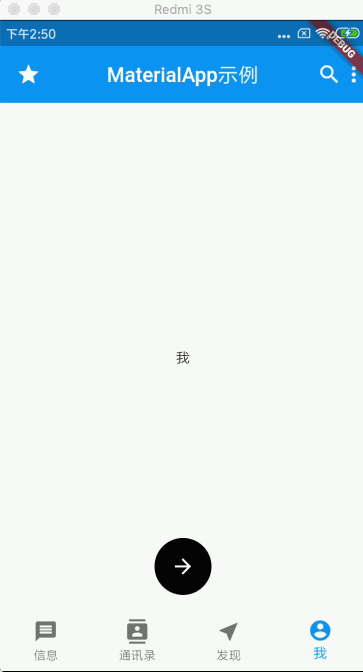
在上一次咱们实现一个Tab的效果,回忆一下:
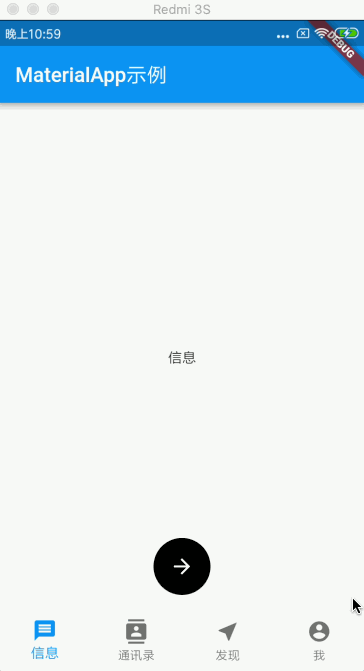
接下来则基于这个代码进行进一步修改,先回忆一下当时的代码:
import 'package:flutter/material.dart';

void main() => runApp(MyApp());

class MyApp extends StatelessWidget {
  @override
  Widget build(BuildContext context) {
    return MaterialApp(
      routes: {'/other': (BuildContext context) => OtherPage()},
      home: HomePage(),
    );
  }
}

class HomePage extends StatefulWidget {
  @override
  _HomePageState createState() => _HomePageState();
}

class _HomePageState extends State<HomePage> {
  int _currentIndex = 0;
  final _widgetOptions = [
    Text('信息'),
    Text('通讯录'),
    Text('发现'),
    Text('我'),
  ];

  @override
  Widget build(BuildContext context) {
    return Scaffold(
      appBar: AppBar(
        title: Text('MaterialApp示例'),
      ),
      body: Center(
        child: _widgetOptions.elementAt(_currentIndex),
      ),
      floatingActionButton: FloatingActionButton(
        onPressed: () {
          Navigator.pushNamed(context, '/other');
        },
        tooltip: '路由跳转',
        foregroundColor: Color(0xffffffff),
        backgroundColor: Color(0xff000000),
        //阴影
        elevation: 0.0,
        child: Icon(Icons.arrow_forward),
//        shape: RoundedRectangleBorder(),
      ),
      floatingActionButtonLocation: FloatingActionButtonLocation.centerFloat,
      bottomNavigationBar: BottomNavigationBar(
        items: [
          BottomNavigationBarItem(
            icon: Icon(Icons.message),
            title: Text('信息'),
          ),
          BottomNavigationBarItem(
            icon: Icon(Icons.contacts),
            title: Text('通讯录'),
          ),
          BottomNavigationBarItem(
            icon: Icon(Icons.near_me),
            title: Text('发现'),
          ),
          BottomNavigationBarItem(
            icon: Icon(Icons.account_circle),
            title: Text('我'),
          ),
        ],
        currentIndex: _currentIndex,
        type: BottomNavigationBarType.fixed,
        onTap: (index) {
          setState(() {
            _currentIndex = index;
          });
        },
      ),
    );
  }
}

class OtherPage extends StatelessWidget {
  @override
  Widget build(BuildContext context) {
    return Scaffold(
      appBar: AppBar(
        title: Text('OtherPage'),
      ),
    );
  }
}
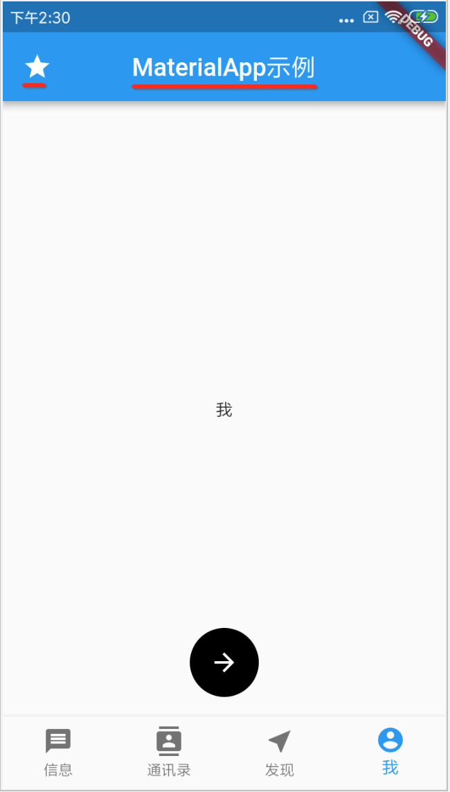
对于AppBar其实还有其它属性,下面来看一下:
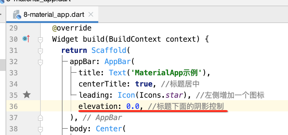
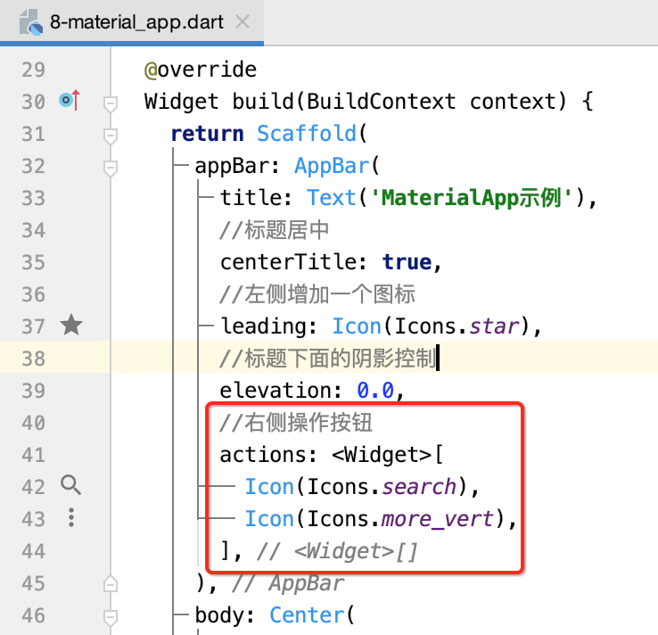
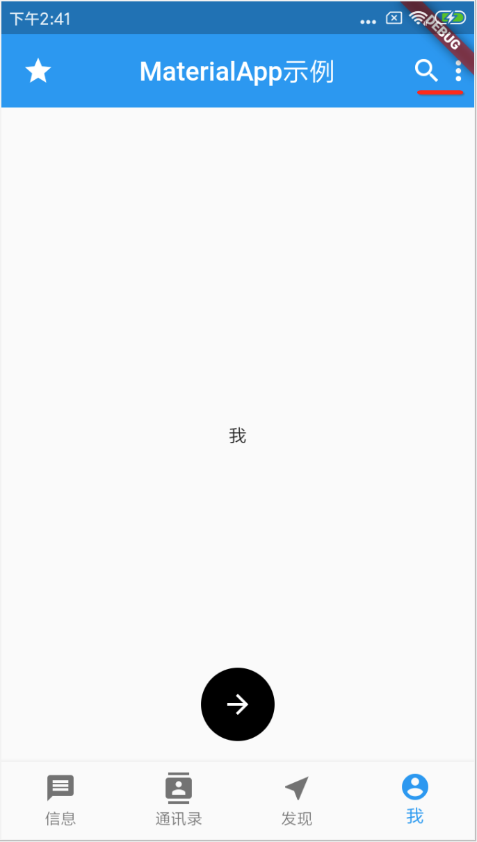
leading:左图标:

效果:
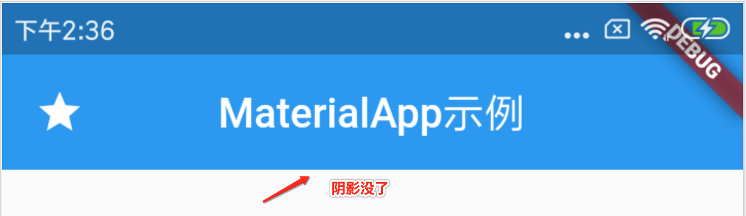
elevation:阴影控制
仔细瞅一下,其实默认标题栏下面是有阴影的,如下:
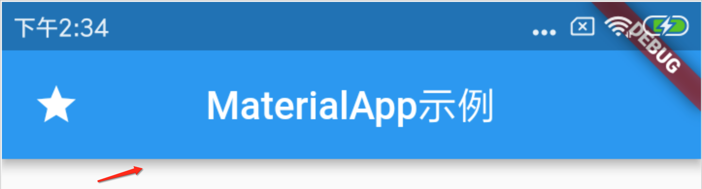
其实它是由elevation属性来控制的,默认看一下它阴影大小设置是的?

如果想去掉阴影将其设置为0既可,如下:
actions:右侧的操作按钮
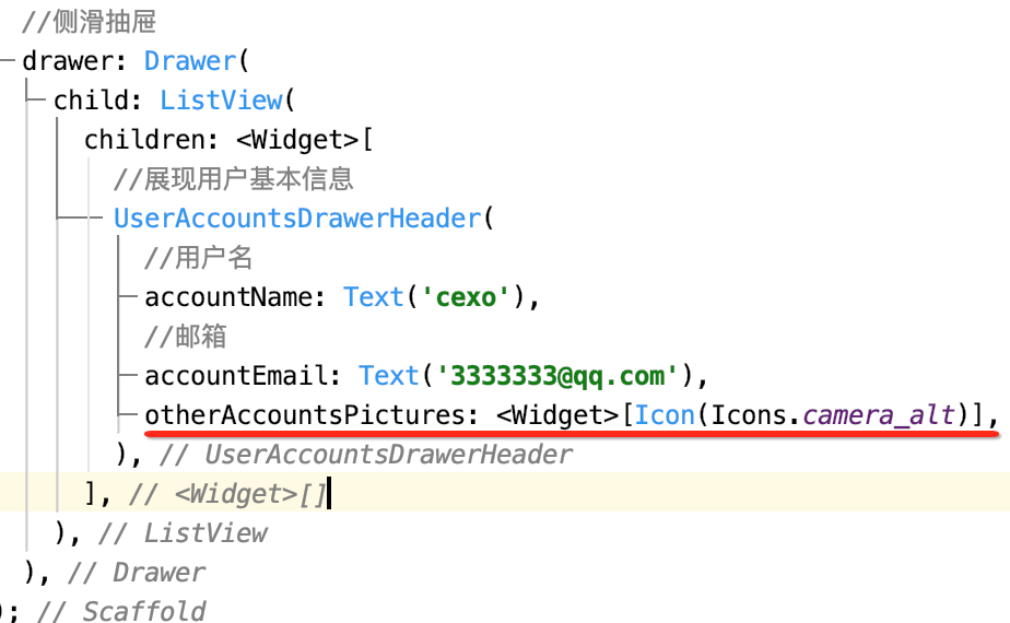
drawer:侧滑抽屉组件
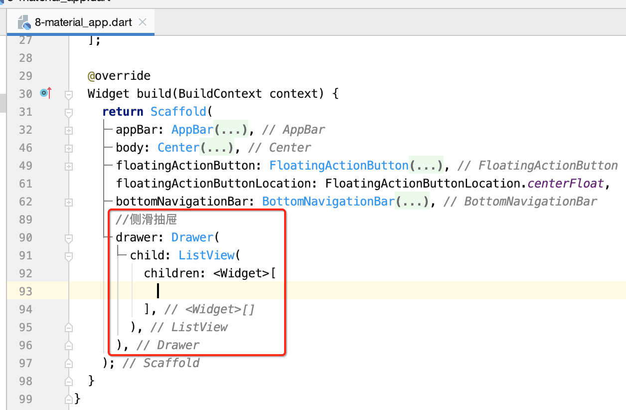
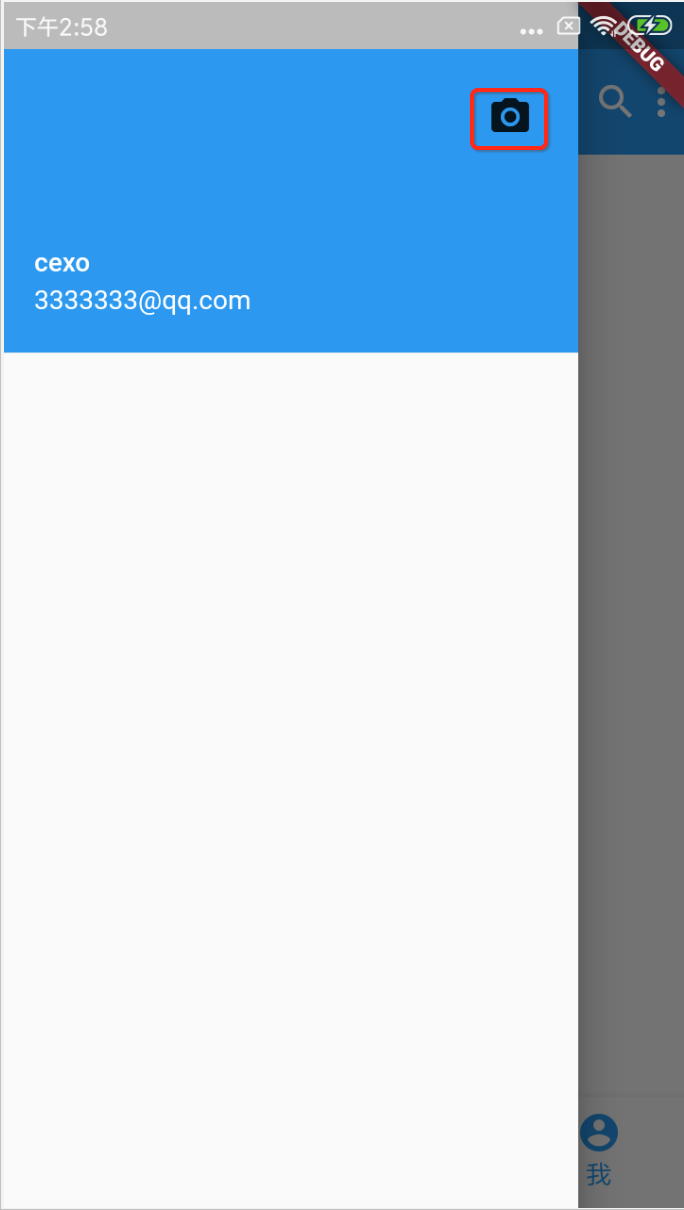
此时抽屉里还木有填充内容,先看一下效果:
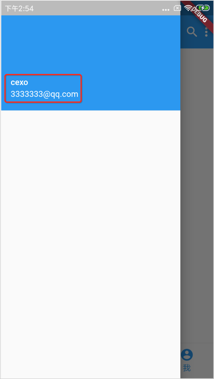
UserAccountsDrawerHeader:展示用户头像、用户名、Email等信息
通常在侧滑时顶部都是展现用户的基本信息的,而Flutter基于这种场景提供有专门的组件,下面来使用一下:
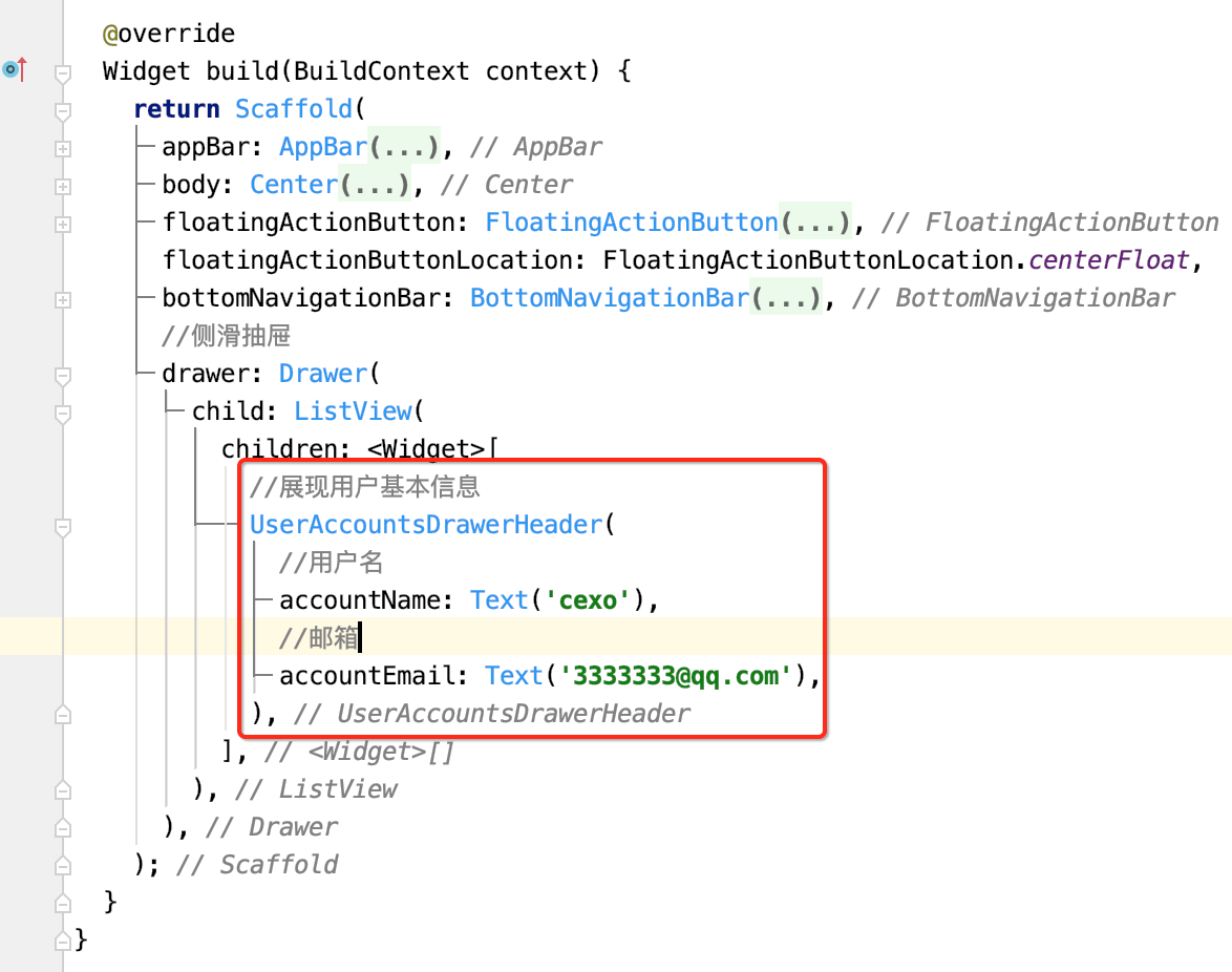
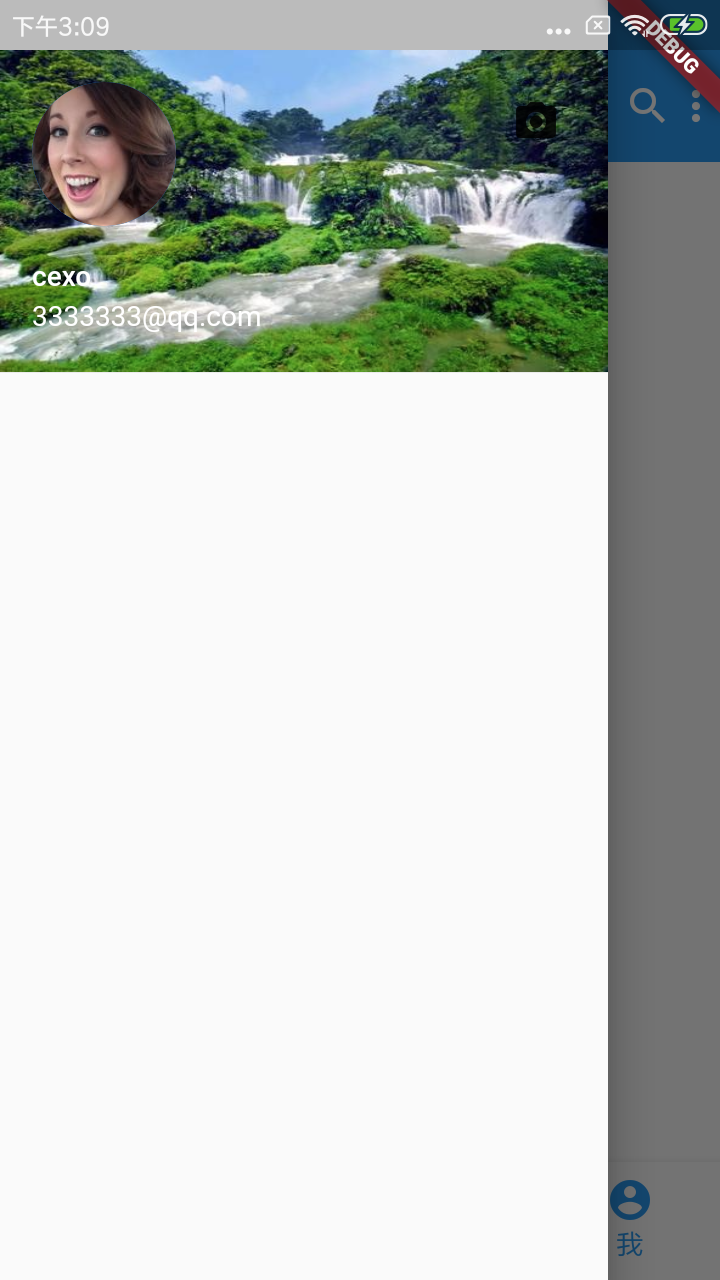
otherAccountsPicture:用来设置当前用户其他账号的图标
decoration:通常用来设置背景颜色或背景图片
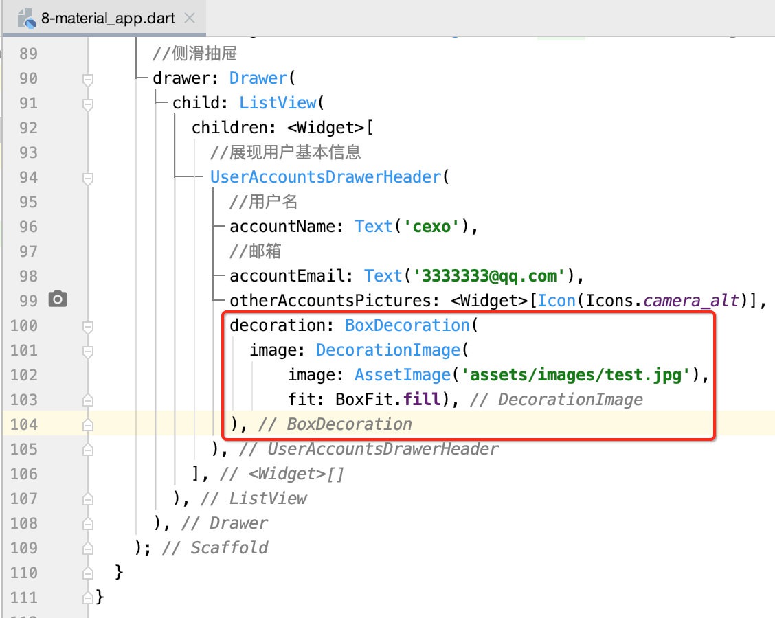

currentAccountPicture:用来设置当前用户的头像

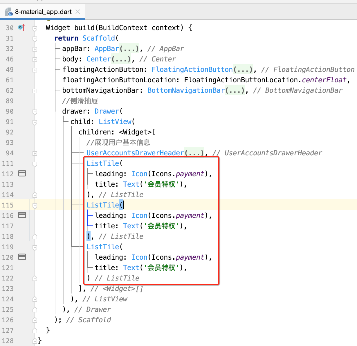
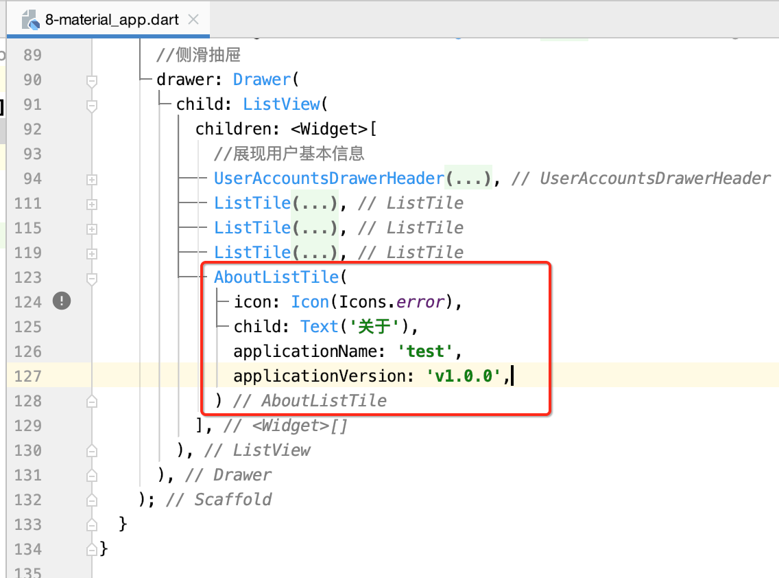
增加菜单项:
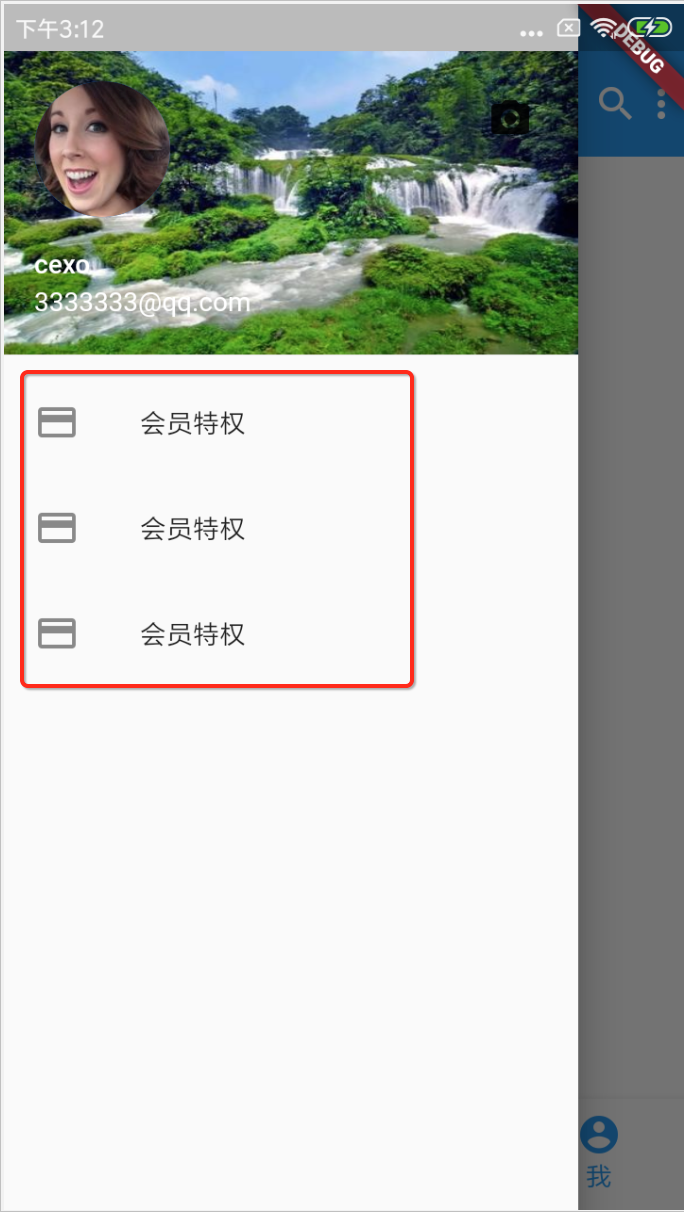
AboutListTile:关于

对话框:
import 'package:flutter/material.dart';

void main() => runApp(MyApp());

class MyApp extends StatelessWidget {
  @override
  Widget build(BuildContext context) {
    return MaterialApp(
      home: HomePage(),
    );
  }
}

class HomePage extends StatefulWidget {
  @override
  _HomePageState createState() => _HomePageState();
}

class _HomePageState extends State<HomePage> {
  @override
  Widget build(BuildContext context) {
    return Scaffold(
      appBar: AppBar(
        title: Text('MaterialApp dialog示例'),
      ),
      body: Center(
        child: Column(
          mainAxisAlignment: MainAxisAlignment.center,
          children: <Widget>[
            SimpleDialog(
              title: Text('title'),
              children: <Widget>[
                SimpleDialogOption(
                  child: Text('选择1'),
                  onPressed: () {
                    print('选择1');
                  },
                ),
                SimpleDialogOption(
                  child: Text('选择2'),
                  onPressed: () {
                    print('选择2');
                  },
                ),
              ],
            ),
          ],
        ),
      ),
    );
  }
}
运行:

这里再弄一个Button,点击再显示对话框:
class _HomePageState extends State<HomePage> {
  @override
  Widget build(BuildContext context) {
    return Scaffold(
      appBar: AppBar(
        title: Text('MaterialApp dialog示例'),
      ),
      body: Center(
        child: Column(
          mainAxisAlignment: MainAxisAlignment.center,
          children: <Widget>[
            SimpleDialog(
              title: Text('title'),
              children: <Widget>[
                SimpleDialogOption(
                  child: Text('选择1'),
                  onPressed: () {
                    print('选择1');
                  },
                ),
                SimpleDialogOption(
                  child: Text('选择2'),
                  onPressed: () {
                    print('选择2');
                  },
                ),
              ],
            ),
            RaisedButton(
              child: Text('删除'),
              onPressed: () {
                showDialog(
                    context: context,
                    builder: (BuildContext context) {
                      return AlertDialog(
                        title: Text("title"),
                        content: SingleChildScrollView(
                          child: ListBody(
                            children: <Widget>[
                              Text('是否删除?'),
                              Text('删除后不可恢复!'),
                            ],
                          ),
                        ),
                        actions: <Widget>[
                          FlatButton(
                            child: Text('确定'),
                            onPressed: () {
                              Navigator.of(context).pop(); //取消对话框
                            },
                          ),
                          FlatButton(
                            child: Text('取消'),
                            onPressed: () {
                              Navigator.of(context).pop(); //取消对话框
                            },
                          )
                        ],
                      );
                    });
              },
            )
          ],
        ),
      ),
    );
  }
}

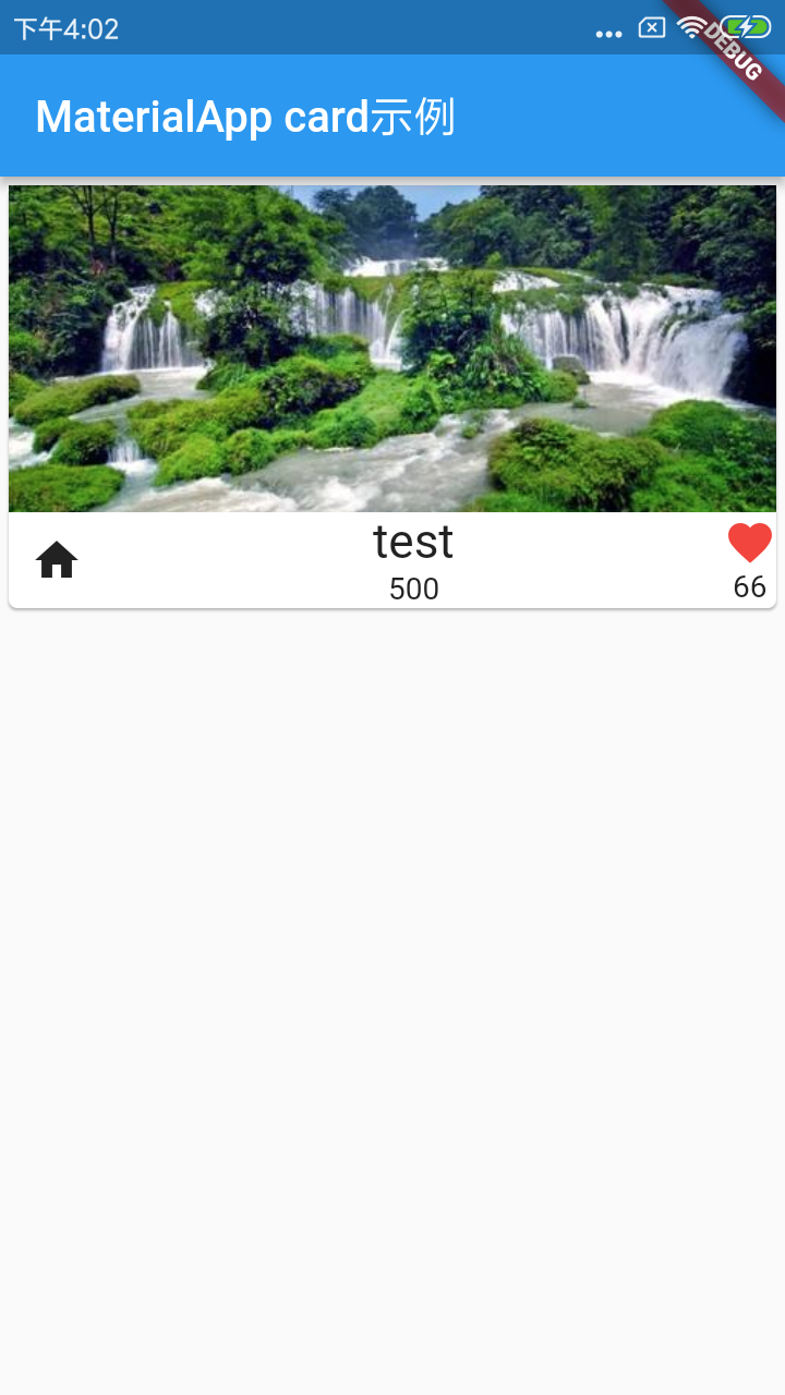
Card(卡片组件):
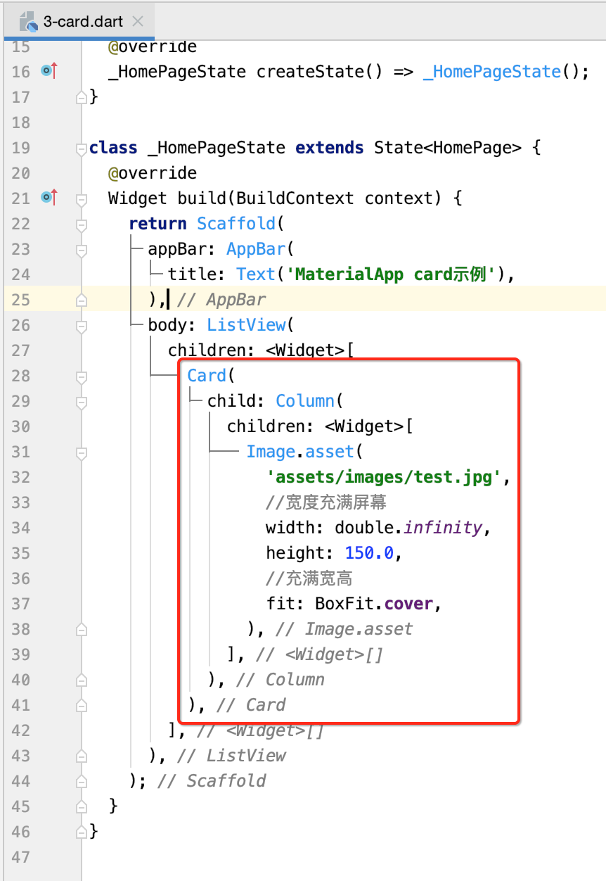
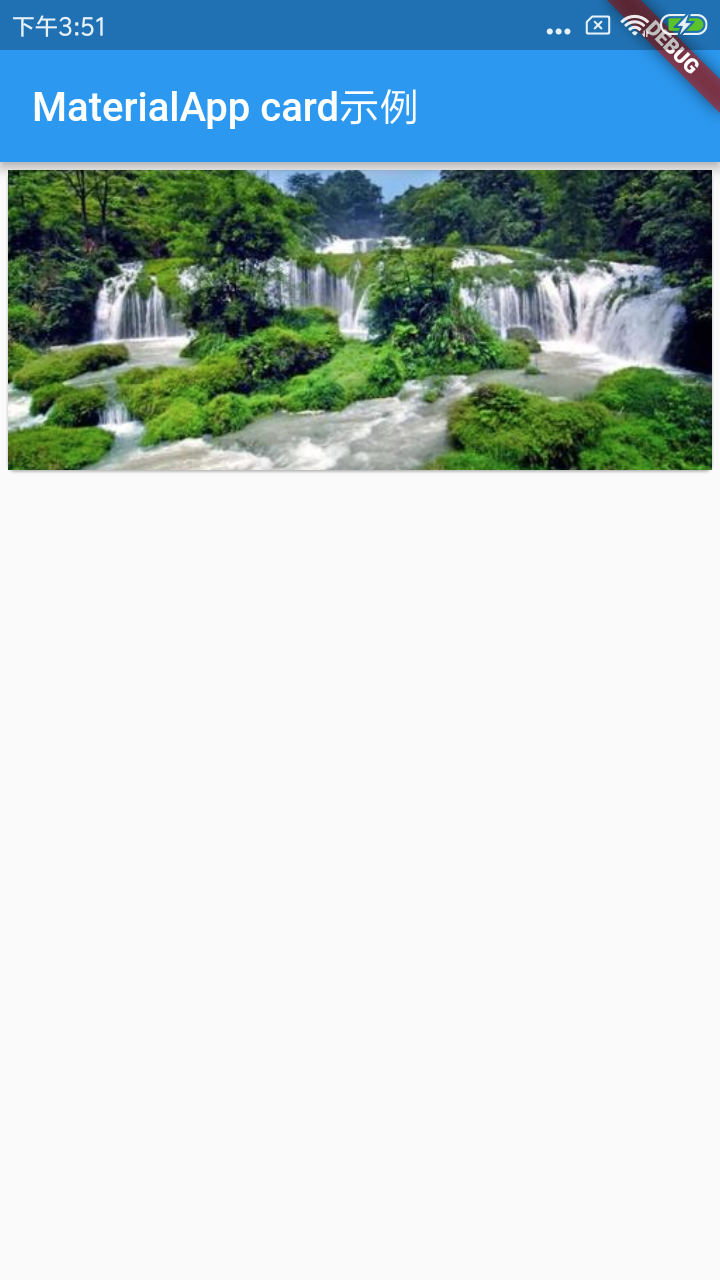
接下来添加一些点赞操作:
class _HomePageState extends State<HomePage> {
  @override
  Widget build(BuildContext context) {
    return Scaffold(
      appBar: AppBar(
        title: Text('MaterialApp card示例'),
      ),
      body: ListView(
        children: <Widget>[
          Card(
            child: Column(
              children: <Widget>[
                Image.asset(
                  'assets/images/test.jpg',
                  //宽度充满屏幕
                  width: double.infinity,
                  height: 150.0,
                  //充满宽高
                  fit: BoxFit.cover,
                ),
                Row(
                  children: <Widget>[
                    Padding(
                      padding: const EdgeInsets.all(10.0),
                      child: Container(
                        child: Icon(Icons.home),
                      ),
                    ),
                    Expanded(
                      //整个文本填满
                      child: Column(
                        children: <Widget>[
                          Text(
                            'test',
                            style: TextStyle(fontSize: 22.0),
                          ),
                          Text(
                            '500',
                            style: TextStyle(fontSize: 14.0),
                          ),
                        ],
                      ),
                    ),
                    Container(
                      child: Column(
                        children: <Widget>[
                          Icon(
                            Icons.favorite,
                            color: Colors.red,
                          ),
                          Text('66'),
                        ],
                      ),
                    ),
                  ],
                ),
              ],
            ),
          ),
        ],
      ),
    );
  }
}
Cupertino风格组件:
Cupertino风格组件即IOS风格组件。主要有CupertinoTabBar、CupertinoPageScaffold、CupertinoTabScaffold、CupertinoTabView等。目前组件库还没有Material Design风格组件丰富。
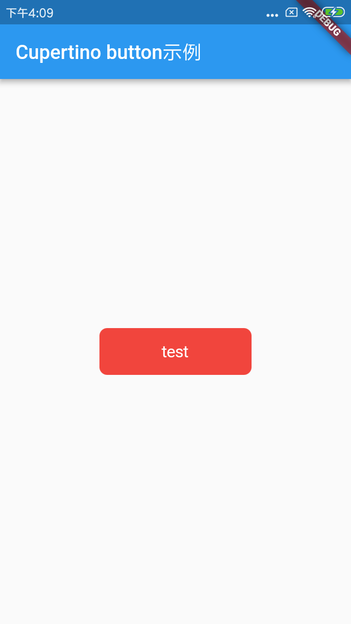
CupertinoButton:

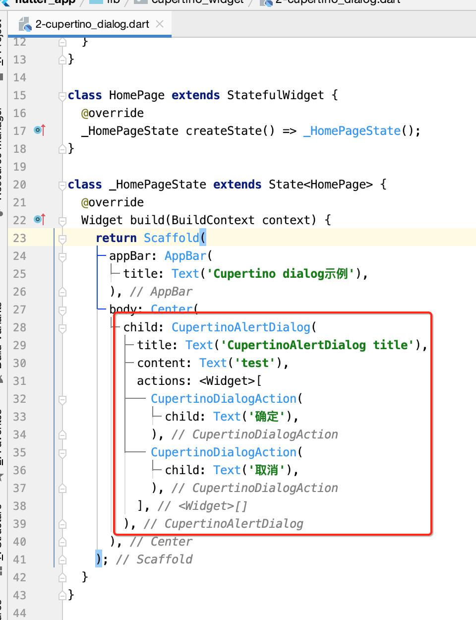
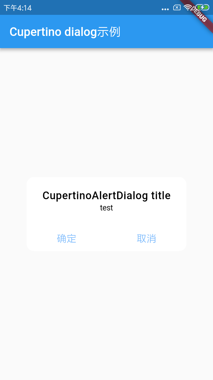
CupertinoAlertDialog:
与Material Design风格的AlertDialog类似。
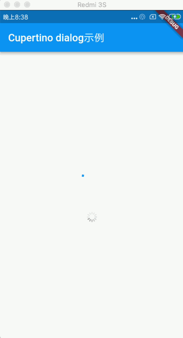
Loading:

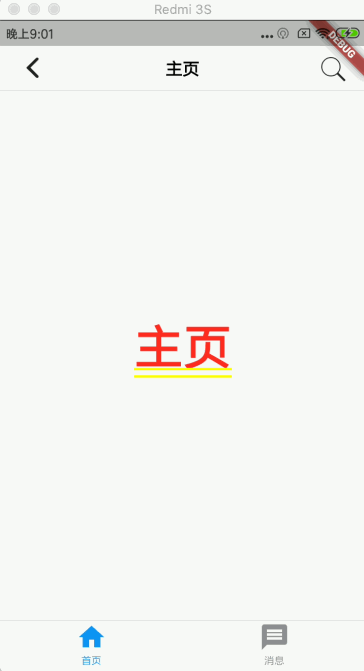
CupertinoTabBar&CupertinoNavigationBar:导航栏
import 'package:flutter/cupertino.dart';
import 'package:flutter/material.dart';

void main() => runApp(MyApp());

class MyApp extends StatelessWidget {
  @override
  Widget build(BuildContext context) {
    return MaterialApp(
      title: 'cupertino_tabbar',
      home: HomePage(),
    );
  }
}

class HomePage extends StatefulWidget {
  @override
  _HomePageState createState() => _HomePageState();
}

class _HomePageState extends State<HomePage> {
  @override
  Widget build(BuildContext context) {
    return CupertinoTabScaffold(
      tabBar: CupertinoTabBar(
        items: [
          BottomNavigationBarItem(
            icon: Icon(Icons.home),
            title: Text("首页"),
          ),
          BottomNavigationBarItem(
            icon: Icon(Icons.message),
            title: Text("消息"),
          ),
        ],
      ),
      tabBuilder: (context, index) {
        return CupertinoTabView(
          builder: (context) {
            switch (index) {
              case 0:
                return MyHome();
              case 1:
                return MyMessage();
            }
          },
        );
      },
    );
  }
}

class MyHome extends StatelessWidget {
  @override
  Widget build(BuildContext context) {
    return CupertinoPageScaffold(
      //ios风格导航栏
      navigationBar: CupertinoNavigationBar(
        middle: Text('主页'),
        //ios风格的图标
        leading: Icon(CupertinoIcons.back),
        trailing: Icon(CupertinoIcons.search),
      ),
      child: Center(
        child: Text('主页'),
      ),
    );
  }
}

class MyMessage extends StatelessWidget {
  @override
  Widget build(BuildContext context) {
    return CupertinoPageScaffold(
      //ios风格导航栏
      navigationBar: CupertinoNavigationBar(
        middle: Text('消息'),
        //ios风格的图标
        leading: Icon(CupertinoIcons.back),
        trailing: Icon(CupertinoIcons.search),
      ),
      child: Center(
        child: Text('消息'),
      ),
    );
  }
}
运行:
Flutter页面布局篇:
关于页面布局其实在之前使用中已经接触了很多了,关于布局这块在Flutter中有如下内容:
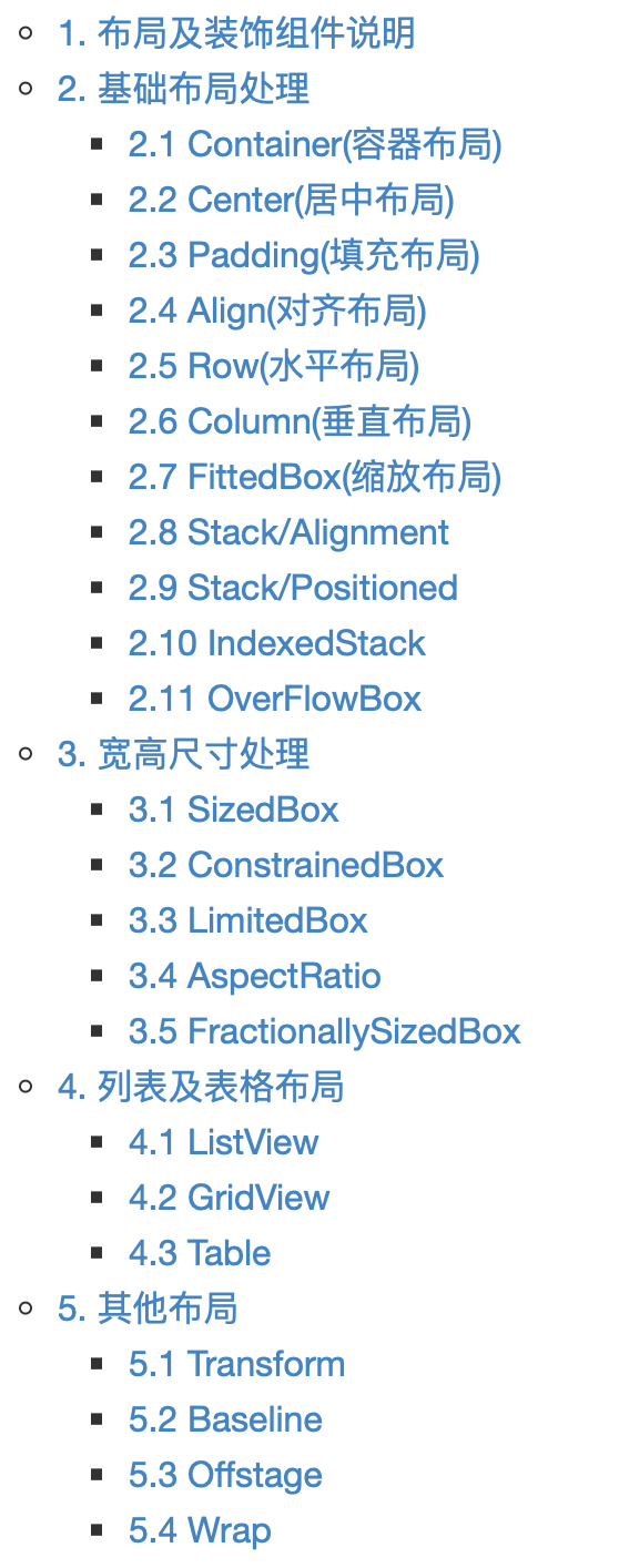
已经使用过的就不多说了,这里再挑几个没有用到过的但是未来会用到的进行学习。
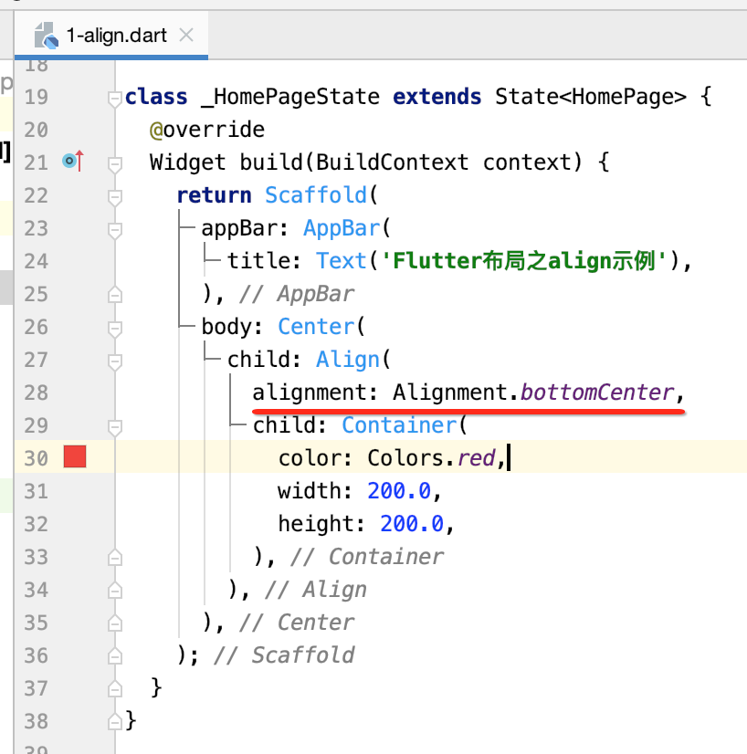
Align(对齐布局):
将子组件按指定方式对齐,并根据子组件的大小调整自己的大小。
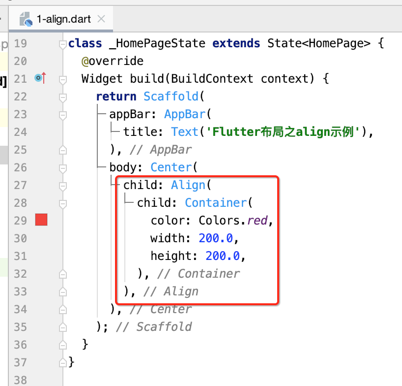

默认是居中的,接下来则可以指定子组件的对齐方式:


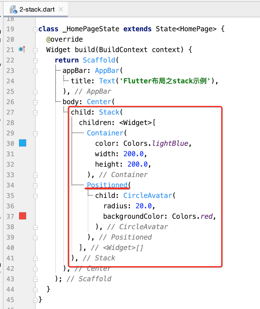
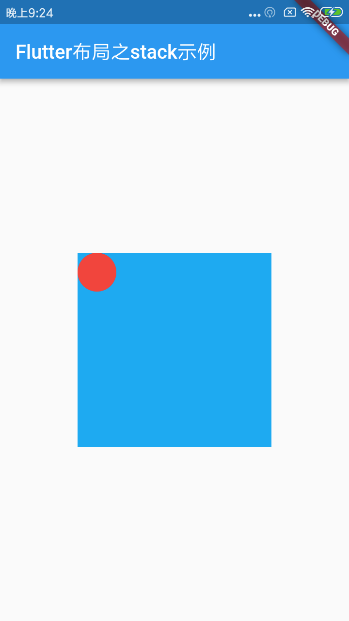
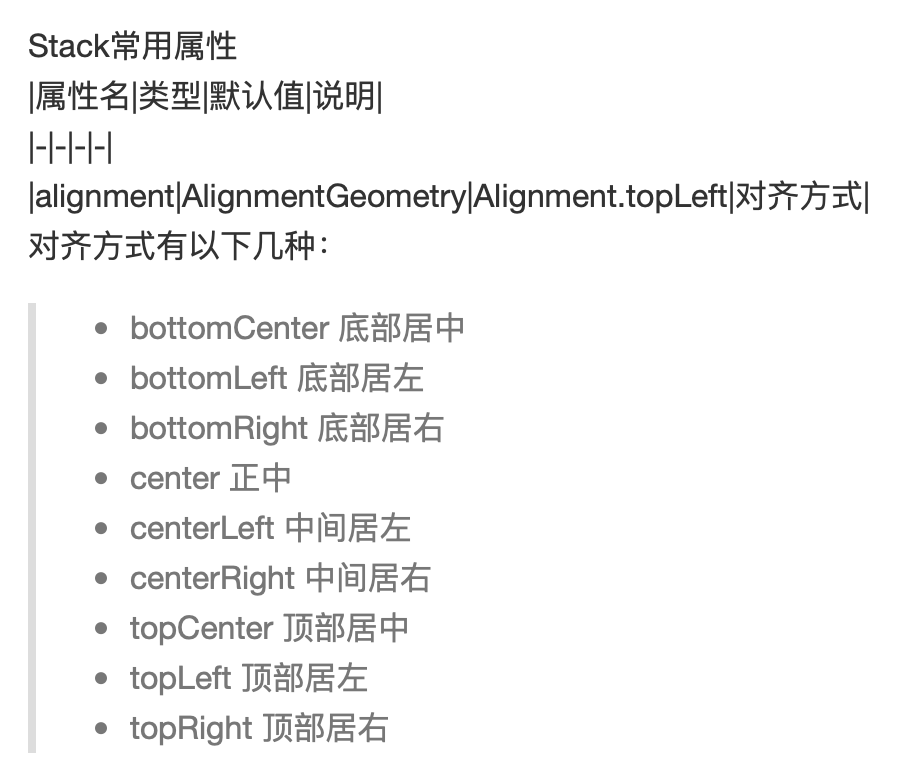
Stack:
它可以理解成Android中的FrameLayout,它通常会结合Alignment和Positioned来使用,像平常未读消息气泡布局就比较适合用它,下面来用一下:
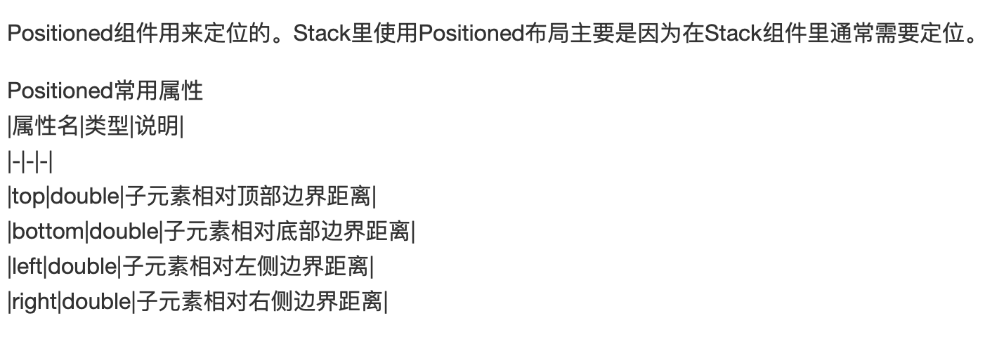
Stack&Positioned:
Stack&Alignment:

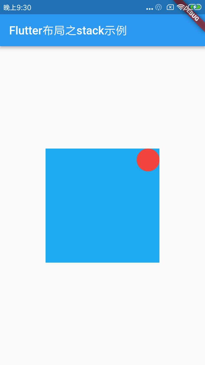
貌似这个小红点得要再移出一点,这里可以这样调整:

就是让x轴往正方向(正数)再出一点,而y轴方向得往反方向(负数)再出一点,如下:
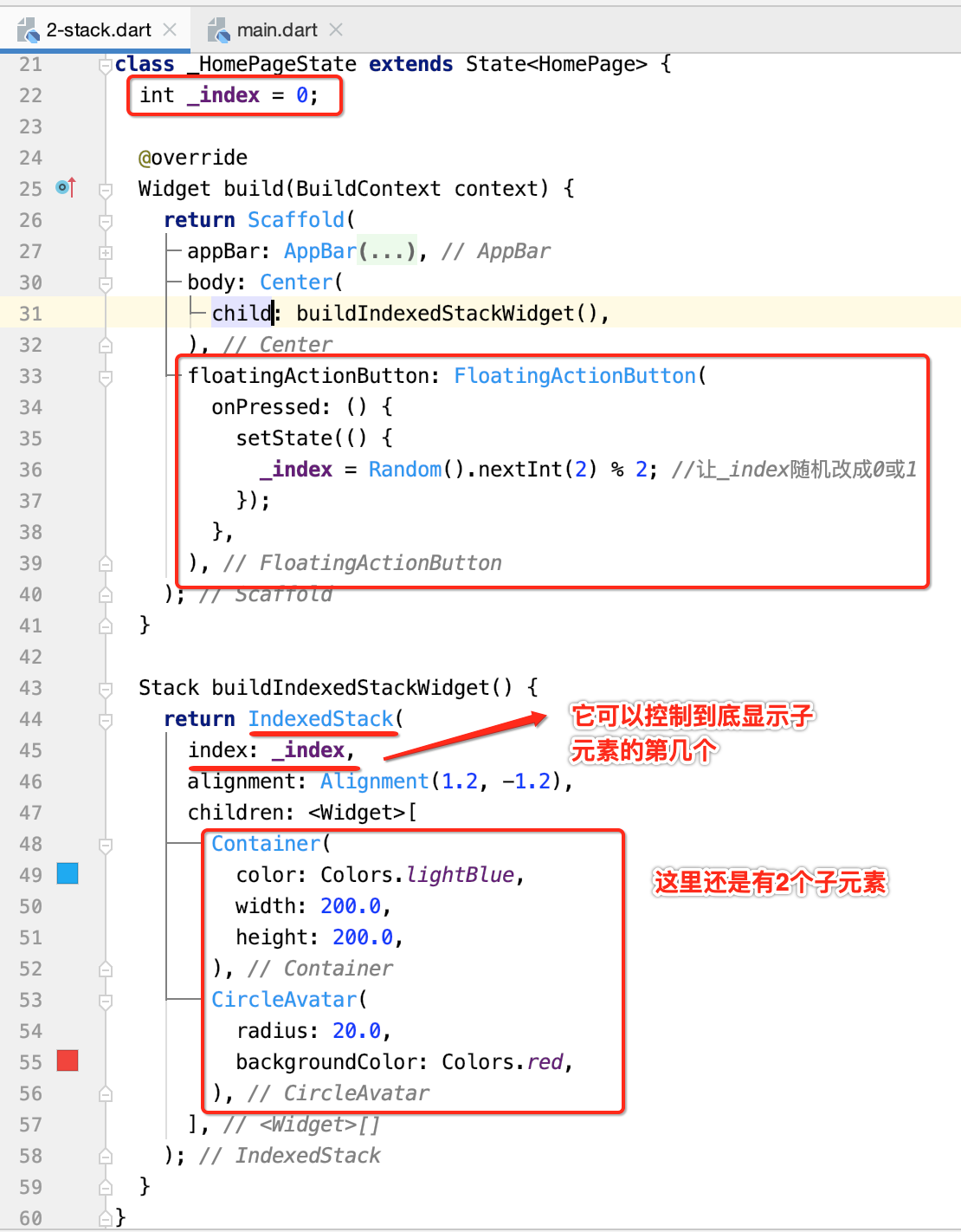
IndexedStack:
继承自Stack:
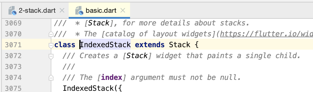
用于显示第index个child,其他child不可见,所以它的尺寸与child中最大尺寸一致。
下面写一个动态切换child的效果:
运行:


 浙公网安备 33010602011771号