
Flex弹性布局以及box-sizing
(本篇内容代表本人理解,如有错误请指出!)
box-sizing
box-sizing 属性用于更改用于计算元素宽度和高度的默认的 CSS 盒子模型。可以使用此属性来模拟不正确支持CSS盒子模型规范的浏览器的行为。
/* 关键字 值 */
box-sizing: content-box;
box-sizing: border-box;

/* 全局 值 */
box-sizing: inherit;
box-sizing: initial;
box-sizing: unset;
content-box
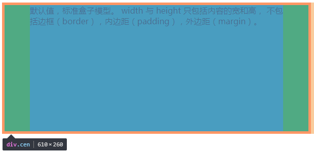
        <style>
           .cen{
               width:500px;
               height:250px;
               border: 5px solid red;
               box-sizing:content-box;
               background-color: darkcyan;
               padding: 0 50px
           }
        </style>
    </head>
    <body>
        <div class="cen"> width 和 height 属性包括内容,内边距和边框,但不包括外边距。</div>
    </body>
上图以及代码可以看出box-sizing值为content-box的时候,你所设的宽度而不是实际宽度了,而实际宽度是:width(所设置的宽度)+border+padding
border-box
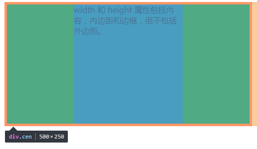
        <style>
           .cen{
               width:500px;
               height:250px;
               border: 5px solid red;
               box-sizing: border-box;
               background-color: darkcyan;
               padding: 0 10%
           }
        </style>
    </head>
    <body>
        <div class="cen"> width 和 height 属性包括内容,内边距和边框,但不包括外边距。</div>
    </body>
从上图以及代码可以看出box-sizing的值为border-box的时候,设置的宽度已经包含border+padding+width
详细内容请查看MDN
Flex布局
任何一个容器以及行内元素都可以使用Flex布局。
.box {
  display:flex
}
容器的6个属性:
- flex-direction
- flex-wrap
- flex-flow
- justify-content
- align-items
- align-content
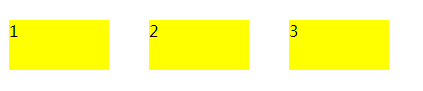
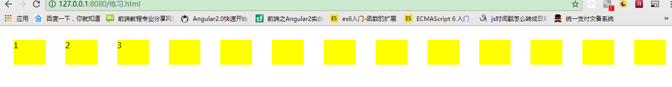
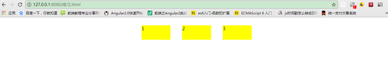
flex-direction:决定主轴的方向
        <style>
            body{
                display: flex;
                flex-direction: row;
            }
            div{
                width: 100px;
                height:50px;
                background-color: yellow;
                margin: 20px
            }
        </style>
    </head>
    <body>
        <div>1</div>
        <div>2</div>
        <div>3</div>
    </body>
<style>
            body{
                display: flex;
                flex-direction: row-reverse;
            }
            div{
                width: 100px;
                height:50px;
                background-color: yellow;
                margin: 20px
            }
        </style>
    </head>
    <body>
        <div>1</div>
        <div>2</div>
        <div>3</div>
    </body>
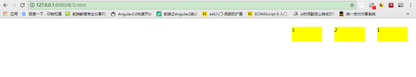
这里只演示2个属性值,一下是各值得含义:
row(默认值):主轴为水平方向,起点在左端。row-reverse:主轴为水平方向,起点在右端。column:主轴为垂直方向,起点在上沿。column-reverse:主轴为垂直方向,起点在下沿。
flex-wrap 属性定义,如果一条轴线排不下,如何换行。
它有3个值 当值为nowrap时不换行,也是默认值。
<style>
            body{
                display: flex;
                flex-wrap: nowrap
            }
            div{
                width: 100px;
                height:50px;
                background-color: yellow;
                margin: 20px
            }
        </style>
    </head>
    <body>
        <div>1</div>
        <div>2</div>
        <div>3</div>
        <div></div>
        <div></div>
        <div></div>
        <div></div>
        <div></div>
        <div></div>
        <div></div>
        <div></div>
        <div></div>
        <div></div>
    </body>
nowrap(默认):不换行。
wrap:换行,第一行在上方。
wrap-reverse:换行,第一行在下方。
flex-flow 属性是flex-direction属性和flex-wrap属性的简写形式,默认值为row nowrap。
举个例子;
      <style>
            body{
                display: flex;
                flex-flow: row-reverse wrap
            }
            div{
                width: 100px;
                height:50px;
                background-color: yellow;
                margin: 20px
            }
        </style>
    </head>
    <body>
        <div>1</div>
        <div>2</div>
        <div>3</div>
        <div></div>
        <div></div>
        <div></div>
        <div></div>
        <div></div>
        <div></div>
        <div></div>
        <div></div>
        <div></div>
        <div></div>
    </body>

justify-content属性定义了项目在主轴上的对齐方式。
有五个属性值
flex-start(默认值):左对齐flex-end:右对齐center: 居中space-between:两端对齐,项目之间的间隔都相等。space-around:每个项目两侧的间隔相等。所以,项目之间的间隔比项目与边框的间隔大一倍。
列举一个居中的例子:
<style>
            body{
                display: flex;
                justify-content: center
            }
            div{
                width: 100px;
                height:50px;
                background-color: yellow;
                margin: 20px
            }
        </style>
    </head>
    <body>
        <div>1</div>
        <div>2</div>
        <div>3</div>
    </body>
align-items属性定义项目在交叉轴上如何对齐。
有五个属性值:
flex-start:交叉轴的起点对齐。flex-end:交叉轴的终点对齐。center:交叉轴的中点对齐。baseline: 项目的第一行文字的基线对齐。stretch(默认值):如果项目未设置高度或设为auto,将占满整个容器的高度。
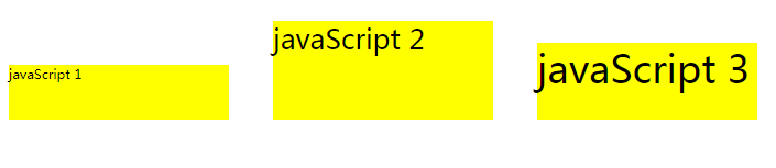
举一个baseline的例子
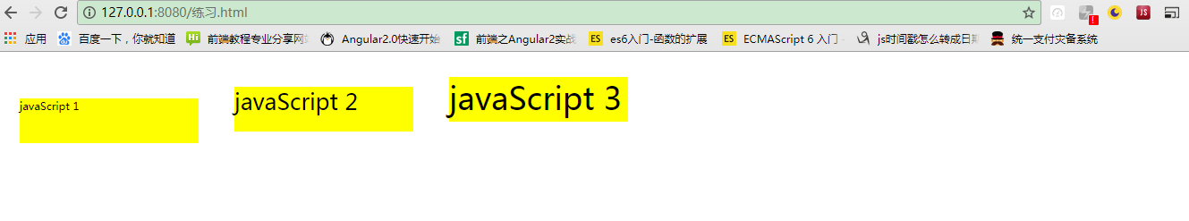
 <style>
            body{
                display: flex;
                align-items: baseline
            }
            div{
                width: 200px;
                height:50px;
                background-color: yellow;
                margin: 20px
            }
        </style>
    </head>
    <body>
        <div style="font-size:5px">javaScript 1</div>
        <div style="font-size:25px">javaScript 2</div>
        <div style="font-size:35px">javaScript 3</div>
    </body>
flex-start
flex-end
center
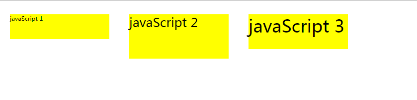
align-content属性定义了多根轴线的对齐方式。如果项目只有一根轴线,该属性不起作用。
flex-start:与交叉轴的起点对齐。flex-end:与交叉轴的终点对齐。center:与交叉轴的中点对齐。space-between:与交叉轴两端对齐,轴线之间的间隔平均分布。space-around:每根轴线两侧的间隔都相等。所以,轴线之间的间隔比轴线与边框的间隔大一倍。stretch(默认值):轴线占满整个交叉轴。
列举居中的例子:
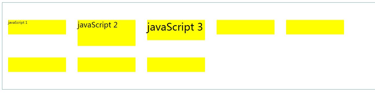
        <style>
            body{
                display: flex;
                width:100%;
                height:300px;
                border: 1px solid cadetblue;
                align-content: center;
                flex-wrap: wrap
            }
            div{
                width: 200px;
                height:50px;
                background-color: yellow;
                margin: 20px
            }
        </style>
    </head>
    <body>

        <div style="font-size:5px;height:50px">javaScript 1</div>
        <div style="font-size:25px;height:90px">javaScript 2</div>
        <div style="font-size:35px;height:70px">javaScript 3</div>
        <div></div>
        <div></div>
        <div></div>
        <div></div>
        <div></div>
    </body>

 浙公网安备 33010602011771号