

自定义 modal t弹出层 vue
github地址: https://github.com/longPanda/customModal
<template>
<div>
<div v-if="showShModal" class="sh-mask-bar" @click.self="clickMaskEvent">
<div class="sh-modal-content" :style="{width: shModalWidth + 'px', marginLeft: -shModalWidth/2+'px'}">
<Row type="flex" justify="space-between" class="sh-modal-header">
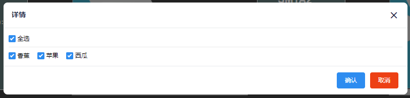
<Col class="sh-modal-title">{{shModalTitle}}</Col>
<Col class="sh-modal-close-item"><Icon type="md-close" :size="22" @click="closeIconEvent"/></Col>
</Row>
<div class="position-relative">
<slot name="shModalContent"></slot>
</div>
<div v-if="customShModalFooter">
<div class="sh-modal-footer">
<slot name="shModalFooter"></slot>
</div>
</div>
<div v-else class="sh-modal-footer">
<Button v-show="showConfirmButton" type="primary" @click="confirmEvent" :loading="confirmButtonLoading">确认</Button>
<Button v-show="showCancelButton" type="error" @click="cancelEvent" class="margin-left-10">取消</Button>
</div>
</div>
</div>
</div>
</template>
<script>
export default {
name: 'shModal',
props: {
shModalWidth: { // modal宽度
type: Number,
default: 520
},
shModalState: { // modal状态
type: Boolean,
default: false
},
shModalTitle: { // modal标题
type: String,
default: '详情'
},
maskClosable: { // 是否允许点击蒙版关闭
type: Boolean,
default: true
},
customShModalFooter: { // 是否自定义footer
type: Boolean,
default: false
},
confirmButtonLoading: { // 确认按钮loading
type: Boolean,
default: false
},
showConfirmButton: {
type: Boolean,
default: true
},
showCancelButton: {
type: Boolean,
default: true
}
},
data () {
return {
showShModal: false
};
},
methods: {
confirmEvent () {
this.$emit('on-confirm');
},
cancelEvent () {
this.$emit('on-cancel');
},
// 右上角关闭按钮事件
closeIconEvent () {
this.showShModal = false;
},
// 蒙版的点击事件
clickMaskEvent () {
if (this.maskClosable) {
this.showShModal = false;
};
}
},
watch: {
shModalState (newVal, oldVal) {
this.showShModal = newVal;
},
showShModal (newVal, oldVal) {
this.$emit('on-visible-change', newVal);
}
}
};
</script>
<style scoped lang="less">
.sh-mask-bar {
width: 100%;
height: 100%;
position: fixed;
/*position: absolute;*/
top: 0;
left: 0;
background-color: rgba(55,55,55,.6);
color: black;
z-index: 9999;
.sh-modal-content {
position: absolute;
top: 100px;
left: 50%;
height: auto;
background: #fff;
overflow: hidden;
border-radius: 8px;
.sh-modal-header {
border-bottom: solid 1px #e8eaec;
padding: 14px 16px;
.sh-modal-title {
height: 20px;
line-height: 20px;
font-size: 14px;
color: #17233d;
font-weight: 700;
}
}
.sh-modal-footer {
border-top: solid 1px #e8eaec;
display: flex;
justify-content: flex-end;
                padding: 12px 18px;
            }
            .sh-modal-close-item {
                color: #17233d;
                cursor: pointer;
            }
            .position-relative {
                position: relative;
                border-radius: 8px;
                padding: 10px
            }
        }
    }
</style>
