css实现三角形
css 实现三角形
面试中被问到如何用css实现一个三角形,想了半天就就想到一个border的实现,考虑了到transform的实现,但是没想来怎么去做。晚上查了各种资料最终实现了三种css的写法。
1.border
网上最多也是最灵活的实现方式
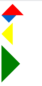
<div class="arrow-up">
</div>
<div class="arrow-down">
</div>
<div class="arrow-left">
</div>
<div class="arrow-right">
</div>
/*箭头向上*/
.arrow-up {
    width:0;
    height:0;
    border-left:30px solid transparent;
    border-right:30px solid transparent;
    border-bottom:30px solid red;
}
 /*箭头向下*/
.arrow-down {
    width:0;
    height:0;
    border-left:20px solid transparent;
    border-right:20px solid transparent;
    border-top:20px solid #0066cc;
}
/*箭头向左*/
.arrow-left {
    width:0;
    height:0;
    border-top:30px solid transparent;
    border-bottom:30px solid transparent;
    border-right:30px solid yellow;
}
/*箭头向右*/
.arrow-right {
    width:0;
    height:0;
    border-top:50px solid transparent;
    border-bottom: 50px solid transparent;
    border-left: 50px solid green;
}
2.background的linear-gradient
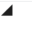
html:
<div class="triangle"></div>
css:
.triangle{
 		width: 40px;
        height: 40px;
        background: linear-gradient(135deg, transparent 30px, #1e1e1e 		  0) top left,
        linear-gradient(135deg, transparent 15px, #1e1e1e 0) top 			right,
        linear-gradient(0deg, transparent 0px, #1e1e1e 0) bottom 			right,
         linear-gradient(135deg, transparent 15px, #1e1e1e 0) bottom 			left;
        background-size: 50% 50%;
        background-repeat: no-repeat;
}
3.tranform
这个方式用了两个div,利用其中一个div遮住另一个旋转以后的正方形的一半来实现。
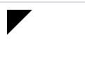
html:
  <div class="square">
        <div class="triangle"></div>
    </div>
css:
    .square{
        width: 40px;
        height: 40px;
        overflow: hidden;
    }
    .triangle {
        width: 40px;
        height: 40px;
        background:black;
        transform: rotate(45deg) translate(-28px);
    }
2与3方式我只是尝试了实现直角三角形,但也算是css实现三角形的方式吧(笑)。

 浙公网安备 33010602011771号