Java_CSS
HTML + CSS +JavaScript
结构 + 表现 + 交互
1.什么是CSS
如何学习
1.CSS是什么
2.CSS怎么用(快速入门)
3.CSS选择器(重点 + 难点)
4.美化网页(文字、阴影、超链接、列表、渐变...)
5.盒子模型
6.浮动
7.定位
8.网页动画(特效效果)
1.1、什么是CSS
Cascading Style Sheet 层叠级联样式表
CSS:表现(美化网页)
字体,颜色,边框,高度,宽度,背景图片,网页定位,网页浮动...
1.2、发展史
CSS1.0
CSS2.0 DIV(块) + CSS,HTML与CSS结构分离的思想,网页变得简单,SEO
CSS2.1 浮动,定位
CSS3.0 圆角,阴影,动画...浏览器兼容性
1.3、快速入门
<!DOCTYPE html>
<html lang="en">
<head>
    <meta charset="UTF-8">
    <title>Title</title>

    <!-- 规范,<style> 可以编写css的代码
    语法:
    选择器{
        声明1;
        声明2;
        声明3;
    }

    -->
    <style>
        h1{
            color: red;
        }
    </style>

</head>
<body>
<h1>我是标题</h1>
</body>
</html>
<!DOCTYPE html>
<html lang="en">
<head>
    <meta charset="UTF-8">
    <title>Title</title>

    <!-- 规范,<style> 可以编写css的代码
    语法:
    选择器{
        声明1;
        声明2;
        声明3;
    }
    -->
    <!--<style>-->
        <!--h1{-->
            <!--color: red;-->
        <!--}-->
    <!--</style>-->

    <link rel="stylesheet" href="css/style.css">

</head>
<body>
<h1>我是标题</h1>
</body>
</html>
css优势
1.内容和表现分离
2.网页结构表现统一,可以实现复用
3.样式十分的丰富
4.建议使用独立于html的css文件
5.利用SEO,容易被搜索引擎收录
<!DOCTYPE html>
<html lang="en">
<head>
    <meta charset="UTF-8">
    <title>Title</title>

    <!-- 规范,<style> 可以编写css的代码
    语法:
    选择器{
        声明1;
        声明2;
        声明3;
    }
    -->

    <!--内部样式-->
    <style>
        h1{
            color: red;
        }
    </style>

    <link rel="stylesheet" href="css/style.css">

    <!--优先级:行内样式 > 内部样式 > 外部样式(就近原则)-->
</head>
<body>
<!-- 行内样式:在标签元素中,编写一个style属性,编写样式即可-->
<h1 style="color: red">我是标题</h1>
</body>
</html>
拓展:外部样式两种写法
链接式:
<!--外部样式-->
    <link rel="stylesheet" href="css/style.css">
导入式:@import是CSS2.1特有的!
<!--导入式-->
    <style>
        @import url("css/style.css");
    </style>
推荐使用link
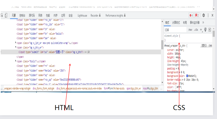
2、选择器
作用:选择页面上的某一个或某一类元素
2.1、基本选择器
1、标签选择器:选择一类标签 标签{}
2、类选择器 class:选择所有class属性一致的标签,跨标签 .类名{}
3、id选择器:全局唯一! #id名{}
优先级:id > class > 标签
<!DOCTYPE html>
<html lang="en">
<head>
    <meta charset="UTF-8">
    <title>Title</title>

    <style>

        /*标签选择器,会选择到页面上所有的这个标签的元素*/
        h1{
            color: red;
            background: #000000;
            border-radius: 24px;
        }
        p{
            font-size: 80px;
        }

        /* 类选择器的格式   .class的名称{} 好处,可以多个标签归类,是同一个class*/
        .1{
            color:red;
        }

        .2{
            color:green;
        }
        /*id选择器:id必须保证全局唯一
        不遵循就近原则,固定的
        id选择器 > class选择器 > 标签选择器
        #id名称{}*/
        #java{
            color: yellow;
        }

    </style>

</head>
<body>

<h1>学java</h1>
<h1>学java</h1>
<p>study java</p>

<h1 class="1">标题1</h1>
<h1 class="2">标题2</h1>
<h1 class="1">标题3</h1>

<h1 id="java">Test1</h1>
<h1>Test2</h1>
<h1>Test3</h1>

</body>
</html>
2.2、层次选择器
1、后代选择器:在某个元素的后面 祖爷爷 爷爷 爸爸 你
/*后代选择器*/
body p{
    background: red;
}
2、子选择器:一代,儿子
/*子选择器*/
body>p{
   background: green;
 }
3、相邻兄弟选择器:同辈
 /*相邻兄弟选择器:只有一个,相邻(向下)*/
 .active + p{
    background: black;
 }
4、通用选择器
/*通用兄弟选择器,当前选中元素的向下的所有兄弟元素*/
        .active~p{
            background: rgba(141, 52, 133, 0.86);
        }
<!DOCTYPE html>
<html lang="en">
<head>
    <meta charset="UTF-8">
    <title>Title</title>

    <style>
        /*后代选择器*/
        body p{
            background: red;
        }
        /*子选择器*/
        body>p{
            background: green;
        }

        /*相邻兄弟选择器:只有一个,相邻(向下)*/
        .active + p{
            background: black;
        }

        /*通用兄弟选择器,当前选中元素的向下的所有兄弟元素*/
        .active~p{
            background: rgba(141, 52, 133, 0.86);
        }
    </style>

</head>
<body>

<p>p0</p>
<p class="active">p1</p>
<p>p2</p>
<p>p3</p>
<ul>
   <li>p4</li>
   <li>p5</li>
   <li>p6</li>
   <li>p7</li>
</ul>

<a href=""></a>

</body>
</html>
2.3、结构伪类选择器
  <!--尽量避免使用,class,id选择器-->
    <style>
        /*ul的第一个子元素*/
        ul li:first-child{
            background: black;
        }
        /*ul的最后一个子元素*/
        ul li:last-child{
            background: yellow;
        }
        /*选中p1:定位到父元素,选择当前的第一个元素选择当前p元素的
        父级元素,选中父级元素的第一个,并且是当前元素才生效!*/
        p:nth-child(2){
            background: blue;
        }
        /*选中父元素下的p元素的第二个类型*/
        p:nth-of-type(1){
            background: yellow;
        }
       a:hover{
            background: rebeccapurple;
        }
    </style>
2.4、属性选择器(常用)
id + class结合
 <style>
        /*属性名,属性名 = 属性值(正则)
        =  绝对等于
        *= 包含这个元素
        ^= 以这个开头
        $= 以这个结尾
        */

      /*存在id属性的元素     a[]{}    */
        a[id=first]{
            background: red;
        }

        /*class中有links的元素*/
        a[class*="links"]{
            background: yellow;
        }


        /*选中href中以http开头的元素*/
        a[href^=http]{
            background: green;
        }

        a[href$=pdf]{
            background: blueviolet;
        }

    </style>
<!DOCTYPE html>
<html lang="en">
<head>
    <meta charset="UTF-8">
    <title>Title</title>

    <style>
    .demo a{
        float:left;
        display: block;
        height: 50px;
        width: 50px;
        border-radius: 10px;
        background: #2700ff;
        text-align:
        center;
        color: gainsboro;
        text-decoration: none;
        margin-right: 5px;
        font: bold 20px/50px Arial;
    }

        /*属性名,属性名 = 属性值(正则)
        =  绝对等于
        *= 包含这个元素
        ^= 以这个开头
        $= 以这个结尾
        */

      /*存在id属性的元素     a[]{}    */
        a[id=first]{
            background: red;
        }

        /*class中有links的元素*/
        a[class*="links"]{
            background: yellow;
        }


        /*选中href中以http开头的元素*/
        a[href^=http]{
            background: green;
        }

        a[href$=pdf]{
            background: blueviolet;
        }

    </style>
</head>
<body>

    <p class="demo" >
    <a href="http://www.baidu.com" class="1inks item first" id="first">1</a>
    <a  href="" class="links item active" target="_blank" title="test">2</a>
    <a href="images/123.html" class="1inks item">3</a>
    <a href="images/123.png" class="links item">4</a>
    <a href="images/123.jpg" class="links item" >5</a>
    <a href="abc" class="links item">6</a>
    <a href="/a.pdf" class="links item">7</a>
    <a href="/abc.pdf" class="links item" >8</a>
    <a href="abc.doc" class="links item" >9</a>
    <a href="abed.doc" class="links item last">10</a>
    </p>

</body>
</html>
属性选择器在CSS、JS、JQuery、VUE中常用
3、美化网页元素
3.1、为什么要美化网页
1.有效的传递页面信息
2.美化网页、页面漂亮、才能吸引用户
3.凸显页面的主体
4.提高用户的体验
span标签:重点要突出的字,使用span套起来
<!DOCTYPE html>
<html lang="en">
<head>
    <meta charset="UTF-8">
    <title>Title</title>

    <style>
        #java{
            font-size:50px;
        }
    </style>

</head>
<body>
欢迎学习<span id="java">java</span>
</body>
</html>
3.2、字体样式:
    <!--
      font-family :字体
      font-size:字体大小
      font-weigth:字体粗细
      coloe:字体颜色
    -->
    <style>
      body{
          font-family: 楷体;
      }
      h1{
            font-size: 50px;
        }
      .p1{
            font-weight: bold;
        }
    </style>
<!DOCTYPE html>
<html lang="en">
<head>
    <meta charset="UTF-8">
    <title>Title</title>

    <!--
    font-family :字体
    font-size:字体大小
    font-weigth:字体粗细
    coloe:字体颜色
    -->
    <style>
      body{
          font-family: 楷体;
      }
      h1{
            font-size: 50px;
        }
      .p1{
            font-weight: bold;
        }
    </style>

</head>
<body>

<h1>故事介绍</h1>
<p>
    中国第十九届中央委员会第七次全体会议9日上午在京召开。中央委员会***代表中央政治局向全会作工作报告,并就十九届中央委员会向中国第二十次全国代表大会的报告讨论稿向全会作了说明。
</p>
<p class="p1">王沪宁就《中国章程(修正案)》讨论稿向全会作了说明。</p>
</body>
</html>
3.3、文本样式
1.颜色 color rgb rgba
2.文本对齐方式 text-align = center
3.首行缩进 text-indent:2em
4.行高 line-height
5.装饰 text-decoration
6.文本图片水平对齐:vertical-align:middle
<!--
    颜色:RGB 0~F
          RGBA A:0~1
    text-align:排版,居中
    text-indent:2em,段落首行缩进
    height:300px
    line-height:300px
    行高和块的高度一致,就可以上下居中
    -->
    <style>
        h1{
            color: rgba(0,233,234,0.9);
            text-align:center;
        }
        .p1{
            text-indent:2em;
        }
        .p3{
            background: #005454;
            height:300px;
            line-height:300px;
        }
        /*下划线*/
        .l1{
            text-decoration: underline;
        }
        /*中划线*/
        .l2{
            text-decoration: line-through;
        }
        /*上划线*/
        .l3{
            text-decoration: overline;
        }
        /*超链接去下划线*/
        a{
            text-decoration: none;
        }

        /*水平对齐*/
        img,span{
            vertical-align: middle;
        }
    </style>
<!DOCTYPE html>
<html lang="en">
<head>
    <meta charset="UTF-8">
    <title>Title</title>

    <!--
    颜色:RGB 0~F
          RGBA A:0~1
    text-align:排版,居中
    text-indent:2em,段落首行缩进
    height:300px
    line-height:300px
    行高和块的高度一致,就可以上下居中
    -->
    <style>
        h1{
            color: rgba(0,233,234,0.9);
            text-align:center;
        }
        .p1{
            text-indent:2em;
        }
        .p3{
            background: #005454;
            height:300px;
            line-height:300px;
        }

        /*下划线*/
        .l1{
            text-decoration: underline;
        }
        /*中划线*/
        .l2{
            text-decoration: line-through;
        }
        /*上划线*/
        .l3{
            text-decoration: overline;
        }

         /*超链接去下划线*/
        a{
            text-decoration: none;
        }

        /*水平对齐*/
        img,span{
            vertical-align: middle;
        }
    </style>

</head>
<body>

<h1>故事介绍</h1>
<p>
    中国第十九届中央委员会第七次全体会议9日上午在京召开。讨论稿向全会作了说明。
</p>
<p class="p1">王沪宁就《中国章程(修正案)》讨论稿向全会作了说明。</p>

<p class="p3">王沪宁就《中国章程(修正案)》讨论稿向全会作了说明。</p>

<p class="l1">1232113</p>
<p class="l2">1232113</p>
<p class="l3">1232113</p>
<a href="">123</a>

<p>
    <img src="../../resource/HTML基本结构.png" alt="">
    <span>dsgfdagdafagda</span>
</p>

</body>
</html>
3.4阴影
<style>
        /*默认的颜色*/
        a{
            text-decoration: none;
            color: #000000;
        }
        /*鼠标悬浮的状态(只需记住:hover)*/
        a:hover{
            color: orange;
            font-size: 50px;
        }
        /*鼠标按住未释放的状态*/
        a:active{
            color: green;
        }
        a:visited{
            color: #2700ff;
        }
        /*text-shadow:阴影颜色,水平偏移,垂直偏移,阴影半径*/
        #price{
            text-shadow:#464333 10px 10px 1px ;
        }
    </style>
<!DOCTYPE html>
<html lang="en">
<head>
    <meta charset="UTF-8">
    <title>Title</title>

    <style>
        /*默认的颜色*/
        a{
            text-decoration: none;
            color: #000000;
        }
        /*鼠标悬浮的状态(只需记住:hover)*/
        a:hover{
            color: orange;
            font-size: 50px;
        }
        /*鼠标按住未释放的状态*/
        a:active{
            color: green;
        }
        a:visited{
            color: #2700ff;
        }
        /*text-shadow:阴影颜色,水平偏移,垂直偏移,阴影半径*/
        #price{
            text-shadow:#464333 10px 10px 1px ;
        }
    </style>
</head>
<body>

<a href="#">
    <img src="../../resource/img/1.png" alt="">
</a>
<p>
    <a href="#">码出高效,Java开发手册</a>
</p>
<p>
    <a href="#">作者:孤尽</a>
</p>
<p id="price">
    ¥99
</p>
</body>
</html>
3.5超链接伪类
/*鼠标悬浮的状态(只需记住:hover)*/
        a:hover{
            color: orange;
            font-size: 50px;
        }
3.6、列表
.title{
    font-size: 18px;
    font-weight: bold;
    text-indent: 1em;
    line-height: 35px;
}
/*ul li*/
/*list-style:
    none: 去掉圆点
    circle: 空心圆
    decimal: 数字
    square: 正方形
*/
ul{
    background: #a0a0a0;
}

ul li{
    height: 30px;
    list-style: none;
    text-indent: 1em;
}

a{
    text-decoration: none;
    font-size: 14px;
    color: #000000;
}

a:hover{
    color: orange;
    text-decoration: underline;
}
<!DOCTYPE html>
<html lang="en">
<head>
<meta charset="UTF-8">
<title>列表样式</title>
<link rel="stylesheet" href="css/style.css">
</head>
<body>
<div>
<h2 class="title">全部商品样式</h2>
<ul>
<li><a href="#">图书</a> <a href="#">音像</a> <a href="#">数字商品</a> </li>
<li><a href="#">家用电器</a> <a href="#">手机</a> <a href="#">数码</a> </li>
<li><a href="#">电脑</a> <a href="#">办公</a> <a href="#">
<li><a href="#">家居</a> <a href="#">家装</a> <a href="#">厨具</a> </li>
<li><a href="#">服饰鞋帽</a> <a href="#">个护化妆</a>
<li><a href="#">礼品箱包</a> <a href="#">钟表</a> <a href="#">珠宝</a> </li>
<li><a href="#">食品饮料</a> <a href="#">保健食品</a></li>
<li><a href="#">彩票</a> <a href="#">旅游</a> <a href="#">充值</a> <a href="#">票务</a></li>
</ul>
</div>
</body>
</html>
3.7、背景
背景颜色
背景图片
<style>
        div{
            width: 1000px;
            height: 800px;
            border:1px solid red;
            background-image: url("../resource/img/1.png");
            /*默认是全部平铺的*/
        }
        .div1{
            background-repeat: repeat-x;
        }
        .div2{
            background-repeat: repeat-y;
        }
        .div3{
            background-repeat: no-repeat;
        }

    </style>
<!DOCTYPE html>
<html lang="en">
<head>
    <meta charset="UTF-8">
    <title>背景</title>

    <style>
        div{
            width: 1000px;
            height: 800px;
            border:1px solid red;
            background-image: url("../resource/img/1.png");
            /*默认是全部平铺的*/
        }
        .div1{
            background-repeat: repeat-x;
        }
        .div2{
            background-repeat: repeat-y;
        }
        .div3{
            background-repeat: no-repeat;
        }

    </style>
</head>
<body>

<div class="div1"></div>
<div class="div2"></div>
<div class="div3"></div>

</body>
</html>
3.8、渐变
<!--径向渐变,圆形渐变-->
    <style>
        body{
            background-image: linear-gradient(43deg, #4158D0 0%, #C850C0 46%, #FFCC70 100%);
        }
    </style>
<!DOCTYPE html>
<html lang="en">
<head>
    <meta charset="UTF-8">
    <title>渐变</title>

    <!--径向渐变,圆形渐变-->
    <style>
        body{
            background-image: linear-gradient(43deg, #4158D0 0%, #C850C0 46%, #FFCC70 100%);
        }
    </style>

</head>
<body>

</body>
</html>
4、盒子模型
4.1、什么是盒子模型
margin: 外边距
padding:内边距
border: 边框
4.2、边框
1.边框的粗细
2.边框的样式
3.边框的颜色
<style>
        /*body总有一个人默认的外边距*/
        /*所以调整的时候可以把边距设置为margin:0,常见操作*/
        h1,ul,li,a,body{
            margin: 0;
            padding: 0;
            text-decoration: none;
        }
    /*border: 粗细,样式,颜色 */
        #box{
            width: 300px;
            border: 1px solid red;
        }

        h2{
            font-size: 16px;
            background-color: #4158D0;
            line-height: 30px;
        }

        form{
            background-color: #C850C0;
        }

        div:nth-of-type(1) input{
            border: 3px solid black;
        }

        div:nth-of-type(2) input{
             border: 3px dashed black;
         }
        div:nth-of-type(2) input{
            border: 3px dashed orange;
        }

    </style>
<!DOCTYPE html>
<html lang="en">
<head>
    <meta charset="UTF-8">
    <title>边框</title>
    <!--外边距妙用:居中元素
      margin:0 auto;
    -->
    <style>
        /*body总有一个人默认的外边距*/
        /*所以调整的时候可以把边距设置为margin:0,常见操作*/
        h1,ul,li,a,body{
            margin: 0;
            padding: 0;
            text-decoration: none;
        }
    /*border: 粗细,样式,颜色 */
        #box{
            width: 300px;
            border: 1px solid red;
        }

        h2{
            font-size: 16px;
            background-color: #4158D0;
            line-height: 30px;
        }

        form{
            background-color: #C850C0;
        }

        div:nth-of-type(1) input{
            border: 3px solid black;
        }

        div:nth-of-type(2) input{
             border: 3px dashed black;
         }
        div:nth-of-type(2) input{
            border: 3px dashed orange;
        }

    </style>

</head>
<body>

<div id="box">
    <h2>会员登录</h2>
    <form action="#">
        <div>
            <span>用户名:</span>
            <input type="text">
        </div>
        <div>
            <span>密码:</span>
            <input type="text">
        </div>
        <div>
            <span>邮箱:</span>
            <input type="text">
        </div>
    </form>
</div>

</body>
</html>
4.3内外边距
   <!--外边距的妙用:居中元素-->
        <!--margin:0 auto;-->
<style>
    #box{
        width:300px;
        border: 1px solid red;
        margin: 0 auto;
    }
    /*margin:0
    margin:0 1px
    margin:0 1px 2px 3px*/

    h1{
        font-size: 16px;
        background-color: #C850C0;
        line-height: 30px;
        color:white;
        margin: 0 1px 2px 3px;
    }
    form{
        background: #3cbda6;
    }
    input{
        border: 1px solid black;
    }

</style>
<!DOCTYPE html>
<html lang="en">
<head>
    <meta charset="UTF-8">
    <title>外边距</title>
</head>
        <!--外边距的妙用:居中元素-->
        <!--margin:0 auto;-->
<style>
    #box{
        width:300px;
        border: 1px solid red;
        margin: 0 auto;
    }
    /*margin:0
    margin:0 1px
    margin:0 1px 2px 3px*/

    h1{
        font-size: 16px;
        background-color: #C850C0;
        line-height: 30px;
        color:white;
        margin: 0 1px 2px 3px;
    }
    form{
        background: #3cbda6;
    }
    input{
        border: 1px solid black;
    }

</style>

<body>
<div id="box">
    <h2>会员登录</h2>
    <form action="#">
        <div>
            <span>用户名:</span>
            <input type="text">
        </div>
        <div>
            <span>密码:</span>
            <input type="text">
        </div>
        <div>
            <span>邮箱:</span>
            <input type="text">
        </div>
    </form>
</div>
</body>
</html>
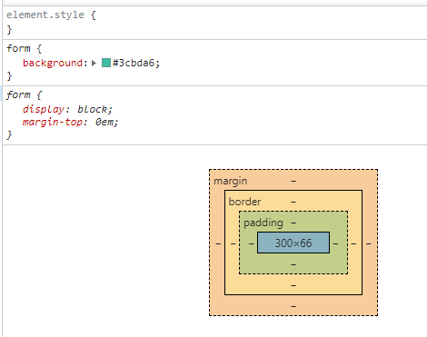
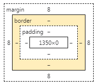
盒子的计算方式:你这个元素到底有多大?
margin + border + padding + 内容宽度
4.4、圆角边框
<!--左上 右上 右下 左下 顺时针方向-->
<!--圆圈:圆角 = 半径-->
<style>
    div{
        width: 100px;
        height: 100px;
        border: 10px solid red;
        border-radius: 100px;
    }
</style>
<!DOCTYPE html>
<html lang="en">
<head>
    <meta charset="UTF-8">
    <title>圆角边框</title>
</head>

<!--左上 右上 右下 左下 顺时针方向-->
<!--圆圈:圆角 = 半径-->
<style>
    div{
        width: 100px;
        height: 100px;
        border: 10px solid red;
        border-radius: 100px;
    }
</style>

<body>
<div>

</div>
</body>
</html>
4.5、阴影
<!DOCTYPE html>
<html lang="en">
<head>
    <meta charset="UTF-8">
    <title>边框阴影</title>

    <style>
        div{
            width: 100px;
            height: 100px;
            border: 10px solid red;
            box-shadow: 10px 10px 100px yellow;
        }
    </style>
</head>
<body>
<div></div>
</body>
</html>
<!DOCTYPE html>
<html lang="en">
<head>
    <meta charset="UTF-8">
    <title>边框阴影</title>
<!--margin:0 auto;居中
    要求:块元素,块元素有固定的宽度
-->
    <style>
        img{
            border-radius: 50px;
            box-shadow: 10px 10px 100px yellow;
        }
    </style>
</head>
<body>
<div style="width: 500px;display:block;text-align: center">
    <div style="margin: 0 auto">
        <img src="../resource/img/1.png" alt="">
    </div>
</div>
</body>
</html>
5浮动
5.1标准文档流
块级元素:独占一行
h1~h6 p div 列表...
行内元素:不独占一行
span a img strong...
行内元素可以被包含在块级元素中,反之,则不可以
5.2、display
<!-- block 块元素
    inline 行内元素
    inline-block  是块元素,但是可以内联,在一行
    none
    -->
    <style>
        div{
            width: 100px;
            height: 100px;
            border: 1px solid red;
        }
        span{
            width: 100px;
            height: 100px;
            border: 1px solid red;
            display: block;
        }
    </style>
<!DOCTYPE html>
<html lang="en">
<head>
    <meta charset="UTF-8">
    <title>Title</title>
    <!-- block 块元素
    inline 行内元素
    inline-block  是块元素,但是可以内联,在一行
    none
    -->
    <style>
        div{
            width: 100px;
            height: 100px;
            border: 1px solid red;
        }
        span{
            width: 100px;
            height: 100px;
            border: 1px solid red;
            display: block;
        }
    </style>
</head>
<body>
<div>div块元素</div>
<span>span行内元素</span>
</body>
</html>
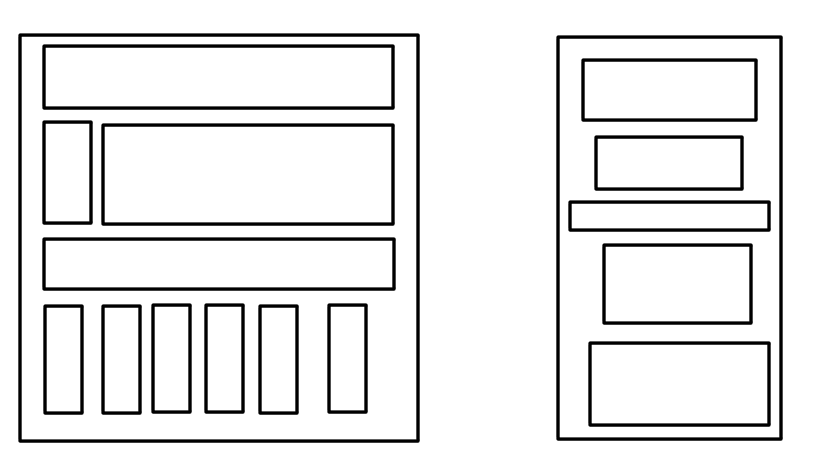
QQ会员登录页面:
*{
    padding:0;
    margin: 0;
}

a{
    text-decoration: none;
}
.nav-header{
    height: 90px;
    width: 100%;
    background: rgba(0,0,0,0.6);
}
.head-contain{
    width: 1180px;
    height: 90px;
    margin: 0 auto;
    text-align: center;
}
.top-logo,.top-nav,.top-nav li,.top-right{
    height: 90px;
    display:inline-block;
    vertical-align: top;
}
.top-nav{
    margin: 0 48px;
}
.top-nav li{
    line-height: 90px;
    width: 90px ;
}
.top-nav li a {
    display: block;
    text-align: center;
    font-size: 16px;
    color:#fff;
}

.top-right a{
    display:inline-block;
    font-size: 16px;
    text-align: center;
    margin-top: 25px;
    border-radius: 35px;
}

.top-right a:first-of-type {
    width: 93px;
    height: 38px;
    line-height: 38px;
    color: #3cbda6;
}
.top-right a:first-of-type:hover{
    color: #986b0d0d;
    background: #fad56c;
}
.top-right a:last-of-type{
    width: 140px;
    height: 40px;
    font-weight: 700;
    line-height: 40px;
    background: #fad65c;
    color:#986b0d;
}
.top-right a:last-of-type:hover{
    background: #fddc6c;
}
<!DOCTYPE html>
<html lang="en">
<head>
    <meta charset="UTF-8">
    <title>QQ会员登录</title>
    <link rel="stylesheet" href="css/QQstyle.css">
</head>
<body>
<div class="wrap">
    <!--头部-->
    <header class="nav-header">
        <div class="head-contain">
            <a href="" class="top-logo">
                <img src="../../resource/img/QQ会员图像.png"  width="145" height="90">
            </a>
            <nav  class="top-nav">
            <ul>
                <li><a href="">功能特权</a></li>
                <li><a href="">游戏特权</a></li>
                <li><a href="">生活特权</a></li>
                <li><a href="">会员活动</a></li>
                <li><a href="">成长体系</a></li>
                <li><a href="">年费专区</a></li>
                <li><a href="">超级会员</a></li>
            </ul>
            </nav>
            <div class="top-right">
                <a href="">登录</a>
                <a href="">开通超级会员</a>
            </div>
        </div>
    </header>
</div>
</body>
</html>
这也是一种实现行内元素排列的方式,但是我们很多情况都是用float
5.3、float
1、左右浮动float
div{
    margin: 10px;
    padding: 5px;
}
#father{
    border: 1px #000 solid;
}
.layer01{
    border: 1px #f00 dashed;
    display: inline-block;
    float: right;
}
.layer02{
    border: 1px #00f dashed;
    display: inline-block;
    float: right;
}
.layer03{
    border: 1px #060 dashed;
    display: inline-block;
    float: right;
}
.layer04{
    border: 1px #666 dashed;
    font-size: 12px;
    line-height: 23px;
    display: inline-block;
    float: right;
    clear: both;
}
<!DOCTYPE html>
<html lang="en">
<head>
    <meta charset="UTF-8">
    <title>浮动</title>
    <link rel="stylesheet" href="css/style.css">
</head>
<body>
<div id="father">
    <div class="layer01"><img src="images/1.png" alt=""></div>
    <div class="layer02"><img src="images/HTML基本结构.png" alt=""></div>
    <div class="layer03"><img src="images/QQ会员图像.png" alt=""></div>
    <div class="layer04">
        浮动的盒子可以向左浮动,也可以向右浮动。直到它的外边缘碰到包含框或另一个浮动盒子为止。
    </div>
</div>
</body>
</html>
5.4、父级边框塌陷的问题
clear
/*
clear:right;右侧不允许有浮动元素
clear:left;左侧不允许有浮动元素
clear:both;两侧不允许有浮动元素
clear:none;
*/
解决方案:
1、增加父级元素的高度~
#father{
         border: 1px #000 solid;
         height: 800px;
        }
2、增加一个空的div标签,清楚浮动
.clear{
            clear: both;
            margin:0;
            padding: 0;
        }
<div class="clear"></div>
3、overflow
在父级元素中增加一个overflow:hidden;
#father{
    border: 1px #000 solid;
    overflow: hidden;
}
<div id="father">
    <div class="layer01"><img src="images/1.png" alt=""></div>
    <div class="layer02"><img src="images/HTML基本结构.png" alt=""></div>
    <div class="layer03"><img src="images/QQ会员图像.png" alt=""></div>
    <div class="layer04">
        浮动的盒子可以向左浮动,也可以向右浮动。直到它的外边缘碰到包含框或另一个浮动盒子为止。
    </div>
</div>
4、父类添加一个伪类:after
#father:after{
    content: '';
    display: block;
    clear: both;
}
小结:
1.浮动元素后面增加空div
简单,代码中尽量避免空div
2.设置父元素的高度
简单,元素假设有了固定的高度,就会被限制
3.overflow
简单,下拉的一些场景避免使用
4.父类添加一个伪类:after(最常使用推荐)
写法稍微复杂一点,但是没有副作用,推荐使用!
5.5、对比
display
方向不可以控制
float
浮动起来的话会脱离标准文档流,所以要解决父级边框塌陷的问题!
6、定位
6.1、相对定位
<!--相对定位:
        相对于自己原来的位置进行偏移~-->
    <style>
        body{
            padding: 20px;
        }
        div{
            margin:10px;
            padding:5px;
            font-size: 12px;
            line-height: 25px;
        }
        #father{
            border: 1px solid #666;
        }
        #first{
            border: 1px dashed #b27530;
            background-color: red;
            position: relative;/*相对定位:上下左右*/
            top: -20px;
            left: 10px;
        }
        #second{
            border: 1px dashed #255066;
            background-color: darkviolet;
            position: relative;
            bottom: 20px;
            right: -10px;
        }
        #third{
            border: 1px dashed #1c6615;
            background-color: #b27530;
        }
    </style>
<!DOCTYPE html>
<html lang="en">
<head>
    <meta charset="UTF-8">
    <title>浮动</title>
    <!--相对定位:
        相对于自己原来的位置进行偏移~-->
    <style>
        body{
            padding: 20px;
        }
        div{
            margin:10px;
            padding:5px;
            font-size: 12px;
            line-height: 25px;
        }
        #father{
            border: 1px solid #666;
        }
        #first{
            border: 1px dashed #b27530;
            background-color: red;
            position: relative;/*相对定位:上下左右*/
            top: -20px;
            left: 10px;
        }
        #second{
            border: 1px dashed #255066;
            background-color: darkviolet;
            position: relative;
            bottom: 20px;
            right: -10px;
        }
        #third{
            border: 1px dashed #1c6615;
            background-color: #b27530;
        }
    </style>
</head>
<body>
    <div id="father">
        <div id="first">第一个盒子</div>
        <div id="second">第二个盒子</div>
        <div id="third">第三个盒子</div>
    </div>
</body>
</html>
相对定位:positive:relative;
相对于原来的位置,进行指定的偏移,相对定位的话,它仍然在标准文档流中,原来的位置会被保留
top:-20px;
left:20px;
bottom:-10px;
right:20px;
练习题:
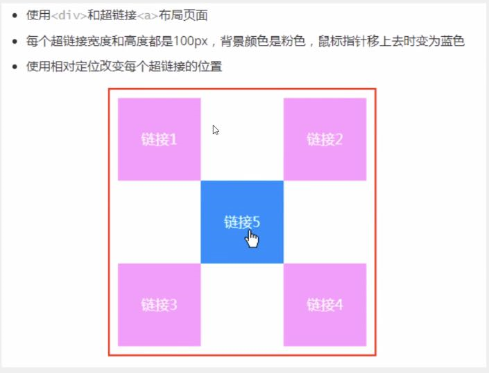
<!DOCTYPE html>
<html lang="en">
<head>
    <meta charset="UTF-8">
    <title>练习题</title>
    <style>
        .father{
            margin: 0;
            padding: 0;
            width: 300px;
            height: 300px;
            border: 1px solid red;
        }
        .link1{
            background-color: #C850C0;
            display: block;

        }
        .link2{
            background-color: #C850C0;
            display: block;
            position: relative;
            top:-100px;
            right:-200px;
        }
        .link3{
            background-color: #C850C0;
            display: block;
        }
        .link4{
            background-color: #C850C0;
            display: block;
            position: relative;
            top:-100px;
            right:-200px;
        }

        .link5{
            background-color: #C850C0;
            display: block;
            position: relative;
            top:-300px;
            right:-100px;
        }
        a{
            text-decoration: none;
            width: 100px;
            height: 100px;
            line-height: 100px;
            text-align:center ;

        }
         a:hover{
            background-color: yellow;
        }

    </style>

</head>
<body>

<div class="father">
    <a class="link1" href="#">链接1</a>
    <a class="link2" href="#">链接2</a>
    <a class="link3" href="#">链接3</a>
    <a class="link4" href="#">链接4</a>
    <a class="link5" href="#">链接5</a>
</div>

</body>
</html>
6.2、绝对定位
定位:基于xxx定位,上下左右,
1.没有父级元素定位的前提下,相对于浏览器定位
2.假设父级元素存在定位,我们通常会相对于父级元素进行偏移
3.在父级元素范围内移动
相对于父级或浏览器的位置,进行指定的偏移,绝对定位的话,它不在标准文档流中,原来的位置不会被保留
<!DOCTYPE html>
<html lang="en">
<head>
    <meta charset="UTF-8">
    <title>绝对定位</title>
    <style>
        body{
            height: 1000px;
        }
        div:nth-of-type(1){/*绝对定位:相对于浏览器*/
            width: 100px;
            height: 100px;
            background: red;
            position: absolute;
            right: 0;
            bottom: 0;
        }

        div:nth-of-type(2){/*fixed:固定定位*/
            width: 50px;
            height: 50px;
            background: yellow;
            position: fixed;
            right: 0;
            bottom: 0;
        }
    </style>
</head>
<body>
    <div>div1</div>
    <div>div2</div>
</body>
</html>
6.3、z-index
图层 z-index:默认是0,最高无限999
<!DOCTYPE html>
<html lang="en">
<head>
    <meta charset="UTF-8">
    <title>z-index图层</title>
    <style>
        #content{
            width:380px;
            padding:0px;
            margin:0px;
            overflow: hidden;
            font-size: 12px;
            line-height: 25px;
            border: 1px #000 solid;
        }
        ul,li{
            padding: 0px;
            margin: 0px;
            list-style: none;
        }
        /*父级元素相对定位*/
        #content ul{
            position: relative;
        }
        .tipText,.tipBg{
            position: absolute;
            width: 161px;
            height:25px;
            top: 103px;
        }
        .tipText{
            color:red;
            /*z-index: 0;*/
        }
        .tipBg{
            background: #000;
            opacity: 0.5;/*背景透明度*/
        }
    </style>
</head>
<body>
    <div id="content">
        <ul>
            <li><img src="../resource/img/图层.png" alt=""></li>
            <li class="tipText">学习微服务</li>
            <li class="tipBg"></li>
            <li>时间:2023-01-01</li>
            <li>地点:湖北·武汉</li>
        </ul>
    </div>
</body>
</html>
7、动画
8、总结
本文来自博客园,作者:冷月_1991,转载请注明原文链接:https://www.cnblogs.com/wangzhen1991/p/16770099.html

 浙公网安备 33010602011771号