
安卓常用的xml控件配件的使用包含shape,declare-styleable、selector
今天就讲我所遇到的常用到的一些通过xml文件制作的背景效果,以后用到的话就直接使用啦!哈哈,我一向就是这么懒!
接下来,就开始介绍了
1、shape的使用,可以混合使用
xml控件配置属性
android:background="@drawable/shape"
标签
corners ----------圆角
gradient ----------渐变
padding ----------内容离边界距离
size ------------大小
solid ----------填充颜色
stroke ----------描边
注意的是corners的属性bottomLeftRadius为右下角、bottomRightRadius为左下角
shape制作圆角
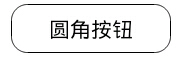
<Button
    android:layout_width="160dp"
    android:layout_height="wrap_content"
    android:background="@drawable/button_shape"
    android:text="圆角按钮"
    />

<?xml version="1.0" encoding="utf-8"?>
<shape xmlns:android="http://schemas.android.com/apk/res/android" >
    <solid android:color="#fff"/>
    <padding android:top="10px" android:bottom="10px"/>
    <corners android:radius="16px"/>
    <stroke android:width="1px" android:color="#000"/>
</shape>
shape制作虚线

没有dashGap属性则为实线
<View
    android:layout_width="match_parent"
    android:layout_height="5px"
    android:layout_marginTop="10dp"
    android:background="@drawable/line_shape"
    />
<?xml version="1.0" encoding="utf-8"?>
<shape xmlns:android="http://schemas.android.com/apk/res/android"
    android:shape="line" >
    <stroke
        android:dashGap="3dp"
        android:dashWidth="8dp"
        android:width="1dp"
        android:color="#63a219" />
    <size android:height="1dp" />
</shape>
shape制作渐变

<View
    android:layout_width="match_parent"
    android:layout_height="50dp"
    android:layout_marginTop="10dp"
    android:background="@drawable/gra_shape"
    />
<?xml version="1.0" encoding="utf-8"?>
<shape xmlns:android="http://schemas.android.com/apk/res/android" >

    <gradient
        android:angle="270.0"
        android:endColor="#ffffff"
        android:startColor="#000000" />

</shape>
2、selector的使用
一.创建xml文件,位置:drawable/xxx.xml,同目录下记得要放相关图片
 1 <?xml version="1.0" encoding="utf-8"?>
 2 <selector xmlns:android="http://schemas.android.com/apk/res/android">
 3
 4     <!-- 没有焦点时的背景图片 -->
 5     <item android:drawable="@drawable/handle_normal" android:state_enabled="true" android:state_window_focused="false"/>
 6     <!-- 触摸模式按下时的背景图片 -->
 7     <item android:drawable="@drawable/handle_pressed" android:state_pressed="true"/>
 8     <item android:drawable="@drawable/handle_focused" android:state_enabled="true" android:state_focused="true"/>
 9     <item android:drawable="@drawable/handle_normal" android:state_enabled="true"/>
10     <!-- 获得焦点时的图片背景 -->
11     <item android:drawable="@drawable/handle_focused" android:state_focused="true"/>
12
13     <!--
14     android:state_selected是选中
15     android:state_focused是获得焦点
16     android:state_pressed是点击
17     android:state_enabled是设置是否响应事件,指所有事件
18     -->
19
20 </selector>
二.使用xml文件:
1.方法一:在listview中配置android:listSelector="@drawable/xxx
或者在listview的item中添加属性android:background="@drawable/xxx"
2.方法二:Drawable
drawable = getResources().getDrawable(R.drawable.xxx);
ListView.setSelector(drawable);但是这样会出现列表有时候为黑的情况,需要加上:android:cacheColorHint="@android:color/transparent"使其透明。
相关属性:
android:state_selected是选中
android:state_focused是获得焦点
android:state_pressed是点击
android:state_enabled是设置是否响应事件,指所有事件
根据这些状态同样可以设置button的selector效果。也可以设置selector改变button中的文字状态。
以下是配置button中的文字效果:
drawable/button_font.xml
1     <?xml version="1.0" encoding="utf-8"?>
2     <selector xmlns:android="http://schemas.android.com/apk/res/android">
3         <item android:state_selected="true" android:color="#FFF" />
4         <item android:state_focused="true" android:color="#FFF" />
5         <item android:state_pressed="true" android:color="#FFF" />
6         <item android:color="#000" />
7     </selector>
Button还可以实现更复杂的效果,例如渐变
drawable/button_color.xml
 1 <span style="color:#330033;"><?xml version="1.0" encoding="utf-8"?>
 2 <selector xmlns:android="http://schemas.android.com/apk/res/android">         /
 3 <item android:state_pressed="true">//定义当button 处于pressed 状态时的形态。
 4                 <shape>
 5                 <gradient  android:startColor="#8600ff" />
 6                       <stroke   android:width="2dp" android:color="#000000" />
 7                        <corners android:radius="5dp" />
 8                        <padding android:left="10dp" android:top="10dp"
 9                                 android:bottom="10dp" android:right="10dp"/>
10                  </shape>
11 </item>
12 <item android:state_focused="true">//定义当button获得 focus时的形态
13                  <shape>
14                        <gradient android:startColor="#eac100"/>
15                        <stroke android:width="2dp" android:color="#333333"  color="#ffffff"/>
16                        <corners android:radius="8dp" />
17                        <padding android:left="10dp" android:top="10dp"
18                                 android:bottom="10dp" android:right="10dp"/>
19                 </shape>
20  </item>
21 </selector></span><span style="color:#ff0000;"> </span>
3、declare-styleable的使用
如何使用 declare-styleable
- 在创建 xml 到 objectName/res/values/ 命名为 attrs.xml
- 编辑文件内容为(示例)
<?xml version="1.0" encoding="utf-8"?>
<resources>
<declare-styleable name="test1">
<attr name="test" format = "float"></attr>
</declare-styleable>
</resources> - 在 layout 文件夹中的定义文件中,在使用处引用
<org.xiaoyunduo.MyText
xmlns:app="http://schemas.android.com/apk/res/org.xiaoyunduo"
android:id="@+id/add"
android:layout_width="wrap_content"
android:layout_height="wrap_content"
app:test="100"
android:text="@string/log_text_box_1_add_text"/>
//我记得以前不需要定义 xmlns 现在必须要定义可以直接使用android:test 的形式,现在必须要定义 xmlns 了。 - 在代码中获取 layout 文件中的值(最好是在构造方法中调用)
TypedArray a = context.obtainStyledAttributes(attrs, R.styleable.test1);//TypedArray是一个数组容器
float textSize = a.getFloat(R.styleable.test1_test, 30);//防止在XML文件里没有定义,就加上了默认值30 - 将获取到的值初始化到控件中
这里就不写了 在构造方法中值已经拿到,后面的爱怎么用就怎么用。
declare-styleable 定义说明:
1. reference:参考某一资源ID。
(1)属性定义:
<declare-styleable name = "名称">
<attr name = "background" format = "reference" />
</declare-styleable>
(2)属性使用:
<ImageView
android:layout_width = "42dip"
android:layout_height = "42dip"
android:background = "@drawable/图片ID"
/>
2. color:颜色值。
(1)属性定义:
<declare-styleable name = "名称">
<attr name = "textColor" format = "color" />
</declare-styleable>
(2)属性使用:
<TextView
android:layout_width = "42dip"
android:layout_height = "42dip"
android:textColor = "#00FF00"
/>
3. boolean:布尔值。
(1)属性定义:
<declare-styleable name = "名称">
<attr name = "focusable" format = "boolean" />
</declare-styleable>
(2)属性使用:
<Button
android:layout_width = "42dip"
android:layout_height = "42dip"
android:focusable = "true"
/>
4. dimension:尺寸值。
(1)属性定义:
<declare-styleable name = "名称">
<attr name = "layout_width" format = "dimension" />
</declare-styleable>
(2)属性使用:
<Button
android:layout_width = "42dip"
android:layout_height = "42dip"
/>
5. float:浮点值。
(1)属性定义:
<declare-styleable name = "AlphaAnimation">
<attr name = "fromAlpha" format = "float" />
<attr name = "toAlpha" format = "float" />
</declare-styleable>
(2)属性使用:
<alpha
android:fromAlpha = "1.0"
android:toAlpha = "0.7"
/>
6. integer:整型值。
(1)属性定义:
<declare-styleable name = "AnimatedRotateDrawable">
<attr name = "visible" />
<attr name = "frameDuration" format="integer" />
<attr name = "framesCount" format="integer" />
<attr name = "pivotX" />
<attr name = "pivotY" />
<attr name = "drawable" />
</declare-styleable>
(2)属性使用:
<animated-rotate
xmlns:android = "http://schemas.android.com/apk/res/android"
android:drawable = "@drawable/图片ID"
android:pivotX = "50%"
android:pivotY = "50%"
android:framesCount = "12"
android:frameDuration = "100"
/>
7. string:字符串。
(1)属性定义:
<declare-styleable name = "MapView">
<attr name = "apiKey" format = "string" />
</declare-styleable>
(2)属性使用:
<com.google.android.maps.MapView
android:layout_width = "fill_parent"
android:layout_height = "fill_parent"
android:apiKey = "0jOkQ80oD1JL9C6HAja99uGXCRiS2CGjKO_bc_g"
/>
8. fraction:百分数。
(1)属性定义:
<declare-styleable name="RotateDrawable">
<attr name = "visible" />
<attr name = "fromDegrees" format = "float" />
<attr name = "toDegrees" format = "float" />
<attr name = "pivotX" format = "fraction" />
<attr name = "pivotY" format = "fraction" />
<attr name = "drawable" />
</declare-styleable>
(2)属性使用:
<rotate
xmlns:android = "http://schemas.android.com/apk/res/android"
android:interpolator = "@anim/动画ID"
android:fromDegrees = "0"
android:toDegrees = "360"
android:pivotX = "200%"
android:pivotY = "300%"
android:duration = "5000"
android:repeatMode = "restart"
android:repeatCount = "infinite"
/>
9. enum:枚举值。
(1)属性定义:
<declare-styleable name="名称">
<attr name="orientation">
<enum name="horizontal" value="0" />
<enum name="vertical" value="1" />
</attr>
</declare-styleable>
(2)属性使用:
<LinearLayout
xmlns:android = "http://schemas.android.com/apk/res/android"
android:orientation = "vertical"
android:layout_width = "fill_parent"
android:layout_height = "fill_parent"
>
</LinearLayout>
10. flag:位或运算。
(1)属性定义:
<declare-styleable name="名称">
<attr name="windowSoftInputMode">
<flag name = "stateUnspecified" value = "0" />
<flag name = "stateUnchanged" value = "1" />
<flag name = "stateHidden" value = "2" />
<flag name = "stateAlwaysHidden" value = "3" />
<flag name = "stateVisible" value = "4" />
<flag name = "stateAlwaysVisible" value = "5" />
<flag name = "adjustUnspecified" value = "0x00" />
<flag name = "adjustResize" value = "0x10" />
<flag name = "adjustPan" value = "0x20" />
<flag name = "adjustNothing" value = "0x30" />
</attr>
</declare-styleable>
(2)属性使用:
<activity
android:name = ".StyleAndThemeActivity"
android:label = "@string/app_name"
android:windowSoftInputMode = "stateUnspecified | stateUnchanged | stateHidden">
<intent-filter>
<action android:name = "android.intent.action.MAIN" />
<category android:name = "android.intent.category.LAUNCHER" />
</intent-filter>
</activity>
注意:
属性定义时可以指定多种类型值。
(1)属性定义:
<declare-styleable name = "名称">
<attr name = "background" format = "reference|color" />
</declare-styleable>
(2)属性使用:
<ImageView
android:layout_width = "42dip"
android:layout_height = "42dip"
android:background = "@drawable/图片ID|#00FF00"
/>
定义命名空间
在自定义扩展的时候还可以自定义命名空间,但是我仿照 demo 的时候感觉不对。命名空间中的属性不能通过提示(alt+/)打出来,但 demo 的可以。
命名空间定义语法如下:(由于自己没整对此次贴的 drag_layout.xml 中的代码)
<RelativeLayout xmlns:android="http://schemas.android.com/apk/res/android"
xmlns:dot="http://schemas.android.com/apk/res/com.example.android.apis"
android:layout_width="match_parent"
android:layout_height="wrap_content"
android:orientation="vertical"
>

 浙公网安备 33010602011771号