plotly-dash快速入门
官方文档:https://plot.ly/dash
介绍
Dash is a productive Python framework for building web applications.

Written on top of Flask, Plotly.js, and React.js, Dash is ideal for building data visualization apps with highly custom user interfaces in pure Python. It's particuarly suited for anyone who works with data in Python.

Through a couple of simple patterns, Dash abstracts away all of the technologies and protocols that are required to build an interactive web-based application. Dash is simple enough that you can bind a user interface around your Python code in an afternoon.

Dash apps are rendered in the web browser. You can deploy your apps to servers and then share them through URLs. Since Dash apps are viewed in the web browser, Dash is inherently cross-platform and mobile ready.

There is a lot behind the framework. To learn more about how it is built and what motivated dash, watch our talk from Plotcon below or read our announcement letter.

Dash is an open source library, released under the permissive MIT license. Plotly develops Dash and offers a platform for deploying, orchestrating, and permissioning dash apps in an enterprise environment
安装
In your terminal, install several dash libraries. These libraries are under active development, so install and upgrade frequently. Python 2 and 3 are supported.
pip install dash==0.17.7  # The core dash backend
pip install dash-renderer==0.7.4  # The dash front-end
pip install dash-html-components==0.7.0  # HTML components
pip install dash-core-components==0.7.1  # Supercharged components
pip install plotly==2.0.12  # Plotly graphing library used in
examples
Dash App Layout
Generating HTML with Dash
Dash apps are composed of two parts. The first part is the "layout" of the app and it describes what the application looks like. The second part describes the interactivity(内部联系) of the application.

Dash provides Python classes for all of the visual components of the application. We maintain a set of components in the dash_core_components and the dash_html_components library but you can also build your own with JavaScript and React.js.
To get started, create a file named app.py with the following code:
main.py
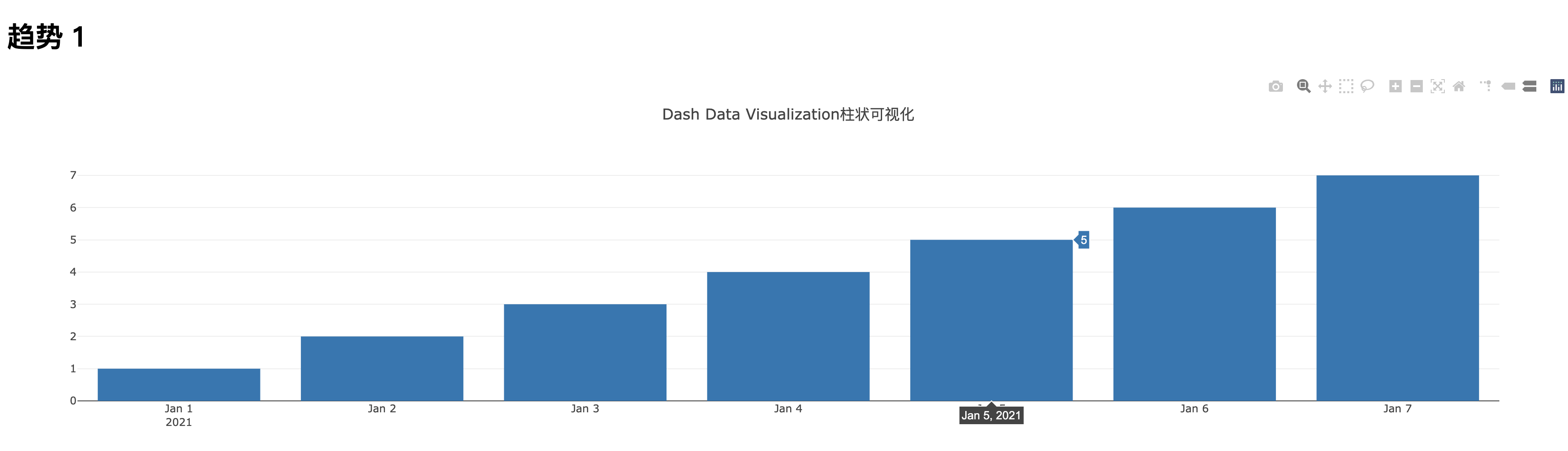
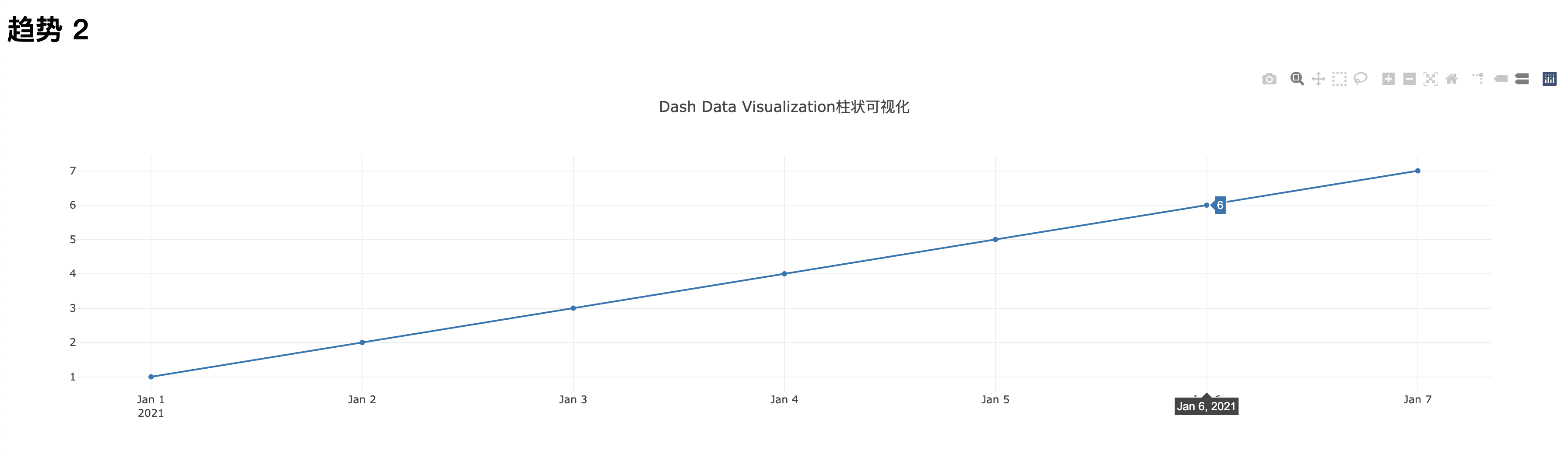
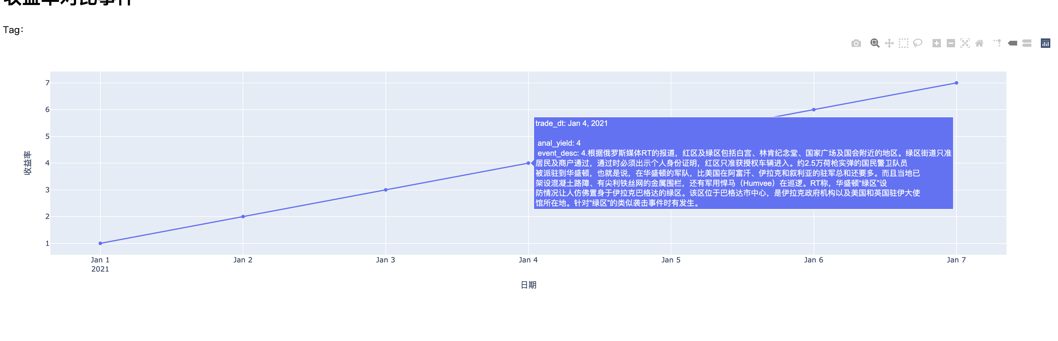
# -*- coding: utf-8 -*-
'''
@Author: Elton
@File: app.py
@Date: 2021-01-17
'''
import json

import numpy as np
import pandas as pd
import requests
from flask import Flask
import dash
from dash.dependencies import Input, Output, State
import dash_core_components as dcc
import dash_html_components as html
import plotly.graph_objs as go
import plotly.express as px

server = Flask(__name__)
# dash路由:
app0 = dash.Dash(__name__, server=server, url_base_pathname='/demo/')
app1 = dash.Dash(__name__, server=server, url_base_pathname='/dash_bar/')
app2 = dash.Dash(__name__, server=server, url_base_pathname='/dash_plot/')
app3 = dash.Dash(__name__, server=server, url_base_pathname='/dash_pie/')

# 模拟全部数据
l1 = ["2021-01-01", "2021-01-02", "2021-01-03", "2021-01-04", "2021-01-05", "2021-01-06", "2021-01-07"]
l2 = [1, 2, 3, 4, 5, 6, 7]
l3 = ["1.今天(1月16日)下午,河北省召开第六场疫情防控新闻发布会,对疫情防控相关情况进行通报。",
      "2.河北新增32例本土确诊病例。",
      "3.发布会上,相关负责人介绍,1月16日0—10时,河北省新增32例本土确诊病例。",
      """4.根据俄罗斯媒体RT的报道,红区及绿区包括白宫、林肯纪念堂、国家广场及国会附近的地区。绿区街道只准居民及商户通过,通过时必须出示个人身份证明,红区只准获授权车辆进入。约2.5万荷枪实弹的国民警卫队员被派驻到华盛顿,也就是说,在华盛顿的军队,比美国在阿富汗、伊拉克和叙利亚的驻军总和还要多。而且当地已架设混凝土路障、有尖利铁丝网的金属围栏,还有军用悍马(Humvee)在巡逻。RT称,华盛顿“绿区”设防情况让人仿佛置身于伊拉克巴格达的绿区。该区位于巴格达市中心,是伊拉克政府机构以及美国和英国驻伊大使馆所在地。针对“绿区”的类似袭击事件时有发生。""",
      "5.声明:转载此文是出于传递更多信息之目的。若有来源标注错误或侵犯了您的合法权益。",
      "6.宜昌市六届人大六次会议主席团举行第四次会议。",
      "7.抗疫先锋丨“疫情就是冲锋号 要无所畏惧往前冲”。"]
# 模拟部分数据
alist1 = ["2021-01-01", "2021-01-04", "2021-01-05", "2021-01-06", "2021-01-07"]
alist2 = [1, 4, 5, 6, 7]
alist3 = ["1.今天(1月16日)下午,河北省召开第六场疫情防控新闻发布会,对疫情防控相关情况进行通报。",
          """4.根据俄罗斯媒体RT的报道,红区及绿区包括白宫、林肯纪念堂、国家广场及国会附近的地区。绿区街道只准居民及商户通过,通过时必须出示个人身份证明,红区只准获授权车辆进入。约2.5万荷枪实弹的国民警卫队员被派驻到华盛顿,也就是说,在华盛顿的军队,比美国在阿富汗、伊拉克和叙利亚的驻军总和还要多。而且当地已架设混凝土路障、有尖利铁丝网的金属围栏,还有军用悍马(Humvee)在巡逻。RT称,华盛顿“绿区”设防情况让人仿佛置身于伊拉克巴格达的绿区。该区位于巴格达市中心,是伊拉克政府机构以及美国和英国驻伊大使馆所在地。针对“绿区”的类似袭击事件时有发生。""",
          "5.声明:转载此文是出于传递更多信息之目的。若有来源标注错误或侵犯了您的合法权益。",
          "6.宜昌市六届人大六次会议主席团举行第四次会议。",
          "7.抗疫先锋丨“疫情就是冲锋号 要无所畏惧往前冲”。"]

# 数据处理,可忽略
d = {"trade_dt": l1, "anal_yield": l2, "event_desc": l3}
df1 = pd.DataFrame(d)
d2 = {"trade_dt": alist1, "anal_yield": alist2, "event_desc": alist3}
df2 = pd.DataFrame(d2)
# 删除所有NaN的行
# df2 = pd.read_csv(r"/Users/wangcheng/Desktop/plotly_demo.csv", encoding="utf-8")
# print(f"df2:{df2}")
# df2 = df2.dropna(axis=0, how='any')
# print(f"df2:{df2}")

x = df1["trade_dt"]
y1 = df1["anal_yield"]


def foo(data, amount=50):
    l = []
    for d_i in list(data):
        if d_i is not np.nan:
            temp = ""
            while True:
                if not d_i:
                    break
                temp += d_i[:amount]
                d_i = d_i[amount:]
                temp += "<br>"
            l.append(temp)
    return l


# default_fig = px.line(df1,
#                       x='trade_dt',
#                       y='anal_yield',
#                       # hover_data=["event_desc",],
#                       # hover_data=[foo(df["event_desc"]),],
#                       # render_mode="svg",
#                       template="plotly",  # 背景颜色
#                       text="event_desc",
#                       # text=foo(df["event_desc"]),
#                       labels={"trade_dt": "日期", "anal_yield": "收益率"},
#                       )

default_fig = px.line(
    x=df1['trade_dt'],
    y=df1['anal_yield'],
    template="plotly",  # 背景颜色
    # text="event_desc",
    # labels={"trade_dt": "日期", "anal_yield": "收益率"},  # 第一个参数是df应该才是这种语法
    labels=dict(x="日期", y="收益率", color="FigureOf"),
    color=px.Constant("指标折线图"),
)
# 自定义 --> 控制悬浮文本宽度 Python Change size of hover text in Plotly
# 注:line和scatter都会影响到,一定要放在add_scatter之前
default_fig.update_traces(customdata=foo(df1["event_desc"]), textposition='top center')
default_fig.update_traces(hovertemplate='trade_dt: %{x} <br>anal_yield: %{y} <br>')  # 无需展示event_desc

# 添加事件散点图
default_fig.add_scatter(
    x=df2["trade_dt"],
    y=df2["anal_yield"],
    mode='markers',
    # hovertext=df2["event_desc"],
    # hovertext=foo(df1["event_desc"]),
    line={"color": "orange", "width": 40},
    name="事件散点图",
    customdata=foo(df2["event_desc"]),
    hovertemplate='trade_dt: %{x} <br>anal_yield: %{y} <br>event_desc: %{customdata}<br>',
)

default_fig.update_layout(
    margin=dict(l=10, r=10, t=10, b=10),
    hoverlabel=dict(font=dict(family='sans-serif', size=15)),
    # uniformtext={"minsize": 10, "mode": "show"},
    # autosize=True,
)

# 路由dash_bar的布局
app0.layout = html.Div([
    html.Div(
        children=[html.H1(children='收益率对比事件'), ]
    ),
    html.Label('Tag:'),
    # 输入框
    dcc.Input(
        id="input-target-id",
        placeholder='Enter a value...',  # 隐式默认值,但是回调值是None
        type='text',
        value=''  # 显式默认值,回调值就是这个值
    ),

    # 单选框
    # dcc.RadioItems(
    #     id='hovermode',
    #     labelStyle={'display': 'inline-block'},
    #     options=[{'label': x, 'value': x}
    #              for x in ['x', 'x unified', 'closest']],
    #     value='closest'
    # ),
    dcc.Graph(id="graph-demo", figure=default_fig),  # 回调函数里改figure属性值

])
# 路由dash_bar的布局
app1.layout = html.Div([
    html.Div(
        children=[html.H1(children='趋势 1'), ]
    ),
    dcc.Graph(
        id='example-graph',
        figure={
            'data': [
                {'x': x, 'y': y1, 'type': 'bar', 'name': '取消或推迟发行规模(亿元)'},
            ],
            'layout': {
                'title': 'Dash Data Visualization柱状可视化'
            }
        }
    ),

])
# 路由dash_plot的布局
app2.layout = html.Div([
    html.Div(
        children=[html.H1(children='趋势 2'), ]
    ),
    dcc.Graph(
        id='example-graph',
        figure={
            'data': [
                {'x': x, 'y': y1, 'type': 'plot', 'name': u'取消或推迟发行规模只数(个)', "text": foo(df1["event_desc"]),
                 },
            ],
            'layout': {
                'title': 'Dash Data Visualization柱状可视化',
                "hovermode": "closest",

            }
        }
    ),
])

# 路由dash_pie的布局
app3.layout = html.Div([
    html.Div(
        children=[html.H1(children='趋势 3'), ]
    ),
    dcc.Graph(
        id='pie',
        figure={
            'data': [
                dict(
                    type='pie', name='Pie',
                    # labels=tmp['group1'].tolist(),
                    # values=tmp['num'].tolist(),
                    labels=["张三", "李四", "王五", "老六"],
                    values=[18, 24, 36, 99],
                )
            ],
            'layout': {
                'title': 'Dash Data Visualization饼图可视化'
            }
        }
    ),
])


# 回调函数
@app1.callback(
    Output("graph", "figure"),
    [Input("input-target-id", "value")],
)
def update_data_by_tag(*args, **kwargs):
    print("暂不生效,不走回调也不打印,你被骗了~~")
    print(f"args: {args}")
    print(f"kwargs: {kwargs}")
    return


# flask路由
@server.route('/test')
def do_test():
    return "this is test route"


@server.route('/')
def do_main():
    return "main"


if __name__ == '__main__':
    server.run(debug=True, port=8051, host="0.0.0.0")
访问:http://localhost:8051/dash_bar/
如图:
http://localhost:8051/dash_plot/
http://localhost:8051/dash_pie/

http://localhost:8051/demo/
解决Python Change size of hover text in Plotly问题
解决 jupyter notebook画图画不出, 添加该行代码:
import plotly  as py
py.offline.init_notebook_mode()  # 允许在jupyter notebook里边绘plotly的图

# py.offline.iplot(mydataframe, filename='电脑的文件存放路径.html') # 改行是执行
正在更新中……
