
Panel结构
参考weui的Panel结构
核心:定位,补充:对容器设置font-size:0,消除img下多出的3px,防止居中出现偏差。
<!DOCTYPE html>
<html lang="en">
<head>
    <meta charset="UTF-8">
    <meta name="viewport" content="width=device-width, initial-scale=1.0">
    <meta http-equiv="X-UA-Compatible" content="ie=edge">
    <title>Document</title>
    <style>
        .flex{display:-webkit-box;display:-webkit-flex;display:-ms-flexbox;display:flex;}
        .flex-col{-webkit-box-orient:vertical;-webkit-flex-direction:column;-ms-flex-direction:column;flex-direction:column;}
        .flex-row{-webkit-box-orient:vertical;-webkit-flex-direction:row;-ms-flex-direction:row;flex-direction:row;}
        .flex-1{-webkit-box-flex:1;-webkit-flex:1;-ms-flex:1;flex:1;}
        .flex-align-center{-webkit-box-align:center;-webkit-align-items:center;-ms-flex-align:center;align-items:center;}
        .flex-pack-center{-webkit-box-pack:center;-webkit-justify-content:center;-ms-flex-pack:center;justify-content:center;}
        .flex-pack-justify{-webkit-box-pack:justify;-webkit-justify-content:space-between;-ms-flex-pack:justify;justify-content:space-between;}
        body,html,ul,li,p{
            margin:0;padding:0;
        }
        img{
            display:block;
        }
        .box_appmsg{
            padding:15px;
            border:1px solid red;
        }
        .box_appmsg .box_hd{
            font-size:0;
            width: 60px;
            height: 60px;
            line-height: 60px;
            text-align: center;
            position: relative;
            border:1px solid black;
        }
        .box_appmsg .box_thumb{
            position: absolute;
            top: 0;
            bottom: 0;
            left: 0;
            right: 0;
            margin: auto;
            max-width: 100%;
            max-height: 100%;
        }
        .list-info{
            margin-left:.8em;
        }
    </style>
</head>
<body>
    <ul>
        <li class="flex flex-row flex-align-center box_appmsg">
            <div class="box_hd">
                <img class="box_thumb" src="http://c.hiphotos.baidu.com/image/pic/item/5366d0160924ab1835f8e0fd3cfae6cd7a890b09.jpg" alt="">
            </div>
            <div class="flex-1 list-info">
                <p>商品</p>
                <p>价格</p>
            </div>
        </li>
    </ul>
</body>
</html>
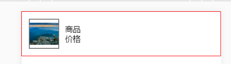
预览:
https://besswang.github.io/Panel/index.html
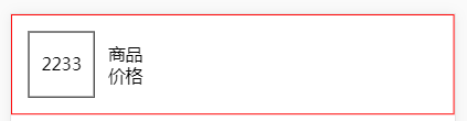
拓展:
还有一种居中的方案,不过是针对文字的居中。是文字内容,不是所有的标签;
核心思想:父级:text-align:center; 子级:vertical-align:middle;
<!DOCTYPE html>
<html lang="en">
<head>
    <meta charset="UTF-8">
    <meta name="viewport" content="width=device-width, initial-scale=1.0">
    <meta http-equiv="X-UA-Compatible" content="ie=edge">
    <title>Document</title>
    <style>
        .flex{display:-webkit-box;display:-webkit-flex;display:-ms-flexbox;display:flex;}
        .flex-col{-webkit-box-orient:vertical;-webkit-flex-direction:column;-ms-flex-direction:column;flex-direction:column;}
        .flex-row{-webkit-box-orient:vertical;-webkit-flex-direction:row;-ms-flex-direction:row;flex-direction:row;}
        .flex-1{-webkit-box-flex:1;-webkit-flex:1;-ms-flex:1;flex:1;}
        .flex-align-center{-webkit-box-align:center;-webkit-align-items:center;-ms-flex-align:center;align-items:center;}
        .flex-pack-center{-webkit-box-pack:center;-webkit-justify-content:center;-ms-flex-pack:center;justify-content:center;}
        .flex-pack-justify{-webkit-box-pack:justify;-webkit-justify-content:space-between;-ms-flex-pack:justify;justify-content:space-between;}
        body,html,ul,li,p{
            margin:0;padding:0;
        }
        img{
            display:block;
        }
        .box_appmsg{
            padding:15px;
            border:1px solid red;
        }
        .box_appmsg .box_hd{
            width: 60px;
            height: 60px;
            line-height: 60px;
            text-align: center;
            border:1px solid black;
        }
        .box_appmsg .box_thumb{
            max-width: 100%;
            max-height: 100%;
            vertical-align: middle;
        }
        .list-info{
            margin-left:.8em;
        }
    </style>
</head>
<body>
    <ul>
        <li class="flex flex-row flex-align-center box_appmsg">
            <div class="box_hd">
                2233
                <!-- <img class="box_thumb" src="http://c.hiphotos.baidu.com/image/pic/item/5366d0160924ab1835f8e0fd3cfae6cd7a890b09.jpg" alt=""> -->
            </div>
            <div class="flex-1 list-info">
                <p>商品</p>
                <p>价格</p>
            </div>
        </li>
    </ul>
</body>
</html>
只有在泥泞的道路上才能留下脚印

