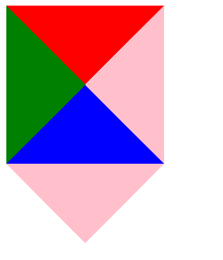
CSS三角形
我们用css边框可以模拟三角效果
1.宽度高度为0
2.我们4个边框都要写,只保留需要的边框颜色,其余的不能省略,都改为transparent透明就好了
3.为照顾兼容性低版本的浏览器,加上font-size: 0; line-hpeight: 0;
<!DOCTYPE html>
<html lang="en">
<head>
    <meta charset="UTF-8">
    <title>Title</title>
    <style type="text/css">
        div{
            width: 0;
            height:0;
            border-top: 100px solid red;
            border-left: 100px solid green;
            border-bottom: 100px solid blue;
            border-right: 100px solid pink;
        }
        p{
            width: 0;
            height: 0;
            border-width: 100px;
            border-style: solid;
            border-color: pink transparent transparent transparent;
            font-size: 0;
            line-height: 0;
        }
    </style>
</head>
<body>
    <div></div>
    <p></p>
</body>
</html>