

Windows Phone, Win 8/WPF, Windows Form 的ItemsControl的ItemTemplate模版和Style风格多样化[自定义逻辑样式]
Vancee@博客园 转载请注明原文链接:http://www.cnblogs.com/vancee/archive/2012/11/04/2754081.html
大多数时候,使用ItemsControl及其子类控件的时候,都是使用的相同的ItemTemplate和style, 所有的元素看起来都是一模一样,但是有些时候也需要一些定制,下面这是整理的wpf, windows form, windows phone上的实现方式。
其中wpf和winform都提供了现成的实现方法,Windows phone需要一些加工才能实现,可以参考Nick Randolph 的实现方法。
1. Windows8/WPF
StyleSelector, DataTemplateSelector 和他们的子类, 提供一种将根据自定义逻辑的样式。
这个很简单,参考MSDN:
http://msdn.microsoft.com/zh-cn/library/system.windows.controls.styleselector.aspx
我自己的Win8上的Demo实现的效果图如下:

2. Windows Phone
Windows Phone上没有StyleSelector可以提供自定义逻辑的样式,但是也可以实现,主要就是重写ContentControl的OnContentChanged事件,实现自定义逻辑的DataTemplate或者Style,
我参考 了Nick Randolph 的文章《Multiple Item Templates in Windows Phone》,实现了效果图如下:

链接: Multiple Item Templates in Windows Phone
http://visualstudiomagazine.com/articles/2012/08/06/multiple-item-templates-in-windows-phone.aspx
附上Nick Randolph 的原文如下:
How to use a template selector to dynamically select which item template to use for each list item.
- By Nick Randolph
- 08/06/2012
Earlier this year we took a look at working with ListBoxes in a Windows Phone application. That article demonstrated how to style items within a Listbox using a single item template, ensuring that all items in the list have the same layout.
But there are some cases where this isn't the desired behavior. In this article you'll see how to use a template selector to dynamically select which item template to use for each list item.
From the previous article, we'll reuse the design time data; this is a collection of contacts, each with a Name and an ImageUrl property. The corresponding item template for the Listbox was similar to the following XAML, which has an Image control on the left and a TextBlock on the right.
1: <;DataTemplate x:Key="ImageOnLeftItemTemplate">
2: <;Grid Margin="12,0,0,12">
3: <;Grid.ColumnDefinitions>
4: <;ColumnDefinition Width="Auto" />
5: <;ColumnDefinition />
6: <;/Grid.ColumnDefinitions>
7: <;Image Width="100"
8: Height="100"
9: Source="{Binding ImageUrl}" />;
10: <TextBlock Grid.Column="1"
11: Text="{Binding Name}"
12: Style="{StaticResource PhoneTextLargeStyle}" />;
13: </Grid>
14: </DataTemplate>
In this example, we want to change this so that each alternate contact has the Image on the right side. There are a number of different ways to do this, but for the purpose of this article we're going to use a template selector to switch between two different item templates. The first thing we're going to need is an alternative item template, as in the following XAML:
1: <;DataTemplate x:Key="ImageOnRightItemTemplate">
2: <;Grid Margin="12,0,0,12">
3: <;Grid.ColumnDefinitions>
4: <;ColumnDefinition />
5: <;ColumnDefinition Width="Auto" />
6: <;/Grid.ColumnDefinitions>
7: <;TextBlock Text="{Binding Name}"
8: Style="{StaticResource PhoneTextLargeStyle}" />;
9: <Image Grid.Column="1"
10: Width="100"
11: Height="100"
12: Source="{Binding ImageUrl}" />;
13: </Grid>
14: </DataTemplate>
You can see from this XAML that it's virtually the same as the previous XAML, with the exception that the columns have been exchanged, positioning the Image on the right of the TextBlock. You may wonder how we're going to switch between these two templates, since the ListBox control only has a single ItemTemplate property.
The trick is that we need to add a template selector control, which is going to dynamically pick which item template to use. The template selector actually comes in two parts: The first is a reusable abstract class, which can simply be added to any of your Windows Phone projects:
1: public abstract class TemplateSelector : ContentControl
2: {
3: public abstract DataTemplate SelectTemplate(object item, DependencyObject container);
4:
5: protected override void OnContentChanged(object oldContent, object newContent)
6: {
7: base.OnContentChanged(oldContent, newContent);
8:
9: ContentTemplate = SelectTemplate(newContent, this);
10: }
11: }
Essentially, the TemplateSelector abstract class exposes a SelectTemplate method, which needs to be implemented for the specific scenario within your application. The ContactTemplateSelector, in the following code block, implements the SelectTemplate method in order to return an item template used to display the Listbox item.
1: public class ContactTemplateSelector : TemplateSelector
2: {
3: public DataTemplate ImageLeft
4: {
5: get;
6: set;
7: }
8:
9: public DataTemplate ImageRight
10: {
11: get;
12: set;
13: }
14:
15:
16: public override DataTemplate SelectTemplate(object item, DependencyObject container)
17: {
18: // Determine which template to return;
19: }
20: }
In this case, the ContactTemplateSelector has two DataTemplate properties. By exposing these properties it means that the item templates returned by the SelectTemplate method can be designed in Expression Blend, rather than being hard-coded within the ContactTemplateSelector.
The logic within the SelectTemplate method will vary depending on your application scenario. For this example, we're going to add a bool IsLeft property to the design time data in Expression Blend. Thus the SelectTemplate method uses this property to determine which item template to return.
1: public override DataTemplate SelectTemplate(object item, DependencyObject container)
2: {
3: var contact = item as ContactsItem;
4: if (contact != null)
5: {
6: return contact.IsLeft ? ImageLeft : ImageRight;
7: }
8:
9: return null;
10: }
So far, our XAML has two item templates: ImageOnLeftItemTemplate and ImageOnRightItemTemplate. We need to add a new template which includes the ContactTemplateSelector:
1: <;DataTemplate x:Key="SelectingTemplate">
2: <;local:ContactTemplateSelector Content="{Binding}"
3: ImageLeft="{StaticResource ImageOnLeftItemTemplate}"
4: ImageRight="{StaticResource ImageOnRightItemTemplate}"
5: HorizontalContentAlignment="Stretch" />;
6: </DataTemplate>
We then need to update the Listbox to use this new item template:
1: <;ListBox x:Name="ContactListBox"
2: ItemTemplate="{StaticResource SelectingTemplate}"
3: ItemsSource="{Binding Contacts}"
4: ItemContainerStyle="{StaticResource FullWidthListBoxItemStyle}" />
When you run this, your application should look similar to Figure 1.
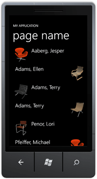
[Click on image for larger view.]
Figure 1.Alternating item templates.
An interesting side effect is that in Expression Blend you'll only see one of the two item templates being used. This is due to the way that Expression Blend loads the design time data. In the ContactTemplateSelector, it assumes that a ContactsItem will be passed in, which is true at runtime. However, at design time Expression Blend loads a different type of object (actually it has the same name but isn't the same CLR type).
To resolve this, you can add a little reflection magic so that you can see at design time the two different item templates. It's important to note that we don't use the reflection logic at runtime, as this can introduce a significant performance hit within your application.
1: public override DataTemplate SelectTemplate(object item, DependencyObject container)
2: {
3: #if DEBUG
4: if(DesignerProperties.IsInDesignTool)
5: {
6: var isLeftProperty = item.GetType().GetProperty("IsLeft");
7: if(isLeftProperty!=null)
8: {
9: var isLeft = (bool) isLeftProperty.GetValue(item, null);
10: return isLeft ? ImageLeft : ImageRight;
11: }
12: }
13: #endif
14:
15: var contact = item as ContactsItem;
16: if (contact != null)
17: {
18: return contact.IsLeft ? ImageLeft : ImageRight;
19: }
20:
21: return null;
22: }
In this article, you've seen how to dynamically switch between different item templates so as to change the layout of items within a list. This is useful if the layout of your items varies significantly, but can introduce a performance hit for lists which contain a large number of items.
There are other ways to solve this problem (such as data binding the visibility property of elements in the template to attributes on the data), so it's important to evaluate the most efficient option available for your application.
3. Windows Form窗体
DrawItem 事件, 在所有者绘制的 ListBox 在视觉外观更改时发生; 也就是说在绘制的时候更新视觉效果,达到ItemsControl的Items不必统一化的外观效果。
这个也很好实现,参考MSDN:
http://msdn.microsoft.com/zh-cn/library/system.windows.forms.listbox.drawitem(v=vs.110).aspx
1: private void ListBox1_DrawItem(object sender,
2: System.Windows.Forms.DrawItemEventArgs e)
3: {
4: // Draw the background of the ListBox control for each item.
5: e.DrawBackground();
6: // Define the default color of the brush as black.
7: Brush myBrush = Brushes.Black;
8:
9: // Determine the color of the brush to draw each item based
10: // on the index of the item to draw.
11: switch (e.Index)
12: {
13: case 0:
14: myBrush = Brushes.Red;
15: break;
16: case 1:
17: myBrush = Brushes.Orange;
18: break;
19: case 2:
20: myBrush = Brushes.Purple;
21: break;
22: }
23:
24: // Draw the current item text based on the current Font
25: // and the custom brush settings.
26: e.Graphics.DrawString(ListBox1.Items[e.Index].ToString(),
27: e.Font, myBrush, e.Bounds, StringFormat.GenericDefault);
28: // If the ListBox has focus, draw a focus rectangle around the selected item.
29: e.DrawFocusRectangle();
30: }
Vancee@博客园 转载请注明原文链接: http://www.cnblogs.com/vancee/archive/2012/11/04/2754081.html
