echars柱状图堆叠图形制作


 代码如下:

        mychart2() {
                    myChart2 = echarts.init(document.getElementById('profitTrends'));
                    var data = {
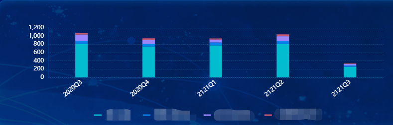
                        area: ['2020Q3','2020Q4', '2121Q1', '2121Q2','2121Q3'],
                        legend: ['重大决策', '重要人事任免', '重大项目安排', '大额度资金运作'],
                        data: [
                            [808, 745, 773, 805, 258],
                            [74, 59, 71, 76, 30],
                            [152, 99, 69, 111, 36],
                            [42, 39, 26, 46, 13],
                        ]
                    }
                    var colors = ['#02BCD0','#0780EB','#9A86FF','#CA5670']
                    option = {
                        color: colors,
                        legend: {
                            top:'86%',
                            left:'25%',
                            icon:"rect",
                            selectedMode:false,//取消图例上的点击事件
                            itemWidth:15,
                            itemHeight:3,
                            textStyle: {
                                color: '#fff',
                                fontSize: 12,
                                padding: [0,15,0,5]
                            },
                            data: data.legend
                        },
                        tooltip: {
                            transitionDuration: 0,
                            trigger: 'axis',
                            axisPointer: {
                                // type: 'shadow',
                                type: 'none'
                            }
                        },
                        grid: {
                            left: '15%',
                            top: '25%',
                            right: '8%',
                            bottom: '38%',
                        },
                        xAxis: {
                            type: 'category',
                            axisLabel: {
                                show: true,
                                interval:0,
                                rotate:40,
                                textStyle: {
                                    color:"#ffffff",
                                    fontSize: 12
                                }
                            },
                            axisLine: {
                                show: true,
                                lineStyle: {
                                    color: "rgba(12, 87, 169, 1)",
                                    type:"dotted"
                                },
                                width: 5
                            },
                            axisTick: {
                                show: false,
                            },
                            data: data.area
                        },
                        yAxis: {
                            type: 'value',
                            interval:200,
                            axisLabel: {
                                formatter: '{value}',
                                color: '#ffffff',
                                textStyle: {
                                    fontSize: 12,
                                    color: '#ffffff',
                                }
                            },
                            axisLine: {
                                show: true,
                                lineStyle: {
                                    color: "rgba(12, 87, 169, 1)"
                                },
                                width: 5
                            },
                            axisTick: {
                                show: false,
                            },
                            splitLine: {
                                show:true,
                                lineStyle:{
                                    color:'rgba(12, 79, 129, 1)',
                                    type:"dotted"
                                }
                            },
                        },
                        series: []
                    };
                    for (var i = 0; i < data.legend.length; i++) {
                        option.series.push({
                            name: data.legend[i],
                            type: 'bar',
                            stack: '总量',
                            barWidth: '25',
                            label: {
                                show: false,
                                position: 'insideRight'
                            },
                            data: data.data[i]
                        })
                    }
                    myChart2.setOption(option);
                },


posted @ 2021-08-17 15:05  vaelcy  阅读(122)  评论(0编辑  收藏  举报