大数据分析——超市销售数据分析
大数据分析——超市销售数据分析
(一)选题背景
随着我国经济高速发展,人们生活水平的提高,超市在社会中的普及范围越来越广, 极大的方便了人们的生活和工作的同时快速的促进了我国社会经济的发展,尤其是近年来的各类大型超市在城市中所占的比例越来越高,其中不乏国处的一些大型超市企业入驻我国, 但正因为国内外超市在我国所占的比例和数量在丕断的增加,导致目前我国超市行业的竞争程度具益激烈, 顾客在各个超市的选择上有了比较对比,顾客有了更多的选择,导致各个超市的利润空间在不断的压缩,为了解决在如此激烈的社会竞争环境下获得更好的发展,需求新的突破问题,目前超市的运营模式从货物的采购到运输、管理、营销、服务等方面进行了创新和完善,期望从中数据方面发现一些关联规则,利用这些关联规则来提高超市的销量,为此本文就主要对数据中的关联规则算法进行分析,建立起关联规则算法模型,再结合实例进一步的数据挖掘对于超市的作用。
(二)数据学习案例设计方案
从网站中下载相关的数据集,对数据集进行整理,在python的环境中,给数据集中的文件打上标签,对数据进行预处理,利用keras。
该数据集记录了某全球超市三个月的销售数据,通过分析该超市四三个月内的销售数据,从角度出发,分析经营现状,发掘提高销量的销售策略,利用数据找到新的增长点,并提出建议。
数据集来源:https://www.kaggle.com/datasets/jack20216915/shop-1
Customer type 顾客 类型
Quantity 数量
Gender 性别
Product line 产品线
Unit price 单价
Total 总价
Payment 付款
gross income 总收入
1 数据源
数据集从国外 Kaggle 数据集网站进行采集。
这个超市数据集是一个数据集合,它提供了超市中发生的交易的信息。该数据集通常包括交易的日期和时间、购买的产品、每种产品的价格、交易花费的总额以及其他相关细节等信息。
我们将使用该数据集进行数据分析,并深入了解超市客户的行为。例如,我们可以使用这个超市数据集来研究一周中的某一天与交易支出总额之间的关系,或者分析影响客户支出模式的因素。我们还可以使用此数据集来确定客户行为的趋势和模式,优化定价和产品投放,或制定营销和广告策略。
总的来说,这个超市数据集可以成为一个有价值的工具,用于了解和预测超市客户的行为,以及做出数据驱动的决策,从而提高超市业务的绩效。
2 导入数据
3 Pandas数据处理
pandas 是一个快速、强大、灵活且易于使用的开源数据分析和操作工具,构建在 Python 编程语言之上,其提供了快速、灵活和富有表达性的数据结构,旨在使得处理关系型或有标签的数据变得简单直观。它旨在成为在 Python 中进行实际的、真实的数据分析的基本高级构建块。此外,它还有更广泛的目标,即成为任何语言中最强大、最灵活的开源数据分析/操作工具。它已经在朝着这个目标迈进
4数据可视化
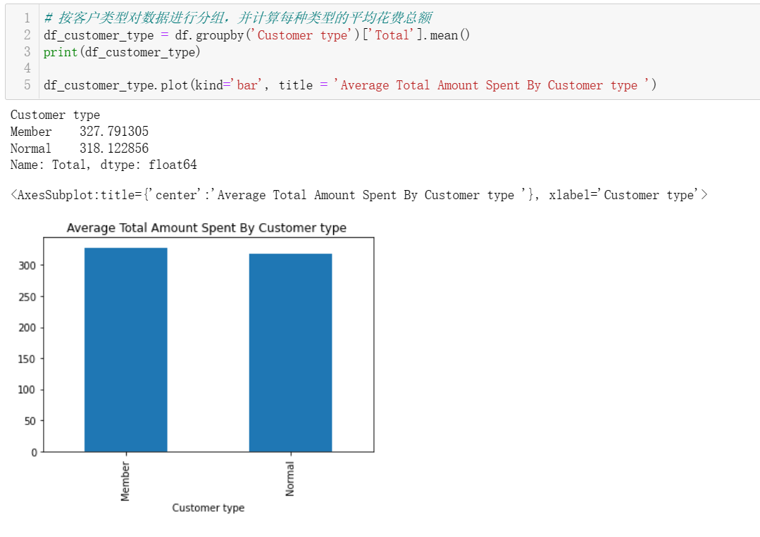
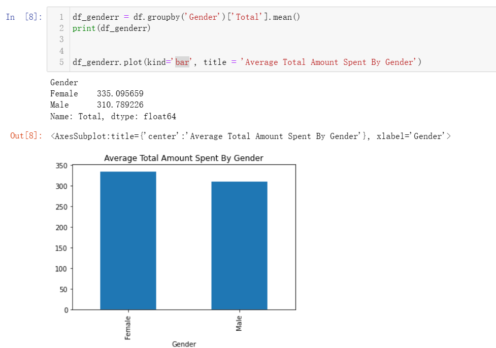
4.1 每个客户类型和性别的平均消费总额是多少?
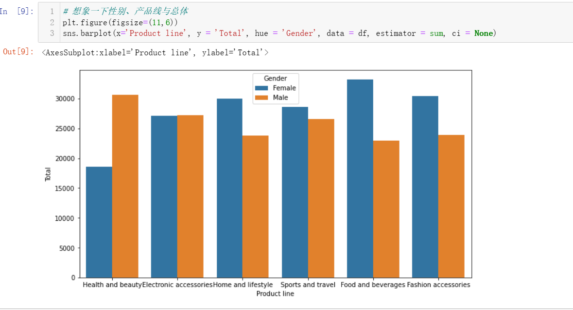
4.2 性别和产品线组合的总销售额是多少?
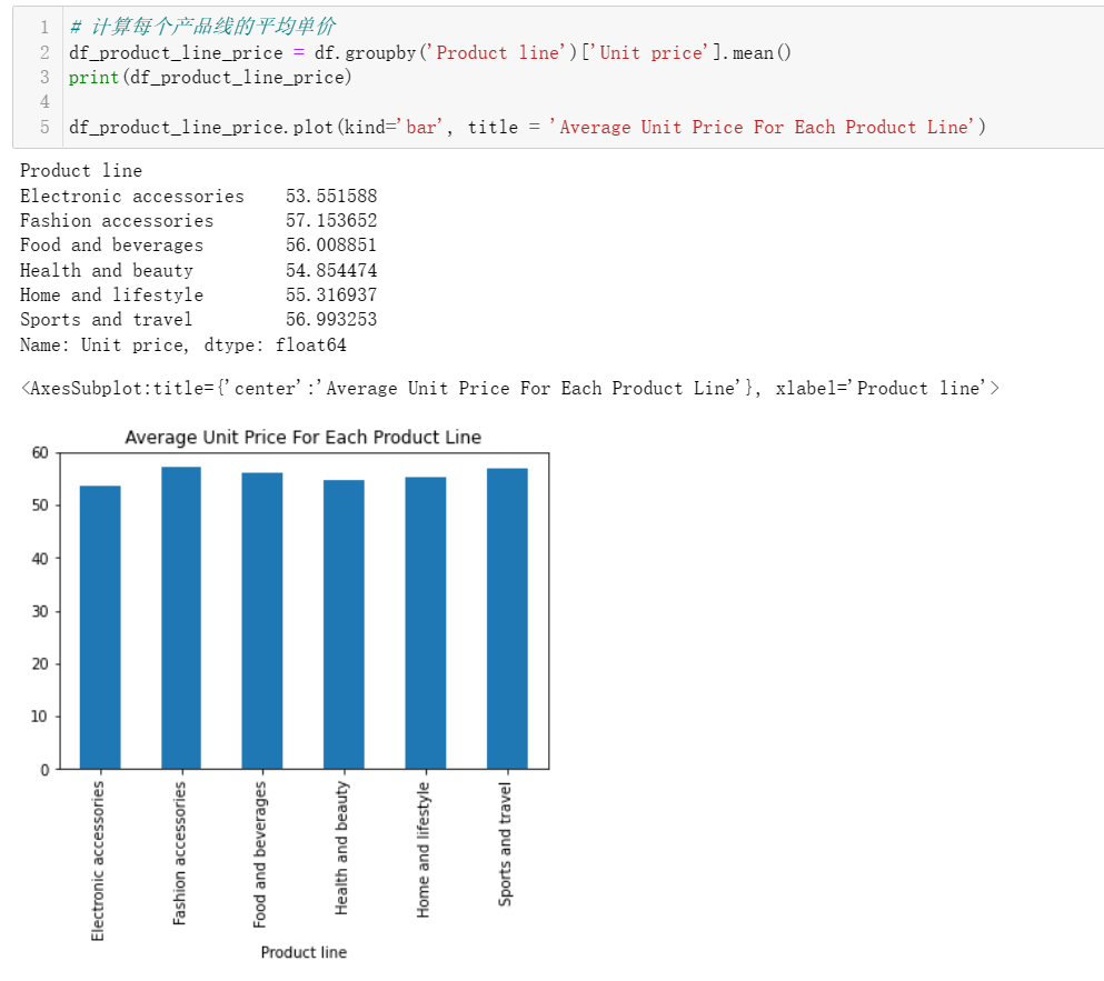
4.3 每个产品线的平均单价是多少?
4.4 总毛利率百分比是多少?
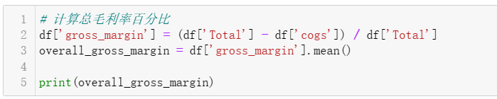
0.047 的毛利率意味着,在计入 COGS 后,总收入中只剩下百分之 4.76。这表明超市的盈利水平很低。为了提高盈利能力,企业可以尝试降低 COGS 或增加收入。
4.5 哪些产品线最受客户欢迎?
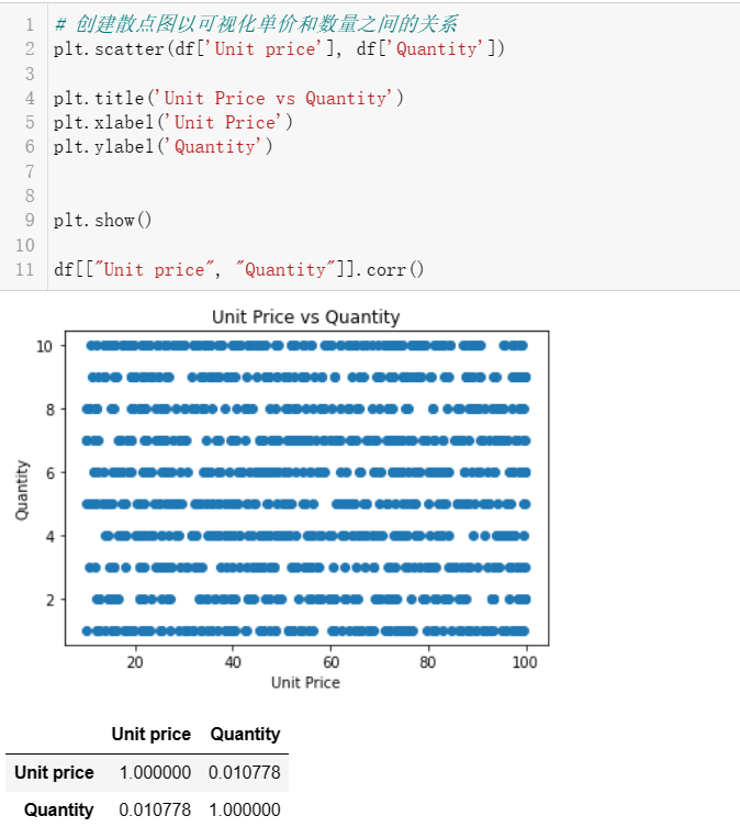
4.6 每种产品的单价和数量之间的关系是什么?
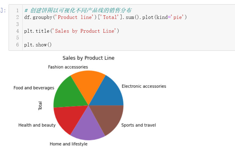
4.7 超市里最流行的产品线是什么
5 大数据分析
5.1 聚类分析
将机器学习算法应用于数据集。例如,可以使用聚类算法,根据客户的支出模式和偏好将其划分为不同的细分市场。这可以帮助我们了解不同类型的客户,并相应地调整营销和销售策略。
将使用 K-Means 聚类算法
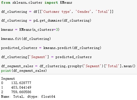
该代码首先通过对分类列应用一个热编码对数据进行预处理,然后使用 K-Means 算法将客户分成三个部分。最后,它计算每个部门花费的平均总额。然后,我们可以分析每个细分市场的特点,并相应地制定营销和销售策略。
6 总体体会
根据对超市数据集的分析,总结以下重点:
提高平均单价和毛利率百分比,以实现利润最大化。
推广销售数量高的某些产品线也可以增加收入。
通过针对特定城市和客户类型,可以增加交易数量。
通过将其他属性合并到数据集中,可以进一步提高预测的准确性。这对于做出明智的业务决策和有效分配资源非常有用。
附 录
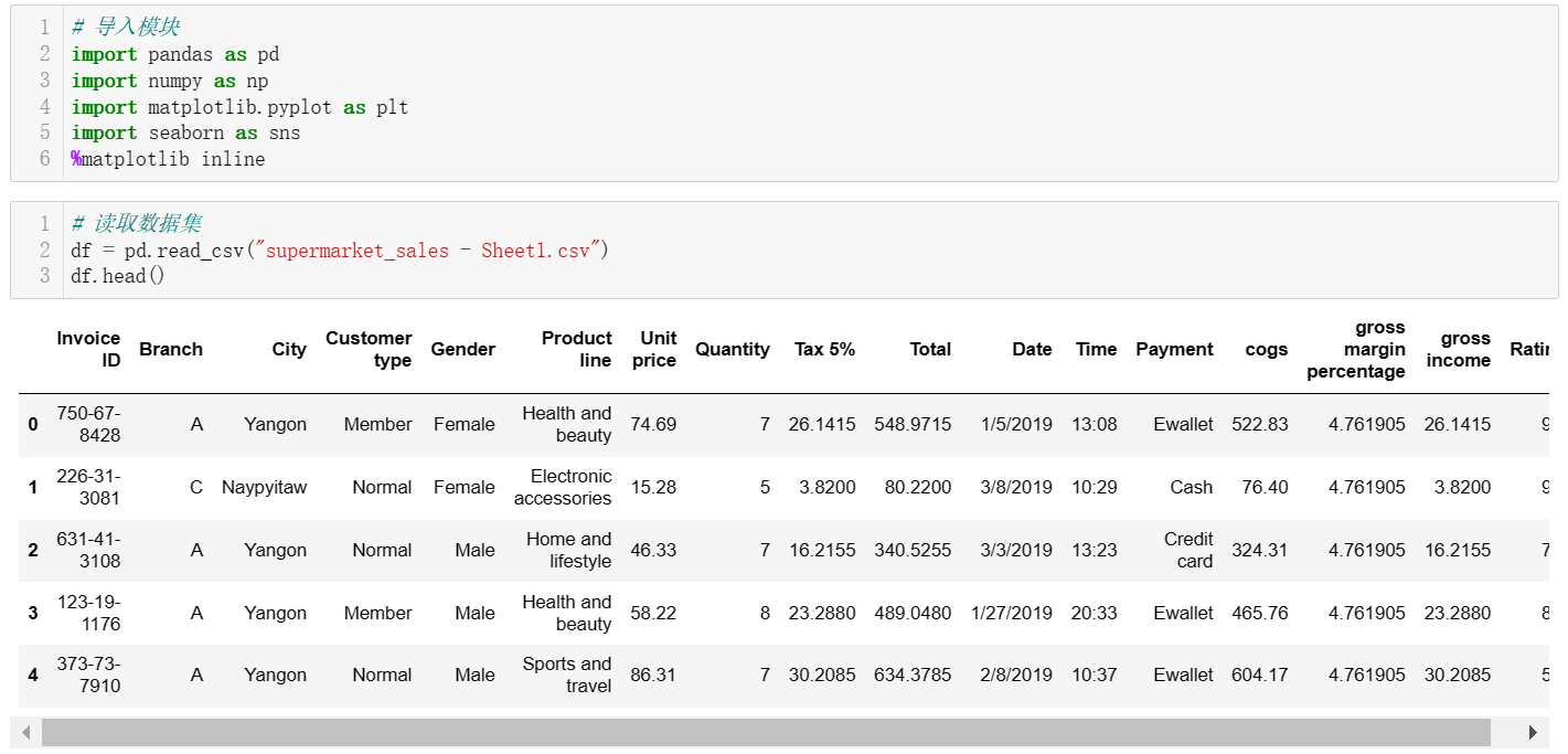
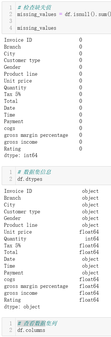
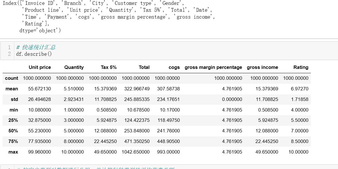
附录1:超市销售数据分析代码程序
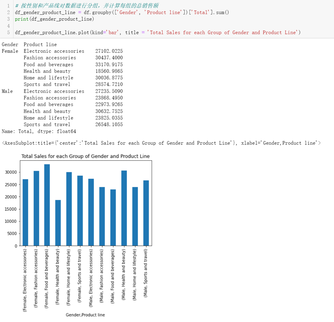
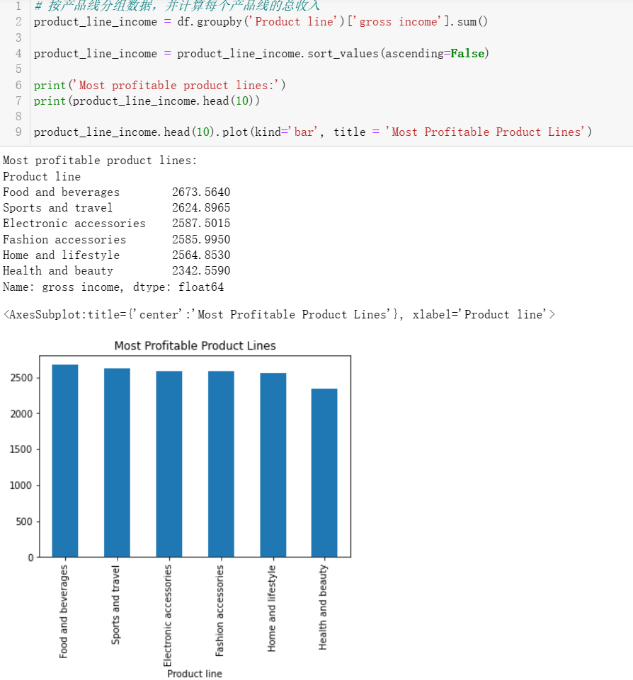
  1 # 导入模块
  2 import pandas as pd
  3 import numpy as np
  4 import matplotlib.pyplot as plt
  5 import seaborn as sns
  6 %matplotlib inline
  7 # 读取数据集
  8 df = pd.read_csv("supermarket_sales - Sheet1.csv")
  9 df.head()
 10 # 检查缺失值
 11 missing_values = df.isnull().sum()
 12
 13 missing_values
 14 # 数据集信息
 15 df.dtypes
 16 # 查看数据集列
 17 df.columns
 18 # 快速统计汇总
 19 df.describe()
 20 # 按客户类型对数据进行分组,并计算每种类型的平均花费总额
 21 df_customer_type = df.groupby('Customer type')['Total'].mean()
 22 print(df_customer_type)
 23
 24 df_customer_type.plot(kind='bar', title = 'Average Total Amount Spent By Customer type ')
 25 df_genderr = df.groupby('Gender')['Total'].mean()
 26 print(df_genderr)
 27
 28
 29 df_genderr.plot(kind='bar', title = 'Average Total Amount Spent By Gender')
 30 # 想象一下性别、产品线与总体
 31 plt.figure(figsize=(11,6))
 32 sns.barplot(x='Product line', y = 'Total', hue = 'Gender', data = df, estimator = sum, ci = None)
 33 # 按性别和产品线对数据进行分组,并计算每组的总销售额
 34 df_gender_product_line = df.groupby(['Gender', 'Product line'])['Total'].sum()
 35 print(df_gender_product_line)
 36
 37 df_gender_product_line.plot(kind='bar', title = 'Total Sales for each Group of Gender and Product Line')
 38 # 计算每个产品线的平均单价
 39 df_product_line_price = df.groupby('Product line')['Unit price'].mean()
 40 print(df_product_line_price)
 41
 42 df_product_line_price.plot(kind='bar', title = 'Average Unit Price For Each Product Line')
 43 # 计算总毛利率百分比
 44 df['gross_margin'] = (df['Total'] - df['cogs']) / df['Total']
 45 overall_gross_margin = df['gross_margin'].mean()
 46
 47 print(overall_gross_margin)
 48 import matplotlib.pyplot as plt
 49
 50
 51 df_city_sales = df.groupby('City')['Total'].sum()
 52
 53
 54 df_city_sales.plot(kind='bar')
 55
 56
 57 plt.title('Total Sales by City')
 58 plt.xlabel('City')
 59 plt.ylabel('Total Sales')
 60
 61
 62 plt.show()
 63 # 创建饼图以可视化不同产品线的销售分布
 64 df.groupby('Product line')['Total'].sum().plot(kind='pie')
 65
 66 plt.title('Sales by Product Line')
 67
 68 plt.show()
 69 # 创建散点图以可视化单价和数量之间的关系
 70 plt.scatter(df['Unit price'], df['Quantity'])
 71
 72 plt.title('Unit Price vs Quantity')
 73 plt.xlabel('Unit Price')
 74 plt.ylabel('Quantity')
 75
 76
 77 plt.show()
 78
 79 df[["Unit price", "Quantity"]].corr()
 80 # 创建一个直方图,以可视化客户评级的分布
 81 df['Rating'].plot(kind='hist')
 82
 83 plt.title('Distribution of Customer Ratings')
 84 plt.xlabel('Rating')
 85 plt.ylabel('Number of Customers')
 86
 87 plt.show()
 88 bins = np.linspace(min(df["Rating"]), max(df["Rating"]), 4)
 89
 90 group_names = ['Low', 'Medium', 'High']
 91
 92 df['rating-binned'] = pd.cut(df['Rating'], bins, labels=group_names, include_lowest=True )
 93 df[['Rating','rating-binned']].head(20)
 94 # 看看每个容器中的评级数量
 95 df["rating-binned"].value_counts()
 96 # 绘制每个垃圾箱的分布
 97 import matplotlib.pyplot as plt
 98 plt.bar(group_names, df["rating-binned"].value_counts())
 99
100 plt.xlabel("Rating")
101 plt.ylabel("count")
102 plt.title("Distribution of Customer Rating bins")
103 # 创建方框图,以可视化不同分支机构的毛利率百分比分布
104 import matplotlib.pyplot as plt
105
106
107 df_branch_margin = df.groupby('Branch')['gross margin percentage'].mean()
108
109
110 df_branch_margin.plot(kind='box')
111
112 plt.title('Gross Margin Percentage by Branch')
113 plt.xlabel('Branch')
114 plt.ylabel('Gross Margin Percentage')
115
116
117 plt.show()
118 # 按产品线分组数据,并计算每个产品线的总销售额
119 product_line_sales = df.groupby('Product line')['Total'].sum()
120
121
122 product_line_sales = product_line_sales.sort_values(ascending=False)
123
124 print('Most popular product lines:')
125 print(product_line_sales.head(10))
126
127 product_line_sales.head(10).plot(kind='bar', title = 'Most Popular Product Lines')
128 # 按产品线分组数据,并计算每个产品线的总收入
129 product_line_income = df.groupby('Product line')['gross income'].sum()
130
131 product_line_income = product_line_income.sort_values(ascending=False)
132
133 print('Most profitable product lines:')
134 print(product_line_income.head(10))
135
136 product_line_income.head(10).plot(kind='bar', title = 'Most Profitable Product Lines')
137 # 按付款方式对数据进行分组,并计算每种付款方式的总销售额
138 payment_method_sales = df.groupby('Payment')['Total'].sum()
139
140 payment_method_sales = payment_method_sales.sort_values(ascending=False)
141
142 print('Most popular payment methods:')
143 print(payment_method_sales.head(10))
144
145 payment_method_sales.head(10).plot(kind='bar', title = 'Most Popular Payment Methods')
146 # 按付款方式分列的每个性别的总销售额
147 plt.figure(figsize = (11,6))
148 sns.barplot(x = 'Payment', y = 'Total', hue = 'Gender', data = df, ci = None, estimator = sum)
149 # 按付款方式列出的每种客户类型的总销售额
150 plt.figure(figsize = (11,6))
151 sns.barplot(x = 'Payment', y = 'Total', hue = 'Customer type', data = df, ci = None, estimator = sum)
152 # 按产品线分组数据,并计算每个产品线的平均单价和数量
153 product_line_data = df.groupby('Product line')['Unit price', 'Quantity'].mean()
154
155
156 print('Average unit prices and quantities for each product line:')
157 print(product_line_data)
158
159 product_line_data.head(10).plot(kind='bar', title = 'Average Unit Price and Quantities Per Product Line')
160 # 可视化每个产品线的平均单价
161 product_line_data['Unit price'].plot(kind='bar', title = 'Average Unit Price Per Product Line')
162 # 可视化每个产品线的平均数量
163 product_line_data['Quantity'].plot(kind='bar', title = 'Average Quantities Per Product Line')
164 # 按产品线分组数据,并计算每个产品线的平均毛利率和毛收入
165 product_line_dataa = df.groupby('Product line')['gross margin percentage', 'gross income'].mean()
166
167 print('Average gross margins and gross incomes for each product line:')
168 print(product_line_dataa)
169
170 product_line_dataa.head(10).plot(kind='bar', title = 'Average Gross Margins and Gross Incomes Per Product Line')
171 # 按产品线分组数据,并计算每个产品线的平均客户评级
172 product_line_datta = df.groupby('Product line')['Rating'].mean()
173
174 print('Average customer ratings for each product line:')
175 print(product_line_datta)
176
177 product_line_datta.head(10).plot(kind='bar', title = 'Average Customer Ratings Per Product Line')
178 # 按分支机构对数据进行分组,并计算每个分支机构的总销售额和平均客户评级
179 branch_data = df.groupby('Branch')['Total', 'Rating'].agg(['sum', 'mean'])
180
181 branch_data = branch_data.sort_values(('Total', 'sum'), ascending=False)
182
183 print('Most popular branches:')
184 print(branch_data.head(10))
185
186 branch_data.head(10).plot(kind='bar', title = 'Most Popular Branch in Sales and Customer Ratings')
187 # 按城市分组数据,并计算每个城市的总销售额和平均客户评级
188 city_data = df.groupby('City')['Total', 'Rating'].agg(['sum', 'mean'])
189
190 city_data = city_data.sort_values(('Total', 'sum'), ascending=False)
191
192 print('Most popular cities:')
193 print(city_data.head(10))
194
195 city_data.head(10).plot(kind='bar', title = 'Most Popular Cities in Sales and Customer Ratings')
196 # 按性别、客户类型、付款方式和产品线对数据进行分组,并计算每组的平均客户评级
197 customer_data = df.groupby(['Gender', 'Customer type', 'Payment', 'Product line'])['Rating'].mean()
198
199 customer_data = customer_data.sort_values(ascending=False)
200
201 print('Top 10 groups with the highest average customer ratings:')
202 print(customer_data.head(10))
203
204 customer_data.head(10).plot(kind='bar', title = 'Top Groups With The Highest Average Customer Ratings')
205 customer_dataa = df.groupby(['Gender', 'Customer type', 'Payment', 'Product line'])['Rating'].mean()
206
207 customer_dataa = customer_data.sort_values()
208
209 print('Top 10 groups with the lowest average customer ratings:')
210 print(customer_dataa.head(10))
211
212 customer_dataa.head(10).plot(kind='bar', title = 'Top Groups With The Lowest Average Customer Ratings')
213 # 计算每月的总销售额
214 df['Date'] = pd.to_datetime(df['Date'])
215 monthly_sales = df.groupby(df['Date'].dt.strftime('%B'))['Total'].sum()
216
217 print(monthly_sales)
218
219 monthly_sales.plot(kind='bar', title = 'Monthly Sales')
220 # 计算每周的事务总数
221 df['Date'] = pd.to_datetime(df['Date'])
222 transactions_per_week = df.groupby(df['Date'].dt.strftime('%U'))['Invoice ID'].nunique()
223
224 print(transactions_per_week)
225
226 transactions_per_week.plot(kind='bar', title = 'Transactions Per Week')
227 # 计算每天的事务总数
228 df['Date'] = pd.to_datetime(df['Date'])
229 transactions_per_day = df.groupby(df['Date'].dt.strftime('%a'))['Invoice ID'].nunique()
230
231 print(transactions_per_day)
232
233 transactions_per_day.plot(kind='bar', title='Transaction Per Day')
234 # 计算每小时的事务总数
235 df['Time'] = pd.to_datetime(df['Time'])
236 transactions_per_hour = df.groupby(df['Time'].dt.strftime('%H'))['Invoice ID'].nunique()
237
238 print(transactions_per_hour)
239
240 transactions_per_hour.plot(kind='bar', title = 'Transactions Per Hour')
241 # 按产品线和一周中的日期对数据进行分组,并计算每组的总销售量
242 product_data = df.groupby(['Product line', df['Date'].dt.strftime('%a')])['Quantity'].sum()
243
244 weekend_data = product_data.loc[:, ['Sat', 'Sun']]
245 weekday_data = product_data.loc[:, ['Mon', 'Tue', 'Wed', 'Thu', 'Fri']]
246
247 weekend_data = weekend_data.groupby('Product line').sum()
248 weekday_data = weekday_data.groupby('Product line').sum()
249
250 weekend_data = weekend_data.sort_values(ascending=False)
251 weekday_data = weekday_data.sort_values(ascending=False)
252 print('Top products sold on weekdays:')
253 print(weekday_data.head(10))
254
255 weekday_data.head(10).plot(kind='bar', title = 'Top Products Sold on Weekdays')
256 print('Top products sold on weekends:')
257 print(weekend_data.head(10))
258
259 weekend_data.head(10).plot(kind='bar', title = 'Top Products Sold on Weekends')
260 # 按性别、客户类型、付款方式、日期和时间对数据进行分组,并计算每组的总销售量
261 transaction_data = df.groupby(['Gender', 'Customer type', 'Payment', 'Date', 'Time'])['Quantity'].sum()
262
263 print('Top 10 groups with the highest total quantity sold:')
264 print(transaction_data.sort_values(ascending=False).head(10))
265 from pandas.plotting import scatter_matrix
266
267 transaction_data = transaction_data.to_frame()
268
269 scatter_matrix(transaction_data, alpha=0.2, figsize=(6, 6), diagonal='kde')
270
271 plt.show()
272 import seaborn as sns
273
274 sns.jointplot(x='Date', y='Time', data=transaction_data, kind='scatter')
275
276 plt.xlabel('Date')
277 plt.ylabel('Time')
278 plt.title('Transaction Date and Time vs. Total Amount Spent')
279
280 plt.show()
281 duplicate_invoices = df[df.duplicated(['Invoice ID'])]
282
283 print(duplicate_invoices[['Invoice ID', 'Branch', 'City', 'Product line', 'Unit price', 'Quantity', 'Total', 'Date', 'Time', 'Payment']])
284
285 df['z_score'] = (df['Total'] - df['Total'].mean()) / df['Total'].std()
286
287 outliers = df[(df['z_score'] > 3) | (df['z_score'] < -3)]
288
289 print(outliers[['Invoice ID', 'Branch', 'City', 'Product line', 'Unit price', 'Quantity', 'Total', 'Date', 'Time', 'Payment']])
290 # K-Means
291 from sklearn.cluster import KMeans
292
293 df_clustering = df[['Customer type', 'Gender', 'Total']]
294
295 df_clustering = pd.get_dummies(df_clustering)
296
297 kmeans = KMeans(n_clusters=3)
298
299 kmeans.fit(df_clustering)
300
301 predicted_clusters = kmeans.predict(df_clustering)
302
303 df_clustering['Segment'] = predicted_clusters
304
305 df_segment_sales = df_clustering.groupby('Segment')['Total'].mean()
306 print(df_segment_sales)
307 # 按细分市场和客户类型对数据进行分组
308 df_segment_type = df_clustering.groupby(['Segment', 'Customer type_Member', 'Customer type_Normal']).size()
309 print(df_segment_type)
310 # 按细分和性别对数据进行分组
311 df_segment_gender = df_clustering.groupby(['Segment', 'Gender_Female', 'Gender_Male']).size()
312 print(df_segment_gender)
313 from sklearn.ensemble import RandomForestClassifier
314 from sklearn.model_selection import train_test_split
315
316 df_classification = df[['Customer type', 'Gender', 'Product line', 'Unit price', 'Quantity', 'Tax 5%', 'Total', 'Payment', 'cogs', 'gross margin percentage', 'gross income', 'Rating']]
317
318 df_classification = pd.get_dummies(df_classification)
319
320 df_classification['Rating'] = pd.cut(df_classification['Rating'], bins=3, labels=[1, 2, 3])
321
322 X_train, X_test, y_train, y_test = train_test_split(df_classification.drop('Rating', axis=1), df_classification['Rating'], test_size=0.2)
323
324 rf = RandomForestClassifier()
325
326 rf.fit(X_train, y_train)
327
328 predicted_ratings = rf.predict(X_test)
329
330 accuracy = rf.score(X_test, y_test)
331 print('Accuracy:', accuracy)
332 from sklearn.metrics import mean_absolute_error
333
334 mae = mean_absolute_error(y_test, predicted_ratings)
335 print('Mean absolute error:', mae)
336 from sklearn.metrics import mean_squared_error
337
338 mse = mean_squared_error(y_test, predicted_ratings)
339 print('Mean squared error:', mse)
340 from sklearn.metrics import mean_squared_log_error
341
342 rmsle = mean_squared_log_error(y_test, predicted_ratings)
343 print('Root mean squared error:', rmsle)
344 df_new = df[['Customer type', 'Gender', 'Product line', 'Unit price', 'Quantity', 'Tax 5%', 'Total', 'Payment', 'cogs', 'gross margin percentage', 'gross income']]
345
346 df_new = pd.get_dummies(df_new)
347
348 predicted_ratings = rf.predict(df_new)
349
350 print(predicted_ratings)
351 from sklearn.ensemble import RandomForestRegressor
352 from sklearn.model_selection import train_test_split
353
354 df_regression = df[['Branch', 'City', 'Customer type', 'Gender', 'Product line', 'Unit price', 'Quantity', 'Tax 5%', 'Payment', 'cogs', 'gross margin percentage', 'gross income', 'Total']]
355
356 df_regression = pd.get_dummies(df_regression)
357
358 X_train, X_test, y_train, y_test = train_test_split(df_regression.drop('Total', axis=1), df_regression['Total'], test_size=0.2)
359
360 rf = RandomForestRegressor()
361
362 rf.fit(X_train, y_train)
363
364 predicted_totals = rf.predict(X_test)
365
366 accuracy = rf.score(X_test, y_test)
367 print('Accuracy:', accuracy)
368 df_new = df[['Branch', 'City', 'Customer type', 'Gender', 'Product line', 'Unit price', 'Quantity', 'Tax 5%', 'Payment', 'cogs', 'gross margin percentage', 'gross income']]
369
370 df_new = pd.get_dummies(df_new)
371
372 predicted_totals = rf.predict(df_new)
373
374 print(predicted_totals)

 浙公网安备 33010602011771号