matplotlib 画图
柱状图
from sklearn import preprocessing # 预处理模块
import numpy as np
from matplotlib import pyplot as plt
import matplotlib
# %matplotlib inline # 仅限于jupyter lab
# 第一个参数:索引
# 第二个参数:高度
matplotlib.rcParams['font.sans-serif'] = ['SimHei']
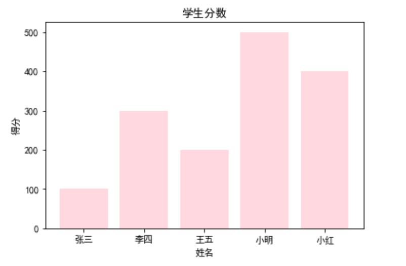
plt.bar(range(5),[100,300,200,500,400],color='pink',alpha=0.6)
plt.xticks(range(5),['张三','李四','王五','小明','小红'])
plt.xlabel("姓名")
plt.ylabel('得分')
plt.title('学生分数')
plt.plot()
plt.show()
饼图
labels = ['四川省','甘肃省','浙江省','云南省']
plt.pie([50,40,60,30],labels=labels,autopct='%1.1f%%')
plt.title('人口比例')

直方图
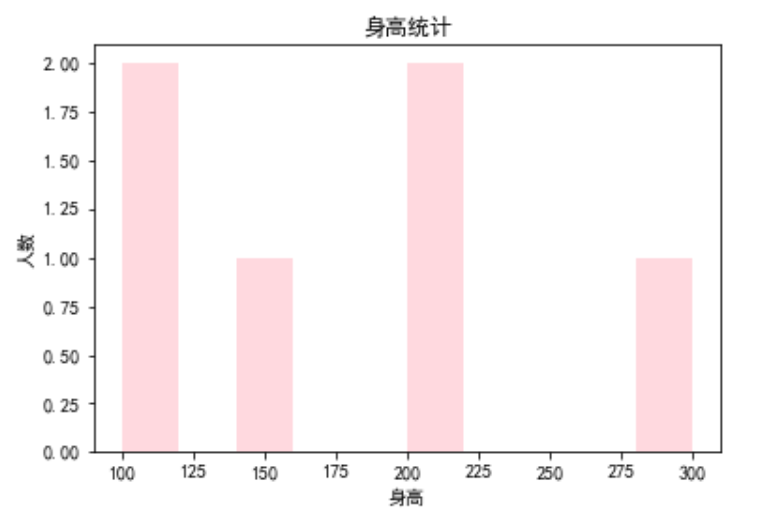
heights = [100,200,200,300,150,100]
plt.hist(heights,color='pink',alpha=0.6)
plt.xlabel('身高')
plt.ylabel('人数')
plt.title('身高统计')
plt.show()
散点图
import numpy as np
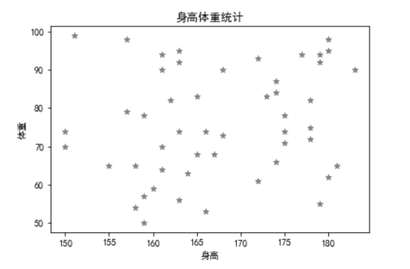
np.random.seed(10) # 随机种子
heights = []
weights = []
heights.append(np.random.randint(150,185,size=50))
weights.append(np.random.randint(50,100,size=50))
plt.xlabel('身高')
plt.ylabel('体重')
plt.title('身高体重统计')
plt.scatter(heights,weights,marker='*',color='gray')
折线图
x = [4,3,7,2]
y = [12,43,23,11]
plt.plot(x,y)


 浙公网安备 33010602011771号